SlideMagic Blog

Frequent updates about all things presentations since 2008. Subscribe to never miss a post.

RSS
·Templates

Stress-testing a new corporate PowerPoint template

The PowerPoint template is usually an after-thought in a corporate brand image project. Business cards, letterheads, envelopes, are considered more important than the look & feel of almost any document that is exchanged among employees and external investors, clients, etc.

As a result, you will find the PowerPoint template guidelines at the back of the brand book, written in language that is aimed at a print designer, it uses non-standard fonts, and its programming was a copy paste from Adobe InDesign.

Here are some things you can do to stress-test a suggested PowerPoint template that is handed to you by your graphic design agency:

  • Click view, slide master, and see whether it contains dozens of layout slides that are leftovers from Microsoft’s default master, ask why you need them
  • Check the file size of an empty presentation, any huge image hiding in the master?
  • Copy past an old presentation into the new master, see what happens. How much time do your employees have to spend fixing things?
  • Try an empty text box and an empty shape: what are the standard colours, standard fonts? Do the bullet points look decent, or do they come in weird shapes and/or colours
  • Are there any random guidelines all over the slide that no one needs?
  • Open the presentation on your children’s computer, how does the template look? Especially the fonts
  • Create some bar and column charts. Are the colours and fonts correct?
  • Open the deck on a Mac and see what happens
  • Try writing a big headline, maybe one that runs over 2 lines, are any logos or other slide items getting in the way?
  • Same for a big rectangular table, can you fit it, or is there a logo or other graphic element sitting in the one of the corners that gets covered?
Continue reading →
·Data visualization

Mary Meeker slide makeover

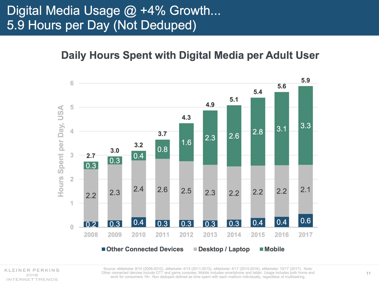
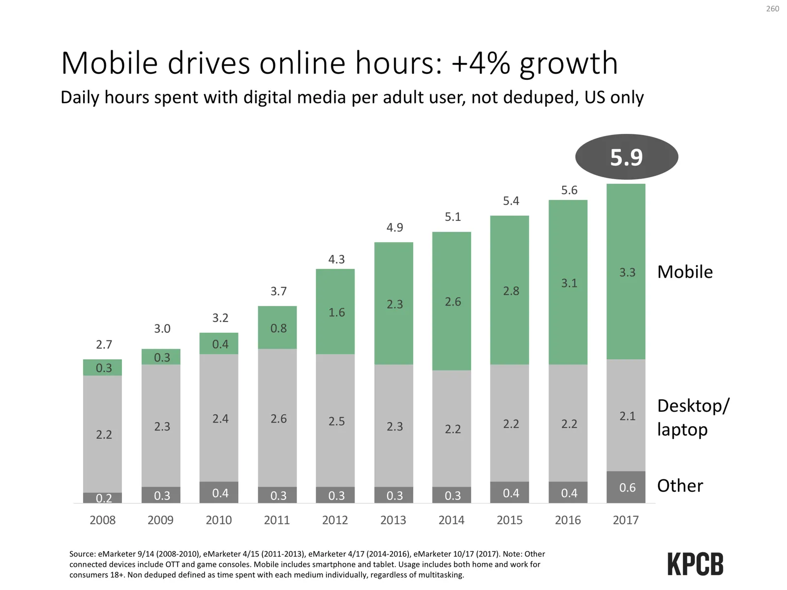
Mary Meeker published her 2018 Internet Report: hundreds of PowerPoint slides filled with dense information. This is a presentation for pondering and study, rather than seeing it as a backdrop for an entertaining TED talk. For this purpose, the slides look pretty decent. I picked a random slide from the beginning of the deck and tried to improve things a bit in “SlideMagic-style”

Here are some things I changed:

  • The KPCB template features the very heavy coloured bar at the top of the page, I took it out, and tried to apply the fresher green colour that was used for the branding of the web site of the document
  • The duplications of the titles were eliminated
  • The vertical chart axis and grid lines are not required, I took them out
  • I edited the title to make it shorter, put the growth point in the title, the absolute hour value as a bubble
  • The columns don’t add up because of rounding, I left it that way, but usually, I would change the value of the biggest column segment to make the numbers add up, it somehow looks sloppy when there are “calculation errors”
  • The legend was hard to read and difficult to link to the data series, I moved them to the right
  • I made the mobile data series pop more with stronger colouring
  • I stretched the data chart a bit horizontally to use the maximum possible space

A complete purist would argue that this chart is actually the wrong one to support the 4% growth point, there are no growth percentages anywhere on the chart.

Continue reading →

Maybe you don't know your story well enough

Some poor, rambling presentations might be the result of the speaker actually not understanding the story well enough. A good presenter understands the story one level of detail deeper than what is contained on the slides. If you don’t actually know that much about the subject you tend to hold on to the bullets on the slides, start repeating things, go in circles.

Some case examples:

  • (Me as a junior analyst in my early days at McKinsey). You just did a big interview survey at the beginning of the project and had to present the current status of the organisation to a room full of executives of the client who obviously knew that picture better than you. Every opportunity was taken to to erode your self confidence. A few weeks and a lot of analysis later, I was full of confidence and could answer every question.
  • (Me as a slightly more senior, but still junior, consultant at McKinsey). You were asked to present a piece of research/knowledge that was prepared by someone else in the Firm, you can obviously present the slides, but things get trickier when confronted with questions. Once you had complete a full project in this particular field, you could ace that same presentation, and add your own content for others to present.
  • Some start up founders get themselves into trouble when it is time for financial forecasts, go-to-market strategy, product pipelines, etc. If you actually do not master these completely, it will show.
Continue reading →
·Creativity

Breaking the step-by-step guide

Most things we get taught are presented in a step-by-step sequence: history lessons starts with the stone age, kids need to play a boring flute before being allowed their guitar, presentation design goes from thinking about your audience, key messages, flow, charts…

As I am trying to refresh the coding knowledge that is still left from my 1990s computer science degree I now see how this approach totally does not work for me.

  • Most concepts are not step by step, sequential. You need to increase your knowledge of all the steps involved gradually, rather than mastering step 1 100% before going on to step 2
  • Brains get bored, and switching from skill training effort to another is a great way to expand your attention span.

Here are ways I sometimes dive deep into slide design, even at the beginning of a presentation:

  • Often there is that one killer slide that you simply know has to be in the deck. Why wait?
  • Nothing better to wake up a bored brain than quickly putting together a beautiful slide master with title pages, separators.
  • “Sweat work” is another way to do something useful when creativity is stuck: plopping in a P&L, creating the team slide, all easy wins
  • Super detailed comparison tables are nerdy slides that often don’t make it past the appendix of a presentation, but, they put the entire story of a presentation on one page (yes, I know), and can serve as a great guide line for the story of the entire presentation, or as a check list to see that you have not forgotten anything. Better design that one first.
Continue reading →
·Data visualization

Quantification as a communication tool

The backbone of almost any management consulting project (and final presentation) is some sort of quantification of options. In essence, the quantification is the communication.

Strategic options can be hard to compare, evaluate. Uncertainty, risk, lack of information, dependencies, short term, versus long term. Throw these in an average politically charged management meeting and the outcome is almost certain: indecision.

A quantification is convenient: simple rank the “score” and the answer rolls out. Every option can be compared objectively. Well, objectively to a certain extend. With all the wild assumptions and predictions, you can pretty much force an Excel model to go anywhere.

But that might actually be useful. The process of debating assumptions, seeing how much they actually matter, which ones are certain, which ones are a bit uncertain, and which ones are wildly speculative, weighing all the factors, is the communication process a consulting team and client will go through. At the end, the point estimate of “Option 3 wins with $52.3b value creation in 2035” might not be correct, but the thought process that went into the estimate means that option 3 is probably the most sensible option to take.

Why do people need to hire expensive consultants to lead them through this process?

  • Some sort of objectivity, an outside party who has the run the numbers with a credibility at stake
  • Raw horse power: knowledge how to run complex calculations involving risk and options (and an infinite supply of available human capacity in a certain time span)
  • Privileged access to information: data from another country, disguised industry benchmarks, etc.
  • And the guts to make broad “20% of the effort, 80% of the result” assumptions where it is appropriate
Continue reading →

Text slide selector

I am experimenting with options on the SlideMagic template store. In this product, you can now select number of text lines, bullet style, and whether you want a side image or not, and the store will serve up the requested template. This is a very basic option implementation, I am looking into more sophisticated slide selections that could be useful for data charts and process diagrams for example, which would make it very easy to adjust the number of steps/years/months in these types of diagrams.

Subscribers to the SlideMagic store can download these charts (or a whole bundle full of text charts) free of charge.

McKinsey slide make over

I found this slide in a recent McKinsey article:

I created a make over of this chart, making it simpler:

  • Remove the icons, they are faint and not clear
  • Cut down unnecessary text: capture, create value, out of the business, you can say the same thing with much less text
  • Use this created space to increase the font size
  • Center the text, the paragraph shape of the existing text in the round shapes does not look good.
  • Re-order some of the terms in the text, to make it fit the shape better, some might not like “business models” now appearing before “services” for example.
  • Move around the text blocks until they fit the shape more or less. The off center moons will never lead to a perfect composition.

Here is the result:

The slide might look a little bit less sophisticated, but it is definitely easier to understand, and quicker to create. And that’s what business presentations should all be about.

I have added a modified version of the original 3-circle Venn diagram to the SlideMagic template store, you can find it here. Subscribers can download this template free of charge. If you are interested in learning more about McKinsey presentations, check out older McKinsey-related posts on the blog

·Delivery

The smartphone snap

People re-use slides for different audiences. And 10 years ago, you would still be able to skip a few slides quickly when they contain confidential information if - by accident - you forgot to delete the product roadmap that you used in last week’s Board meeting. (Or you forgot to mark them as “hidden”).

The smart phone with super high resolution cameras means that nothing is safe anymore. There is the accidental smartphone snap, but also the professional “slide harvesters” diligently recording every slide in your deck. An HD video just needs a millisecond to capture the slide that is being skipped.

Here are some other confidentiality pitfalls to watch out for:

  • Data that still sits in the underlying Excel sheets, even when you take the data labels of your chart
  • Hidden slides in presentation mode that are there for everyone to see when you send a PowerPoint file
  • Speaker notes
  • Collaborator comments
  • File names or URL names that can still persist in a document even after its is PDF-ed
  • Tiny footnotes that give away important information

Cover image by Ben White on Unsplash

Starting a new book...

People are spending too much time designing their own decks and sitting through other people’s presentations, using hours that could have been spent on making better decisions, inventing something great, or simply connecting with your family.

I am attacking the problem on multiple fronts (app, template store), and am now starting to dust of the book that I put out a few years ago. I want to raise the quality of its production, and make it much, much more practical with easy links to templates in the app and the store.

Watch this space.

Cover image by Angelina Litvin on Unsplash

·PowerPoint

Saying no to "send info to Microsoft"

I am a huge fan of the improvements Microsoft has been making to PowerPoint over the last few years, it now outshines Keynote.

One thing though, is bothering me: after every recent update it is very hard to say “no” to the question whether Microsoft can record every single one of your clicks to make the program even better. You can simply accept or learn more.

On a Mac, I managed to make the window go away by repeatedly clicking on the red cross in the top left corner of the pop-up window, hopefully that registered as a “no”.