SlideMagic Blog

Frequent updates about all things presentations since 2008. Subscribe to never miss a post.

RSS
·Books

Book review - "The presentation secrets of Steve Jobs"

Steve Jobs, the CEO of Apple, is a public speaking legend, and in The Presentation Secrets of Steve Jobs, author Carmine Callo aims to give you everything you need in order to be “insanely great in front of any audience” (as he puts it). When I started of reading the book I was not that enthusiastic. The book repeats a lot of the speaking basics that are covered by other authors on the same subject. A very good overview for someone who has not read many public speaking books.
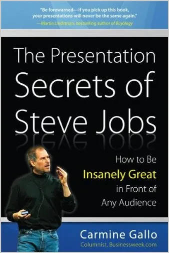
But later on in the book it became more interesting for me, as Gallo goes into the detail of a number of keynote addresses by Steve. As it turns out, Gallo is a speaking coach who works a lot in the high tech sector, a field I recognize since my local clients often are in the Israeli technology industry. Flicking back through the pages, here are some of the ideas I highlighted:

  • The book made be reconsider my aversion towards video in presentations (because it causes so many technological problems). Maybe 10 years later, technology has moved on and it is time to think about incorporating (very short) fragments of video.
  • “Your audience does not care about your product, people care about themselves”. A good reminder when creating presentations that need to sell technology products loaded with features.
  • The concept of “reality distortion field”, being such a good speaker that the audience is basically ready to accept anything from you
  • A reminder how important headlines are
  • A reminder how important it is to practice (if there is one public speaking tip that is important, this one is it). And building on this: you actually need to practice in order to sound spontaneous and speak naturally. Winging a presentation with improvised language and “uhs” and “ohs” does not sound spontaneous and natural.
  • That you need to be Steve Jobs in order to dress like Steve Jobs in a key note presentation.
  • The important of “signalling” making it completely and utterly obvious what the point of your slide/image is. No brain puzzles for your audience.
  • Great speakers remain calm and confident when something unexpected happened, see this video full of Apple bloopers:
Continue reading →
·Advertising

Everything in excess

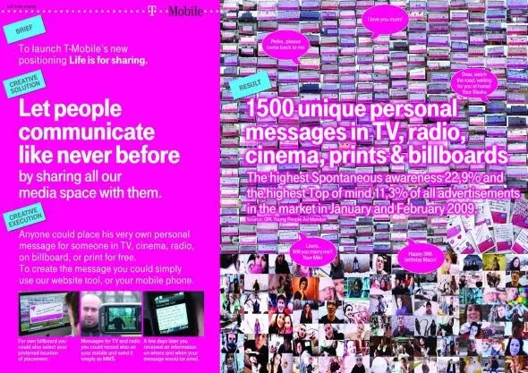
This ad reminds me of many poor PowerPoint slides I see. It sure grabs the attention, but that’s probably also the only thing it does.

Let people communicate like never before, let’s try to achieve that in 2010 but in a more positive way. A happy new year to you all.

A bigger picture on Ads of the World.

·Design

Five presentation images your audience will not understand

It is important that your audience “gets” the image on a slide immediately, otherwise they will be staring at it, thinking about it, trying to solve the puzzle, in short everything but return their attention to you as the speaker.

Some reasons why an image that makes perfect sense to you in your office might not work for a big audience:

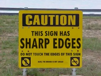
  1. The clue is in the small print (as in the image used in this post). Put a big marker to draw the attention to the sentence that matters
  2. Incredibly busy compositions, Times Square in New York, a screen shot of a video game
  3. Cartoons with a lot of text. Things get worse when a small cartoon image is scaled up, leaving a poor picture quality. Give your audience time to read it, and may black out the screen to focus attention back on you
  4. (Too) interesting people: an image of the red carpet during Oscar night might make people wander off and examine those beautiful dresses rather than listen to your story about Business Process Redesign
  5. Clever graphics such as an Escher drawing. “Hey, how did he do that?”
·Design

Avoid slide elements with negative connotations

I really like red as a bright contrasting color to put comments or circles on busy slides. Until a meeting with people in the Finance Department of one of my big corporate clients. “Can you please take the red off, in our (financial) language red equals bad news”.

Three things to avoid in slide design:

  1. Bright red highlights in fonts, especially when talking about numbers
  2. Arrows pointing down (if you want to visualize something positive), why not redesign the slide and have them point up?
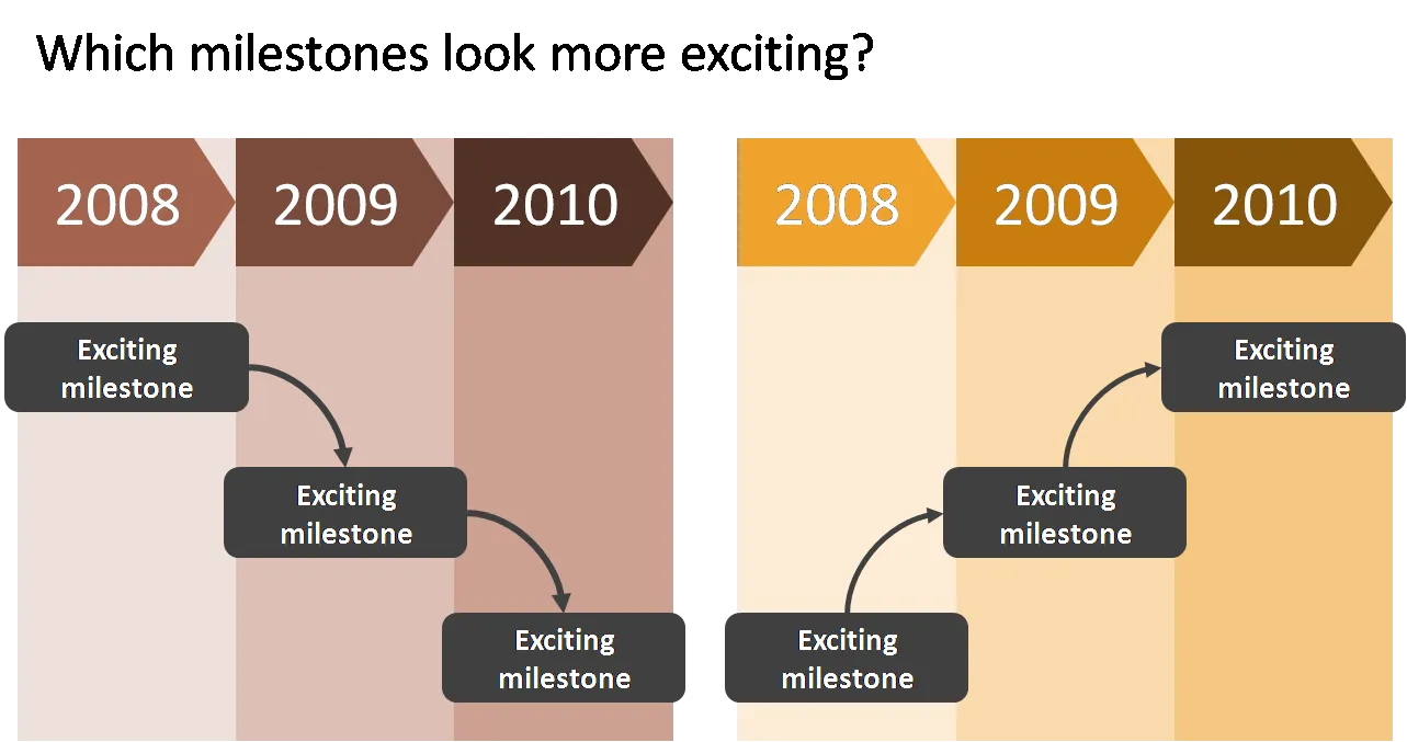
  3. Lines, sequences, or page elements that force the eye to go from top left to bottom right. The milestone graphic in this earlier post is a good example.

As always, these are not rules to be set in stone, it is just another piece of slide design context that you should be aware of.

·Design

The most expensive printing paper does not always look the best

Printers will always try to sell you the heaviest paper with the glossiest finish. If you are not printing the new corporate brochure or annual report, but need to make nice books of your PowerPoint presentation, I would go for a more modest choice of paper. It looks a lot better and costs a lot less.

Image via airgap

·Design

The best wishes for 2010

I would like to wish all readers happy holidays and a healthy and prosperous 2010. From a presentation perspective, try to make a difference in 2010, for example:

  • If you are working in an organization with a conservative approach to presentations, try to find an opportunity to demonstrate a different way to get your message across, spreading the ideas we talk about here to more people.
  • If you are a professional presentation designer consider donating some of your time to a really important cause and design the best possible presentation for it.

Since Tel Aviv is bright, warm, and sunny today, and probably the only Xmas tree in the city is put up in my apartment, I actually enjoy watching some of these old masters that have been put too many times on post cards:

Pieter Breugel the Elder, 1565, Hunters in the snow**, Oil on wood, 117x162cm, Kunsthistorisches Museum, Vienna

·Design

A presentation review

You can learn a lot from regularly checking out the SlideShare front page. Here is a presentation that caught my eye. What I like about it:

  • A consistent theme of the images throughout the presentation: (mostly) black and white, retro images of workplace scenes
  • Original typography
  • A very simple list structure, counting down from 14 to 1

Some items that I like less:

  • Inconsistent use of colors (probably done on purpose though)
  • The grunge font and use of colors make the text sometimes hard to read over the image background
  • Putting text in vertical boxes, it looks cute but is hard to read
  • The transition from the presentation content to the “contact me” last page, the beautiful presentation falls back into a more common PowerPoint format including bullet points

14 Signs You Need A New Approach To Performance Appraisals San Francisco

·Data visualization

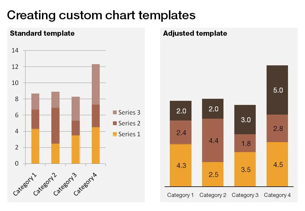
PPT hack - custom chart templates

The standard PowerPoint templates do not look very good. The standard slide layout invites people to write presentations through endless lists of bullet points. But even more time-consuming to change are the standard templates for data charts.

This earlier post with a make-over of a column chart in a presentation by Skype shows some of the pain a presentation designer has to go through over and over again to create decent data charts. It took me around 17 years to discover the option to create your own templates. Let’s save you this time, right now.

If you click a chart in PowerPoint 2007, you can find the “save as template” button in the “design” ribbon of the chart. (Confusingly, two “design” ribbons pop up when you have a chart open, one for the chart, one for the slide). Give your template a name and PowerPoint 2007 will save it in the appropriate directory (with a “.CRTX” extension, but you do not need to worry about that).

The next time you select “insert chart”, a folder appears at the top of the standard PowerPoint options, open it to create a data chart using your own customer templates.

·Colors

The color orange - since 1512

While reading Chris Brogan’s latest book Trust Agents, I came across this interesting factoid: until only very recently there was no word for the color “orange” in Western European languages. Chris claims that it is the main reason why we talk about “red heads” or “goldfish”.

Research on Wikipedia provides more background:

The colour is named after the orange fruit, introduced to Europe via the Sanskrit word nāranja. Before this was introduced to the English-speaking world, the colour was referred to (in Old English) as geoluhread, which translates into Modern English as yellow-red. The first recorded use of orange as a colour name in English was in 1512, in the court of King Henry VIII.

·Concepts

Chart concept - the zipper

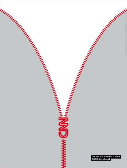
This ad by CNN reminds me of a chart concept that I use often to uncover things: the zipper. It can easily be replicated in PowerPoint using two approaches:

  • Select a stock image and remove the background color if necessary. An example here, or here, or this nice bag full of cash that you will return to your investors in 4 years.
  • If you are in an artistic mood you can actually recreate the zipper using basic PowerPoint rectangles, maybe using straight lines instead of curved ones.

Via Ads of the World