SlideMagic Blog

Frequent updates about all things presentations since 2008. Subscribe to never miss a post.

RSS
·Art

Art Authority for Mac

I reviewed Art Authority, this great art catalogue for iPad earlier, and I just bought the same application for the Mac.

The bad news, the user interface is a lot worse than the iPad. You browse art in finder windows, sometimes via HTML pages.

The good news, working with the images is a lot easier. Since a good keyword search mechanism is still missing, a very large monitor makes it easier to browse icons of paintings. You can have multiple thumbnail windows open, and leave them open for a long time.

Ten dollars well spent. Twenty dollars well spent if you buy the iPad app as well.
·PowerPoint

Tilting Google maps

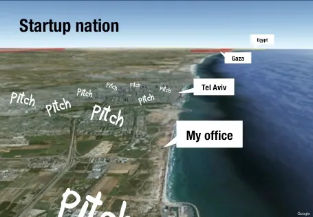
Someone asked me how I managed to create this image of my office location in a recent presentation.

The secret is in an earlier post about tilting Google maps. Pay attention to the angle that the satellite camera took when taking images closer to the ground. Rotate the image in such a way that shadows look natural.

·PowerPoint

Presentation design and web design

In many of my presentation design projects, the content of the presentation is already 80% available on the client’s web site: a startup with an exciting new technology, the strategy of a big Fortune 500 company. But it clearly does not a good job at explaining the messages in an interesting visual way. (Otherwise you could just put a modified version of the web graphics as the background to your presentation).

Over the past years, we have learned a lot about effective design of presentation visuals. Maybe web design is next, and can learn from this process? Fewer buzzwords, fewer environmental policies, less prominent contact details. If bullet points and clutter do not work in a presentation, why would they work in a web site? Instead: the web page as a clutter-free presentation canvas that tells your story.

The implication will be that, similar to presentations, we get a level playing field in web design. A good web site template that can handle big images and sliders is all you need from the technical site. That is the easy part. The difficult bit is to get the story right.

·Advertising

Photo compositions that hurt the eye

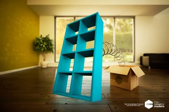
Photo editing software can do a lot, and it is getting increasingly used in advertising. This ad however shows its limitation. When you try to be photo-realistic and it is not 100% right, it just hurts the eyes. The concept behind the ad is good, the execution not.

Via Ads of the World.

·Investor presentation

Mark Suster on pitching to VCs

The great people of SalesCrunch are beginning to put the videos from my New York presentations online. First up is Mark Suster, a well-known venture capitalist from LA who introduces my presentation on pitching VCs

Mark is one of the best VC bloggers around, and I was honored when he offered to introduce my presentation in New York in person. We found out the night before that we happened to be in the same city (it is a statistically low probability that 2 people from Tel Aviv and Los Angeles are at the same time in New York).

More videos to come. Thank you Ann Lupo for the video recording and editing.

·Delivery

Voice pacing

Here is an interesting article about voice pacing on the BBC web site. Researches analyzed voice patterns of 1,400 attempts to get people to do a phone service. Here they are:

  • Speak moderately fast
  • Pause
  • Don’t change the pitch of your voice too much

You could re-write these findings as follows:

  • Be energetic and enthusiastic
  • Don’t rattle off a pre-programmed script
  • Act normal

In short, have a human conversation.

·PowerPoint

Editable maps in PowerPoint

I do not agree with the design approach of the majority of free template databases on the web. Many of these sites are built to attract Google traffic and host cluttered templates that seem nothing more than a more colorful extension of Microsoft’s standard bullet point opening screen.

Presentationmagazine.com fits somewhere in the middle. Managed by Jonty Pearce, It hosts some standard PowerPoint templates that I would not use in a design, but also has a number of useful articles.

The really useful content of this web site however is its library of free editable PowerPoint maps. You can download them and color states, countries and continents with your own colors. An excellent resource.

·PowerPoint

PowerPoint feature wish list for Microsoft

My wish list of features to be included in PowerPoint. Feel free to add your own in the comments.

PowerPoint 2011 for Mac

  • Custom font embed (available in PPT 2010)
  • Ability to set custom theme fonts (available in PPT 2010)
  • Selection pane (available in PPT 2010)
  • Define custom grid spacing (available in PPT 2010)
  • Ability to lock the static grid

PowerPoint 2010 for Windows

  • Better integration with photo browsers (available in PPT 2011)
  • Included weights in font selection menu (available in PPT 2011)
·Gadgets

Magic Mouse versus Logitec MX mouse versus Magic Trackpad

I have experimenting with various input devices over the past month.

  • The Logitech MX mouse: a leftover from my old PC. Large to fill the palm of your hand completely, this device has worked for me very well over the past years. If there is one drawback it is the materials it is made off. This fake-velvet plastic actually wears off after long use, making the piece of hardware that you touch all day, every day of the year look and feel dirty.
  • The Apple Magic Mouse. I actually had to get used to this device for a few days. Unlike the Logitech mouse, it is small. You move it with your thumb and index finger. The surface is made of glass enabling you to manipulate the cursor and zoom just like you can do on a track pad. I love the clean material (glass), no more sticky plastic on your fingers. Sometimes though, the scrolling can be a bit unpredictable in PowerPoint, oops I just went 2 pages up.
  • The Apple Magic Trackpad is a standalone version of the trackpad that is usually found in laptops. It has a nice large surface, and nice click. For a casual computer user, this would be the one I recommend. For the professional designer (me included), I still prefer a mouse to manipulate and drag shapes across the screen.

After a month, I end up working with the Magic Mouse most of the time. I still need to find a solution for that unpredictable scrolling somehow.

·PowerPoint

Helvetica - the movie

I finally managed to get my hands on the movie Helvetica (affiliate link). It is a wonderful documentary about this famous type face, and how it has managed to infiltrate our daily lives on almost anything we see written in the street. Beautiful movie shots, nice music, and interviews with some well-known typographers.

Somewhere hidden inside the movie is an interview with typographer Erik Spiekermann where he gives his opinion about the typeface helvetica. He speaks very quickly but in a few seconds he makes a great number of points that I have started to notice as well: Helvetica works great with lots of white space around it and Helvetica needs careful attention with weights. (In fact I think one of the reasons that Arial looks so poor is that people usually only use the regular and bold variants. Helvetica comes in an endless range of weights.)