SlideMagic Blog

Frequent updates about all things presentations since 2008. Subscribe to never miss a post.

RSS
·Art

Lessons from Vidal Sassoon

I am continuing my quest through the long tail of Netflix design movies and stumbled on this one: Vidal Sassoon the Movie (affiliate link) about the famous hairdresser. In itself, his story is very interesting, growing up poor in an orphanage, and becoming a global celebrity.

For me, there were two things that I found especially interesting.

  1. It took him 9 years to find his signature style that would change the way women looked (and thought of themselves) in the 60s. Design is hard work, even for the best and most talented among us.
  2. He says that it is easy to see when something is wrong, but very hard to come up with something that is right.

This is exactly the case in slide design as well (at least for me). Learning to design is going through lots of your own failures, eliminating stuff that is not right, leaving you with the things that do. One way to accelerate the process is to plough through design books and absorb anything design around you. It increases the odds that you will bump into something that works.

·Data visualization

Simple - complex - simple

This is the path that financial analysis usually follows. We start with a simple back off the envelop, then complicate things in Excel. In presentation design, the last step is crucial: bringing down that Excel model back to a simple calculation.

And that simple calculation is likely to be completely different from the one you started off with. Building the complex model has taught you how your business really works financially. And only when you understand that, can you go back to simple.

Most of the times, presentations stop in the middle. They throw the data output form the complex model at the audience. That is a sign that you do not understand it yet, and if you don’t get it, the audience will not get it for sure.

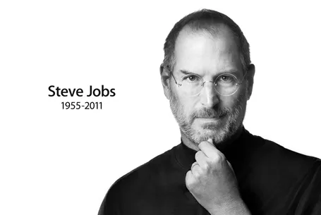
"Who is Steve?"

“Who is Steve?” my daughter asked this morning. “The guy who came up with the idea for that device you are holding. Kids, you are watching way too many movies, shut it off and go eat some breakfast”

You can admire Steve Jobs as a person (I did not know him personally), you can admire him as a successful businessman who made billions by not giving up (MBA students might be interested in this), but most of all Steve was a man who had an enormous impact on my day-to-day life.

Seeing his keynote addresses a few yeas ago made me realize that the world could be a better place if I could help people present just a little bit more like Steve. In the process, I managed to cut myself free from corporate shackles and take charge of my own life.

Today you can feel a strong personal loss for someone you have never met in person. And it is actually Steve who made that possible. Thank you for that.

·PowerPoint

Become a movie director

The second page of a business presentation is most likely the agenda page, and they all look the same: we will summarize what we are going to say, then we go through the story, and then we will summarize it again.

The rule “tell’ m what you’re gong to tell, tell ’m, and tell ’m what you just told them” is often quoted as a good structure for a presentation.

There is one place where repetition is used to force people to remember things: education. We pound, and pound, and pound, on the brains of children reluctant to absorb new facts until the brain “snaps” and finally gives up the resistance.

As a result, content is remembered, but not for long. The day after the test, it already starts to fade away. If we have to hammer in the messages into the minds of our audience, we have not got our story straight.

Stories are a much more powerful way to make people remember things. People love stories. Take for example this very short one:

“For sale, baby shoes, never worn.”

It is the shortest story that Ernest Hemingway has ever written (and he claims that it is his favorite). Upon reading this story, your mind lights up. It is curious what happened to the baby. It starts to fill in the missing blanks.

The brain needs a framework in wich to put a story. Stories are great frameworks, and so are physical locations. Our mind is spatial.

We have all been in brainstorm sessions where the white board looks like a complete mess after an hour of discussion. If you take a picture of it using your cell phone camera, and look back 3 weeks later, there is a good chance that you can almost remember the entire debate minute-by-minute. Not because the writing on the picture is so clear, but because your brain has allocated a location on the board to store all memories form a particular fragment of the discussion.

Continue reading →
·PowerPoint

The first 4 bullets

I presented at an investor relations conference the other day and a buy-side analyst made some comments about what it was in a presentation or document that gets him to read further: the first four bullets need to catch his attention.

So, does this mean that your first slide should have 4 powerful bullet points on it?

Not necessarily. What the analyst said was that he wanted to get excited about an investment opportunity in about 1 minute. Given that most corporate presentations are a collection of bullet points, he translated that 1 minute into a number of bullets. However, that same minute can also contain a highly visual slide sequence that does a much better job pitching your idea.

Image by kcdsTM.

·PowerPoint

Reminder: my webinar tomorrow

Just a reminder that I will be hosting a webinar as part of Ellen Finkelstein’s Outstanding Presentation Workshop tomorrow. Details of the event are here.

·PowerPoint

Mission statement on slide 2?

Mission statements are supposed to be the ultimate piece of prose: in one sentence you have the entire essence of a company: what you stand for, what your values are, how you treat customers, everything. This is serious stuff. Making jokes about the mission statement is often considered committing sacrilege.

Mission statements often feature on page 2 of a corporate presentation, right after the title slide. Here you are: our company in one sentence.

It takes time to develop a good mission statement. Projects to craft one can take weeks. The entire organization needs to be involved. Words need to be adjusted. Values need to be discussed.

And that is exactly the problem for an external audience. They miss the context of the 3-week project. They miss the background of the debate. They have no idea about that offsite where you discussed your company’s values. For someone who reads the mission statement for the first time, it is well, just another sentence with familiar sounding words.

The ultimate example of the Curse of Knowledge.

When I pooh pooh mission statements in presentations I did not mean to make fun about the values of your company. I think mission statements are valuable. Slide 2 of your presentation is just not the right place for them.

·Gadgets

Software developers, please fix this

More and more applications will be a platform to deliver presentations, which means more and more applications need to do the following things:

  1. Have a good full screen mode
  2. Respond to Logitech and Apple remote controls
  3. Support dual monitors including slide preview mode, where you can see the upcoming slide on your laptop screen (not on the screen the audience is watching)

Adobe Acrobat does not have preview mode, and does not respond to an Apple remote. Apple Preview only seems to have slide shows with automated page transitions. OK, Preview might not be intended for running presentations, but Adobe at least should build in features that make Acrobat a good alternative to PowerPoint and Keynote for presenting slides.

Tablet devices would be another category. It is easy now to hook up an iPad to an HD screen. Again, presenting slides should be thought of as a required application.

What do you think of the new layout?

Google is upgrading the Blogger platform and today I switched on the new Dynamic Views. With the drop down menu at the top left of this page you can play around with a number of viewing options.

Personally, I like the way how the template invites readers to go back to some of my older posts. It comes at a price though, the current template is not very flexible in terms of design. I cannot add a lot of branding, and I do not like the (centered) formatting of the individual posts. Hopefully over time, Google will bring back more options for tweaking.

On balance, I think I will stick with the new format. What do you think?

UPDATE: I reverted back to the old layout, not so much because of the look and feel, but more because some basic functionality was not working (i.e., viewing comments).

Teaching public speaking to the new generation

Wanda Taliaferro contacted me to draw attention to her not-for-profit organization The New Jersey Orators that teaches children aged 7-18 to speak in public with confidence. The organization is also one of 10 global finalists in a Lenovo-sponsored competition that can land them $50,000. If you want, you can vote for them here, by selecting the Building Confidence - One Word at a Time entry.