Extreme perspective
Images get more interesting with a dramatic perspective. How to find them? Look for unusual camera angles, and put an object on the foreground to amplify the effect of depth. As it is done in this ad found on Ads of the World.



Frequent updates about all things presentations since 2008. Subscribe to never miss a post.
Images get more interesting with a dramatic perspective. How to find them? Look for unusual camera angles, and put an object on the foreground to amplify the effect of depth. As it is done in this ad found on Ads of the World.
Most financial or scientific data slides gave all visual elements equal weight.
This is not how the novice discovers your data. Make the first order element pop out, so people get the message without the clutter of all the other information.
For the 2nd, 3rd order elements you can use smaller fonts, or - what I find most effective - use light grey font colors. Another options is to put a long wordy foot note at the bottom of the chart that has all the other bits in it, thereby avoiding the need to populate the slide with scattered text labels.
After people get the message and have questions they will look for more information and find everything they need.
When people receive my analyst or investor presentations and they see a few years of P&L data entered manually one-by-one, they always ask me whether after all these years I have not found a more efficient way to do it. I have not.
While I punch in the numbers manually (which takes about 15 minutes by the way), I can do a lot of things in parallel:
A data table is worth that extra attention, instead of an Excel data dump, you get a visual that makes sense.
I said before that it is a shame that PowerPoint (or Keynote) do not have these powerful replicators that you can find in motion graphics software. Filter Forge is a nice piece of software that plugs into PhotoShop and extends the range of filters you have available for your images.
Here is an example image I created for a client that has software that works across all possible versions of the highly fragmented Android mobile operating system.

Filter Forge is a platform on which users can contribute their own filters, the result is an endless library of filters, including the perspective distortion above, instagram-style retro filters, and filters that turn your images into cartoons or impressionist paintings.
It is not cheap, I bought the professional edition which is priced at $399.
Thank you for checking my blog’s availability in this small online survey. Looking at the results, I see that many problems occur with people behind corporate firewalls. My client base actually includes some IT security companies and people are checking whether I managed to get myself blacklisted.
The domain blog.ideatransplant.com is a Google blogpost address in disguise. I started a discussion on the Google Blogger support forum here. If you want, you can add your issues to the discussion there.
Many readers are complaining that they cannot load my blog and only have access through the RSS feed. People say they get DNS errors. I have tried many things, but have not been able to pin down the problem. Could you do me a huge favor and click http://stickyslides.blogspot.com and http://blog.ideatransplant.com and, after that, fill out this short survey? Thank you!
If you are reading this in your RSS reader and actually have access issues to the site, here is the direct link to the web form.
<p>&amp;amp;lt;p&amp;amp;gt;&amp;amp;amp;amp;amp;amp;lt;p&amp;amp;amp;amp;amp;amp;gt;&amp;amp;amp;amp;amp;amp;amp;amp;amp;amp;lt;p&amp;amp;amp;amp;amp;amp;amp;amp;amp;amp;gt;&amp;amp;amp;amp;amp;amp;amp;amp;amp;amp;amp;amp;amp;amp;lt;p&amp;amp;amp;amp;amp;amp;amp;amp;amp;amp;amp;amp;amp;amp;gt;Loading…&amp;amp;amp;amp;amp;amp;amp;amp;amp;amp;amp;amp;amp;amp;lt;/p&amp;amp;amp;amp;amp;amp;amp;amp;amp;amp;amp;amp;amp;amp;gt;&amp;amp;amp;amp;amp;amp;amp;amp;amp;amp;lt;/p&amp;amp;amp;amp;amp;amp;amp;amp;amp;amp;gt;&amp;amp;amp;amp;amp;amp;lt;/p&amp;amp;amp;amp;amp;amp;gt;&amp;amp;lt;/p&amp;amp;gt;</p>
Related to yesterday’s post, here is a piece of advice: make it a habit to take cellphone images of workshops, site visits, conference, foreign visitors, a strategic deal signing, moving day to the new office, etc. throughout the year. I always find that when the moment comes for a new corporate presentation, the only office visual a client can produce is one of the entrance corridor with the receptionist in front of the company logo.
This video by Before & After Magazine shows a great way how to visualize the team behind your company. I always think it is a shame that people do not invest in better photography for their presentations. How hard is it to get someone to hold a camera and take a group picture of your management team? It looks so much better than the inconsistently cropped, high school year book-like, images you usually see in a presentation.
I actually make the team description slide a bit more dense than other charts in a presentation. During the presentation the presenter will talk around the photo and introduce the team, the text in the boxes is for reading after the presentation.
The Before & After Magazine has some nice graphics design instruction material on their site (some is free, some is not). Their YouTube channel is also worth checking out.
The year 2012 could be the tipping point for Apple’s presentation design software Keynote. Only now I get multiple requests from clients to start designing presentations in this format. Especially smaller companies and startups who have the privilege to be able to decide on a 100% Mac IT infrastructure are the pioneers. So, over the past month it has been the first time that I had the opportunity to use Keynote on an industrial scale, on time critical presentation design projects.
Most Keynote versus PowerPoint evaluations on the web count the number of features, slide transition effects, or the quality of the built-in themes. So this is maybe the explanation why these features get some much prominence in marketing of both products. Personally, I find them the least important aspects of the software. What matters is how easy your workflow is: manipulating objects, changing the order of slides, managing images, creating and editing data charts. My review will focus more on these issues.
People say that the best Apple products are those that Steve Jobs used frequently personally, and Keynote is such a product, and it shows. The interface is lighter, fresher, simpler without PowerPoint’s baggage of older versions.
The concept of the inspector window with the properties of any object you click at (image, shape, graph, text) is incredibly useful and time saving compared to looking for the right menu in PowerPoint.
One of the biggest pains of PowerPoint 2011 are the drawing guides that you cannot lock. Re-size an object near the blue drawing guide, and tsjak, off she goes. Not so in Keynote. Aligning, positioning is all easier and cleaner.
Things are never sure in business analysis. One option to deal with uncertainty is to use data ranges: $3-5m instead of ~$4m.
While it might be the correct approach to qualify your analysis, I do not find it visually pleasing. My approach would be to settle on a point estimate, and put a note on your slide that these numbers are estimates. It also easier to discuss with your audience, it is difficult to refer to ranges all the time: “Next year’s sales of $3-5m”.
One additional complication, ranges amplify when you add or subtract them. In the chart above, you see that 6.5 equals to a range of 4-9 instead of 6-7 for example. If this is the point you want to make, our sales forecast can fluctuate wildly because of things we do not know, then use the chart. If you just want to give a small range to show uncertainty about the exact value go for the point estimate.
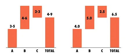
And one more issue, a range of $1m more or less can be a big difference if you apply it to a small number, or a big one: 1-2 versus 10-11 for example. The first is a 100% variation, the second 10%. So, to do it correctly you have to write down in your chart: 1.0-1.1 and 10.0-11.0. All this just makes it too complicated to have a meaningful strategy discussion.
And another one: ranges are a pain to use in calculations, as seen in the slightly counter-intuitive column chart above. (See an earlier post on how to make water fall charts here).