

SlideMagic Blog

Frequent updates about all things presentations since 2008. Subscribe to never miss a post.

RSS
·Concepts

Rigorous deal selection

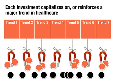
A U.S.-based healthcare-focussed venture capital fund only invests in a company if it pushes forward on of seven trends in healthcare. The page below tries to visualize that.

The point here is only about the rigorous selection, the trends themselves get explained on separate slides, and the portfolio companies get discussed somewhere else in the presentation. After the presentation, institutional investors should remember that the fund is very picky in investing their money, “remember that magnet slide?”
iPhone commenting on this blog

Sometimes, a reader manages to publish a comment on my blog using the Blogger commenting system, and not the Disqus engine that I have embedded. My blog does not show the Blogger comments, nobody will see them, and I cannot respond to them. Two requests: firstly, please use the Disqus commenting system, and secondly, if you were the victim of this glitch, could you please let me know how you managed to still get into the Blogger commenting system? Maybe it is via the RSS feed? (Obviously, when telling me this, please use the Disqus system :-))

UPDATE: If you comment on my blog using the iPhone mobile template, you get the Google Blogger commenting engine, not the Disqus one. As a result, your comment will disappear on a Google server somewhere, never to be seen by anyone, ever again. I have contacted Disqus support.

·Concepts

Endless permutations

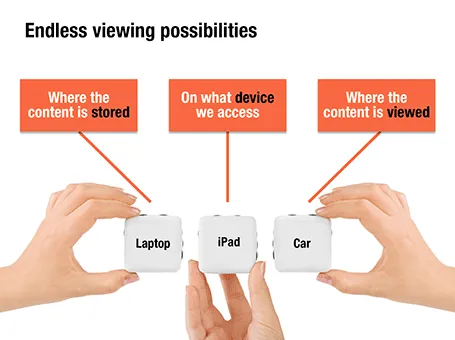
Here is a nice way to visualize an unlimited amount of possible combinations. The sanitized example below was designed for a client with a new digital media technology. You could create a similar concept with a suitcase combination lock, or maybe a slot machine.

·Animations

Uncover versus popup

I am not a big fan of animation, spectacular effects do not support a serious business message and documents with animations do not convert well to PDF for emailing.

Sometimes there is no escaping though, especially when you need to explain components of a complex system. The best way to do this is to add elements one-by-one through a series of clicks.

The usual way to do this is to use pop-up animations. However, these can be cumbersome to edit: you often forget one item in a group, and have to start all over again.

There is an alternative: cover the critical elements in your slide with boxes and remove the boxes one by one. Easier to edit. You can even make it more sophisticated by given the boxes a 10% transparency: the viewer sees sort of what is coming, but not completely. When you want to PDF and email a version of your document, you simply delete all the boxes which leaves the full diagram intact.

·PowerPoint

Links to full screen YouTube videos

The most reliable way to include video in your presentation is to include it in your presentation file. Dragging a video file into Keynote for example creates huge file sizes, but you eliminate the hassle of having to save files in the same location.

A less elegant option, but one that saves space, is to rely on live YouTube links for playback. Here is an approach to do this:

  1. Play the video (in the highest resolution possible) and pause it at the moment you want to use for the placeholder image.
  2. Take a screen shot and paste the image into your slide
  3. Draw a big triangle and place it in the middle of your still image as a play button
  4. Insert the hyperlink to the YouTube video inside the triangle and you are done.

In presentation mode, you can click your play button triangle with the mouse and your browser will open to play the video.

By default, the video will play in the standard YouTube view with all the screen clutter around it. Here is a way to get a link that triggers a full screen view of a YouTube video.

The standard format of a YouTube URL is this: http://www.youtube.com/watch?v=R55e-uHQna0. Here is the trick. Replace the watch?v= bit with this v/ to get this result: http://www.youtube.com/v/R55e-uHQna0. Make this the link your play back triangle points to.

·PowerPoint

Need a simple planning tool

Business is going well and I am in need of a basic time planning tool. My work style has changed from one that is management consulting-like (1 project at a time, from start to finish), to a more erratic (creative?) work schedule. I take on many projects at the same time, ponder about creative approaches in parallel, and have become much, much faster in execution once I have the ideas for the killer slides in my head.

With all of this, it has become hard to get a good grip on my actual work load and give clients a realistic delivery date of a project. Most project planning tools available are designed for large projects executed by multi-person teams doing tasks that are defined in days and not hours. These tools also find it difficult to manage multi-tasking: one person who is working on more than one project at a time.

So, I wonder whether you have come across a tool that allows me to do the following:

  • Quickly add lots of short projects
  • Sync with a calendar to take into account holidays and other commitments
  • Put in hard deadlines for some projects, while leaving others open
  • Allow multi-tasking

I have been playing around with Omniplan and Clarizen, but these do not seem to do what I need.

·PowerPoint

Writing it on every page

Sometimes a senior executive comes in at the end of a presentation design process and starts making some “edits for clarity”. She probably does not have a lot of time to go through the deck in detail, but wants to make sure the key points are said. No better way to do this than adding the words “flexible solutions ” on as many pages as possible. Now the deck says at least what it is supposed to say.

When this happens, it is time to stand up for yourself.

·McKinsey

So what?

The first day of your career at McKinsey, you learned about the concept of “So what?”. It meant asking yourself what the real point of a chart full with analysis was, and writing that down as the title.

A so what should be meaningful, and not simply stating a fact for example instead of “We are making a loss in France”, maybe it should read: “It is time to leave the French market”

Once you established what the so what of the chart is, you could then go on an cut down any facts, data, or analysis that was not essential to make the point.

If you identified the key messages correctly you would be able to understand a document by just reading the headlines, the content of the slides just backs up what the title says.

A useful day-one concept, I still use it pretty much every day.

·Creativity

Getting the most out of a designer

Designers can do good work, or can do great work. How can you get them to do great stuff?

  • Give them plenty of time. Introduce your pitch way before the deadline, build a relationship, start the actual work with enough head room for creativity and iterations. Good presentations are not born under deadline stress
  • Give them a broad briefing. Tell the story you want to tell in double the time you have. Give background about the story, the audience, the occasion. What goes in the design process, will come out.
  • Give them freedom. Very strict instructions will return your own presentation with the objects on the slide just a little bit better aligned.
  • Give them budget. If after a a long negotiation the designer utters “OK, I will try to squeeze it in” followed by a a sigh, it is unlikely that you just switched on all the creative genius that is present in the designer.
  • Give them a blank sheet of paper. Insisting on using an ugly corporate PowerPoint template is a set up to failure for the presentation design project.
  • Give them access. If the CEO needs to give a presentation, the CEO needs to talk to the designer directly. Chinese whispers through corporate hierarchies dilute the message.
  • Give them sleep. If you are working in different time zones, it can be tricky to find overlapping meeting times. A designer having to get (stay) up in the middle of the night is unlikely to do the best she can.
Continue reading →
·Advertising

Presentation first

Presentation design often comes at the back of other marketing communication (advertising, scripts for brochures, white papers, and web sites). In many cases, marketing can benefit from the opposite approach. Visuals are much better to lay the foundation of a marketing story than text. And it is far easier to involve a CEO or other senior executive in a visual presentation design process, then force her to go through revisions of text. So a good presentation design project does not only give you a nice slide deck, it might well provide the inspiration for an entire marketing campaign.