Look at these synergies!
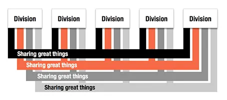
Here is an alternative to a circle-like composition of a holding company and its subsidiaries.


Frequent updates about all things presentations since 2008. Subscribe to never miss a post.
Here is an alternative to a circle-like composition of a holding company and its subsidiaries.
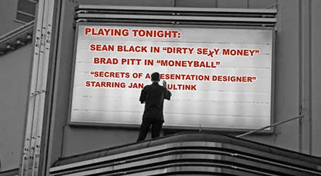
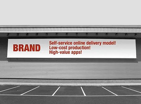
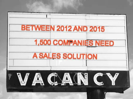
Maybe a bit overused, I still applied the billboard concept in a number of presentations recently.
I would love to use hand drawn graphics in my presentation, but I never got to drawing and sketching on a computer. Any tools without a direct screen feedback loop (the mouse, drawing pads, and even the Wacom Inkling) simply do not work for me, and I think a screen like this are very expensive and generate additional clutter in my workspace.
The iPad could solve this, because it has a touch-sensitive screen. As a result, hundreds of drawing apps have popped up in the app store. Drawing apps are different from note take apps. The latter require wrist protection, a good way to organize notes. Drawing apps require brushes, color, pens. Like with writing apps, most drawing apps come loaded with features that just confuse me.
Hence, I was happy to discover Paper by 53, a minimalist drawing app (one of the readers pointed it out to me in a my recent review of iPad note taking apps). Paper just cut down the drawing tools to the bare essentials, and the result is actually good I think. The app is free, but this version comes with one drawing tool: the ink pencil, if you want to get a pencil, a marker, a pen and a paint brush (water colors) it will set you back $8 in in-app purchases.
The pencil is the tool I actually use most. There is a big drawing problem with the iPad screen: it is not pressure sensitive, and varying stroke width is the key feature what makes writing with an ink pen so great. Paper solved this with adjusting the stroke with depending on your speed as you move the pen over the screen. More confident, fast strokes, will appear bolder. (The pen tool works the other way around, moving it slowly creates heavy ink, moving it fast produces a thin line). I love the simple cartoon style sketches that this app produces, and I am looking out for a first client situation where I can try out a cartoon-style presentation (like the one below) for real.
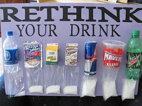
This photo posted by Carolyn McDowell is much more powerful than a bar charts with the sugar content of soft drinks
It always seems tempting to have 2 (or more) versions of a deck. One for sending, one for presenting live, one short one, one long one, one for printing. Ideally, this is the right solution, but in practice, you always forget to transfer changes from version to the next. I prefer to keep one master file with all slides inside, and chop out the ones I do not need right before I present, email, etc.
The exception is probably a high-profile keynote that merits a file on its own, but for day to day business presentations, keep one deck.
If you work alone in a room (or are willing to use headphones) you can lighten up your design work with some nice music in the background. I have made a complete u-turn on this, starting off with requiring library-like silence to concentrate.
Not all music is suitable for work. Dominant lyrics, or tunes that stick in your head do not work. Music that is so slow that it puts you to sleep is also not ideal. Audio advertising make your office feel like a car repair shop. And the worst of all, repetition is annoying (“hey here is that same sone again for the fifth time”).
The repetition argument pretty much kills the traditional CD option, and even your personal iTunes library will be exhausted soon. Most of all, your personal music purchases of the past are unlikely to be suited for work music.
Internet streaming apps are the solution. Spotify is great, but it requires you to find the right (long) playlist that fits your work requirements. And that is difficult. Pandora is another solution. The genre or artist radio stations are good, but also here you run out of new music. After playing the cool jazz radio station for 2 days you start recognizing the songs.
So, the app I love is Songza. It has far less choice in terms of songs, but it has a treasure of playlists for any occasion you can think of, including work: acoustic, jazz, electronic. Unlike Pandora, the songs are curated by human experts rather than automatic algorithms.
They are a bit out of context without the verbal explanation, but here are the slides I used during my presentation in Munich. I am trying out the platform of my client SalesCrunch as an alternative to SlideShare.
I am continuing my experiment to create a completely paperless creative workflow to increase my mobility. Until now, I had to settle in my creative corner, have my pencils around, have my paper around, before I could get in the mood to do serious design work. I reviewed note taking apps here, now it is the turn of calculators.
Whenever I design a presentation, I almost always have a calculator open on my desk. I design all my data charts by hand, the old fashioned way, doing the final step completely analogue to make sure that resulting slide is really the very best to convey the specific message I want to get across. The calculator is used to calculate the % breakdowns, and to do the final check whether the whole thing adds up. Small calculation errors can distract the audience and undermine the credibility of your analytical work. (I she cannot get the numbers in the chart to add up, what about the underlying spreadsheets?)
So, over the past decades I have used the famous HP 12C as my sole calculator. First in hardware form, then as an app on my iPhone. Since spreadsheets arrived in the early 1990s, I have no need anymore for sophisticated NPV calculations on a calculator. I was simply used to the user interface of the machine, to such an extend that I replaced it for about EUR 100 with a new one a few years ago.
The iPhone HP 12C works, but is not perfectly convenient. I always fiddle with the landscape-only orientation, and the buttons are a bit too small to be convenient. So the iPad solves at the least the button size issue. Like note taking apps, there are an infinite amount of calculator apps available for the iPad (including the build in one).
I often get this question when discussing a new project with a client. Can we cut costs by cutting slides? For slide make-over, the answer is yes. Cost and the number of slides have a lineair relationship. For my bespoke presentation design work there is not that much correlation. Why? The hardest part of the presentation design work is coming up with the idea, the concept. Once you have got your head around that, it does not really matter if you need a few more slides or not. So, the answer you get for this question tells you something about the sort of designer you are talking to.
Handwritten notes are very important in presentation design. I use 2 kinds:
For writing I use my favorite pencil: the Lamy 2000 (review).
Let’s look at application 1 first: meeting notes
Although I love my luxury micro note book, there is a big problem with analogue note taking: finding stuff. Since you write sequentially, and often use poor handwriting, it is hard to access notes that are part of a specific project (I can have more than 10 things going on at the same time).
Digital note taking on an iPad can solve this: simply create a note book for every project.
The key problem is the iPad-hand interface. Steve Jobs always was against using a styles, he correctly reminded us that we have 10 of them already. That is true for navigation, but not for writing large pieces of text (fast). The biggest problem is seeing what you do. Big fingers are getting in the way of your eyes, leading to illegible scribbles. And after a while you get tired of holding your finger straight. So there is no escaping from a style.
An iPad stylus needs to have a fat tip with a soft surface, mirroring the texture of a human finger. The resulting line can still be highly thin though, getting drawn at the center of impact of the soft tip. To show this effect, see fashion designer Karl Lagerfeld sketch drawings live on stage during the LeWeb 2011 conference in Paris last year (skip to 19:50).