

SlideMagic Blog

Frequent updates about all things presentations since 2008. Subscribe to never miss a post.

RSS

Facebook IPO video

Facebook published its IPO video, you can watch it here. Some observations (in random order).

First of all, this video is so much more professional than the ones we saw before (Zynga, Groupon). Gone are the executives presenting their slides in slightly uncomfortable positions, and instead we see a streamlined performance of relaxed-looking people.

The videos work great to present the senior team, and to highlight case studies of selected clients (both huge corporations, and small businesses). Video is less good to present some of the extraordinary facts about Facebook. Making the point that Facebook is the American Idol final, times 2, but then every day for advertisers could be made stronger on a visual. But the video is loaded with these extraordinary statistics that could have been emphasized more, maybe at the expense of some of the product feature explanations (time line, news feed, etc.)

The video is also modest about putting Facebook in the development of the Internet. They could have claimed that Facebook is redefining the net, by putting a social layer on top of it. The video focusses most of the time on what Facebook is today. The investor wants to know what Facebook could be. The payment business for example, only comes out in minute 28 of the presentation. The legal council probably advised against speculating too much about the future of the company in an IPO presentation.

The financial section of the presentation is too short. Stats fly over the screen, and at no single point do you get a complete financial picture of Facebook. Growth, cost, margins. profits, cash flow. The designers of the video probably thought that the objective is to get people interested enough for them to seek out the detailed financial statements themselves.
Continue reading →
·PowerPoint

Start with the story

When you start to write a college text book, or you are cutting up the project work for a team, you start with a structure: market, cost, competition, etc. When you start with a presentation, you start with the meat, the substance, the story, what you want to say. Big difference, often confused.

·PowerPoint

New Dropbox sharing

Sending big files as email attachments is increasingly cumbersome. Dropbox is an excellent alternative. It recently added a third option to share files with someone, it is my new favorit. Here are all 3 in a row:

  1. Shared folder. The recipient needs to install Dropbox (a barrier) and gets access to an entire directory on your computer. If she overwrites a file, your file gets changed too. This option is secure.
  2. Public folder links. You can send links to files in your public folder to other people. Anyone who has the link can access the file. If someone has your Dropbox user id, they could guess the name of a file, since the URLs are predictable. It is still hard, but not very secure. The recipient does not have to install Dropbox.
  3. Link sharing, the new one. It is now possible to get a sharing link for any file in Dropbox, not just the public folder. The link is garbled and very hard to guess. People can decide to view the file online (useful for mobile devices), or download it. The recipient cannot change the file, but if you do, the link points automatically to the latest version. If you want you can remove the link from Dropbox and other people can no longer access the file anymore. There is no need for the recipient to install Dropbox. Very useful.

The details are explained here.

Too good to be true

The other day I watched a startup CEO pitch, and his story sounded too good: “There are huge exits in my industry, a few IPOs, everyone uses this technology now, 5 similar companies in the world do really well and one is worth $1b”

“We started out 6 months ago and already have a great technology.”

While he convinced me that this is probably an attractive sector of the technology market to invest in, he also did not answer the elephant in the room question, “Are you arriving too late at the party?”

·Creativity

The hard bit

There are 3 levels in presentation design understanding:

  1. Spotting that a presentation looks really good (99% of people can do this)
  2. Spotting that a presentation actually does not look good (this is still relatively easy, although a surprising number of people, including some who call themselves designers, are unable to do this)
  3. Creating something that looks good, this is the really hard bit

A bit of modesty here: I too find myself stuck in level 2 often with my own work, pulling my hair out why it just does not come out right. In the end it is usually good, but it takes effort.

·Books

Most of your slides are a grid

In some presentation slides, the grid is obvious: a data table is an example. But also without the explicit lines of a table structure, you can recognize a grid in almost any composition you make. A diagram, the positioning of boxes on a slide, even a big picture with a few words of text. Recognize the grid structure, imagine the hidden lines and make sure everything lines up and is spaced out nicely. It will make for a much better slide composition.

If you are ready to dive in to hard core literature on the use of grids in graphics design, I can recommend the 1981 book Grid Systems (affiliate link) by Swiss graphics design master Josef Mueller-Brockmann(some of his poster design are in this Flickr set). The big issue for print designers is to juggle around text columns and images. Presentation slides are a bit different, but still the conceptual approach applies to them as well.

·Books

Visual memory

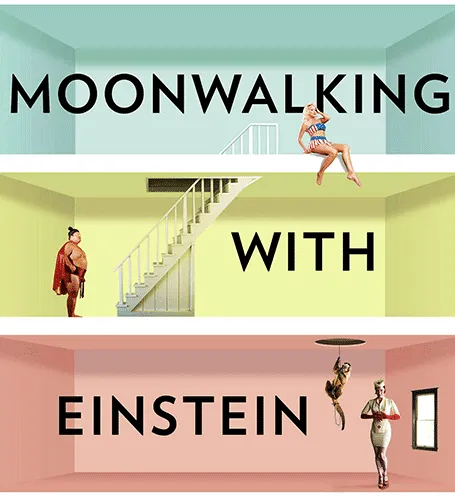
A year after discovering it, I finally got around to reading Moonwalking with Einstein(affiliate link), by Joshua Foer. A journalist gets fascinated by memory championships, and takes on the challenge to participate himself. On the way he explains how to train your memory, and puts memory in a historical context.

Why am I interested in these types of books? Presentations are all about helping people remember your story. We all know that forcing people to remember bullet points be repeating and repeating and repeating them does not work. The brain needs a visual story around which to store your message.

And it turns out that is exactly what memory champions do. They commit random numbers, names, facts, to rooms in virtual memory palaces in their brain. These palaces are often based on places the contestants know very well: a home, a school, a library. In these rooms, the objects are placed in the most outrageous (memorable) ways possible, including smells and sounds. After you put everything there, you can simply take a walk in your virtual memory palace and see all objects in front of you.

Scientists now think that the brain actually never forgets anything (capacity: 10-100TB). The problem is accessing the information. The brain needs an emotional stimulus (smell, visual) to unlock its memory. Slightly different than a indexed memory access of a computer. People think that we are so good at remembering places, locations, stories is survival: how to find a place with food, and then more importantly, how to find the way back home was a more useful skill in the stone age than remembering phone numbers.

Continue reading →
·Delivery

Writing versus speaking

This blog post by YCombinator founder Paul Graham on writing versus speaking is worth reading start to finish.

What he says is probably inspired by the many conference speakers he saw. A big brand gets up the stage, unprepared, slightly rambling, but charismatic and full of catchy sound bites. In the end, when you look back, she actually did not say that much. Writing a good story is much harder.

This is what I encounter in presentation design every day. It is hard to design that story, but when you crack it, it often can be said in very little words but full of real content and insight.

But then again, I think that conference audiences are not always looking for that piece of insight or intellectual stimulation. Maybe they just want to laugh and have a good time.

·Advertising

Lego Simpsons

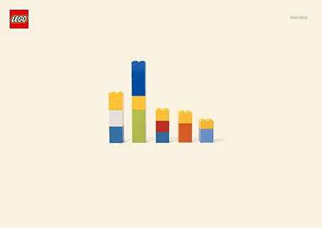
I love Lego. The ad below looks like a PowerPoint column chart, but also like the Simpsons family. It shows the power of imagination that many of us forget about when we grow up. (More ads here on Ads of the World).

·Layout

Where to start?

Common presentation design wisdom is to start your design process by going analogue, sketching an outline on a piece of paper, on yellow stickers on a whiteboard, or in a mind mapping app. That is one of three components I start a presentation design with. Two others:

  1. A completely finished, random slide that is easy to make (a financial forecast for example) and just looks great to design the overall look and feel for the deck, yes going straight in to slide design software at hour 0
  2. A sketch of “killer chart”, a diagram that is the core of the whole story, the most important concept that needs to come across.

With these 3 pieces done, the biggest creative problems have been solved, and it boils down to executing your design.