

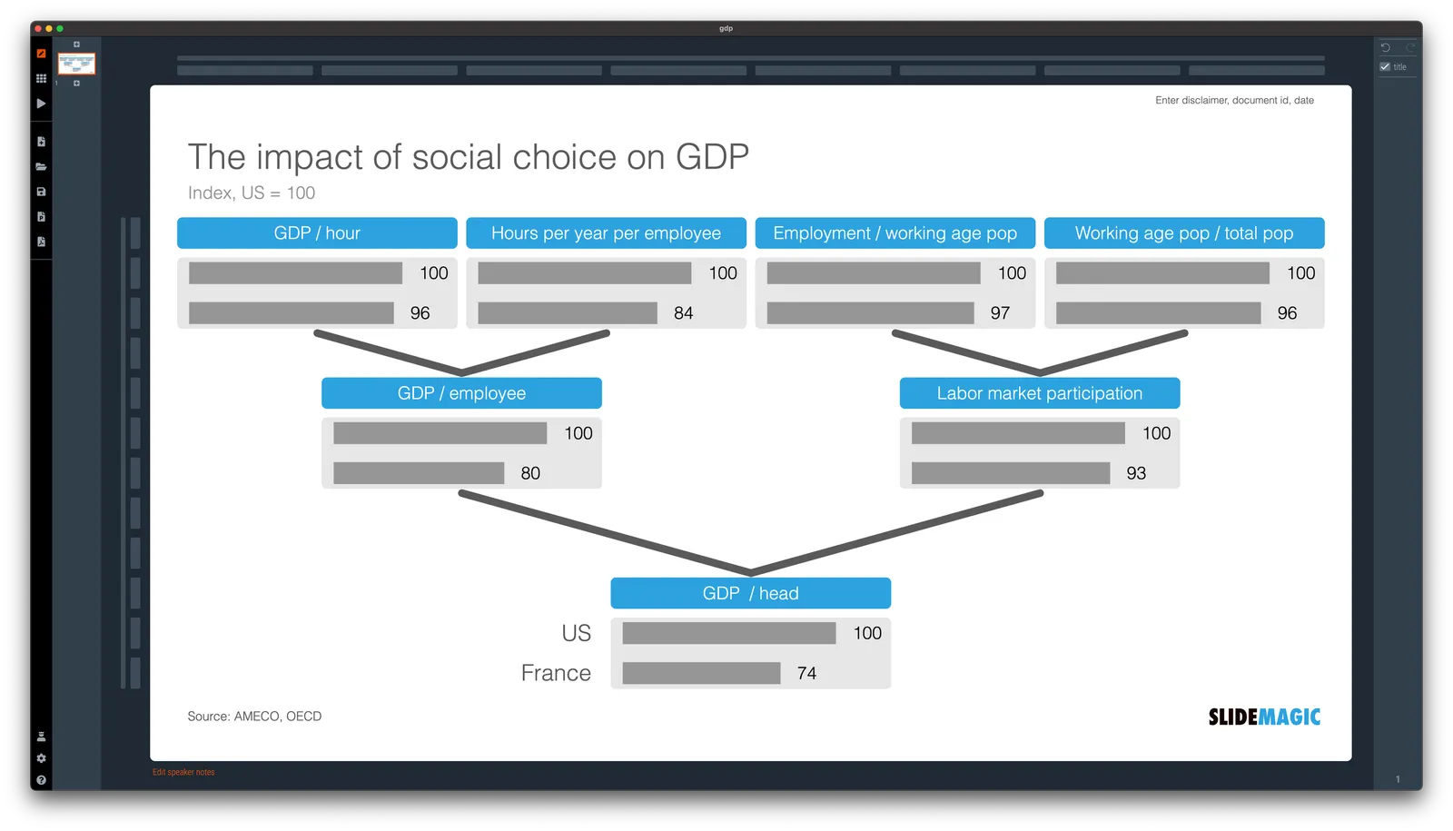
A quick make over of a chart that flew by on Twitter, explaining differences in GDP / capital between France and the US.
In SlideMagic, it is very easy to replace tabular data in bar charts. I have added [this slide](
) to the SlideMagic slide library, search for ‘GDP’ in the app and it will show up for you use in your own presentation.The productivity proximity between US and various EU countries and the difference in GDPs per capita is explained by the social choice of fewer worked hours, longer vacations, demography and labour market features, as illustrated in the slide below for France and the US (2021).1/ https://t.co/kffwt7VWLE pic.twitter.com/rvIi0sxokC
— Vitor Constâncio (@VMRConstancio) October 18, 2022