SlideMagic Blog

Frequent updates about all things presentations since 2008. Subscribe to never miss a post.

RSS
·Investor presentation

The excitement sapper on the last page

A good pitch should be a crescendo of energy and excitement. Ideally it goes up all the way through the story. But it is hard to avoid even for the best story tellers that in the middle of the presentation the audience attention drops a bit. Make sure to bring everyone back to the tip of their chairs at the end tough.

A sure energy sapper is a last presentation slide full of bullet points that recap the entire presentation. “Oh no, he is going to read out the entire thing!” When the presenter is at bullet 2, the audience has finished reading the entire page full of things they already heard over the past 20 minutes.

A better approach is to repeat one crucial visual, diagram, image on the last page that reflects a key point in your presentation. It will be visual memory anchor point for your entire presentation.

Art: Paul Klee, The Red Balloon, 1922

Click here to subscribe to the blog

·Software

No, online collaboration has not been solved yet

SlideMagic is moving into the polishing phase, after which we can take off the invite-only beta sign up form the app. So far I have mainly focused on the slide design engine. Sloppy design is one big problem of modern business communication.

The other one is collaboration, version management, and sharing, which I am starting to think about more and more now. Email attachments are big. You are always looking for slides in old presentations. You can never keep track on how has access to your files in Dropbox. You are never sure that when you delete a file because of space constraints somewhere, it will also be deleted somewhere else. “Did I just share that file with the entire internet?” Where is that file in iCloud? Who remembers shared Lotus Notes databases from the 1990s? Mass multi-editor collaboration creates to the too-many-captains-on-ship problem.  Companies find it impossible to maintain clean slide templates, or up to date versions of slides. Full project management environments feel like corporate prisons where every action/edit has to go through an application.

There must be a smarter, much simpler, way to do this.

Art: Henri Matisse, Dance, 1910

Click here to subscribe to the blog

·SlideMagic

Speaker versus explanation notes on SlideMagic

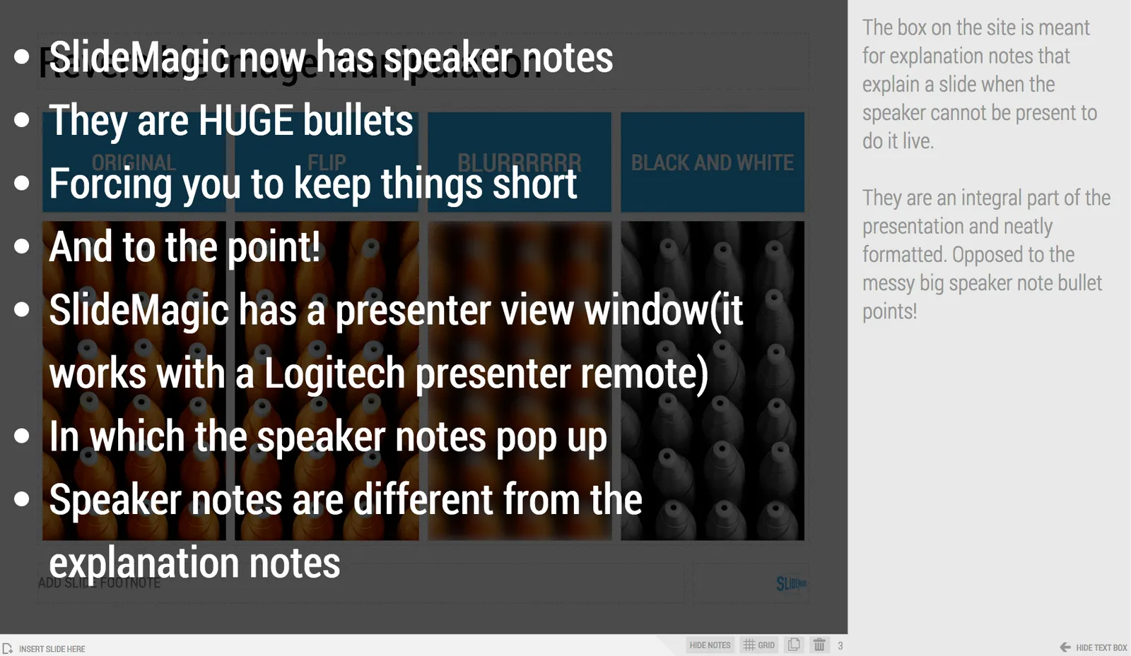
SlideMagic now has 2 types of notes for each slide:

  • Explanation notes can be added to the right of the slide (optionally) and are meant for explaining the content of the visual is nice fluid full sentences. In case the presenter cannot be there to explain things in person. They are nicely formatted.
  • Speaker notes are messy, huge bullets that serve as a reminder for the speaker during a live presentation. The bullets are visible to the speaker on the presenter window (not to the audience).

Art: George Jakobides, Two children playing peekaboo, 1895

Click here to subscribe to the blog

"We should add a few extra bullets"

The time of a presentation is finite. You have 20 minutes, not more. So, if you discover that you did not address a certain issue, message in your presentation, you can only add it at the expense of other content.

Just “adding a few bullets about it on page 12” will have 2 implications:

  • Your extra point will not be made, because it does not feature strongly enough in the presentation
  • The power of whatever was already on slide 12 gets diluted by the extra visual clutter or more text

If it is an important point you need to make, make it at the expense of another. If it is not important, don’t bother putting it in. Squeezing does not result in great presentation designs.

Art: Paolo Veronese, The Wedding at Cana, 1562

Click here to subscribe to the blog

·Books

Useful presentation design tools and resources

As most of my clients outside Israel are enjoying the X-mas break, I have some time to clean up my web site further (no holiday here in Tel Aviv). I added a bunch of presentation design resources on the site.

  • Presentation design books. The flurry of new presentation design book releases seems to have faded a bit over the past years. Has all that needs to be said, been said, or did I miss anything?
  • Presentation design tools. A few neat software tools that can make the life of a presentation designer easier.
  • Sources of presentation images. There are more and more sites out there that offer free stock images under a creative commons license. These images are free, look real, BUT the library sizes are still small, and search is limited.
  • The blog search archive. Now that I moved away from Blogger, it is harder to add sidebars with search boxes, archive links, and tag clouds to the blog. Hence, the dedicated search page for access to 6.5 years of posts (more than 1700 in December 2014).

I hope you find it useful, and let me know suggestions to add more resources.

Art: Gustave Caillebotte, Les Raboteurs de Parquet, 1875

Click here to subscribe to the blog

Happy holidays! (2015 versus 2010)

Here is my happy holidays post from December 2009, 5 years later, it is still highly relevant. Happy holidays!

Art: Pieter Breugel the Elder, 1565, Hunters in the snow

Click here to subscribe to the blog

New SlideMagic features

Over the past weeks we have quietly updated SlideMagic. Some workflows will go faster now (you can now change another shape without having to back to the main menu bar, you can drag and drop in story mode), and some bugs have been fixed. There were 2 bigger features deployed a few days ago.

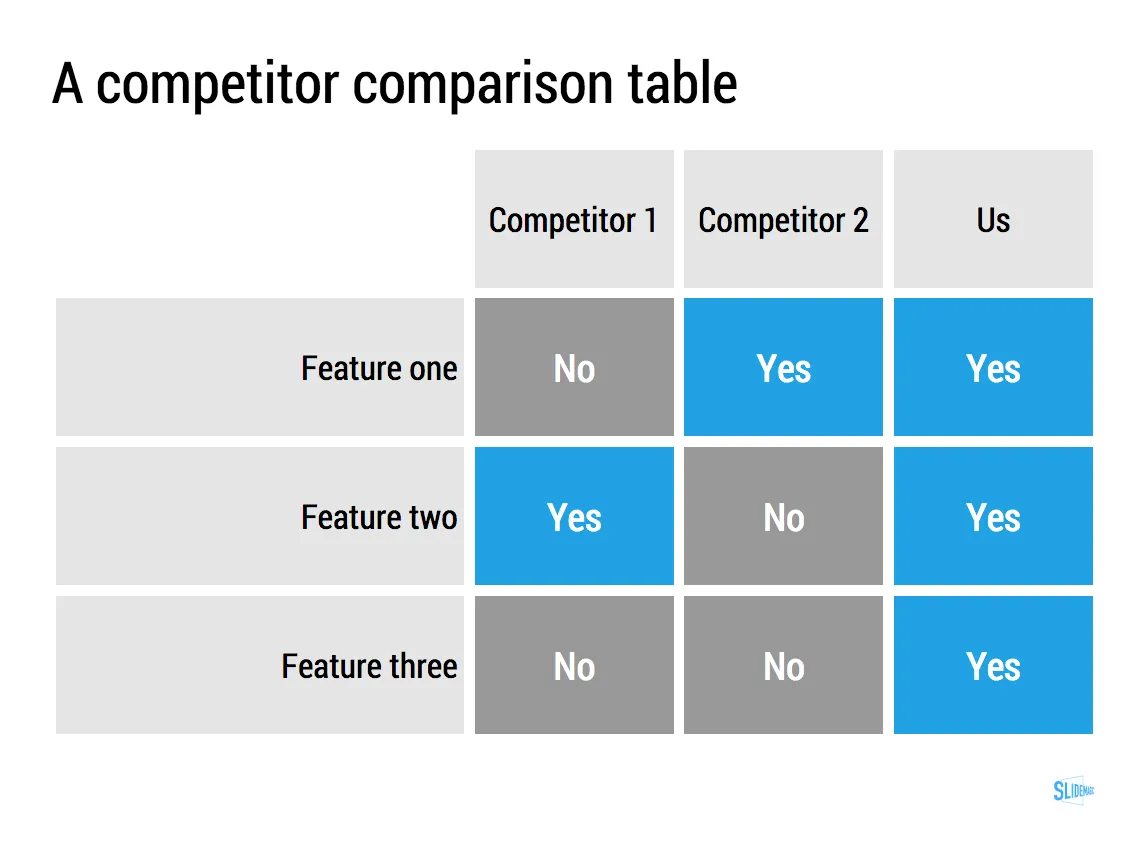
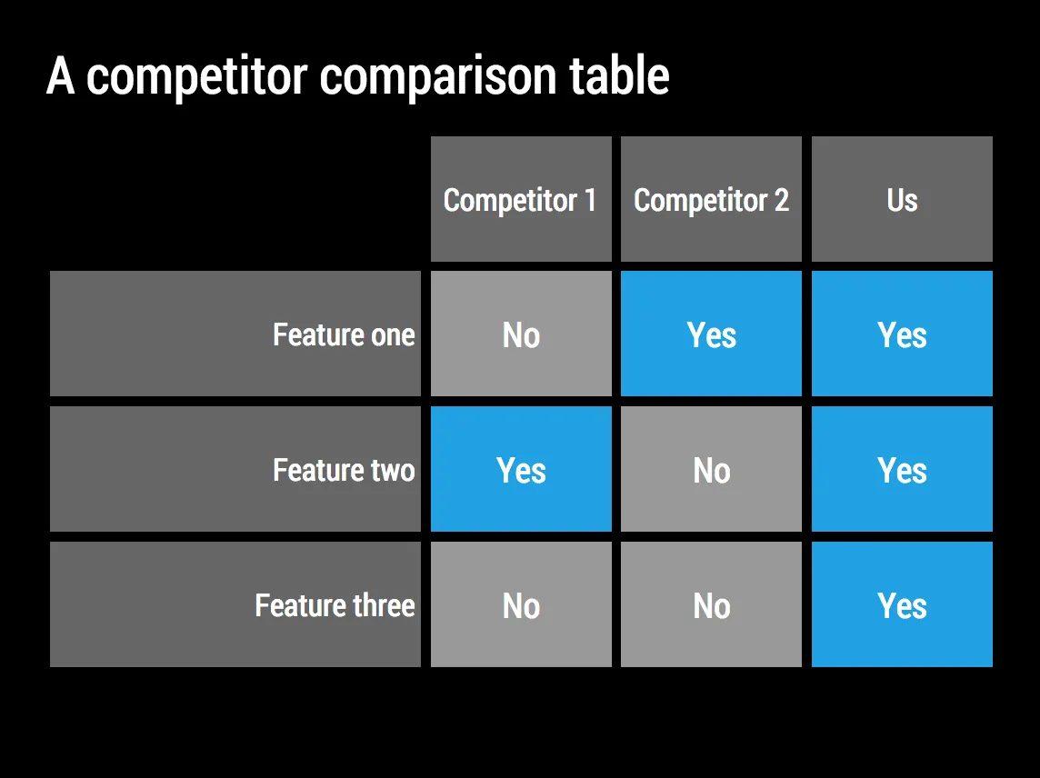
Automatic flipping to a dark background (and back)

Working with limited colour combinations has its advantages: your slides will always look great. But it allows us to do other things as well, we can automatically convert your presentation to a dark background (on click) to make it more suitable for larger audiences where you do not want the speaker to be overpowered by a huge white screen. Once you are done, -click- and you are back to conference room friendly white.

Image manipulation

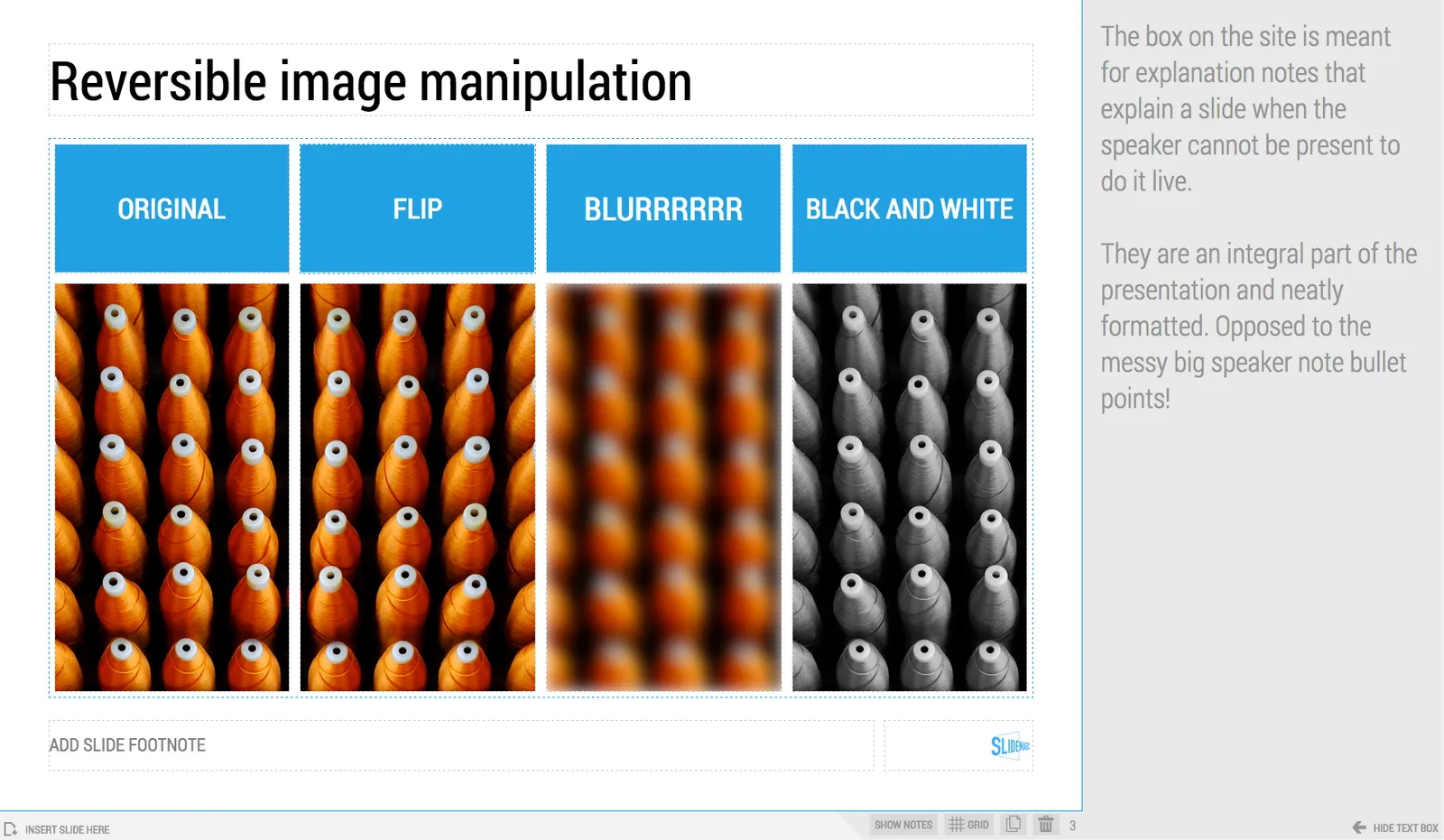
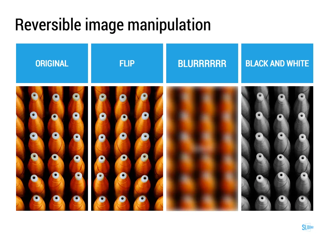
Most presentation design software is loaded with image manipulation functionality, including the ability to stretch and distort the aspect ratio of a photography. SlideMagic only offers the image manipulation you need most: a horizontal flip, blurring, and black and white conversion. All of which are reversible.

Personally, I use the B&W conversion a lot. Wherever I can, I prefer working with black and white images.

Art: Maarten van Cleve, Kitchen Interior, circa 1565

Click here to subscribe to the blog

·Investor presentation

How to pitch a VC, according to VCs...

There is no better person to get VC pitch advice from then the people who sit at the receiving end of your presentation. Here are startup VC pitch suggestions from a few well known people in the industry. Click on the image to see what to they have to say.

 Mark Suster, Upfront Ventures

Mark Suster, Upfront Ventures

 Dave McGlure, 500 Startups

Dave McGlure, 500 Startups

 Paul Graham, Y Combinator

Paul Graham, Y Combinator

 David Rose, angel investor

David Rose, angel investor

 Reid Hoffman, LinkedIn

Reid Hoffman, LinkedIn

 Vinod Khosla, Khosla Ventures

Vinod Khosla, Khosla Ventures

Art: Frans Hals, Regents of the St. Elizabeth’s Hospital in Haarlem, 1641

Click here to subscribe to the blog

·Software

Lawyers, politicians, doctors, priests, and corporate executives...

…They all have their own traditional language. Complicated contracts, evasive and woolly statements, illegible prescriptions, religious books only written in Latin, and bullet point-filled PowerPoint presentations full of jargon and buzzwords. These languages were formed by tradition, and some may argue are here to protect a profession (who needs a lawyer when you can seal agreements with a simple paragraph?).

And yes, I put business presentations in the same category. Change is already happening. Formal letters are replaced by short, informal emails. The woolly Microsoft Word long hand memo was replaced by PowerPoint bullets. And for very important presentations (1% of the total?), businesses start investing in visual, custom designed, presentations (the work I do under the Idea Transplant name)

But change can go further.  The other 99% of business presentations can be different as well. These documents do not have to be graphically stunning, loaded with the latest animation and zooming effects, or full of exciting video clips. They need to look good, and they need to have a clear, crisp, direct, visual language.

It requires a change in the corporate language that corporate executives are using. And making that change is hard. Requiring a new complicated piece of software for it would kill the change before it even starts. The idea behind my presentation design app SlideMagic is to stop comparing business language to that used by lawyers, politicians, doctors, and priests…

Art: Benjamin Ferrers, The Court of Chancery during the reign of George I, circa 1725

Click here to subscribe to the blog

·Design

Your own style

After years of design work, many of my presentations start to develop a similar signature style or look-and-feel. (Secret: it looks remarkably close to the templates in SlideMagic). I think there is nothing wrong with that: you can easily recognise the work of famous poster designers, painters, architects. Presentation designers should be no exception.

I would encourage you to find your own signature style. Once you have figured out a distinctive way to make any chart look good, you are free to focus on its content. No need to worry about fonts, image crops, data chart layouts, and all the time to worry about composition, content, what image to put and what data to visualise.

Art: detail of Gustav Klimt, The Kiss, 1908

Click here to subscribe to the blog