SlideMagic Blog

Frequent updates about all things presentations since 2008. Subscribe to never miss a post.

RSS
·Investor presentation

Example startup pitches

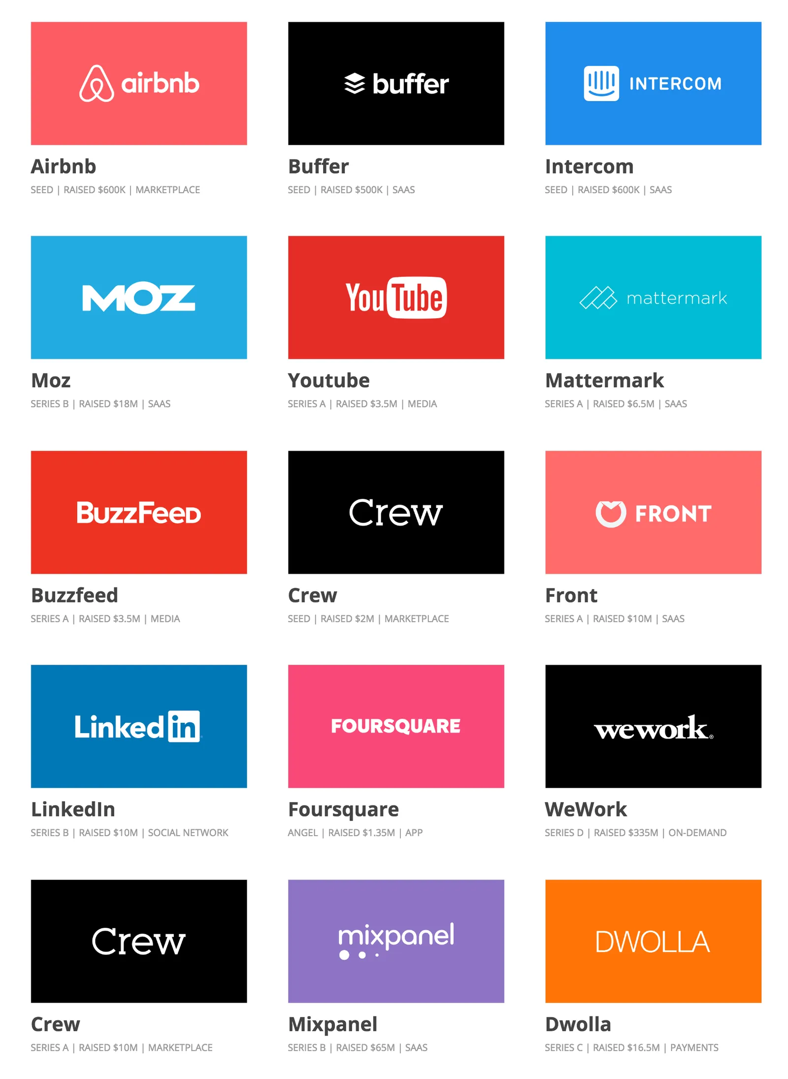
Here is a nice collection of early-stage startup pitch decks that managed to raise money successfully.

There are some common concepts in all of them:

  • Most importantly, they are actually great ideas. LinkedIn, YouTube, AirBNB now look like totally obvious concepts, but back when they started out they were not.
  • They explain clearly what the company/product actually does, often via a demo of screen shots. Many startups omit this important part of your pitch (surprisingly).
  • Often, there is a very powerful traction slide inside. If you have grown your business from nothing to millions of dollars in 6 months, investors will pay attention, and forgive you if the rest of the slides in the pitch deck are not that good.
  • All these decks are email friendly, you get the idea without the need for a presenter to explain it to you. (That is now actually the main type of presentation I design for my clients)
·Investor presentation

Full circle

Every pitch starts with an informal, but often very good, story/conversation. Then we start to complicate things with slides, templates, storylines, structures until we get to some slide deck. Then, it is often useful to step back to the very fundamental investor questions:

  1. What is it they are trying to do? (Often not clear in a presentation)
  2. Will anyone want to use it? (Rational logic, emotional gut feel)
  3. Can you make money from it? (There are many good ideas that do not deliver a profit)
  4. Can this team pull it of? (Probably most important question)
  5. (Can I construct a good deal given valuation, cap tables, Board seats, etc.)

Basic presentation template organization

Years of experience with client presentation templates have confirmed that there is basically only one way to lay out a corporate template.

  • Title at the top left. Some templates have a huge corporate logo getting in the way there
  • If you want to put a logo, put it at the bottom right to compensate for the “weight” of the title in the top left. Logo on the top right eats space for the headline, logo at the bottom left makes it harder to put footnotes
  • Page number in the top right (bottom right is taken up by the logo)
  • Which leaves space for footnotes at the bottom left.

You might notice that my presentation app SlideMagic uses this layout.

·Data visualization

One science is harder to explain than another

Most of my client work involves a presentation with a hard/difficult business or scientific issue to explain. All science is complex, and it requires someone to study for years to understand it. But in some scientific disciplines I can get away with things.

Take medicine for example. Here is what you can do to make things understandable to the layman:

  • Micro focus on one very specific condition/disease, and omit all other 35,000 medical issues a student usually has to go through
  • Simplify, eliminate complex / long / Latin names
  • Abandon commonly used diagrams, and instead make your own, completely non-standard drawings that are solely aimed at explaining a phenomenon.
  • Shrink all the statistical proof into a footnote. It is important for peer-reviewed research, it is not needed to understand the basic mechanism of a drug

This can work in other disciplines as well: economics for example. But it does not work everywhere. Mathematics for examples requires a broad understanding of concepts that are all stacked on top of each other, depend on each other. And there is no easy to simplify formulas.

Image from WikiPedia

·Story

No patience for backgrounds and market trends

Some of my client work is for managers of business units in a large organisation who need to convince the corporate centre to make a politically charged decision. Some mistakes I encounter in the briefing document:

  • Most decks start with backgrounds, market trends, history of the unit, all information that is not directly related to the issue on the table. Only in the back (or on the last page), buried in a bullet point comes the central point of the meeting.
  • The overall pro/con arguments are not well laid out, you need to distill them from the pages, or sometimes it requires verbal explanation
  • Critical arguments that could be backed up by facts are not.

In these type of meetings with a busy senior executive I like to get to the point early. Lay out the options, and summarise why you think your preferred one is the best. Then dive with charts to support the points, where ever you can backed up by facts.

Presentation text = headlines

When you add text to your presentation, you are writing headlines. And headline writing is completely different from writing prose. Take the mind set of a headline writer when designing presentations.

  • Space is limited, so keep it short:
    • Avoid filler words
    • Active, not passive verbs
    • Find synonyms for long words
  • But… keep them meaningful. Abstract, vague, generic text is a waste of space
  • Take typography and layout into account. If things don’t fit, re-write the headline
    • Watch weird line breaks
    • Keep things balanced: 2 super short category descriptions followed by a long one means either making the first 2 headlines longer (yes), or - more likely - cut the 3rd one
    • Watch out for orphans

Typography is a valid reason to re-write a headline! Try explaining that to your colleagues when the entire meeting room has settled for a slide title after an hour debate, and you say “sorry, does not fit in 2 lines”

Image from WikiPedia

·Story

Description versus story

They are different

  • A description is an exhaustive, dry representation of a concept. It is what education uses. It is better to add too much information, rather than being incomplete. Description have a standard format, structure (inside, outside, etc.). Descriptions are wordy translations of what can be transferred using an image in one second.
  • Stories get to the point. Anticipate the audience’s obvious questions, take into account the audience context, build on what the audience already knows, use surprise and tensions, and a flexible structure that is not always the logical, standard one.

Image from WikiPedia

·Concepts

Pitch at the right level

It is hard to put your pitch at the right level. I often see two types of mistakes:

  • Far too small: an entrepreneur pitches a device or a product without putting it in an overall context of where humanity is going. (I.e. a device that can help old people without talking about the greying of many Western societies).
  • Far too big: millennials, online video, global warming, mobile devices, the gig economy, Moore’s law, everything gets put in the first 20 minutes of the pitch to show what a huge opportunity this product is, being at the centre of all these seismic changes in the world

The best pitch is somewhere in the middle.

Image from WikiPedia

·Investor presentation

Raising money with 5 slides

It happens. Some startups can create one slide that shows a line from 0 to 100 million users or $500m revenues in 1 year. Some startups can show a slide with clinical data proving they have the cure for cancer.  If you are not one of them, don’t listen to pitch advice by these startups and have some more backup information.

·Story

The tricky point

The bar is rising in presentation design. More and more people know how to design decent slide, more and more people know how to explain a business concept visually.

The challenge that remains is often a very specific point. In most cases, this is the answer to an “elephant in the room” question, a very specific answer to a question an ignorant but intelligent layman might have.

Most people burry these super important points inside a “standard” slide. “Oh, that is the point I make verbally when we present the competition slide.”

I tend to make these points more in your face. Dedicate a specific slide to it. Even sometimes putting things straight in the headline (“No, we are not another Google”).

These slides can be hard to design. The best approach is to listen really carefully when you explain it verbally to someone. “There are 3 groups of products, 1, 2, and 3, but none of them address y”. “Gasoline engines can do x, but with electrical power we can do this.”. “Up until now you could not see at nanometer level, but now it is possible”. Look at the sentences and see what they do. Divide things in groups (boxes), contrasts between two options, “From to”. Your language gives clues about what visual concepts to use. They don’t have to be sophisticated, they just should be clear.

Image via WikiPedia