SlideMagic Blog

Frequent updates about all things presentations since 2008. Subscribe to never miss a post.

RSS

Simple vs simplistic

As a developer of an app, you are deep into its features. How do you stack up versus alternatives, we offer x, we offer y, we offer z. It can sometimes sound offensive when, as a presentation designer, you come back with a very simple visualisation of a competitive differentiation. This is not a simplistic dumbing down of the story, this the way users / buyers make decisions, and investors understand your story.

·Layout

Digital car instrument clusters

I had the opportunity to drive a BMW the other day with al all digital instrument display panel. Car manufacturers have something to learn about design. The display tried really hard to look like an analogue one, reflections, depth effects, glow edges, gradients. The whole thing feels very PowerPoint 2007 / Windows 7 / Nokia to me.

Also, a digital display opens up the possibility to re-arrange how the smaller data elements are displayed (kms, fuel tank, etc. etc.), but BMW did not (yet) do that.

Car instrument panels are up for a big shake up. I think the answer is not displays that mimic analog gear, plus eliminating buttons and replace them with touch screens and menu diving. Instead, I would opt for a beautiful, minimal display of essential information, and actually, very high quality, regular “analogue” buttons.

It affects not only the user/driver experience today, but also whether cars will eventually turn into a classic or not. To make the parallel with electronics, old gear from the 1960s / 1970s can still look/work beautiful, while designs from the 1980s and 1990s with low res/poor digital interfaces look cheap and ugly. Digital displays that look advanced today, will be totally obsolete in 5 years from now.

We will see what happens.

·Investor presentation

Checklist for a VC fund investor presentation

A VC fund who is raising money itself asked me the other day to give some example slides of other VC fund decks I have been working on. Showing slides is not possible because of confidentiality, but I could jot down the usual pieces of content after browsing through a dozen recent ones. Here we go in random order:

  • Bios of the investment team, emphasizing different things: investment exit record (if present), how long people have been working together (in and outside the fund), the diversity of skills the team has (including running operations in a business), the big brand employers they have been working for in the past
  • Examples of deal flow they saw last month (sanitized of course)
  • Their perspective on the particular geography they work in (which sectors are hot, where valuations are reasonable, how things have changed over time, how things compare to Silicon Valley)
  • Their perspective on which technology sectors are attractive, which ones not.
  • The network to potential acquirers of companies they have
  • Returns, investment track record, big exits
  • The story behind how the partners in the fund met
  • What sort of deal flow funnel they want to build (how many companies they see, due diligence, investment, etc.)
  • The legal and organization structure of the fund
  • Quotes from entrepreneurs they invested in about them
  • Social media follower stats
  • Pictures of events for entrepreneurs they organized
  • First page screen shots of industry articles they have written, interviews that were published, images of TV appearances
  • Some sort of competitive map of all funds in the same space, highlighting how they are different without “thrashing” their colleagues
  • A list of achievements they had with their portfolio companies, which clients they introduced, which hires they were involved in, which companies raised follow-on investments
  • Which famous LPs invested in their funds (very confidential stuff)
  • Profile pages of portfolio companies
  • Some sort of BCGmatrix not about products but about portfolio companies, which ones are OK, which ones are stars, which ones are write offs
  • List of advisors
  • A slide with legal terms of the fund (fees, carry, etc. etc.)
  • And: evidence of how uniquely “hands-on” the investment team is with their portfolio companies (every fund says this)
Continue reading →
·Layout

Slideuments and graphics designers

Many designers with excellent skills in web and/or print design somehow cannot deploy their talent very well in PowerPoint/business presentations. I have been thinking hard about why this could be.

The key challenge I think is the tight relationship with content and design. In print/web the design of a page does not really change that much if the content changes (it is still a block of text, an image, and an icon that fit in the same overall grid). In a business presentation, everything goes upside down when your competitor analysis needs to include 3 instead of 2 dimensions.

The second reason is - I think - that both people who write presentations and designers who polish them, stick to the conventional slide format: title across the top, list of bullets.

Now here is an interesting experiment for a 100% graphics designer who is not allowed or does not have the knowledge to touch any of the content (the classical print graphics designer situation). Assuming the presentation is a slideument (meant for reading rather than presenting).

Hand over the material in a word processor, as a long text file rather than a partly finished PowerPoint presentation. Now give the designer total freedom to present this material in any form she wants, even in any software she wants, using any page layout she wants.

Changes are you might get a pretty good lucking slideument by taking “PowerPoint” and its familiar layout out of the equation.

Image via WikiPedia

·Story

"Story telling" in a business context

The majority of business pitches do not have the entertainment value of a Harry Potter story. It is hard to transform that customer case example where you installed new servers that are 4x faster into a fast-paced, spell-binding campfire story. And no, few people will be interested in the 30 minute mini episode of a “day in the life of” your hypothetical customer in Amsterdam who had a scalability issue.

So what elements of “story telling” can we use in everyday business presentations? Some ideas.

  • A sequence or flow that keeps the audience interested to hear the next point. This flow might be completely different from a text book business analysis.
  • Some sort of framework, context that keeps the whole thing together. If you use a quantified case example, us the it throughout the presentation to explain different concepts. If you use analogies, keep them comparable.
  • Show data points to which the audience can relate to. Per bottle, % of sales, hours saved. Abstract numbers don’t talk
  • Slow down in details that are interesting, relevant, have the courage to skip over content that is obvious and or repetitive
  • Introduce unexpected transitions, “You think this is obvious, right? Well it isn’t. Did you know that…”

Business presentations can use elements of story telling without having to open with “let me tell you a story…”

Image via WikiPedia

·Story

When the problem is not the story

All my clients want that presentation that uses story telling and captivating images to hook its audience emotionally and gets them to sign an investment check right here, right now.

But sometimes that beautiful story is not the issue. Ideas can be pretty simple to describe, the market size easily understood, what is left is the concern that company can actually make it happen.

Business models, cost structures, go-to-market routes, hiring plans, product releases, all “boring stuff” that pretty much only can be captured in McKinsey-style tables. Ah, that annoying presentation designer who keeps on pointing out inconsistencies between the slides.

These cases also highlight why certain companies can do incredibly well in big audience pitch competitions, but fail to raise money from professional investors scrutinizing the details in small conference rooms.

New year, new beginning...

We are celebrating the Jewish new year here in Tel Aviv, and I just returned form a short bike ride around the city, during which I got an interesting idea that could take SlideMagic into an entirely new direction. Something that was staring me in the face for a few years I think, but I did not spot it. Something that is probably not very hard to do technically, but requires my experience and weird combination of skills to get it right. Sorry to be a bit cryptic here!

·PowerPoint

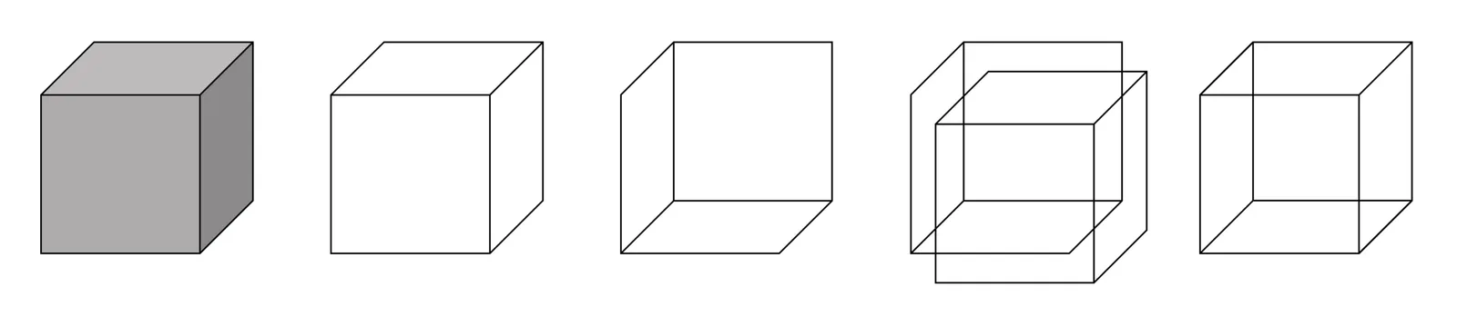
Making a transparent cube in PowerPoint

There is a 3D cube shape in PowerPoint, here is how you can make it transparent. The secret: rotate a copy of itself and paste them over each other.

Image via WikiPedia

·Story

Is it OK to be "negative"?

People say that in marketing, it is bad to be negative, trashing the competition’s product and/or business. I can see how that makes sense in public advertising. Being the angry company who keeps on kicking others will not help build your brand in the long term.

In closed room sales and investor pitches, I think it is a bit different. You don’t have much time, and the audience across the table might not know the market very well. Stressing your positives and hoping that they will fill in the comparison to the competition might not be enough.

The tone of a presentation does not have to be negative, the differentiation versus the competition should be made very clear. In most cases, there is a positive way to spin this story. Both models have a reason to exist: your product works great for this segment, the other product will work better in that segment.

Even in the consumer market, people are looking for the head on comparisons, even if they are absent in advertising. Product reviews by trusted sources, and online comments by honest consumers, trolls, and competitors impersonating as a reviewer will inform the buying decisions.

For corporate buyers or investors, this back channel to get the real story does not really exist, and/or they do not have the time to find it, so being a bit more explicit might not be that bad.

·Layout

Useful busy slides

Increasingly, presentation meetings are about discussing a proposal for investment or a product sale, rather than confronting an audience with an idea for the very first time. People have gotten the basic idea in material they saw beforehand.

So, there is a new role for busy slides, meant for pondering on a desktop screen.

A number of things can make slides busy:

  • Too many topics/ideas to cover
  • Lots of filler/buzzwords that inflate a simple point into a paragraph of prose
  • Complex relationships, dependencies, architectures, pricing models

The first two are a no-go, even for presentations that are meant for reading. The third option however, can be useful. In many cases, it is virtually impossible to visualize a complex timeline or network in a series of slides with pretty pictures and one word on them.

Some guidelines how to design these useful slides crammed with content:

  • Think about every word/label you type, can it be shorter, and if so, will we save an entire line?
  • Grid, grid, grid: make sure everything lines up with everything where ever possible, this will make the composition calmer on the eye
  • Hierarchy: create multiple layers of insight, big bold ones that catch the eye immediately, smaller subtle one for the reader who has more time
  • Use color to connect items

Image via WikiPedia