Podcast appearance
I did a 30 minute podcast interview with Sally Koering Zimney who runs the “This moved me” public speaking blog. Have a listen here. I talk about slide design and the philosophy behind my presentation app SlideMagic.


Frequent updates about all things presentations since 2008. Subscribe to never miss a post.
I did a 30 minute podcast interview with Sally Koering Zimney who runs the “This moved me” public speaking blog. Have a listen here. I talk about slide design and the philosophy behind my presentation app SlideMagic.
My presentation app SlideMagic is all about the grid. We have made some improvements to make the workflow (even) faster. Now, when you insert rows and or columns, it copies its design and structure from its neighbors. This will save you a lot of time in more complicated table layout with different background colors.
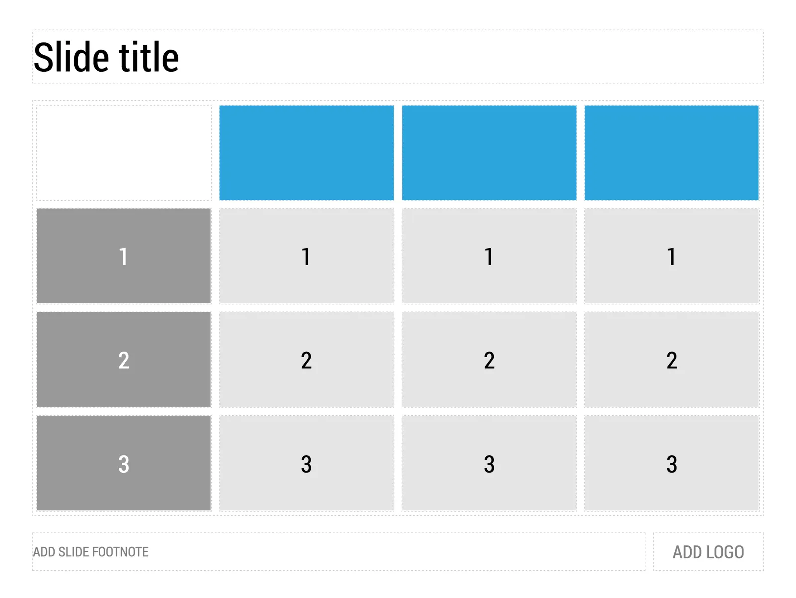
1) Our starting point
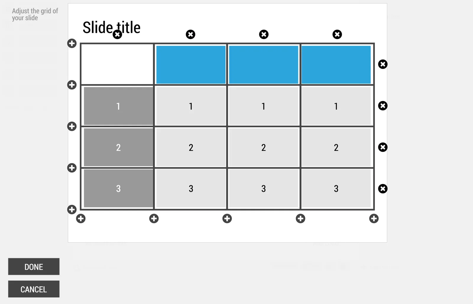
2) Open the grid editor
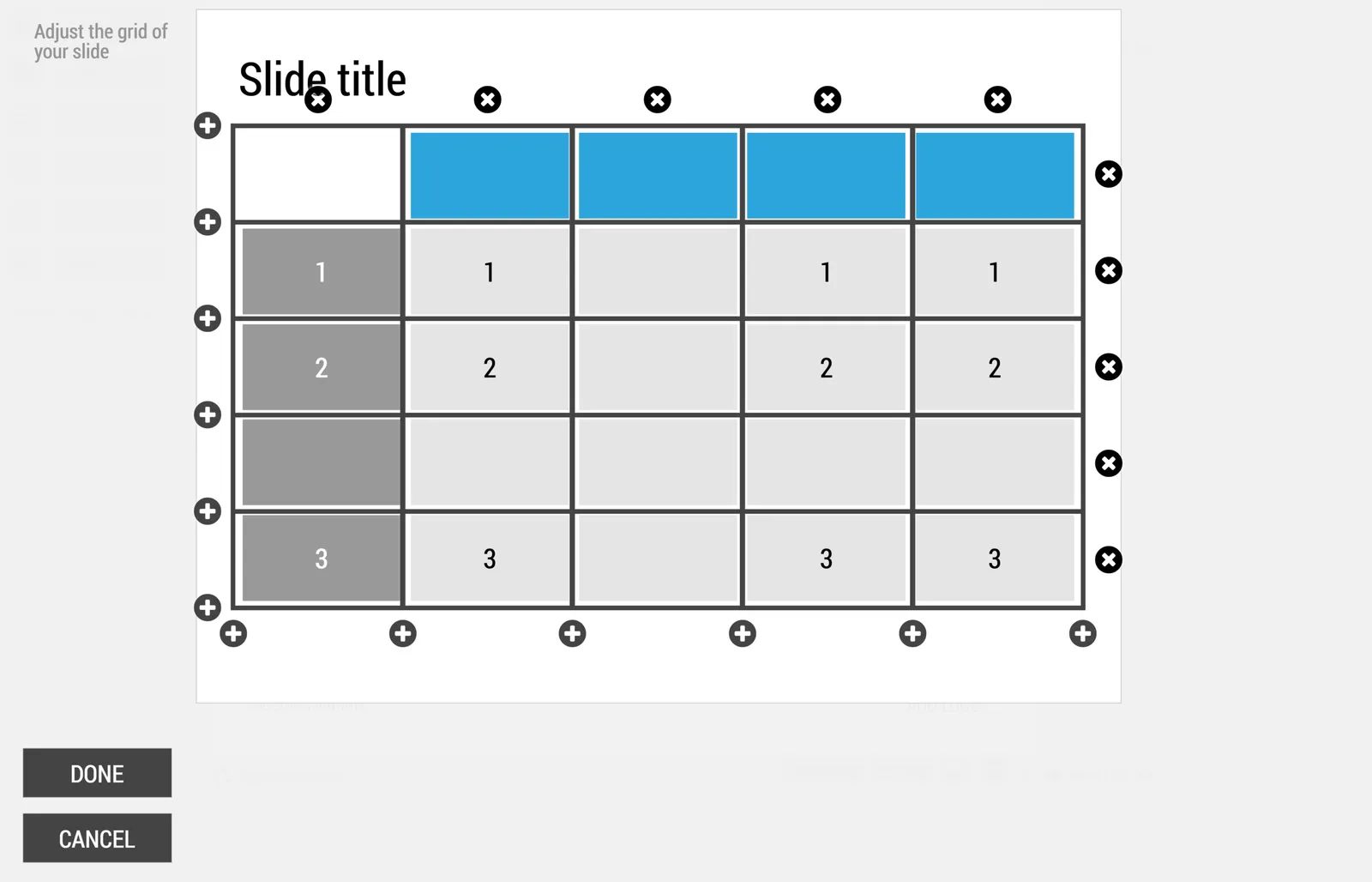
3) Add a row and a column
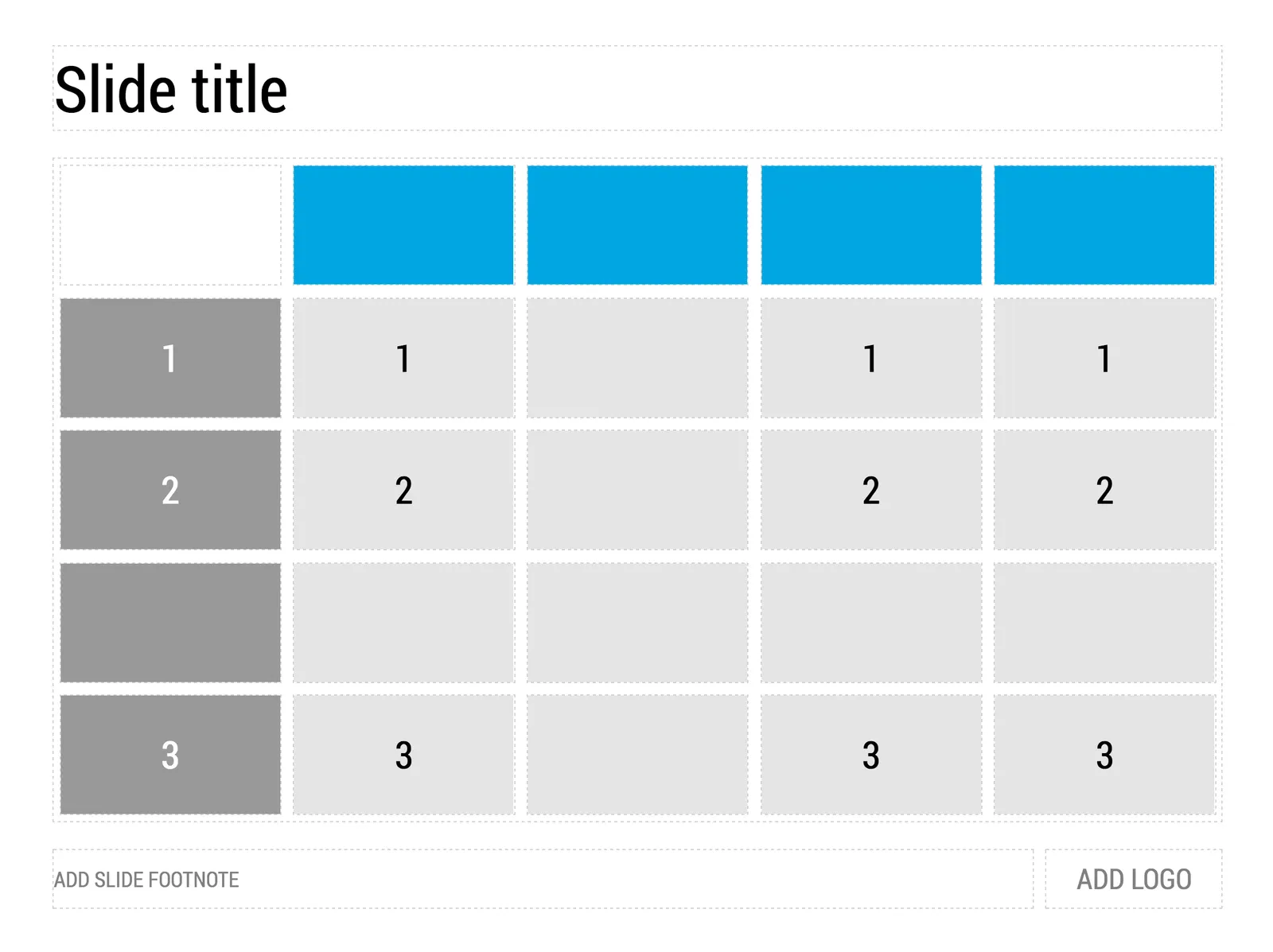
4) The result
Image via WikiPedia
Art is a subset of design, it wants to change you. The “Hope” poster from 2008 captured the feelings of many (not all expectations came true though 8 years later). The same artist is part of a broader group who has started a campaign to use design to remind us of humanity. I think it should appeal to everyone across the entire political spectrum who believes in human values, civilized debate, and pragmatic government.

When I meet with a startup for an investor presentation, I am usually the first external “marketing person” they meet with. (Understandable, no investors, no money, no marketing budget). Some CEOs are nervous about the daunting task (and cash expense) of getting all those marketing materials ready as the company expands beyond product development. Sales presentation, investor presentation, one pager, leaflets, website, introduction video, etc. etc. (“Do you do those as well?”)
My advice: take things one step at a time. An investor presentation is a good place to start, since any investor presentation needs to include some sort of customer sales presentation as well. (Investors need to be sold of the product).
The company/product story is often not completely set in early stage startups. So, freezing the spec and commission a lot of money to all kinds of designers might cause problems down the road. A presentation is actually a useful format to play around with visual concepts. Graphical execution might not be the best, but things can look decent enough and are easy to change.
After you feel that the presentation starts to work, you can consider upping the investment in the design of other marketing material. But here, I would do things gradually as well.
When working with video and video producers/designers, make sure you have a version of the footage that does not include text (in a specific font, containing a positioning that could go out of date) and logos (that could be changed later on). Video footage can be useful for a long time.
There is an overlap and there are differences.
Overlap. At the core of both an investor and a sales presentation is some story that said what it is you actually do, and why this is such a great solution that you should buy it. Useful for a customer, but also useful for an investor. The latter will ask: “will someone want to buy this?”, but more importantly: “can this person sell in a convincing way?” This overlapping part of the presentation is the core company story.
Sales presentation only: add things that are specific to the potential client’s problem/situation. Add a censored competitive positioning (don’t bend the truth, but don’t volunteer weaknesses either). Add the administrative details about exact pricing, installation, etc. etc.
Investor presentation only: add a (more) candid competitive positioning, market sizing, profitability, pipeline, team bio, etc.
So, the investor presentation is the broadest in coverage. In terms of number of slides (hours at the computer), each of the above components could be equal in size. In terms of time invested though, the first part, the core sales presentation is the hardest to get right, it is the fundamental story of your company/product.
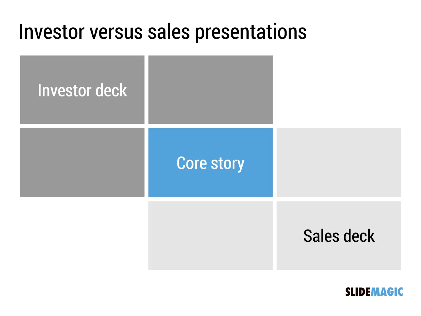
Bonus, a quick Venn diagram in SlideMagic style (make decent looking simple slides quickly) below. You can clone slides I used in the blog to your own SlideMagic account via this link.
Design is all about uncovering patterns and proportions that are somehow hidden in the cosmos. Architects, music composers, graphics designers, chefs, film directors, painters, authors, each is hoping to uncover a genius composition that has been hiding in plain sight for a few billion years.
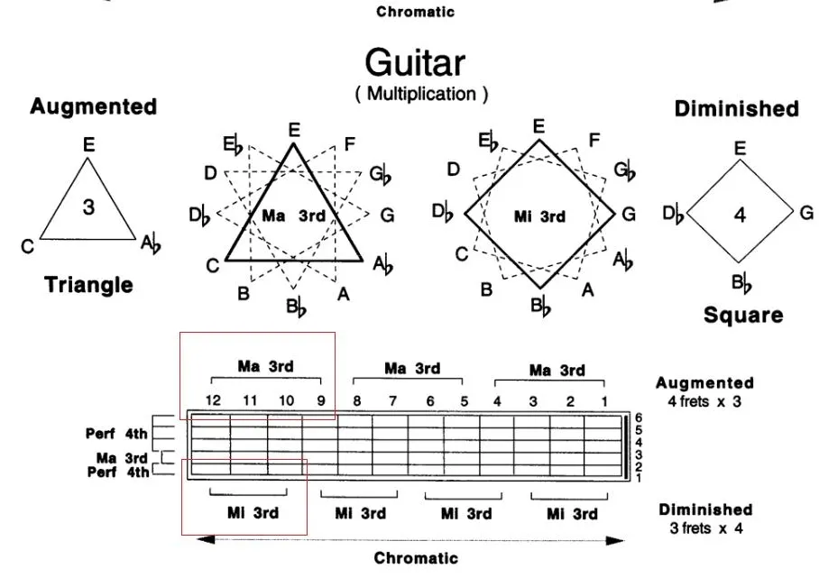
Recently, I was introduced to the patterns that jazz guitarist Pat Martino is using to teach chord shapes on the guitar. The diagram in the video (if you are interested) shows how he uses turning triangles and squares (visual objects) to construct chords (audio).
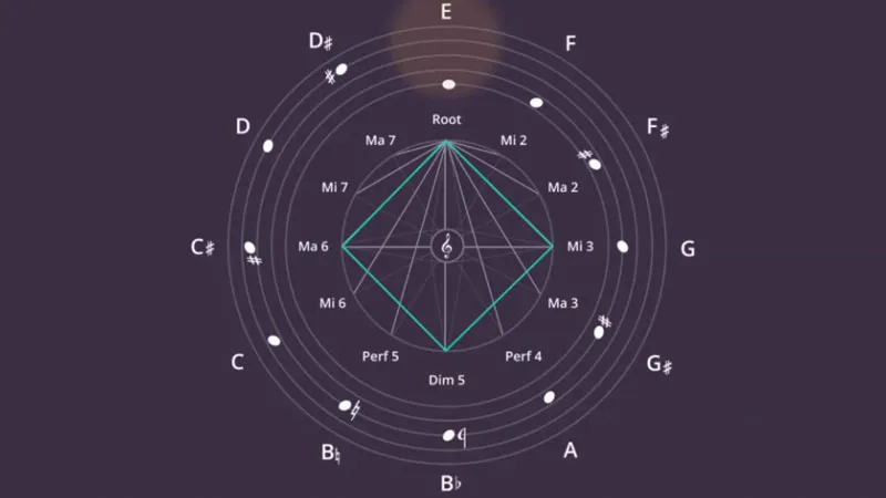
In other videos, Pat explains how he uses words as musical inspiration. For example, he assigns a note to each of the 26 letters of the alphabet, and then creates words (“beautiful” for example) to see what they sound like.
This screen shot is typical for many logo pages in presentations:
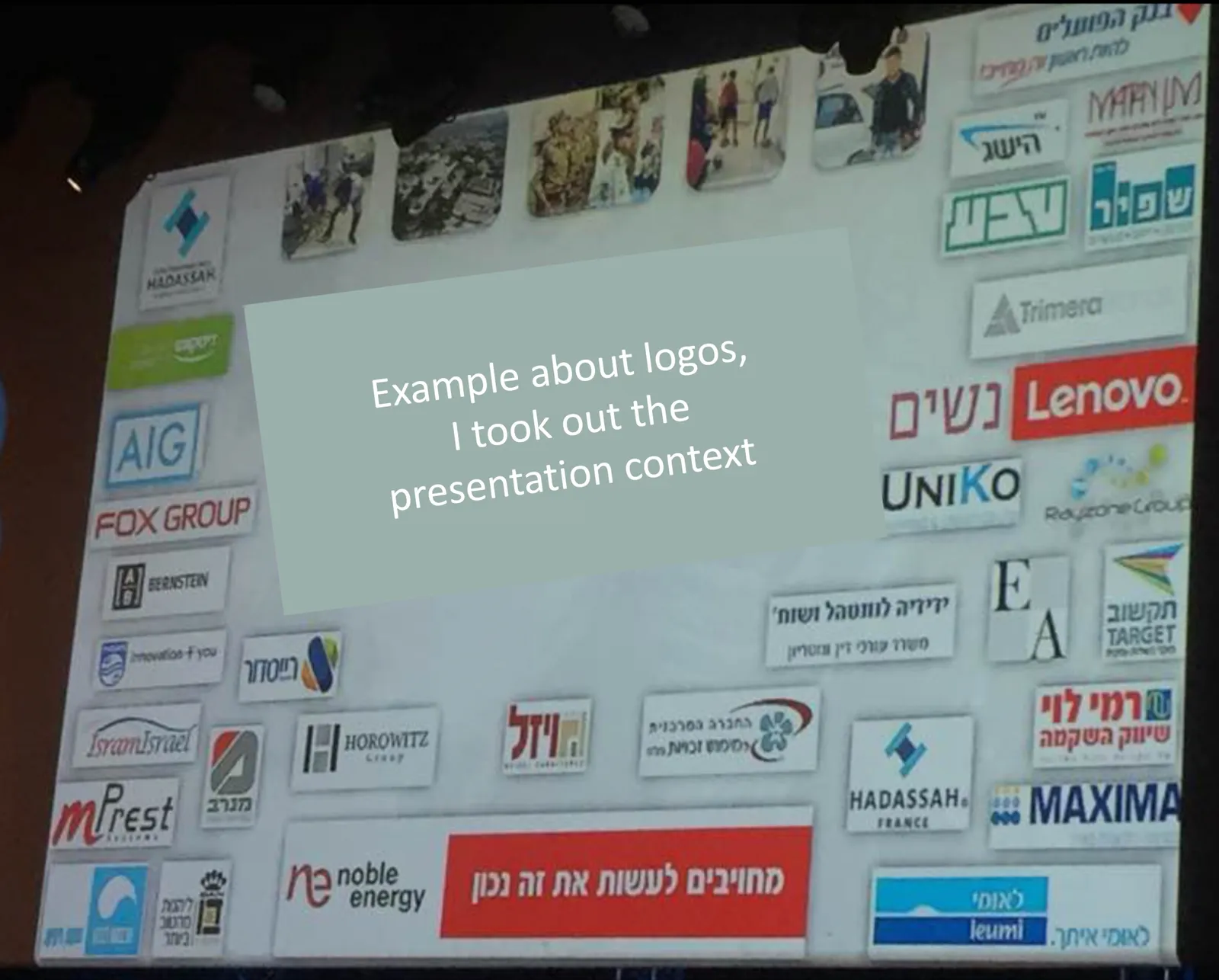
Images files are copied into the slide after which a background shading is added. The shadow creates an instant frame around the logo which is too tight, definitely not the framing the logo designer intended. Now that all logos have a box around them, the eye immediately wants everything to be distributed and aligned properly in a grid, which is impossible to do given the different sizes of the boxes. Finally, the drop shadows actually do not look good.
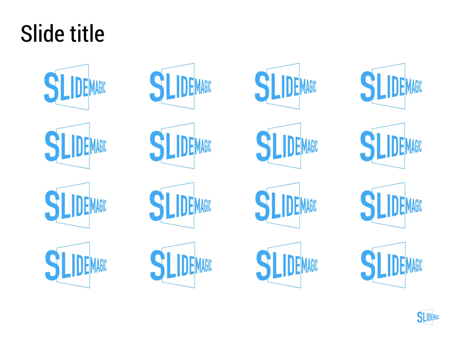
My approach to logo pages is to adhere to a strict grid and keep everything on a white background to give the logos space to breathe. In PowerPoint or Keynote it is a bit fiddly to line up all the logos, I usually put in a temporary table to make sure everything is lined up in rows and columns. When every logo is in its place, I delete the table.
My presentation app SlideMagic makes it easy, it is impossible not to align images in a proper grid.
Most people amass a huge library of PowerPoint and Keynote slides on their computers. File search as a tool to find presentations is collapsing under the load, and searching for a specific slide inside a presentation is impossible. Most people are now using their email program as a document archive (“where is that deck I sent Sally last week?”).
BitLasso’s Reveal is a new program that aims to solve this issue. After installation it builds a database of all your slides and makes them searchable by keywords. The first try is very impressive, you use a specific topic that you still remember from a long time ago, and pop: there are the slides!
Slides are grouped together if they are similar (with yellow highlighting the differences), you can group them by date, by title. It all works brilliantly.
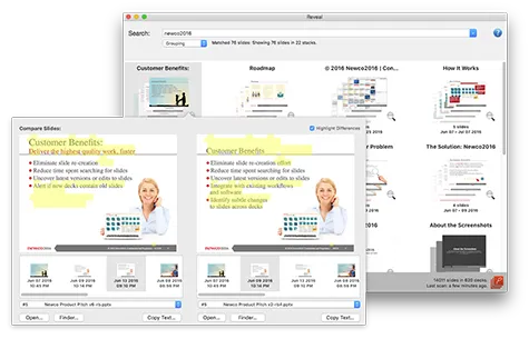
As a graphic design nitpicker, I noticed that fonts are not rendered correctly. But, remember this is a search tool, not a presentation application.
For the average user, this tool works great. For me, a professional presentation designer who has an incredibly large slide library with presentation for many, many, clients there is still a problem. Common business search terms will return so many slides that it is still hard to find the one you need. This is not a problem of the software though, more a result of my profession.
One suggestion could be to allow the search results to be grouped by some sort of directory, or limit the search inside a specific directory, since most users will have a basic level of organization by project on their hard drive to focus the search.
We put in a number of improvements to the user interface of my presentation design app SlideMagic.
Templates, regular decks, duplicating, importing, etc. was all a bit confusing. We made a number of improvements to make the workflow more intuitive.
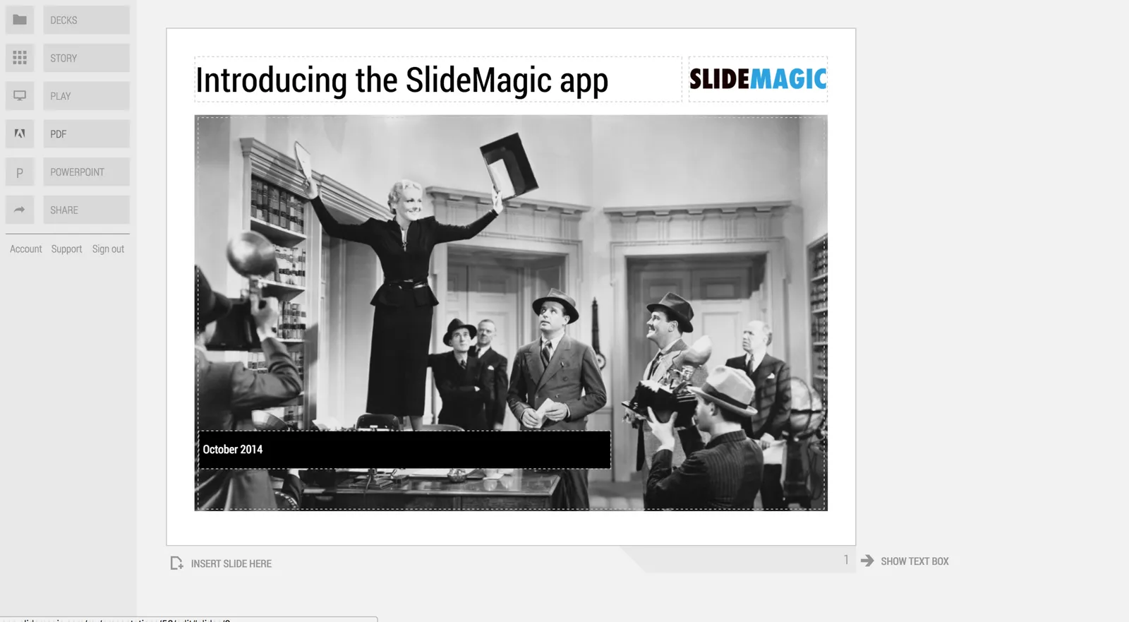
The account, support, and logout links that used to sit at the bottom left of the screen have been moved up. These buttons caused issues on smaller screens, especially tablets. As a result, SlideMagic is now running pretty well on iPad. I am not a big believer in designing slides on a small screen/tablet, because you need a decent canvas to focus and be creative. But, it can be handy to have the option to make smaller edits on a mobile device and that is now going pretty well with SlideMagic.
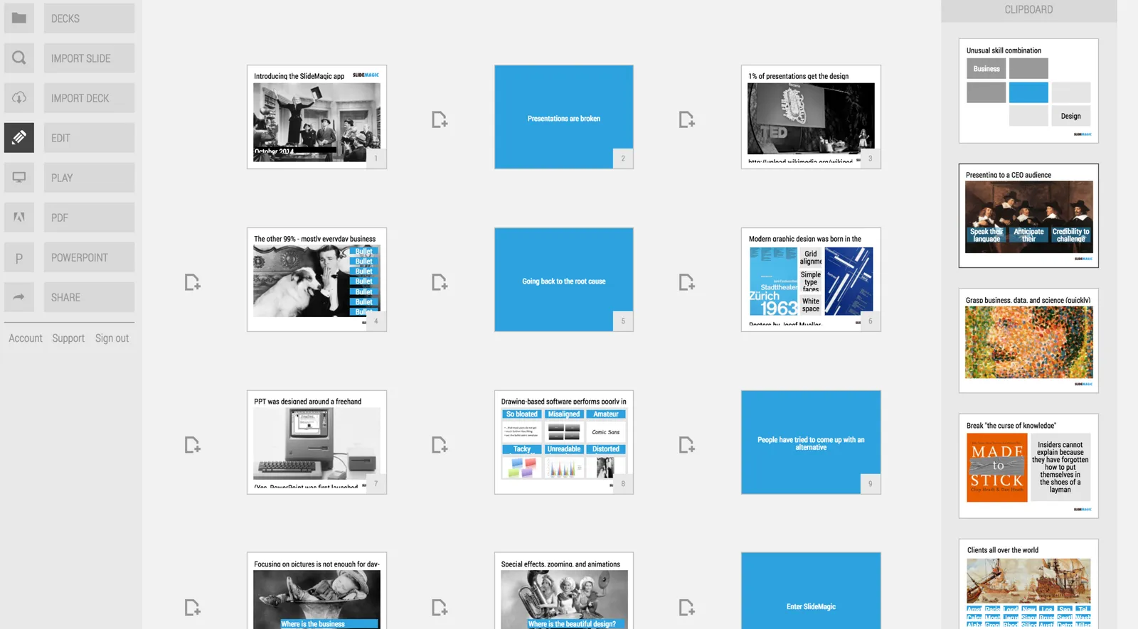
Let me know if you have any more feedback on SlideMagic here in the comments or by sending a message to jan at slidemagic dot com.
The advantage of being a small operation is that decisions can be executed quickly. My branding has moved from “Axiom One”, “Slides that Stick”, “Sticky Slides”, “Idea Transplant” to “Slide Magic”.

SlideMagic is the name of my app, and Idea Transplant stayed the name of my professional presentation design business. I am now retiring Idea Transplant. The name is fantastic, and says exactly what I do, but it is not very catchy “can you spell that email address one more time please?”, and is confusing to clients. My presentation design app does not get any “brand aura” (buzz word alert), and most importantly, the blog name SlideMagic does not add value to my professional presentation design business.

So to keep things clean and simple, Idea Transplant will be come “Slidemagic Bespoke” with the same look and feel as the app. In practice, people will call it “SlideMagic” with the bespoke bit mainly used as a small tag line on the web site.
I am now also going through the clean up of all my social media accounts. Bare with me as I cleaning up all the correct URL redirects etc.
