SlideMagic Blog

Frequent updates about all things presentations since 2008. Subscribe to never miss a post.

RSS
all posts

Search results for “competition”

·Design

SlideShare kicks off the 2009 World's Best Presentation contest - some thoughts

The World’s Best Presentation contests on SlideShare have become the closest thing we have to the annual world championship in presentation design: a lot of submissions, high-profile judges. This year’s edition just kicked off (deadline September 8).

SlideShare World’s Best Presentation Contest 2009

The bar is moving up. Everyone has learned where to find stunning images. Everyone has learned how to accomodate the fast-clicking online viewer by dragging charts out over multiple slides. Everyone has figured out how important the first page is in catching attention.

It is a shame that SlideShare did not set a subject for the contest, this would level the playing field. Part of the competition now is to find a compelling story, many presenation design gurus are probably in writer’s block as we speak.

The winner will be selected based on a professional jury, votes, and on the distribution of the presentation in social networks. So part of the effort is to design the content, part of the work of a contestant is to run an election campaign.

In the next edition SlideShare should run a finale similar to American Idol, in which the finalists have to present their slides in front of an audience/video camera.

I hope the winner of the contest will be a presentation that touches people, and makes them change their behavior in some way or another. This is not neccesarily the presentation with the most beautiful pictures, motion typography or amazing professionally crafted cartoon characters and sketches.
·Design

A daily dose of framework napkins

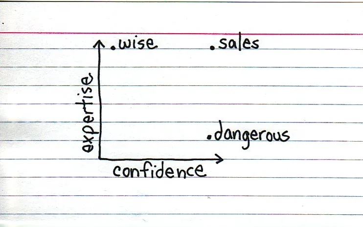
Yesterday’s post about Venn diagrams led me to a blog that I seem to be the last person on the planet to discover:Indexed. Jessica Hagy posts a napkin-style framework everyday. Sometimes funny, sometimes with a valuable insight about life or an unusual way of looking at things. Here is an example:

Venn diagrams, but especially 2x2’s, are very popular among McKinsey, BCG, Bain, and other management consultants. “We have put the world into 4 buckets, so now we understand it”.

For solving problems they are great, and I have used hundreds of them in my 17 year (oops) as a management consultant. All issues are on the map, how we can we move from one box to another?

But take a step back and think when you want to use these frameworks in a big keynote presentation. To illustrate my point: look at the drawings on the Indexed blog, and check which ones do you get in a second. Tricky isn’t it?

My advice: use these 2x2 frameworks only

  1. if you want to show movement of dots in the boxes. For example you can use the same framework in a few slides to show changes in strategy, or the positioning of a company
  2. if you want to highlight how your company/idea differentiates itself from the competition (by being in the top right box).

If you just need a structure to list 3 items, try to find a simpler way to visualize things.

Still, add Indexed to your RSS reader, it’s great fun.

·Design

The PGDN PGDN PGDN pitch deck to let Mr. VC get it

Another excellent post by Mark Suster on the subject of pitching to VCs, specifically whether you should send your deck in advance. Read the post here, or get an overview of his entire series on VC pitching here.

The main conclusion: do send A deck in advance. As I suspected, VCs double-click the PPT attachment of an email, and go PGDN PGDN PGDN (this fast) until the end before reading the body of the email (if they read this at all).

OK, we all know that most presentations do not stand on their own, and that the presenter him/herself adds 80% to a presentation. To get through to a busy VC though, you have to leave all these ideals behind. Sorry.

Think of this PGDN PGDN PGDN presentation as a specific type of presentation that has a completely different objective from the standup ptich presentation. You try to get the VC to think longer than 60 seconds about your company:

  • Use the same graphical techniques you would use to try to grab the attention of volatile SideShare audiences. Big images, big fonts so that someone going click, click, click gets the messages
  • Focus the content of the presentation on letting VCs “get it”. And this is some of the stuff that entrepreneurs usually leave out. What do you do? “What, you want me to write down that we are making a firewall with a built-in spam filter?” “We do much more than that: we are offering a radically new holestic security concept!” The latter is hard to get…
  • We have no competition”. Not useful. VCs trying to “get it” like to put you in boxes, compare you to competitors/companies they know. Make life easy for them.
  • A VC who (thinks that he/she) gets it, can spend more time on your company, make some calls
Continue reading →
·Design

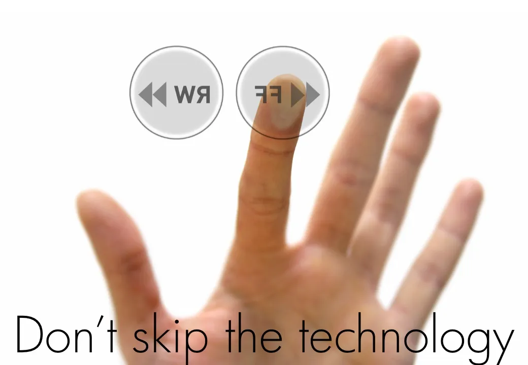
VC pitch - don't skip the technology

Here is another slide from my “how to pitch to a VC” presentation explained in more detail. (The “Zen”-style slides do not stand on their own very well)

When people have limited time for a presentation they often start to cut “the meat” of the story. What’s left after the trimming is a set of generic “summary slides” at such a high level of abstraction that they don’t say very much anymore.

Venture capitalists do not have much time. Still, resist the temptation to skip the technology section when pitching your startup. This is the key asset you have. This is what makes you stand out from the competition. This is what makes VCs understand that there is a real business here, not just a set of PowerPoint slides.

How can you present a complex technology in very little time? Don’t spend time on exhaustive architecture diagrams with layers of details and boring process flows. Instead make people understand why your technology is so unique and so hard to copy.

The deep dive is a good technique to do this. Take a few very specific examples, and dive all the way down into the detail to make your point. Show the complex code, show how long it took you to solve the issue, and show how it will take the competition double this time to imitate it.

Remember, your audience is smart (and busy). Any scientist or engineer should be able to explain the technology solution to an intelligent layman in just a few words and a few images. There is no bigger offense to your audience (and a guaranteed VC turn-off) then to say “this might be a bit too complicated for you, I’ll just skip it in this executive summary”.

·Design

2009: the year of stock image fatigue

Today I am writing a speech for a group of university students, so I had the luxury of being able to"go all the way" with creativity, not having to worry about whether visual concepts would be appropriate for the audience.

Eighty slides later, I got tired of many of the images I used and cut back on a lot of them.

  • Page after page of yet another stunningly beautiful image takes the attention away from the presenter and gives the audience the impression of reading a giant coffee table picture book
  • There is only so many funny or shocking images an audience can absorb. One “pie in the face” can be funny, one aggressive guy might be OK, but not ten slides like these. People don’t like to look at close-ups of spiders.
  • Metaphors get forced: “I knew he would use that squashed orange to show that we are being squeezed by the competition.”
  • Cost: 80 pages with a few trial images per page start to add up.

What you can do to overcome stock image fatigue:

  • (I passed level 0 already: cutting out the cheesy image)
  • Have the courage to go even more minimalistic: use a few words on a beautiful background color (experiment with light and elegant fonts, short words with are extremely large fonts)
  • Re-color stock images so they look more similar
  • Use images that are similar in style, for example just “retro” black & white shots throughout your presentation
  • Use real images from sources such as Flickr (check the license)
·Design

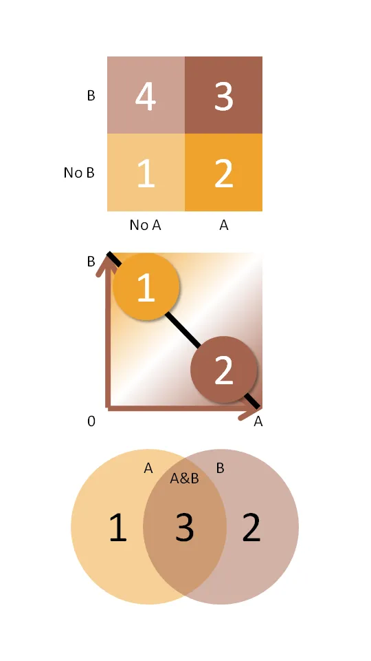
Chart concept: the 2x2 matrix and other grouping techniques

McKinsey and other management consultants love 2x2 matrices (and obviously 3x3s). Personally, I think they are often overused (framework overload).

Not every categorization can be crammed into this framework.

  • The axes need to be logical
  • The groups needs to lead to 4 categories, i.e., leaving one or two boxes as “not applicable” does not make sense
  • They work particularly well when you want to show things moving from one category to the other
  • They are good to show that something stands out (from for example the competition) by popping up in the top-right corner

Here are some other techniques to group items on a PowerPoint slide using line and venn diagrams:

  • Diagram 2 - “you cannot have it both ways”
  • Diagram 3 - “the best of both worlds”

Steve Jobs pitching his company (NeXT)

Two interesting videos in which Steve Jobs (then still busy with NeXT) uses a white board and a marker to explain the strategy of his company:

  • who is the target customer?
  • why do they pick us and not the competition?
  • how are we going to reach them?

The informal presentation style is very similar to the one advocated in “The back of the napkin” by Dan Roam.

Video 2:

Via Venture Hacks A summary of useful links with advice on how to pitch a startup to a VC here.

·McKinsey

Classic McKinsey business frameworks

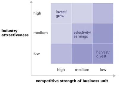
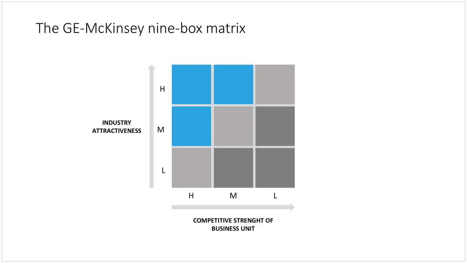
The McKinsey Quarterly added another framework to a series that discusses historic business analysis frameworks: the GE-McKinsey 9 box matrix, developed in the early 70s.

Glancing over the article and hearing the audio explanation made me realize: things have moved on. Managers have become much more skilled in absorbing diagrams, and business portfolio analysis is more than plotting industry attractiveness and competitive strength. The elaborate explanation of the 3x3 would almost be an “insult” to a sophisticated management audience in 2008. Still, today I constantly invent “frameworks” for presentation on the spot: how to present 4 steps, 3 distinctive factors versus the competition, 6 phases to launch, the best of both 2 worlds, but none of them are standard. Also, I am increasingly moving away from the urge to summarize all factors and aspects of a solution on one (the first) page. Rather, I take an audience through a step-by-step story to the final answer. The difference between a concise document and an engaging live presentation. For more nostalgic reading:

  • Classic frameworks by McKinsey & Company (7-S, Structure-Conduct-Performance [SCP], others)
  • Classic frameworks by the Boston Consulting Group (Growth-share matrix [Stars, cash cows, dogs, question marks], others)

UPDATE February 2018: I have now added the GE McKinsey matrix and lots of other consulting frameworks to the SlideMagic template store.

 The GE-McKinsey matrix in PowerPoint

The GE-McKinsey matrix in PowerPoint