SlideMagic Blog

Frequent updates about all things presentations since 2008. Subscribe to never miss a post.

RSS
all posts

Search results for “web design”

·PowerPoint

PowerPoint on iPad review (2018)

Microsoft is on a roll, and now that I am turning temporarily into a developer, I appreciate them even more with very powerful code editors, and repeated decisions to open source their software (the entire Windows platform engine is going open source), and make other sensible decisions (moving to the Chromium browser rendering engine inside Edge).

The office apps are no exception, and I took some time to play around with PowerPoint on my new iPad.

The app looks and feels fantastic (I have something to aspire to), and all the basic design features work flawlessly. I find it easier to find my way around coming in “cold” then the keynote app for iPad. The small screen encourages you to design simpler slides, and spend less time adding stuff that is not essential to your story.

In 2018, things are still not perfect though. But most shortcomings are to blame on the iPad form factor, not Microsoft:

  • Presentation design is a creative process that needs space, a big screen, accurate placing of objects (fingers are less good here than a mouse). An iPad is just not a focussed design interface.
  • File management is still cumbersome on an iPad. Finding that deck from last week, opening a spreadsheet side by side, copying an image from the web browser, things that take a second on a computer are not intuitive on an iPad.
  • Because of the form factor Microsoft has cut down the features for PowerPoint on iPad. In itself, this is great (I am also focusing the features in my app), but, once the genie is out of the bottle, it is very hard to have the same application on different platforms with different feature sets, especially if you are working with collaborators on different devices. “Please create this bar chart”, is emailed to the analyst working on an iPad in the taxi who then discovers that data charts are not really supported. It also hard to create custom themes and colour schemes.
Continue reading →

Linchpin jobs - chart makeover

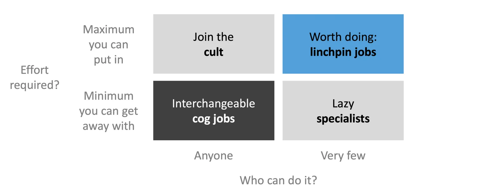
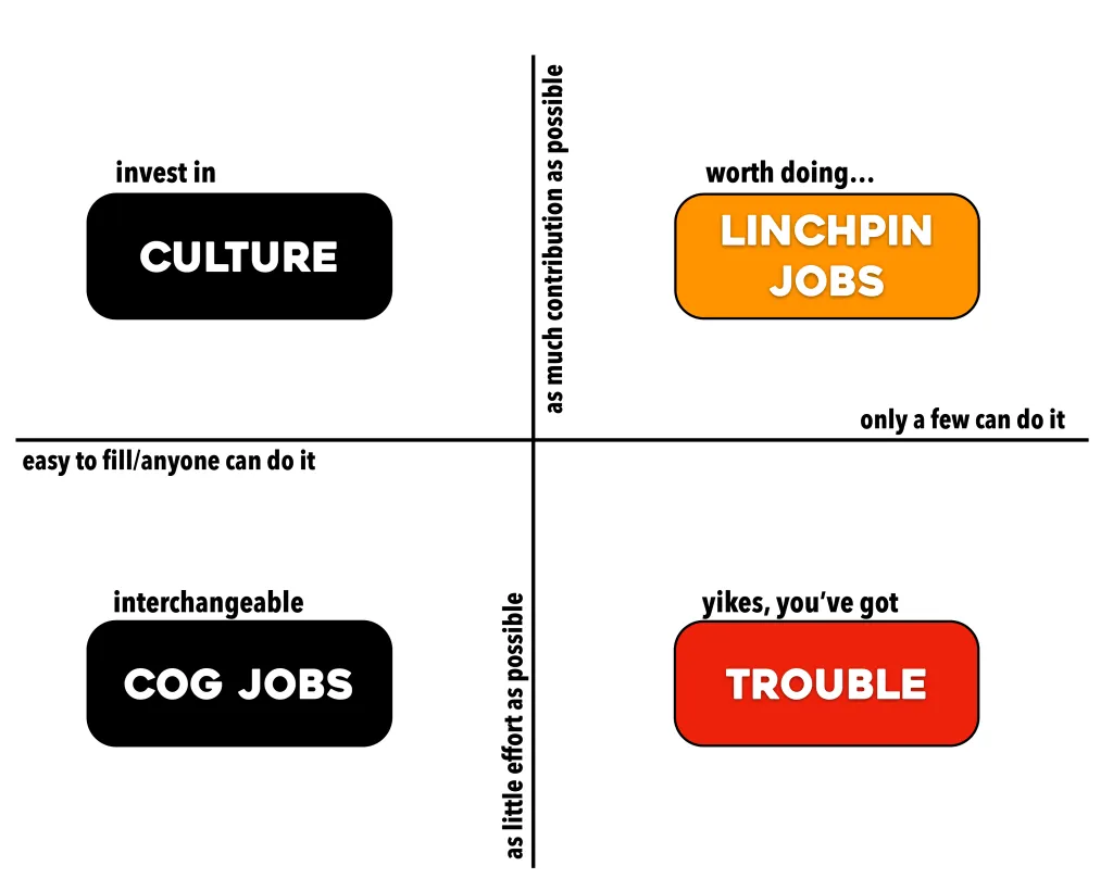
Seth Godin designed this framework to explain what Linchpin Jobs are:

I did a quick makeover of the diagram, keeping the design super simple (life is too short to be spending designing charts at your desk):

  • Move from an XY to a 2x2 layout to make it easer to read the axis
  • Changing the labels of the boxes, axes to get rid of excess text, make them more consistent
  • Change the colours so that the cog jobs stand out (I think they are worse than what I call “lazy specialist” roles

Cover image credit: Jared Goralnick

Way back

I was looking back at my old site on the Wayback Machine the other day and noticed how my approach to presentation design has changed. Back then, I would put huge efforts in finding unusual images, study advertising design, push PowerPoint to its limits. The result: some pretty unusual presentations.

Today, I have become much more pragmatic: presentations should be easy to understand (which might mean cutting that exotic visual metaphor), have a pro/no-nonsense look, and very easy/quick to put together, there are more important things to do than battling presentation design software.

Have I become lazy? I don’t think so. Just a more realistic and practical approach to presentation design.

Looking for 2-5 beta testers

My first software product that I coded myself seems to be working and I need a handful of beta testers to work with. I want to see if there are unexpected bugs still hiding in the product, and what happens if people start installing things on a machine other than my own (full of developer privileges when it comes to accessing hard disks, etc.)

What is this product? A plug in for PowerPoint that converts SlideMagic presentations to 100% perfect PowerPoint. Extra bonus: automatic translation to and from a dark background, and flipping between 4:3 and 16:9 aspect ratio in a second without distortions. Users get sent a “.MAGIC” file that the tool can interpret.

It runs on Windows only, since I had to dive pretty deep into the Microsoft .NET libraries to get all this to work. (At the moment, I deal with Mac-originated conversion requests partly manually, you get the same quality conversion sent to you with a time zone delay, but this will not be sustainable if request volume goes up).

This product is not the final stage of SlideMagic, more a first step for me to test whether I can ship useful software. I am catching up with technology since my 1992 graduation from engineering school, now I have moved on from PowerPoint plugins to writing Windows desktop applications from scratch for a next product release. Desktop apps are a bit “1995”, but for B2B design work, “cloud” might not always be the best solution. In any way, I have to pass this station before being able to move on to web and possibly mobile app technologies. It is fascinating to see that you can basically do anything in software if you are not intimidated by technology and have the courage to leave the traditional boxes/application models and user interface approaches.

Continue reading →
·Typography

Font sizing

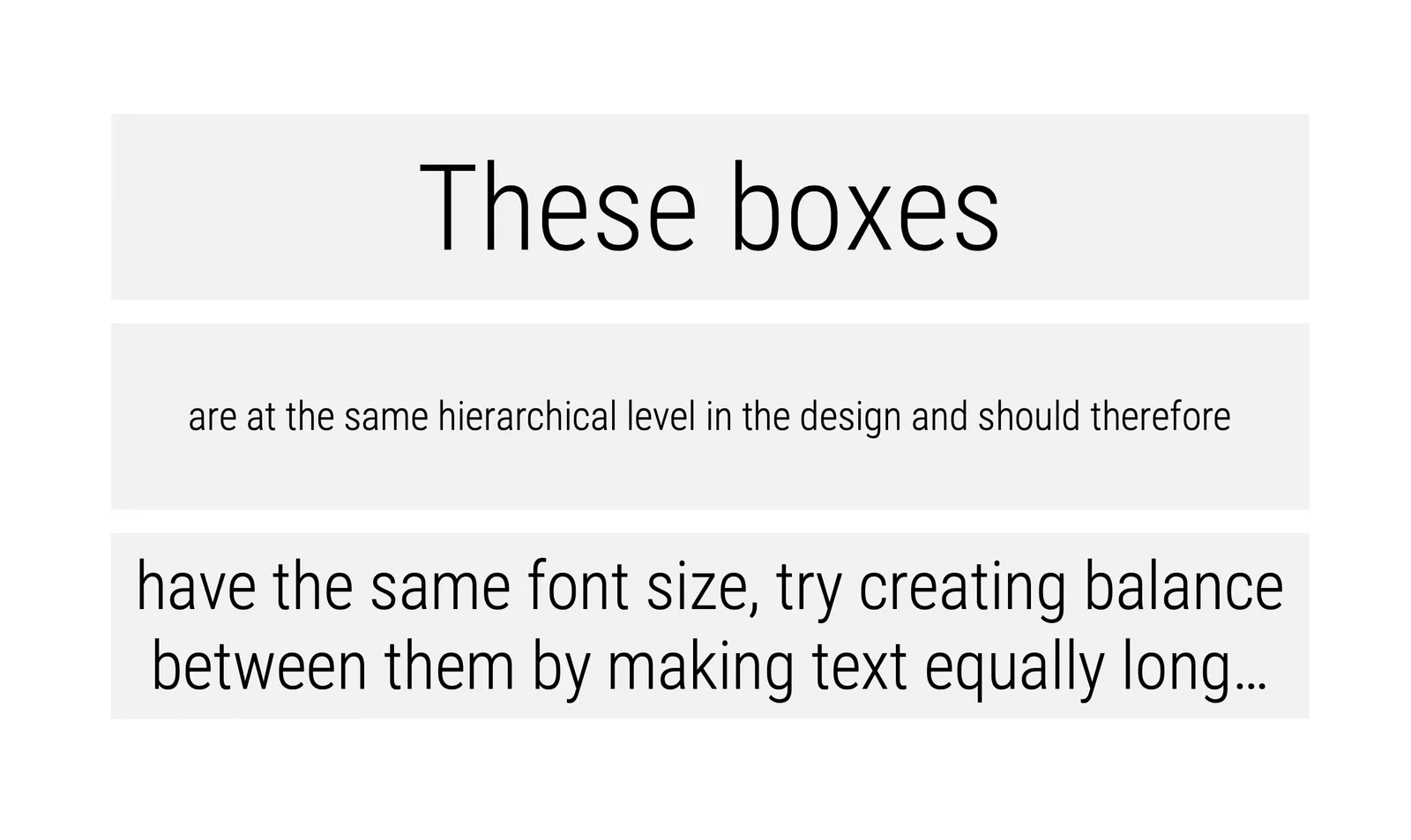
When people submit their SlideMagic documents for conversion to PowerPoint, I still have to peek inside for a second for a quick manual operation. Here is the most common design mistake I see: different font sizes in boxes that are part of the same list or grouping.*

Yes, bigger fonts are better, but in case of lists, it is the lowest common denominator that determines their size. Slide design is like formatting headlines in a print newspaper: you need to edit text to make the message clear, but also to fit things in the typographical constraints.

  • Users in te app are warned beforehand about this.

Cover image by Andre Benz on Unsplash

·Software

The state of productivity apps

The reviews of the new iPad Pro are coming in: ten years after introduction this tablet device has caught up in performance with the average laptop. Most reviewers come to a similar conclusion: yes, the device is powerful, but it does not let me do the things I want it to do to replace a laptop completely. The enthusiasm for mobile devices as work tools seems to dampen a bit. I must admit that I am going through a similar process, re-adjusting priorities for where I want to take the SlideMagic app next after V1.0, the web app.

I have not solved the problem yet, nobody has, but here are some observations that I am taking into account and thinking about:

  • There are different user segments, consumers, professionals, and even within professionals there are differences: a blogger or tech reviewer has different computing needs then an investment analyst or a web designer.
  • A single user segment has different uses for a device that can overlap between segments. Presenting for a big audience, making quick edits in the taxi, walking through a few pages over a coffee, focussed slide design, crazy/creative concept development, brainstorming.
  • User experience is incredibly important, and even the smallest glitches, delays, or inefficiencies can become annoyances quickly. (Web user interfaces still cannot match those of a properly designed native app).
  • Some things can be done better with touch, but the good old mouse pointer has its value too. Fingers can be clumsy.
  • It is very hard for people to get used to new interface concepts, part of the reason why the basics of PowerPoint are pretty much the same as they were 20 years ago. This is also true for touch interfaces, personally I did not bother to learn all the 3 finger swipes and other gestures on my phone, tablet, or laptop track pad. In the same I way I never learned the keyboard short cuts on a desktop beyond CTRL-C and CTRL-V.
  • Cloud-based collaboration is still messy and confusing,. Multiple people editing the same master document is often not helpful. It is often not clear what you shared with whom, what access permissions, is the file, is it the folder, etc.
Continue reading →

Stock image creep in Unsplash

I really like the free photo site Unsplash, I hardly use stock image sites such as iStock or Shutterstock anymore. As a pro with paying clients, the prices of the stock images are not really a concern in the overall budget of a presentation design project, it is simply the dilution of quality of these big stock photo sites with cheesy images.

But worryingly, I see the first “stock images” pop up on Unsplash as well, I hope they will continue to curate their uploads carefully, or maybe add a “stock image alert” warning button on a photo.

·Data visualization

2x2 matrix overload

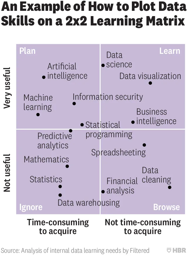
This 2x2 chart is hard to understand (source on HBR)

From a design point of view:

  • Axes labels are hard to read
  • Axes labels are too blunt, mathematics has its uses
  • Too many dots at locations that are too precise
  • Typography of the labels goes across the boxes
  • The 4 quadrant labels do not stick out enough

And that’s the design part. More importantly, the content… The title of the chart seems to suggest that it is just an example of how to use 2x2 matrices, but I think people are serious about its content. A comparison of apples and oranges. I need to start casually learn how to do data cleaning, and not yet get into AI but be prepared for it, and to use AI, I don’t need to understand statistics at all.

Cover image by Nick Femerling on Unsplash

Slideshare RIP?

This blog post popped up in my Twitter feed the other day: SlideShare is no longer what it used to be.

I agree, personally, I do not use the service anymore, and a quick visit to today’s home page shows a stale site showcasing “today’s” top presentations that are 4 months old. I can still remember those annual presentation design competitions a couple of years ago that attracted a lot of attention.

In retrospect, SlideShare was a mix up of a lot of businesses:

  • A tool to save email attachment size
  • A place to search for content
  • A curated content discovery platform
  • An engine that enabled you to embed presentations in web site
  • Etc.

The service was hindered by technical limitations: somehow the quality of played back presentations was not that high, and full of SlideShare branded links and content, which is why I moved away from the platform. Recently, SlideShare killed the re-upload feature that preserved back links and view counts. Also, the acquisition by LinkedIn which then got acquired by Microsoft did not help to focus management. And finally, there are lots of other platforms out there that can host clickable slides somehow. None of them have managed to attract crowds that SlideShare could assemble though.

Ultimately, there is a market for a SlideShare-like platform I believe. And now 10 years after SlideShare was founded the economics of running the platform (storing lots of media rich content) could be fundamentally different.

Not all grey is grey

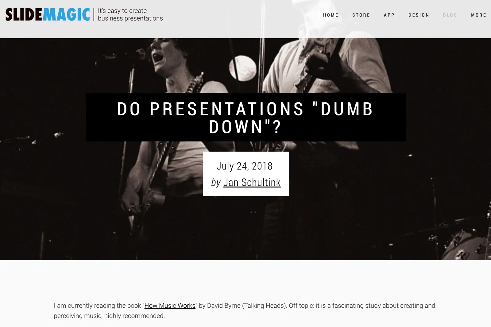
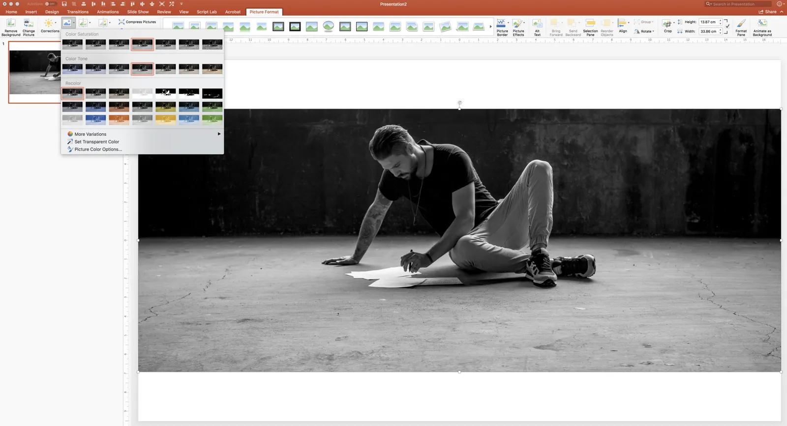
Design mistakes happen to the best of us. See this screen shot of a blog post from a few days ago. The image the looks black and white, is actually not black and white. It is always good to remove all colour from all images, even when they appear to be black and white already.

In PowerPoint you do this in picture format - colour, see the screen shot below.

Cover image by Oleg Laptev on Unsplash