

When people submit their SlideMagic documents for conversion to PowerPoint, I still have to peek inside for a second for a quick manual operation. Here is the most common design mistake I see: different font sizes in boxes that are part of the same list or grouping.*
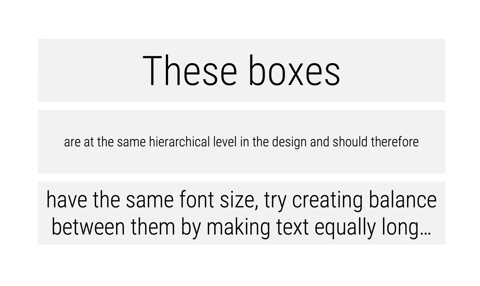
Yes, bigger fonts are better, but in case of lists, it is the lowest common denominator that determines their size. Slide design is like formatting headlines in a print newspaper: you need to edit text to make the message clear, but also to fit things in the typographical constraints.
- Users in te app are warned beforehand about this.
Cover image by Andre Benz on Unsplash