SlideMagic Blog

Frequent updates about all things presentations since 2008. Subscribe to never miss a post.

RSS
all posts

Search results for “windows”

·Software

iPad Pro review

While I have been upgrading my phone fairly frequently over the past years, my iPad has pretty stayed the same for a long time. I got the first one with Retina display (the 3 I think), got frustrated with its weight and got a Mini as soon as that one was equipped with a Retina display. Last week, I got an iPad Pro 9.7.

Why? I will be honest, screen size. I subscribe to many iPad magazines in niche categories (mountain biking, synthesizers if you are interested) and these smaller publications do not always have apps that adjust to small screen sizes. At 46, I found them increasingly hard to read.

Also I was curious about the Apple Pencil and keyboard. The big iPad Pro tempted me, but I held out long enough to read the reviews of most users who found its size too bulky. So, here I am with an iPad Pro 9.7.

The first thing that strikes you is the incredible screen this iPad has. My iPhone 6S looks poor next to it. Second is its weight. Feels the same as my old Mini, despite a much larger screen.

The pencil is the first one that actually works for an iPad. Over the years I have tried many, many styli, and always found myself going back to paper. All my slide designs start as a sketch on a piece of paper, I like to make them big, so I burn through many trees in a month. I am hopeful that the pencil will finally end this waste. The real answer will come after a month of use or so. The pencil works nicely in the Apple Notes app, but really shines in the Paper app by 53.  The only drawback of the pencil is that there is nowhere to put it. I reviewed a leather designer cover I got for my iPad 3 to carry everything around.
Continue reading →

Stale PowerPoint templates

User interface, web design, and presentation are moving quickly. Graphics that looked fresh and new a couple of years ago, now look really stale and old. Look at old version of Windows and Mac OSX operating systems, a mobile phone home screen in 2008, and the PowerPoint template you are still using today.

A large part of this is driven by screen technology. Ten years ago, monitors had lower resolutions and fonts had to be fatter, and rough gradients could still look smooth. Also documents that long reasonable on a 4:3 aspect ratio become harder to read on wider 16:9 monitors as sentences streeeeeetch over the entire screen. Harder to read, and it looks out of balance.

What can you do to your PowerPoint template to make it look less like the 1990s? Here are some steps:

  • Switch to a lighter font. Calibri light looks OK and won’t give you any compatibility problems on Macs and Windows.
  • Stop using drop shadows and gradients
  • Remove the old low resolution JPG graphics from your slide template. If you or your corporate communications department insists on having some branding on the slides, but a tiny high res logo at the bottom right
  • Don’t use bullet points
  • If you have to use bullet points don’t use a hierarchy of bullet points
  • If you have to use a hierarchy of bullet points, keep them all the same font size, and use a dot, dash, smaller dot for the levels (no squares, or other funny characters)
  • On 16:9 screens don’t run long sentences in small fonts across the full width of the screen. If you have a lot of text put boxes next to each other (a horizontal list, versus a vertical list)
  • Restrict the use of colour, use the accent colour in your company’s logo, well, to make an accent. Stop using bright red, pink, green, or yellow
  • Stop using underline and italic
  • Legal disclaimers, footnotes, and page numbers can be really, really small somewhere at the bottom, only readable for people who press their nose against the screen
  • Get someone in IT to program all these changes into a idiot-proof new PowerPoint template with all the right default shapes, fonts and colours
Continue reading →
·Typography

Calibri light

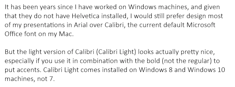
It has been years since I have worked on Windows machines, and given that they do not have Helvetica installed, I would still prefer design most of my presentations in Arial over Calibri, the current default Microsoft Office font on my Mac.

But the light version of Calibri (Calibri Light) looks actually pretty nice, especially if you use it in combination with the bold (not the regular) to put accents. Calibri Light comes installed on Windows 8 and Windows 10 machines, not 7.

Goodbye Arial.

Image on WikiPedia

iPad Pro and presentation design

I have been reading the reviews of the Apple iPad Pro and the Microsoft Surface Pro with great interest. Analyst Benedict Evans and many others claim that iOS/Android powered devices will replace OSX/Windows computers as the main computing tools we use.

Illustrators and designers seem to love the devices. Big surfaces with a precise pencil signal the end of the expensive Cintiq devices.

Writers (bloggers, journalists) complain that they miss the mouse/track pad on these devices. It is hard to go back and forth from keyboard to screen to move quickly through text and cut/paste sentences.

Presentation design might actually be a good fit for a bigger tablet, if you can make things run smoothly without the need for the attached physical keyboard. It would require a redesign of the user interface though, the mouse-based UI is too complicated, and the current mobile UIs are too counter-intuitive, many functions are hidden. SlideMagic might fit the bill, I am going to find out soon.

Still, there is the difference between “it works great” and mass adoption in big enterprises…

·SlideMagic

SlideMagic bugs fixed

Presentation software needs to be absolutely bug free. Unlike a social media mobile app, where you can wait with grazing your news feed for a few hours, the presentation app needs to be ready for that critical 20 minute slot for the all-or-nothing presentation.

That is the reason I am keeping SlideMagic still in beta as I iron out all possible glitches. Here are some we fixed recently. If one of these caused you to stop using the app, give it another try.

  • Fixed: small (but annoying) differences in font size rendering between what you see in PDF and what you see on screen, causing words to drop to the next line when you don’t want them to.
  • Fixed: erratic font size behaviour when rapidly increasing or decreasing font sizes
  • Fixed: enabling multi-edit of cells to manage colours, font sizes of more than one cell in one go.
  • Fixed: no need to leave and re-enter the shape format menu to work on another cell
  • Fixed: Windows/Firefox UI freezes
  • Fixed: story mode drag and drop issues

SlideMagic is moving closer to production stability.

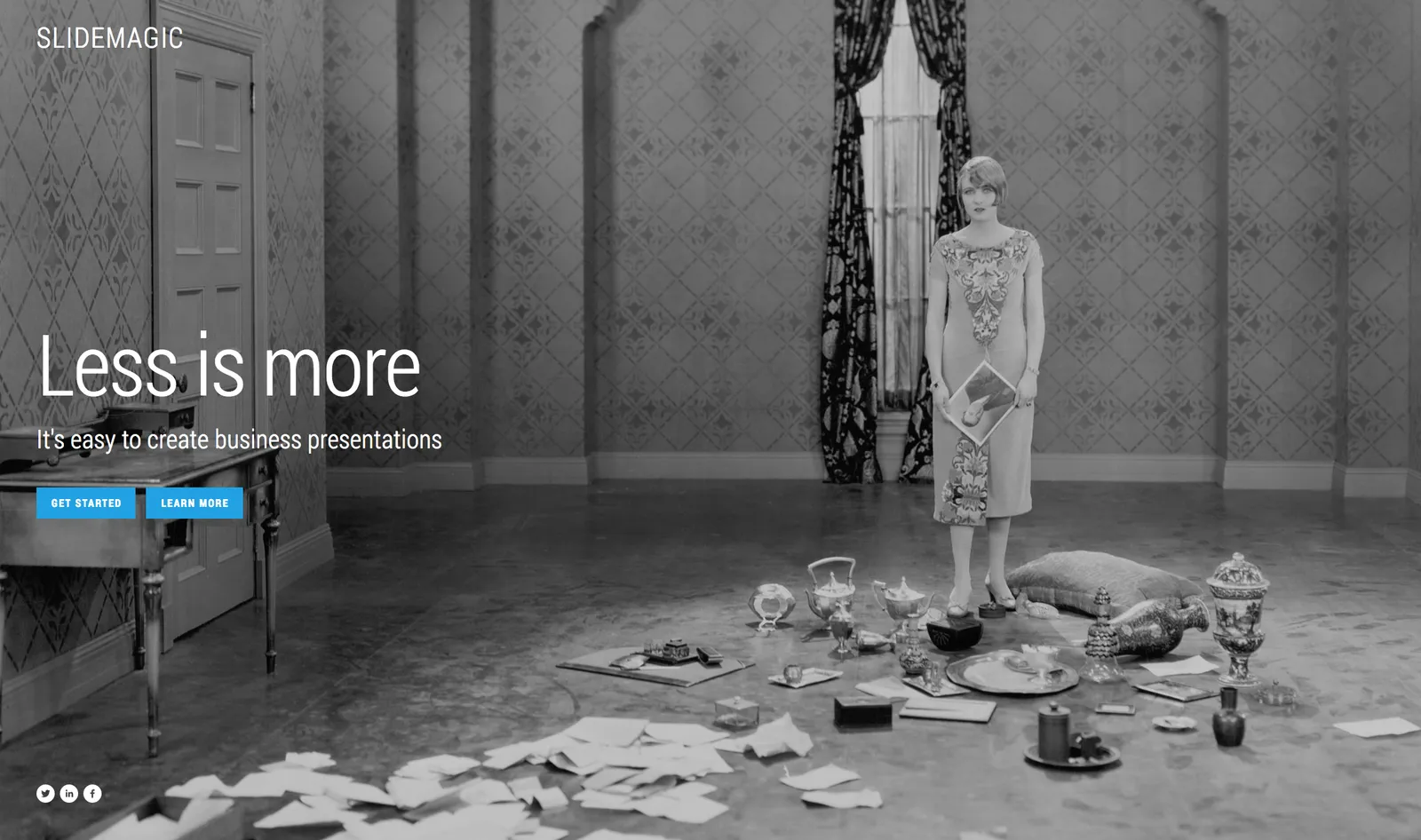
B.t.w, I updated the SlideMagic marketing site yesterday, making the positioning plain and simple: it is easy to make business presentations. Easy, that’s it. Also made the images a bit more daring.

Art: Scène d’été, or Summer Scene, is an oil on canvas painting by Frédéric Bazille, completed in 1869

HTML to PowerPoint?

I am considering adding a one-way PowerPoint conversion to SlideMagic (i.e., you can export SlideMagic slides to PowerPoint, but not the other way around). The big migration from Windows to Mac happened when Apple allowed you to run Windows on it. In the end, few people did, but the thought that you could encouraged more people to make the switch.

My question. Are there any developers reading this post who can point me to useful open source converters to start with, and/or people that have gained experience with HTML to PowerPoint conversion somehow? Feel free to reach out via jan at slidemagic dot com.

Art: Froanna, the artist’s wife: by Wyndham Lewis 1937

·Software

New PowerPoint 2016 for Mac can beat Keynote

The preview of the new Microsoft Office 2016 is out (finally) and I have installed it on my production machine letting it do all my presentation design work for clients. (You can download the Office 2016 preview here)

  • It looks beautiful. PowerPoint 2016 for Mac looks exactly the same as PowerPoint 2013 for Windows. A calm flat user interface. Working in a beautiful software environment always encourages you to create beautiful presentations.
  • The whole interface feels faster, snappier, and smoother, somehow. This is especially true for Excel. The current version of Excel for Mac has a highly annoying latency when entering data in cells.
  • Subtle changes to the default colours and fonts. Gone are the boring olive greens of the old PowerPoint colour scheme. Calibri light looks great on Retina displays. Gone are the default gradients and drop shadows. Gone are the tick marks in data charts.
  • The commenting infrastructure is nice for collaboration with other people
  • Full integration with OneDrive cloud storage (if Microsoft has guts they should add Dropbox as well, and maybe even Google Drive).
  • Now PowerPoint gives suggested snap lines to place objects, automatically distributing and aligning things on your screen.
  • The grid behaves more normal with a centimeter ruler. If you accidentally move a grid line (yes, this still happens) it is easy to move it back to the right position.
  • Now text and shape backgrounds have the exact same colour rendering, an annoying bug in PowerPoint 2011, where despite selecting the same RGB value, colours on text and shapes would render differently.
Continue reading →
·Layout

The final clean up

Some things to check once you think you have finished your presentation:

  • Are the fonts consistent throughout the presentation? Are have default Arials/Calibris managed to sneak in?
  • Are font sizes in comparable boxes the same?
  • Are the headlines all in the same place on every slide?
  • Are objects in each slide aligned, and properly distributed?
  • Are the proper colours used on every slide, including data charts, or do you still see standard PowerPoint colours anywhere?
  • Are all images in the proper aspect ratio, without distortion?
  • Did you include an attribution to creative common images?
  • In case you will be displaying the presentation on another computer, have you checked Windows/Mac rendering issues? Sometimes fonts are rendered in slightly different sizes, causing words to drop to the second line.
  • Is data properly rounded up?

Now you see why SlideMagic has 1 font, 1 accent colour, and a strict grid that makes it impossible to misalign objects or put titles in the wrong places.

Art: Berthe Morisot, Hanging the Laundry out to Dry, 1875 Subscribe to this blog, follow me on Twitter

·Typography

Designing presentations for retina displays

Typographers had big debates when Apple launched the first iPads and iPhones with retina displays (“Retina” is the marketing name for a screen with such a high pixel density that your eyes cannot see individual pixels anymore). Retina displays are obviously different from low resolution screens, but - as the typographers discovered - are also different from paper/print.

I now see similar issues with large retina monitors. A traditional PowerPoint presentation with an Arial or Calibri font looks somehow off. You need lighter, thinner, crisper fonts. Macs have Helvetica light installed, but Windows machines not. Drop shadows look “dirty”. Outlines around boxes look too heavy.

My guess is that Microsoft will fix the font issue in upcoming releases of Windows and Office products. But, if we fix the issue for computer screens, we are still left with this huge install base of crappy VGA overhead projectors in corporate conference rooms that never get replaced…

If you are working on a really important, one off, presentation find out about the screen you are going to present on and test your design.

Art: Vincent van Gogh, Starry night, drawing, 1889

Click here to subscribe to this blog about presentation design

·Keynote

New PPT for Mac now 1 year later

In a recent blog post, Microsoft announced a new version of Outlook (the email client for Mac), but at the same time pushes back the launch of a new Mac version of its Office suite (Excel, Word, and of course PowerPoint) by a year to the second half of 2015:

Historically we have released a new version of Office for Mac approximately six to eight months after Office for Windows. However, following the release of Office 365 we made the conscious decision to prioritize mobile first and cloud first scenarios for an increasing number of people who are getting things done on-the-go more frequently. This meant delivering and continuing to improve Office on a variety phones (iPhone, Windows Phone, and Android) and tablets (iPad and Windows)—brought together by the cloud (OneDrive) to help people stay better organized and get things done with greater efficiency at work, school, home and everywhere between. Continuing our commitment to our valued Mac customers, we are pleased to disclose the roadmap for the next version of Office for Mac—including Word for Mac, Excel for Mac, PowerPoint for Mac and OneNote for Mac.

In the first half of 2015 we will release a public beta for the next version of Office for Mac, and in the second half of 2015 we will make the final release available. Office 365 commercial and consumer subscribers will get the next version at no additional cost, and we will release a perpetual license of Office for Mac in the same timeframe.

Continue reading →