SlideMagic Blog

Frequent updates about all things presentations since 2008. Subscribe to never miss a post.

RSS
all posts

Search results for “web design”

·Layout

Grouping data in tables

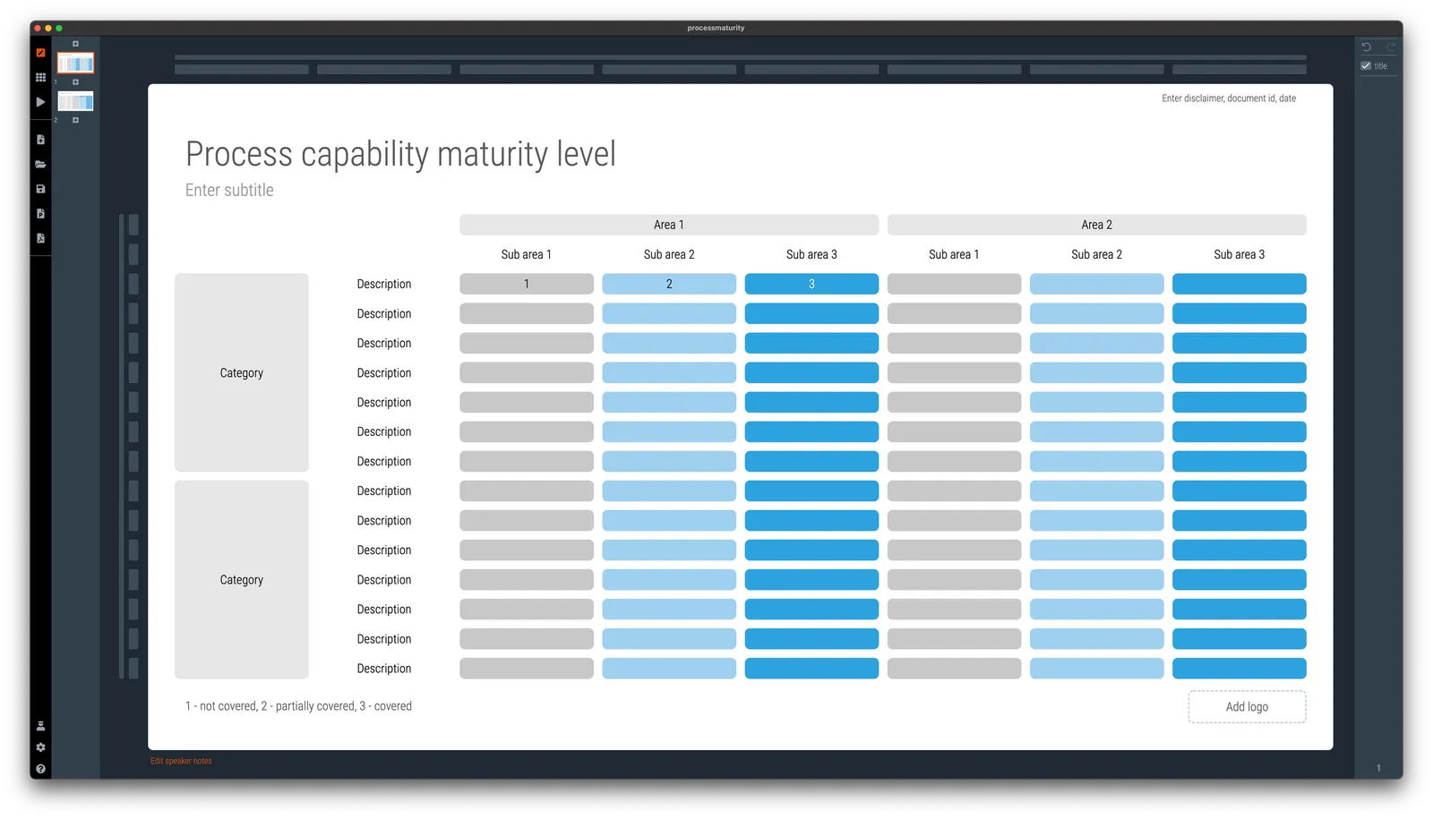
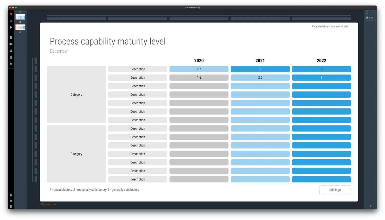
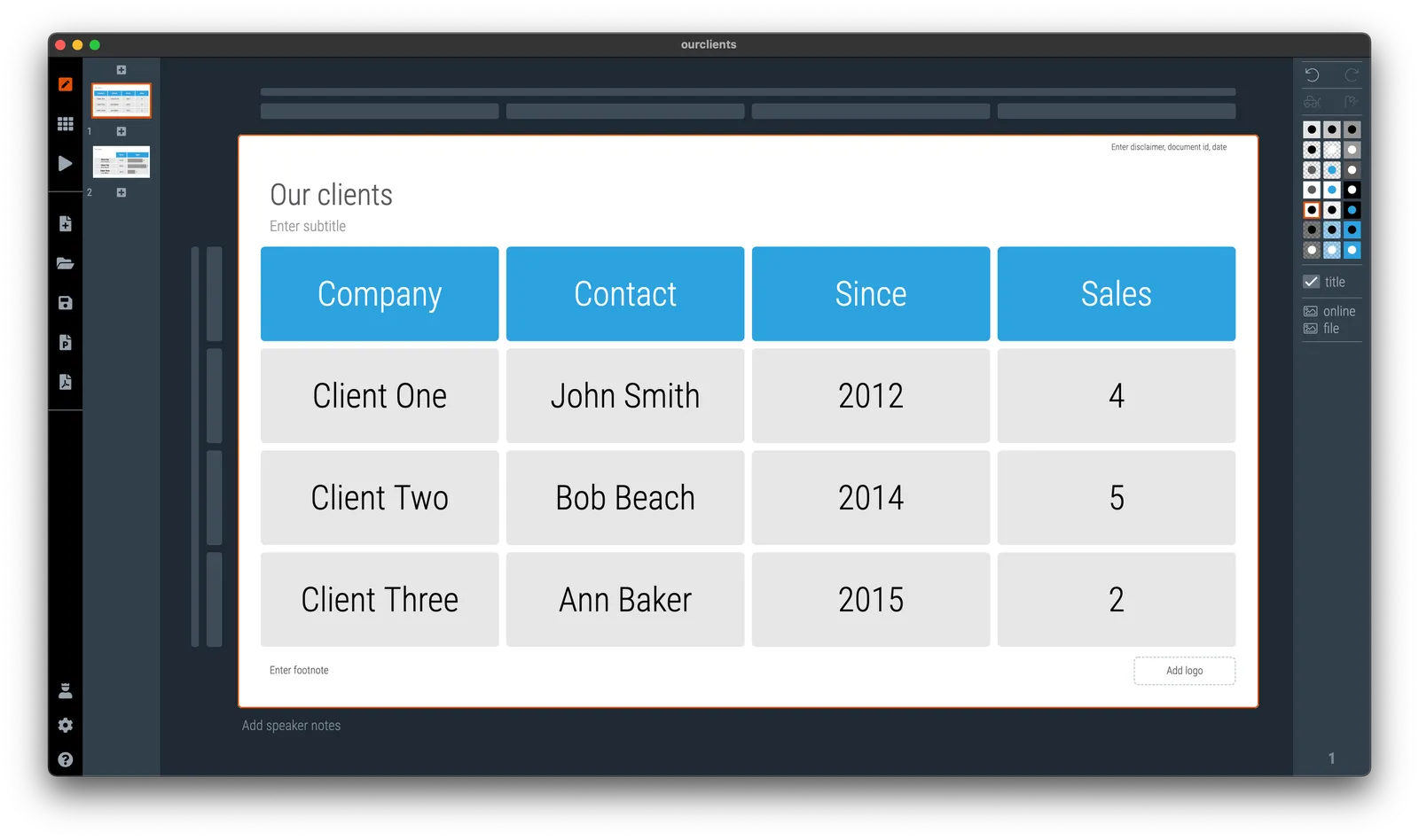
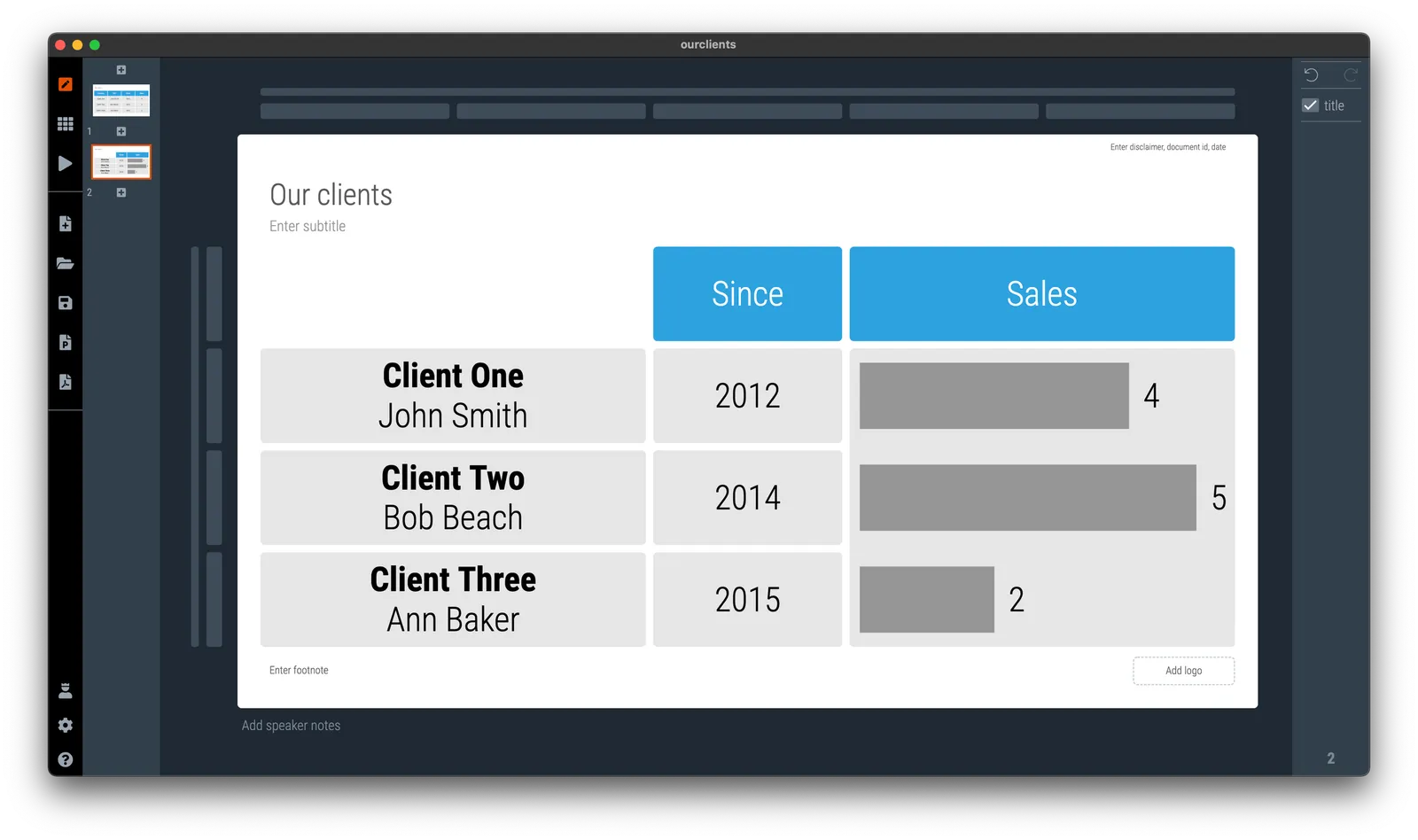
In spreadsheets or databases, things should be clearly labeled. Every column has a heading that describes what’s in it. When it comes to slide design, you can allow yourself a bit more freedom. Look at the 2 slides below

In the second slide, I omitted detailed descriptions of data that is probably clear to the audience, and grouped things together in one box. Easier on the eye.

·Software

My other project...

Over the past year I have been working on another project together with my co-founder Anat Naschitz (my partner in life as well). This week we are quietly revealing things to the public: 9xchange is a marketplace for molecules. There are a lot of molecules on the shelves of pharmaceutical companies, biotechs, and academic institutions that never get turned into drugs. It takes a lot of effort, and requires you to reveal your pipeline strategy to start selling these assets to players who could use them. 9xchange is going to make that easier.,

I have not spent a huge amount of effort on the design of the landing page, most energy went into coding a secure B2B marketplace (a much bigger technical challenge than the SlideMagic app). But I like the graphical language which is very different from most corporate websites. Have a look here. The messaging of the front page is likely to change as we interact more with users.

Membership of 9xchange is still by invitation only at the moment. Contact me if you work and/or invest in the healthcare industry and would like to try it out.

This project does not mean the end of SlideMagic, which will continue to be developed, don’t worry,.

·Software

Vintage presentation software

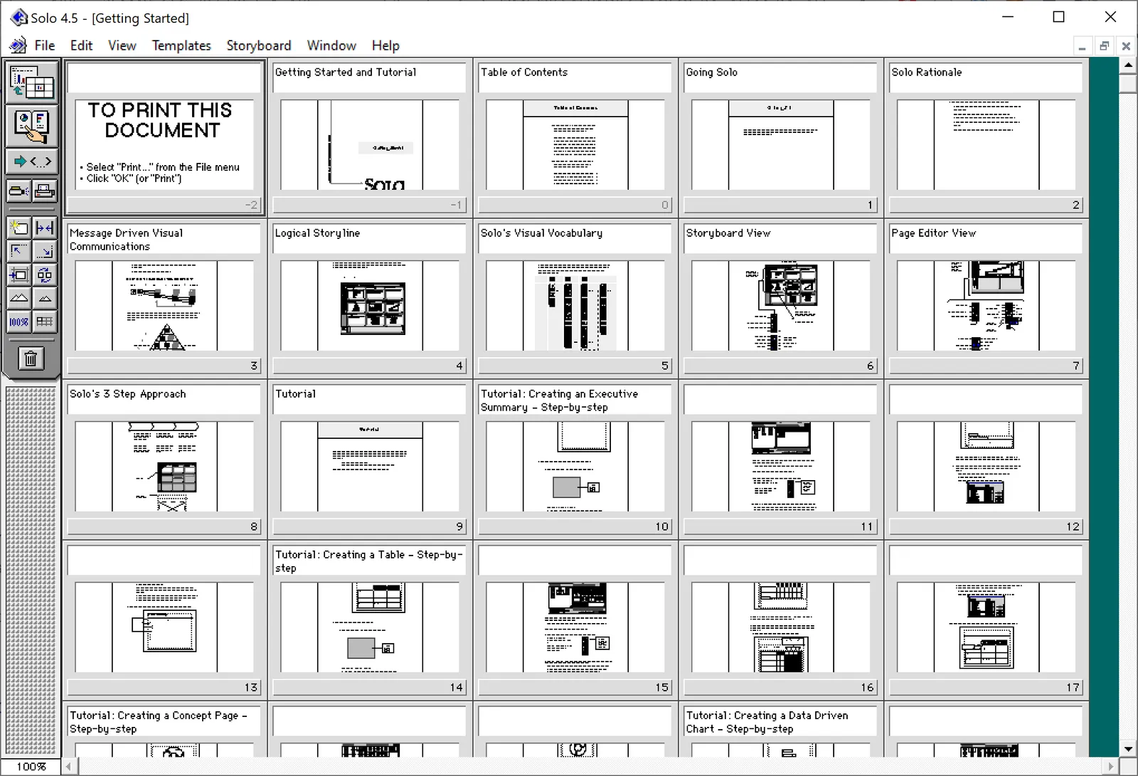
At McKinsey in the 1990s, we used ‘Solo’ presentation software to make slides. It was far ahead of its time (before PowerPoint became the standard). It had a very advanced template engine that enabled you to recreate charts in the McKinsey style. The software required some skill, and charts were usually created by professional graphics designers who took hand-drawn charts as an input. Back then, Solo would run on Macs only. Which was the reason that McKinsey issued Macbooks to their staff at the end of the 1990s, so that consultants could edit (and create) their own slides if they had to.

Ultimately PowerPoint was the end of Solo. Not because of its capabilities, but because McKinsey’s clients would have this installed on their machines, and these clients wanted to edit slides themselves. And with the advent of PowerPoint, the slide format became less consistent in McKinsey. (Both the result of a less sophisticated template library, and the reduced influence of professional graphics designers to create the slides).

I checked this morning, and Solo is still around, here is the web site: https://www.axoninc.com/. Support has ended in 2020 though. I tried installing the demo on Mac, but failed. The PowerPC engine no longer works. It does work on Windows 10 though, but I had to click a button 587 times because the license of the trial version expired 587 days ago (on 7 February 2022). Those clicks were rewarded with some good memories though, I have added some screen shots.

Continue reading →
·Story

What, how, why?

I saw these headings of a well-known story line structure being put up literally on a website in a big font size. What? Paragraph of text, how?, paragraph of text, why?, paragraph of text.

I like to use these frameworks in a more indirect way. Use them as guidelines to set up your story. Use them as a checklist to see that you covered everything, use them as a starting point if you are stuck in writer’s block, and most importantly, if they don’t work for your specific situation, pick another one or use your own.

The same applies to visual frameworks (SWOT, etc. etc.). They are designed to help you get started with grouping ideas, but if you find yourself forcing things in boxes that do not really fit, pick another one.

·Images

Backgrounds

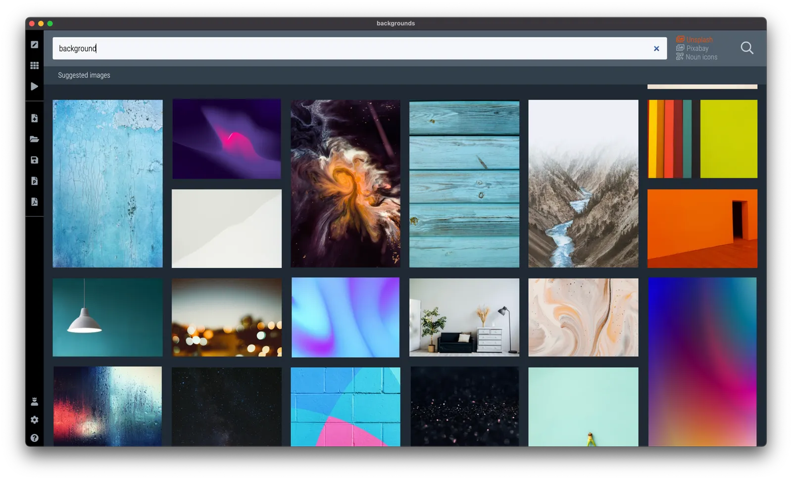
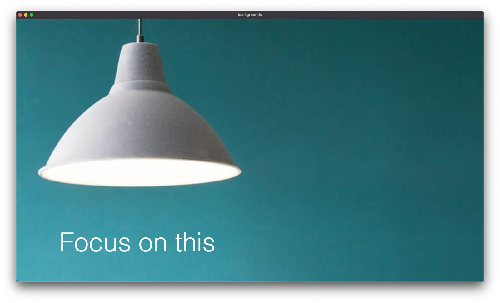
Some of the best images you can use in a presentation are those with lots and lots of white space. Photographers tend to crop images to make their subject stand out. Great for the image, but often less ideal for the layout of your slide.

Instead of searching for functional or descriptive words such as “car” or “bucket”, search for “background” or “wallpaper” in SlideMagic and something unexpectedly useful might show up.

These examples are pretty straightforward to recreate in SlideMagic, with your own background images and text. Still, I added them to the library so you can use the min your slide designs

·Layout

Your pitch deck on the home page

Happy 2022! I am returning to blogging after the holidays. Over the past week I have been busy designing the web page of our new medical startup (still in stealth, so I cannot show it to you yet…).

The more I thought about this page, the more I came to the conclusion that the web presence of this company at this stage should be a pitch deck to potential partners, rather than the usual feature list and headshots of the management team.

Most “presentations” on web pages are either a static gallery of images/screenshots, or an embedded video., but this layout does not look very good across a wide range of unpredictable screen sizes. For a chart to look good on different screen sizes, and more importantly different aspect ratios (phones are portrait, computers are landscape), you need to break the fundamental layout of the page.

Most slides have the classical title-on-top, content-in-a-rectangle-below layout. For my site, I changed that to 2 squares, one of which takes the role of the slide title with a big written message, and 1 with a supporting graphic. The layout changes depending on the device you are watching the site.


This layout change is common on web sites, but it is used a bit randomly. Pictures and text blocks move around disconnected depending on the screen size. For a “presentation” you need tighter control.

Another major problem for a web designer is rapidly changing content. It is common to make small and big changes to pitch decks all the time, while websites are relatively static. To solve this, my experience with SlideMagic came in very handy. I wrote a simple chart engine that reads “slides” with their titles and shapes in a simple format, and then renders them on the screen in the desired aspect ratio.


Continue reading →
·Typography

Sorting text by length

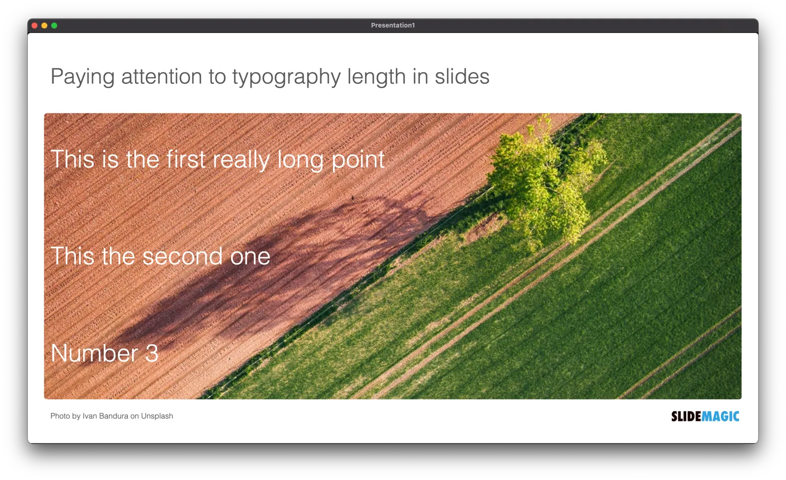
In slide design, every detail counts. Pay attention to the length of text blocks when putting them on a page. Sorting them by length can give an interesting visual effect. Or the other extreme, picks words on purpose so that the length of each text box is more or less the same.

PS. How did I get the picture? Search for “diagonal" in the SlideMagic app and you get lots of suggestions

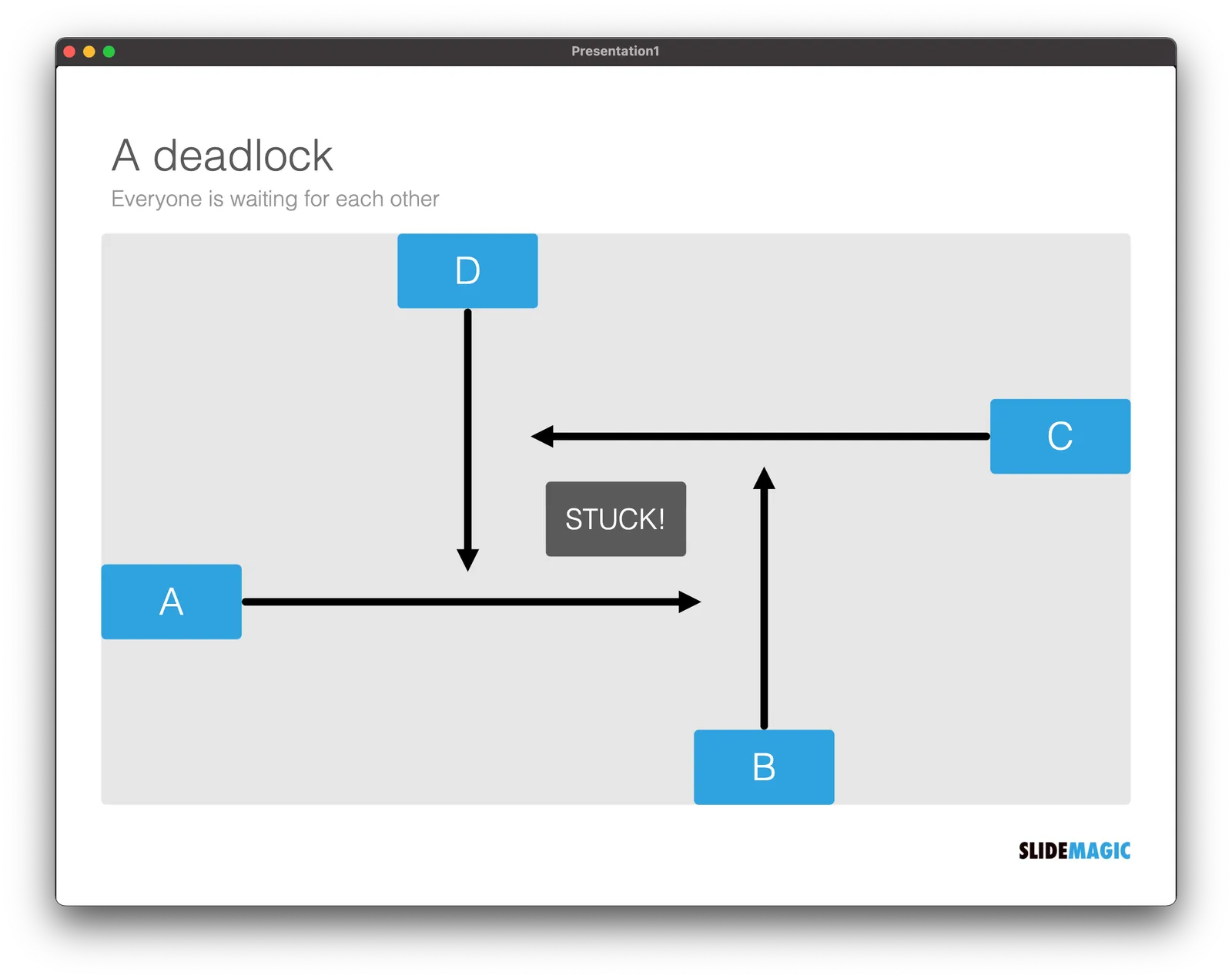
Stuck!

I needed a chart today that showed how things are in a deadlock, everyone is waiting for each other, and as a result, nothing happens. I added this new design to the SlideMagic library for you to use.

·Layout

Dynamic layouts

For my next venture, I am actually getting into a lot of “slide” design work: displaying financial data in a web browser with totally unpredictable screen sizes and screen aspect ratios. This problem has been solved for traditional web sites with text and pictures. (That is pictures where you do not really care how they are cropped).

For financial information, this is not the case. Spreadsheet-like tables that look good both on a 27” widescreen monitor and a smartphone screen, for example. All this layout work is not the core of what this venture will be about, but I am learning a ton that can feed back into SlideMagic. And vice versa, the SlideMagic chart engine, could take data from this new system and create presentations pretty much on the fly.

To be continued.

·Layout

Not a very good Apple slide....

This Apple slide from a recent product launch event looks very non-Apple…

  • Busy, lots of information
  • Font sizes all over the place
  • Big 13x, 11x, 2x, but hard to read what is improved
  • Rounded edges are too rounded
  • The grid is broken
  • Imbalance: some boxes have heavy dark images, bleeding off the edge, others have no images…
  • Look at the font styling used for “thermal”

The people and design budget at Apple can do better than this…