SlideMagic Blog

Frequent updates about all things presentations since 2008. Subscribe to never miss a post.

RSS
all posts

Search results for “windows”

·Hardware

Logitech MX Master 2S review

My recent deep dive into the writing code (More than 1000 lines and counting) forced me back on the Windows platform to make the best use of Microsoft’s development tools (see an earlier post). The biggest problem I faced with the Apple Magic mouse: wild UI swings when navigating PowerPoint slides because of the imperfect calibration of the glass touch surface in Windows 10.

So, I got myself a Logitech MX Master 2S mouse…

I burnt through many of these clunky mice in the 1990s and 2000s and actually liked them, except for the “silky” silicon covers of them that would turn sticky after a year of use.

This Master 2S version got rid of that silicon by the feel of it. Yes, it is bulky and looks nerdy but I must admit, it feels actually a lot more comfortable to have something you can rest your hand on when working all day. That resting is the big problem of the Magic Mouse: by design you cannot really rest your hand on the touch sensitive glass, your hands is always hovering above it, requiring constant energy. On Mac, the calibration works, on Windows it does not.

Instead of the glass, the Logitech mouse has scroll wheels. The vertical scroll is brilliant: you feel a clicking resistance when while moving slowly, but the wheel starts spinning smoothly when you race up and down (pages of code). Horizontal scroll is another (small) wheel on the side, which is definitely less natural than the Magic Mouse.
Continue reading →
·Software

Microsoft, please beef up the PowerPoint web app API

There are 2 types of software approaches for writing add-ins for Microsoft Office applications: so called VSTOs, and web applications. VSTO is the older technology. It integrates deeply into Office and the Windows operating system, code is written in C#. This restriction to Windows is the reason that all PowerPoint plug ins and extensions run on Windows at the moment. The web application API is the newer approach, allowing you to code applications with standard Javascript/HTML.

This has huge advantages:

  • It runs on all platforms and devices, not just Windows.
  • Any coder who knows Javascript/HTML can hit the ground running with developing apps, a far bigger developer community than people who know their way around VSTO/C#.
  • It is a lot easier to integrate these Office web apps into existing web applications (such as SlideMagic).

I have a lot of ideas to extend PowerPoint beyond the current plugins that offer in-app access to stock photo sites but… PowerPoint is at the bottom of the priority list when it comes to API development at Microsoft. Excel, Outlook, and to a certain extend Word, get priority. Specifically, the ability to manipulate slide content is very limited (put text in the currently selected text block, or place an image somewhere on the page).

PowerPoint is the key communication tool that is used in corporates (not Word). PowerPoint is tricky to master (50% to blame on software, 50% to blame on the “eye for design” that not everyone has). Combine these 2 and it is the biggest opportunity for 3rd party developers to make a change to business communication, make a financial return for both developers and Microsoft, and make PowerPoint stand out over Apple Keynote.

Continue reading →
·Hardware

Presentations on mobile - 2018

Now and then, I go back and analyse the inroad that mobile devices have, and have not made, on mobile devices, after the state of euphoria we all had back in 2010.

As a viewing device, phones and tablets have made great progress. In a significant number of face-to-face and small conference table meetings, people are using mobiles and tablets to present theirs slides.

As a creation device though, things are not that advantaged. And now that we have apps that do  perfectly fine job at creating presentations on a tablet, we can no longer blame it on technology. Here are some reasons why it is (and will remain) difficult to create presentations on a tablet (let alone phone):

Presentation design is a creative process that requires a big, bold, clutter-free work environment. This means it will always work better with a big screen, a nice big desk to work on, and a quiet environment. Trying to type things on a small screen in a crowded cafe, or in the back of the taxi will never create brilliant presentations.

The default work setting for creating a presentation is the office, and, when given a choice, the small tablet is inferior to the laptop or desktop computer.

File management is still tricky on small screens. Having 3 presentation decks open, plus 2 spreadsheets, plus the dashboard with last quarter’s results in the BI system, plus a stock photo site, plus 4 old emails with attachments that contain slides, is by definition hard to manage on a tablet.

Continue reading →

SlideMagic data charts as a default in your PowerPoint

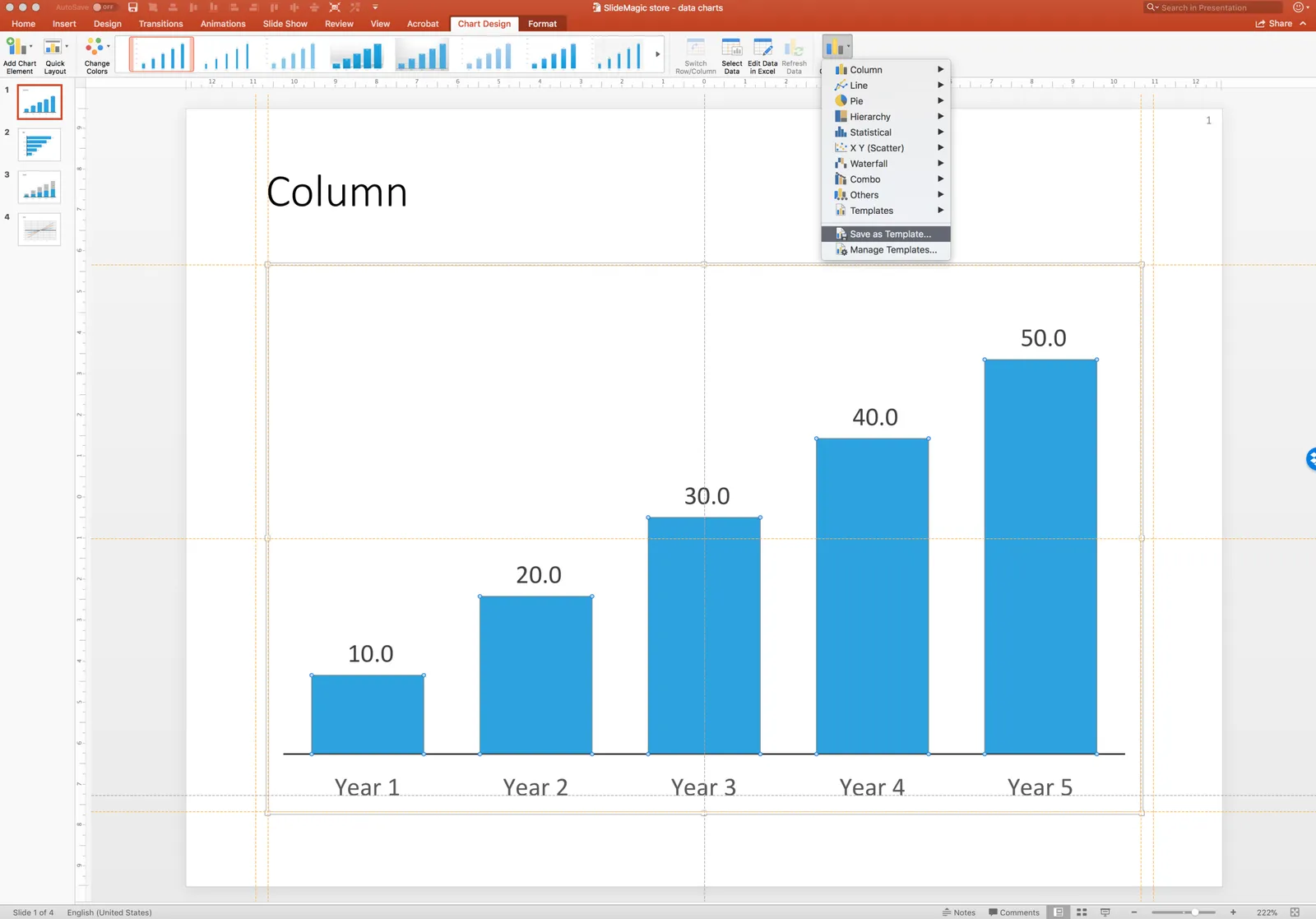
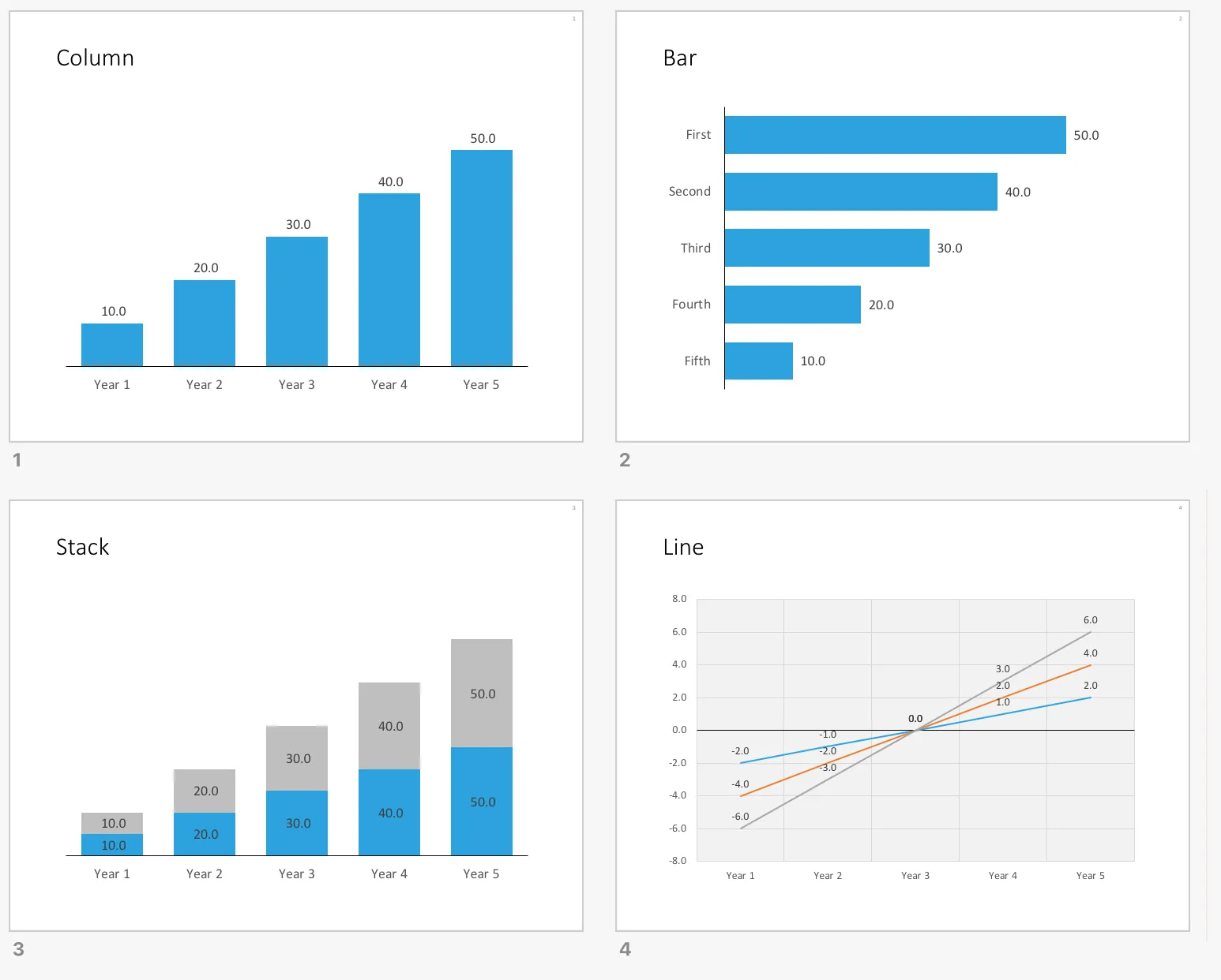
All my data charts have the same simple look and feel, inspired by the format that I started using on my first day as a McKinsey consultant.

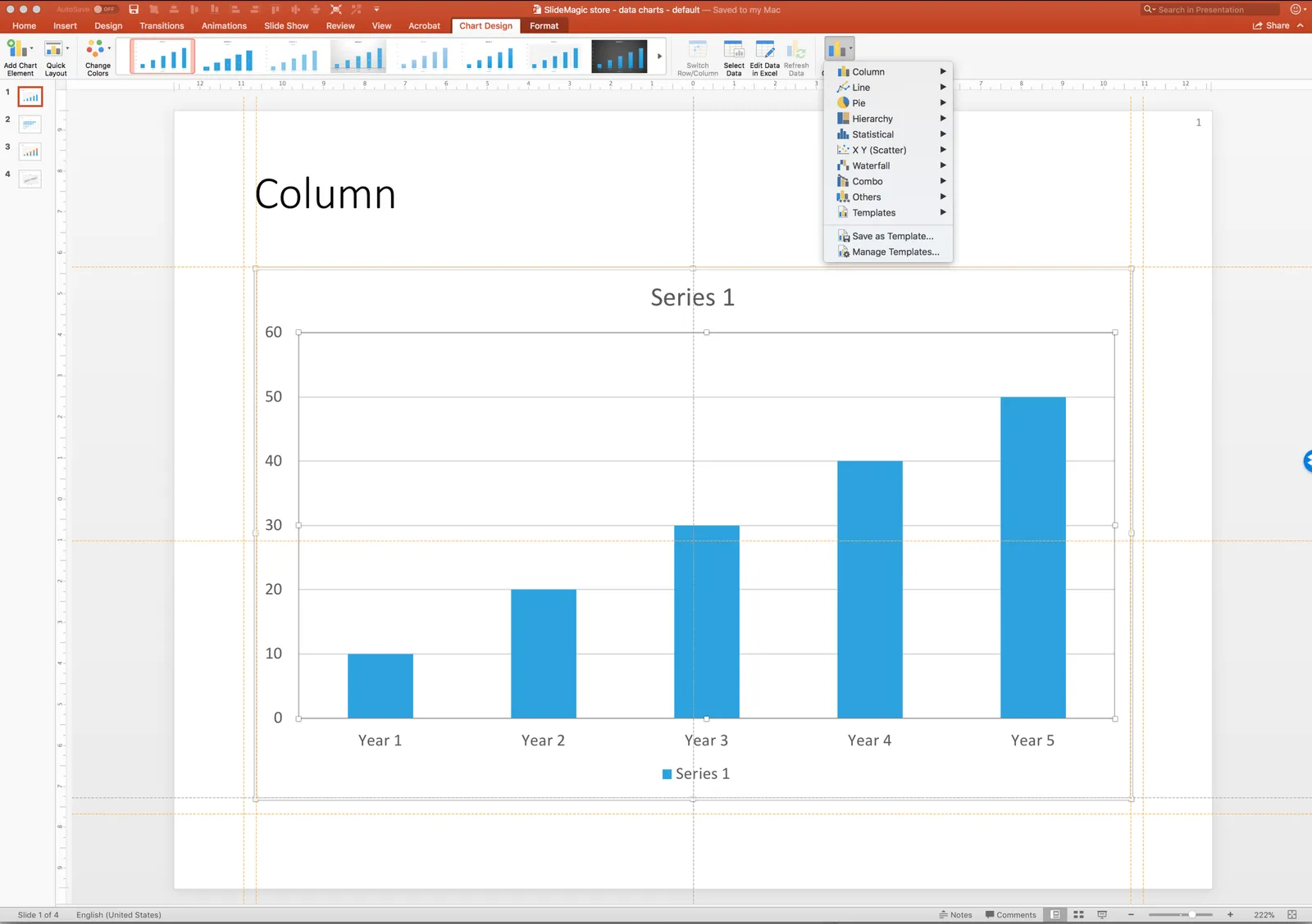
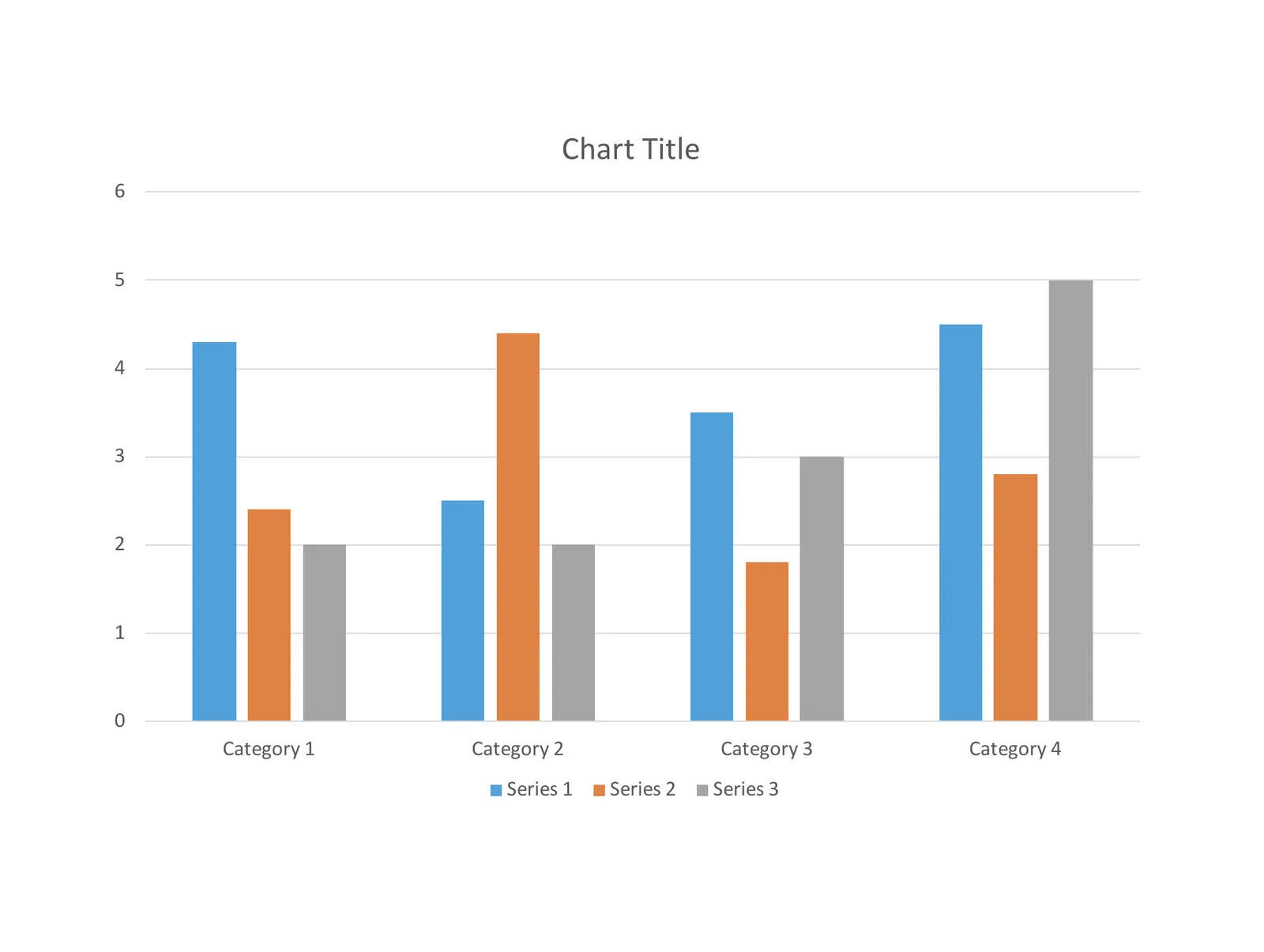
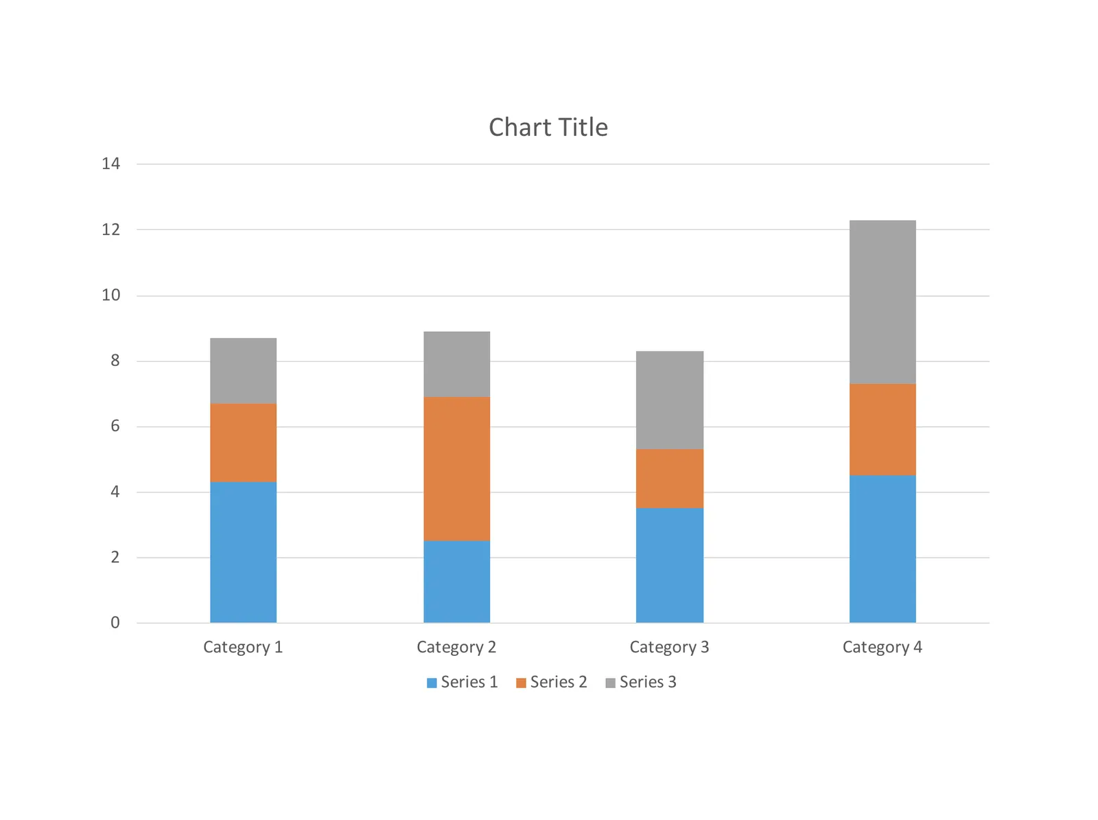
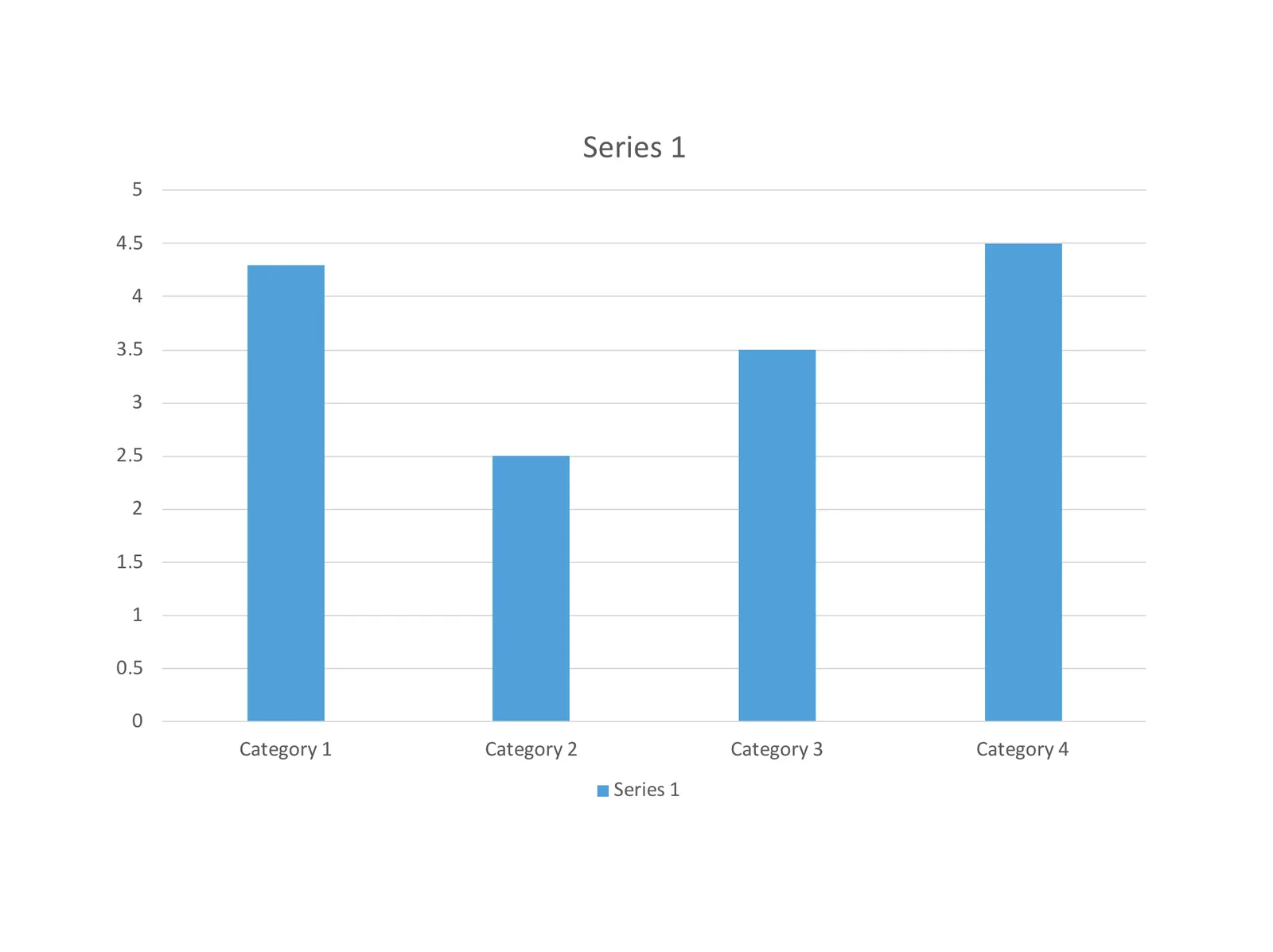
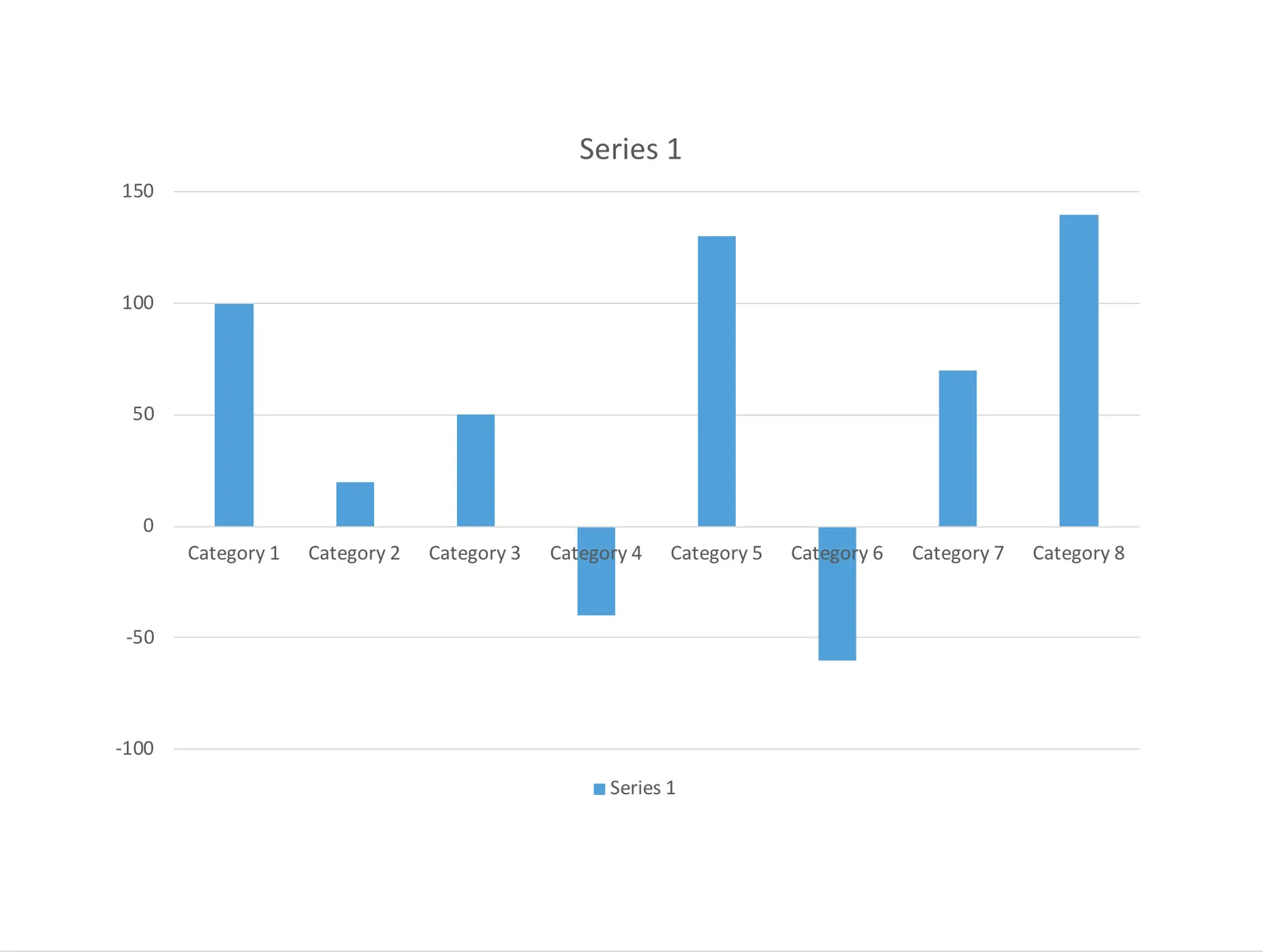
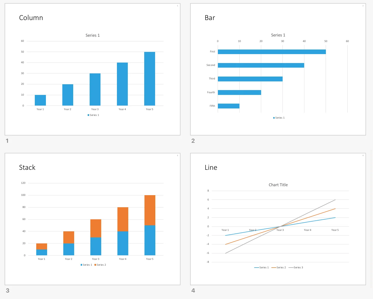
They are different from the default PowerPoint data chart templates:

I have added the above 4 simple charts to the SlideMagic template store. You can set them as templates in your own PowerPoint applications (Mac screen shot, but I think Windows is exactly the same). Select the chart, click chart design, click *change chart design,*then go to the bottom of the menu and save the chart as a template. This methods is easier than sending you the actual template files and getting you to store them deep down in the computer’s file directories.

Repeat this process 4x for each of the slide designs in the file.

Now, the next time you insert a standard PowerPoint chart, you can instantly re-format it to look like a SlideMagic chart by selecting it, clicking slide design, then clicking change chart design again, and now you will see a new option, templates, from which you can pick the file you just saved.

You can download the default data chart templates from the store here.

·Concepts

Native waterfall charts in PowerPoint for Mac

Waterfall charts have emerged in PowerPoint for Mac after a recent software update. This would be a major addition, since these types of charts are highly useful to summarise changes in data. I have shown in previous blog posts how it is possible to construct a waterfall chart starting from a regular stacked column chart, but it involves manual calculations and PowerPoint fiddling.

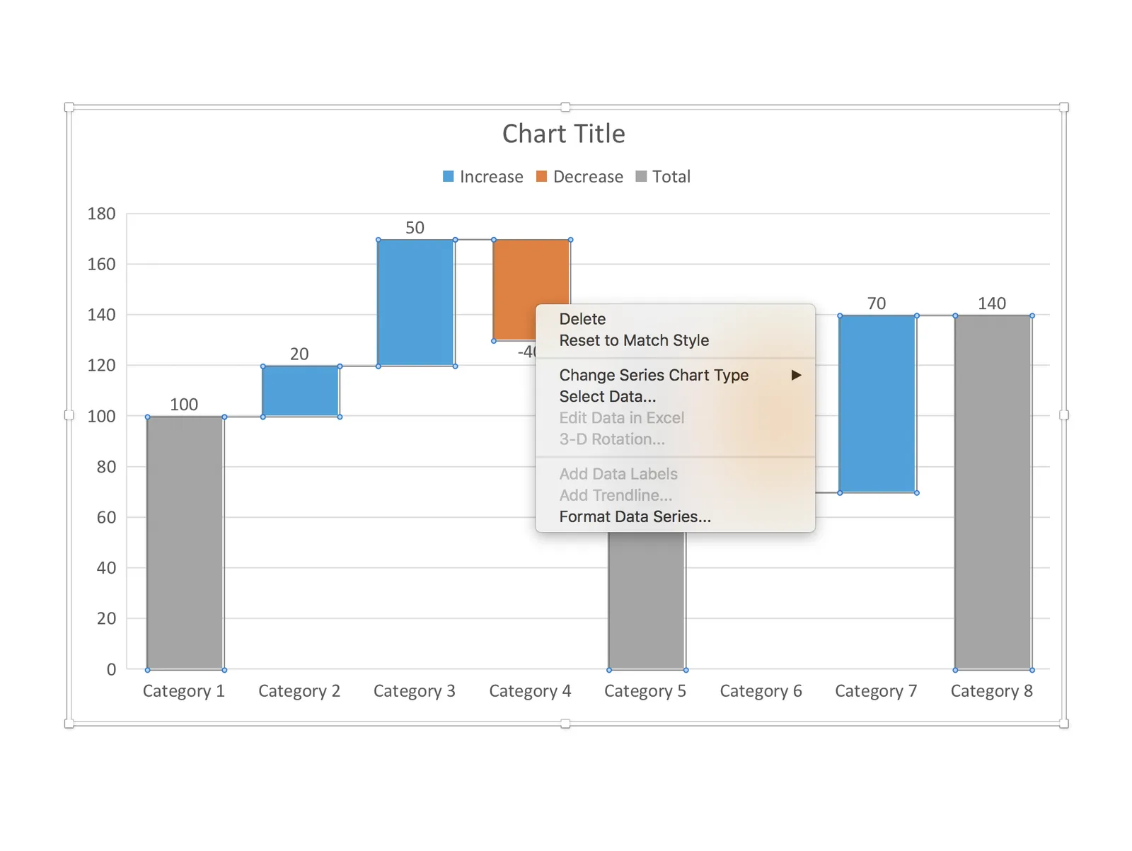
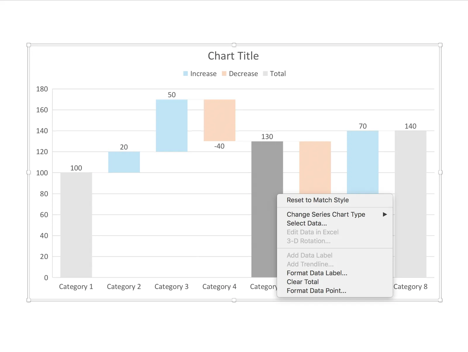
The new waterfall templates for PowerPoint for Mac are a step in the right direction, but things are not perfect (yet) though. For some reason, you cannot edit the data of the waterfall that gets inserted in PowerPoint, nor can you change the design of the chart. I figured out a work around:

 1. Data in the standard PowerPoint for Mac waterfall chart cannot be edited (

1. Data in the standard PowerPoint for Mac waterfall chart cannot be edited (“edit data in Excel” is grey out)

 2. The only adjustment you can make is selecting a cell, and then designating it to be a total column (or not)

2. The only adjustment you can make is selecting a cell, and then designating it to be a total column (or not)

 3. Work around: add a regular column chart

3. Work around: add a regular column chart

 4. Make it a stacked column

4. Make it a stacked column

 5. Delete data all but one data series

5. Delete data all but one data series

 6. Add the data you need

Continue reading →
·PowerPoint

How to export PowerPoint slides as high res images on a Mac

I am working with PowerPoint 2016 for Mac

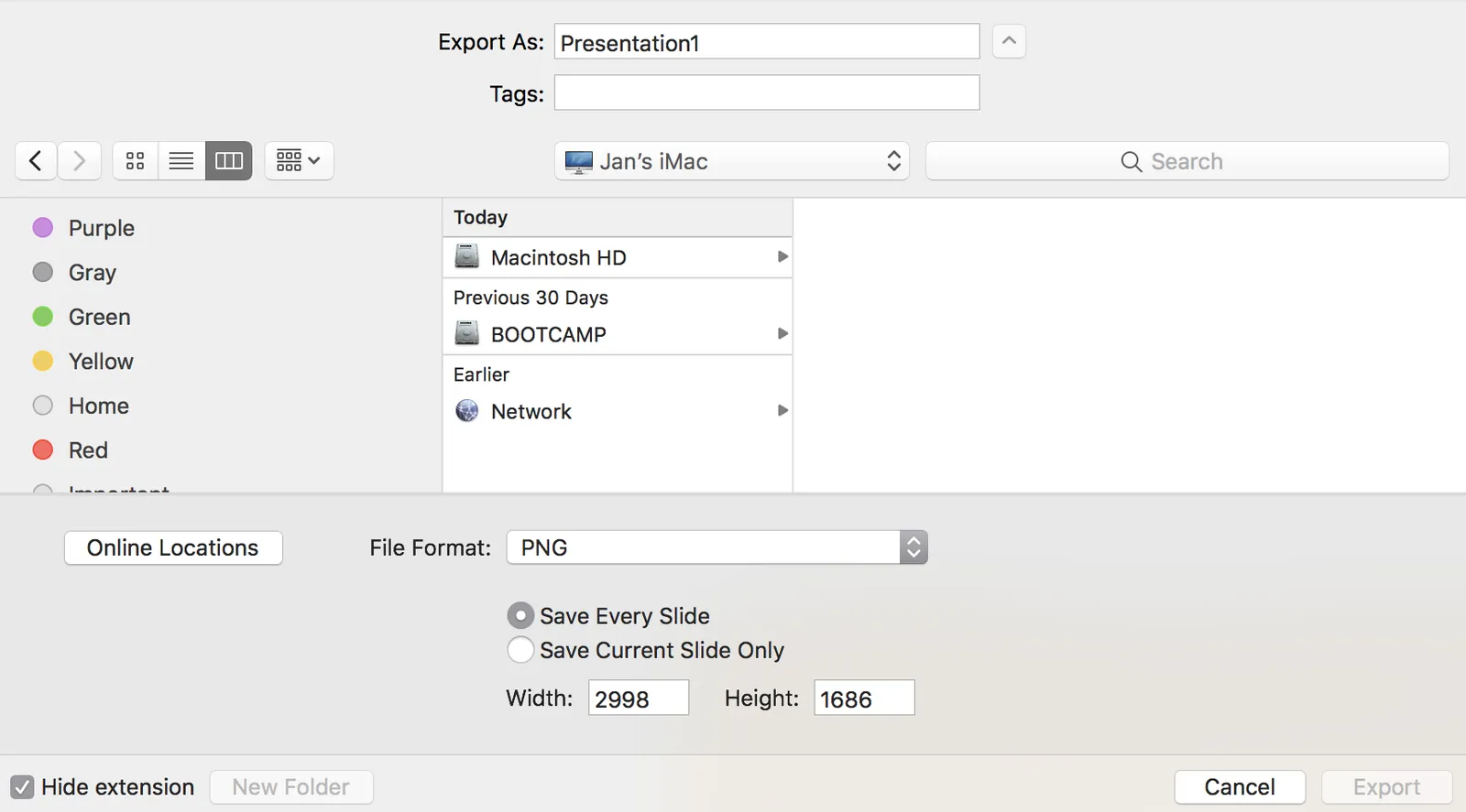
PowerPoint can export your presentation as a series of images. Go to file, export, select PNG, and you can select just one slide, or the entire presentation to be exported. In the latter scenario, images will be saved in a newly created directory.

Probably a left over from earlier PowerPoint versions, the resolution of these images has always been poor when using the standard settings. In previous versions of PowerPoint, you could somehow change DPI (dots per inch), but it did not affect the output. There are also ways to hack registry system variables (on a Windows machine, not a mac). The results have always been unpredictable.

In the most recent version of PowerPoint on mac, you are presentation with a menu in which you can enter the desired slide dimensions. This dialog behaves strangely when entering extreme values has height or width, flipping the orientation of the slides.

For some reason, I get decent pictures both in 4:3 and wide screen aspect ratios when setting the width to 2998, and the height is calculated to 1686. I have tried to understand why, but failed to do so far. It is probably not worth breaking your head over it, just use these numbers.

·Software

Maps in Excel

Microsoft has been adding some new features in Excel recently (I am using the Mac version). I am so used to working with the software that I rarely look at new feature additions, unless they are staring me in the face.

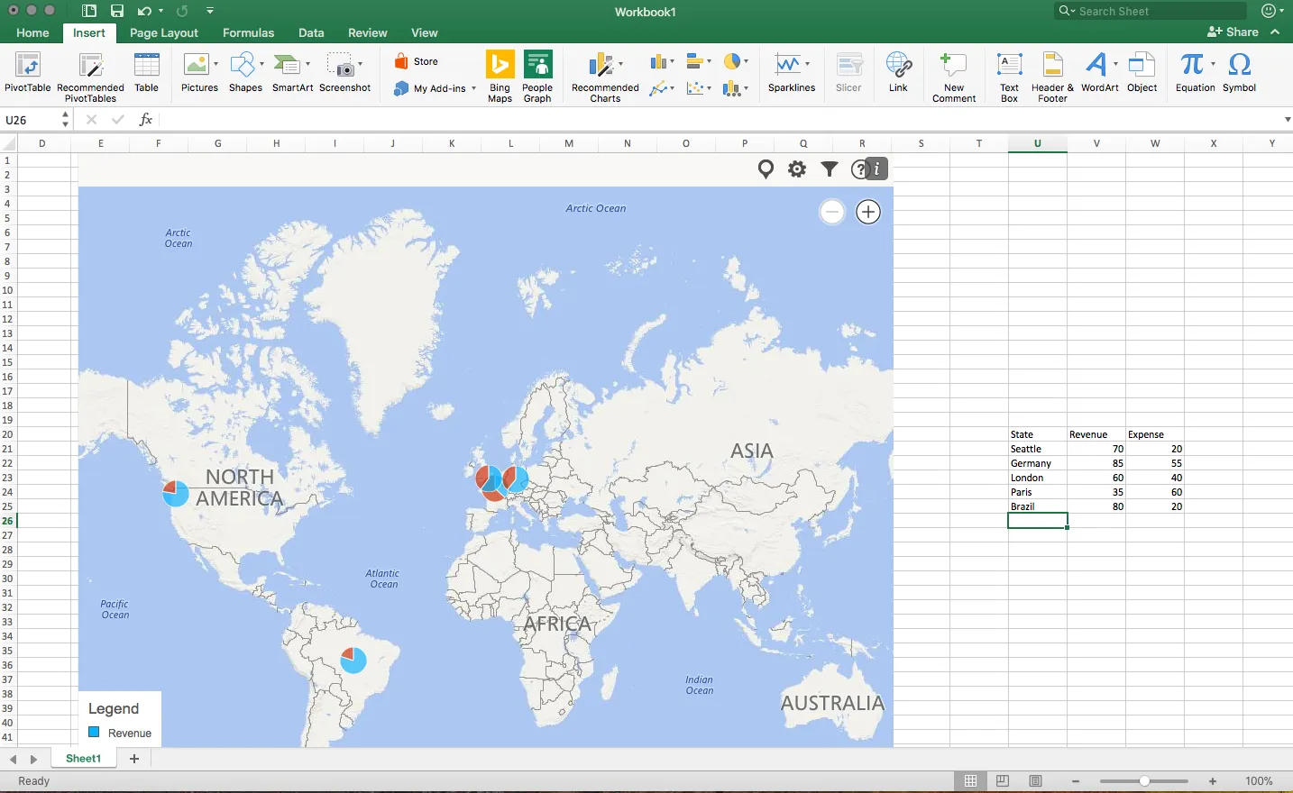
One of buttons that got my attention are Bing maps: you can now plot data on locations in a map. You enter a table with locations and a numeric value, and they get plotted in the appropriate location. The map zooms in and out. When you drag the map from Excel into PowerPoint, it becomes a static image of the last zoom level.

I think this is very useful as an analysis tool for for example a retailer who wants to visualise stock levels across its stores.

The implementation on a Mac is still a bit crude: it would be great if you could shade entire countries based on a value, conditional formatting. (I see that the Windows version is much more advanced).

Also, the graphical appearance of a Bing map is not designed with a presentation in mind. The map has lots of unnecessary clutter, and random geographical labels are displayed depending on zoom level, pretty much like the map you are staring at when the in-flight entertainment system is switched of just before your plane lands.

Hopefully the Mac version will be upgraded to the features of the Windows version soon.

·Layout

Digital car instrument clusters

I had the opportunity to drive a BMW the other day with al all digital instrument display panel. Car manufacturers have something to learn about design. The display tried really hard to look like an analogue one, reflections, depth effects, glow edges, gradients. The whole thing feels very PowerPoint 2007 / Windows 7 / Nokia to me.

Also, a digital display opens up the possibility to re-arrange how the smaller data elements are displayed (kms, fuel tank, etc. etc.), but BMW did not (yet) do that.

Car instrument panels are up for a big shake up. I think the answer is not displays that mimic analog gear, plus eliminating buttons and replace them with touch screens and menu diving. Instead, I would opt for a beautiful, minimal display of essential information, and actually, very high quality, regular “analogue” buttons.

It affects not only the user/driver experience today, but also whether cars will eventually turn into a classic or not. To make the parallel with electronics, old gear from the 1960s / 1970s can still look/work beautiful, while designs from the 1980s and 1990s with low res/poor digital interfaces look cheap and ugly. Digital displays that look advanced today, will be totally obsolete in 5 years from now.

We will see what happens.

Bad 1990s design habits

Below a repost from 3 years ago, an blog post I put out on a Medium publication that I am taking down. Putting it out here to preserve it.

You can design better presentation slides by getting rid of engrained habits that can go back decades.

Sometimes I work with teenagers to teach them about presentation design. To my surprise, they often are much better students than “grown ups” who are supposed to benefit from decades of business experience. Here is a theory why.

Transparencies for overhead projectors encouraged you to copy pages out of a book and uncovering paragraphs or key points bullet by bullet. Moving to PowerPoint, people just kept writing these bullets.

The first visuals that you felt compelled to project to an audience were data charts: lines, bars, columns. These type of graphs needed to have a title in the top left and a source at the bottom. Most slide designs today use a big title at the top left, other typography on the page is almost never bigger than the title. Very rarely, people leave the title out all together.

Pictures are low resolution and take a lot of memory, hence you can only put in small images in a presentation document that you need to email someone.

PowerPoint was created as a mouse-based drawing software, rising alongside Microsoft Windows. Everything could be dragged, and resized easily to fit. Cropping an image was tricky. The first plasma TV screens confirmed to us that it was OK to stretch an image out of proportion, as long as it fitted whatever you needed to fill easily.

Continue reading →
·Hardware

5k screens

I broke my laptop screen and was forced to rethink my IT setup. For the first time in 10 years, I went back to a desktop as my main computer: the 27" iMac and will fix up my laptop as a secondary computer for onsite client work or travel. My desktop is also connected to one additional large Thunderbolt display.

The difference between the 5k monitor and the Thunderbolt screen is amazing. After working for 1 day on the new screen, you can’t imagine having had to deal with this grainy Thunderbolt monitor for a couple of years. (The Thunderbolt screen is long overdue for an upgrade).

Two big monitors work also better than one big screen and a laptop as a side monitor. Mac OSX is still clunky when dragging large application windows between different size screens. You always had to fiddle and resize windows. Now that the monitors are more or less the same aspect ratio I no longer have that issue.

Still I believe that the fluid window-based operating system where you can resize and position windows where ever you want them creates messy work environments. Mac OSX needs some sort of grid structure where you can snap things into place. Maybe an extension of the new multi-app feature that is now part of iOS.

When going back to desktop you need to budget for one more piece of equipment: a backup battery (UPS). The power goes down, your computer goes down. Apple should have put in a 5 minute battery that enables you to power down the machine orderly in case of a power failure. The latter we tend to have here in Israel in the middle of the summer when air conditioners drive the power grid to its maximum capacity, or in the winter when violent thunderstorms hit power lines.