SlideMagic Blog

Frequent updates about all things presentations since 2008. Subscribe to never miss a post.

RSS
all posts

Search results for “web design”

·Advertising

The power of repeat - redux

Computers love to repeat things. You should use it in your PowerPoint presentations. Control-C / control-V the same object over and over, making sure that things are aligned and spaced properly. The resulting chart is both busy and calm at the same time. Possible applications:

  • There are lots of these things arond
  • It’s crowded
  • We’re different (2 out of the 234 sheep in this ad are different for example)
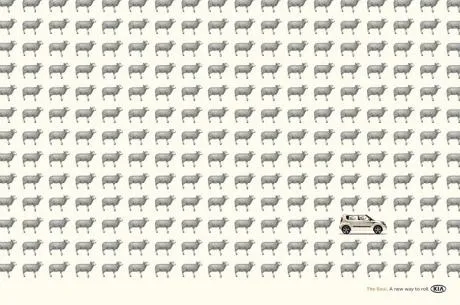
“Repeats” are sometimes used to compare values in infographics. I do not think that this is a good application of the technique. Use repeats to talk about one variable, use regular bar charts to compare things.

Via Ads of the World.

·Design

Think of the 3rd dimension in stock images

99% of PowerPoint slides and 99% of stock images are 2 dimensional: showing an object or a shape on a flat background. When looking for your next stock image, try picking out those that add 3 dimensional depth.

The image of the flower field above (bought on iStockPhoto) is a good example. The whole point of the picture is the depth, not the objects in the photograph.

  • Taken very close to the ground
  • Focus close to the lens
  • Lines that come together to disappear at the horizon

A good image to support something that goes on and on and on, or a new and untapped source of information that all of a sudden becomes available.

·Design

Logo repeats - bullet points in disguise

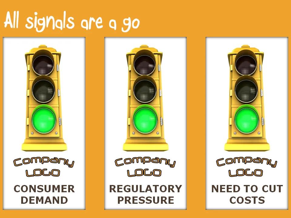
I often use a “logo repeat” technique to hammer home a set of interesting assets a company has, or a number of favorable forces that are helping a company. I must admit that these slides are bullet points in disguise, but the repetitive use of logos and other graphical elements make them powerful somehow.

·Design

Use regular polygons to place objects on a slide

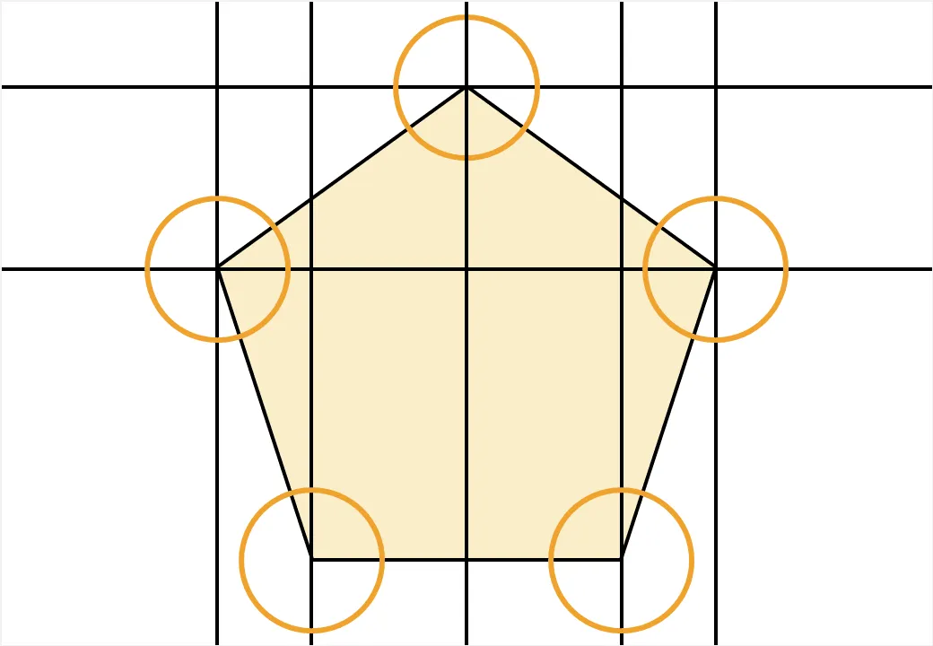
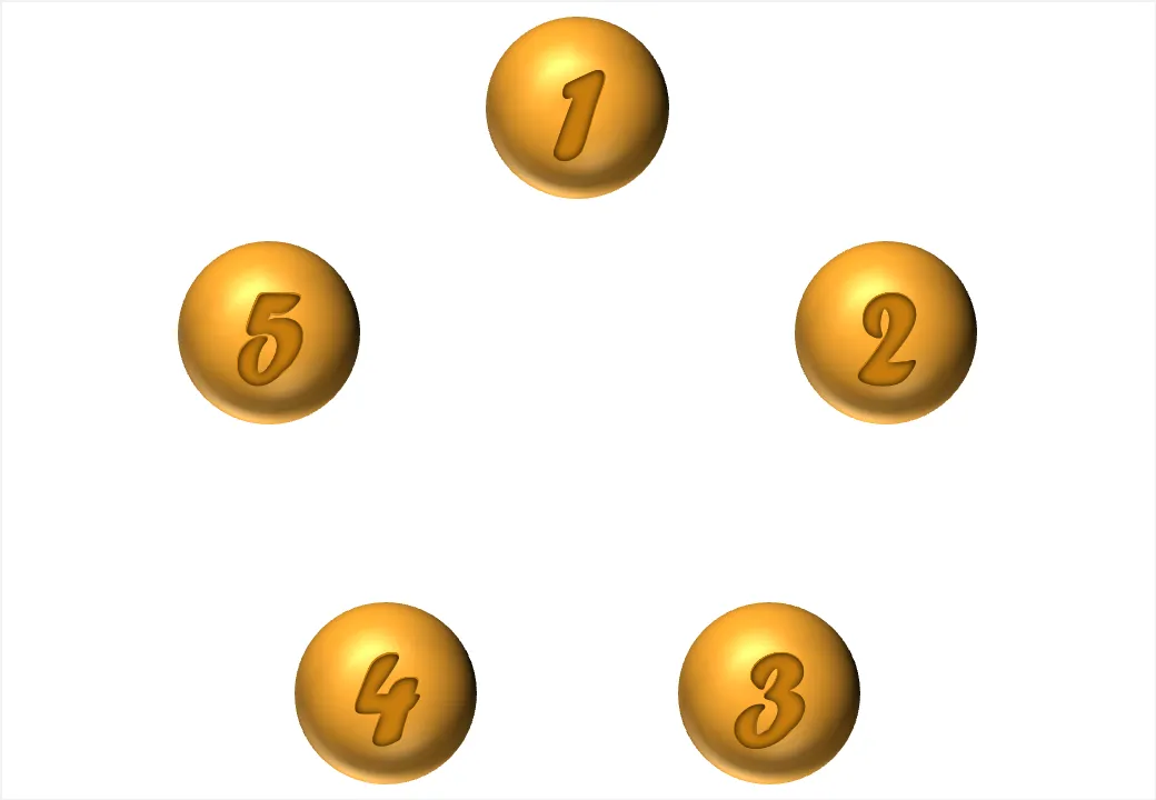
You can use geometrical concepts to get the perfect spacing of objects on your slide. Use the corners of regular polygons (all angles are the same, all sides have the same length) such as regular triangels (3), squares (4), regular pentagons (5) to position your objects with the aide of a few guides that you can remove later.

Note that you can draw regular polygons in PowerPoint by holding down the shift key to lock the aspect ratio of any shape you are drawing.

·Design

Online tilt-shifting image manipulation tool

Tilt-shifting is a photographic technique that creates images with very narrow depth of field. It can be used to take real images and make them look like photographs of miniatures. The site tiltshiftmaker.com creates the effect for you. It works best with images with lots of detail on the foreground: houses, cars, people. An example from the tiltshiftmaker site, a town on the Amalfi coast in Italy.

Via GeenStijl

·Concepts

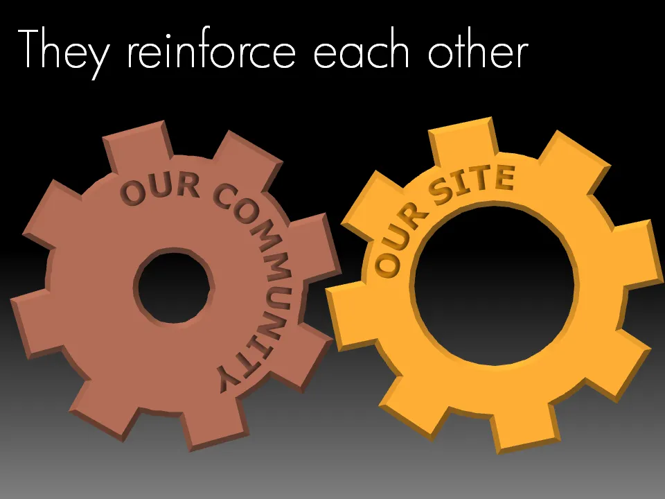
Chart concept - look, they reinforce each other!

Sometimes two things go together hand in hand, they make each other stronger. Big interlocking wheels are a great way to show this in PowerPoint. Add some nice circular text and here you go. Resist the tempation to make them turn using an animation though…

·Concepts

Chart concept: slowing down

This cover of a PwC report is an example of an excellent use of images.

  • You get the point instantly, even from a far distance, the concept is right
  • Both the report cover and the image have lots of “white space
  • The image is a completely natural and real one, no artificial models, compositions
  • There is a great sense of depth and perspective in the image, search “sheep + road” in a stock photography site and you get a whole bunch of very unexciting pictures
  • The picture is cropped nicely, see the road running on the golden proportion
  • The image colors blend in with those used in the report (blue highlights)
·Design

George and Martha and leveraging audience anticipation

Weekend reading. I was reading some stories of George and Martha this weekend to my children, and was reminded of a great blog post by Nancy Duarte about leveraging your audience’s anticipation in your presentation. Let them do a bit of the work as well, rather than just sitting down while being spoon-fed with content.

The “slide” with the grinning George is a more powerful one than Martha walking away to get a towel while the information conveyed is the same.

The images are scans from this book. Recommended for any parent.

·Design

Oops, forgot to sanitize my speaker notes before emailing the presentation...

Speaker notes are a great tool to prepare a presentation. You can write out your thoughts in sentences, independent from the visual structure of your slide (sequential instead of parallel). In PowerPoint presenter view, you can display them on your own computer, while the audience only sees the clean slide.

Speaker notes are usually somewhat hidden. You can see them if you have the editing window open at the bottom of the slide edit screen, or when you print the notes pages. It is easy to forget that you’ve entered them.

Nonetheless, they are an integral part of the PPT file. You send the PPT, you send the notes. So be careful in case you use notes to add side comments like “note to self: do not bring up the poor 2008 performance! :-)”. A sure guarantee that it will be brought up during the presentation. UPDATE: Akash Bhatia provides a wonderful solution in the comments. I have re-written my post below:

One solution could be to send a PDF version of your docoument. But there is a smart feature in PowerPoint 2007. Hit the Office button, select “prepare” and then click “inspect document”. It lets you purge all kind of personal information from your presentation, including presenter notes. Make sure to save your file under a different name before saving.

·Design

Address your obvious weaknesses in investor presentations

Taking two more slides from my presentation about investor presentations.

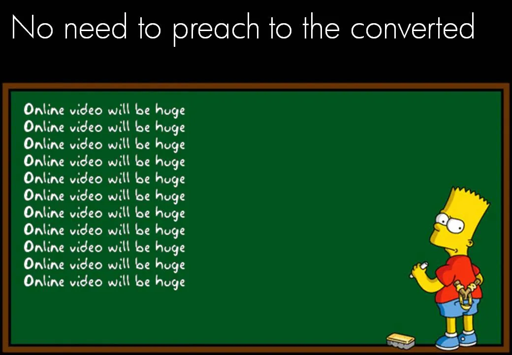
There is no point in going on, and on, and on about something that is already common knowledge. Everyone assumes that online video will be a huge market. (Of course, we could be collectively wrong). Don’t spend your valuable presentation time on this.

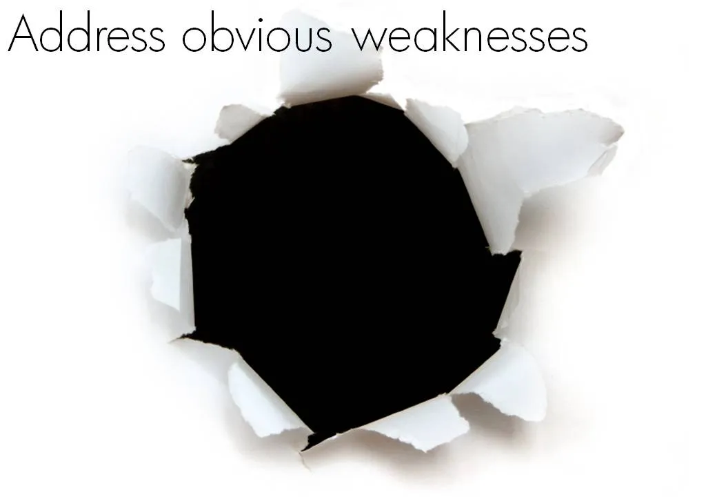
On the contrary, focus on your obvious weaknesses. Highlighting weaknesses does not mean shooting yourself in the foot by bringing up details that harm your investment case. Instead, think what questions any intelligent human being would have when listening to your story. There is no avoiding. If you don’t address them, the questions will remain.

“So, you are trying to build a page rank-based search engine?” “Yes, exactly, you picked that up fast. Let me show you our cool technology and some pretty impressive first search results” Wrong answer.