SlideMagic Blog

Frequent updates about all things presentations since 2008. Subscribe to never miss a post.

RSS
all posts

Search results for “web design”

·Advertising

Chart concept - can't see the forest through the trees

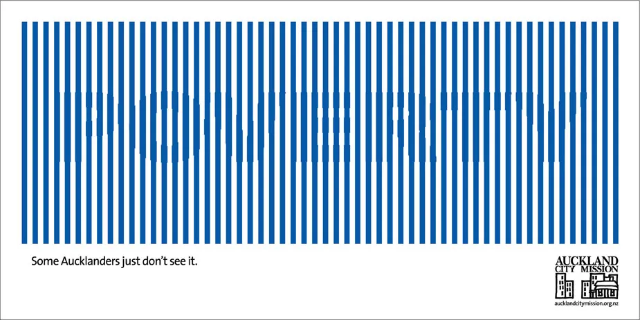
Sometimes you can’t see the forest through the trees. How to visualize this? The ad below uses a technique that can be copied easily in PowerPoint: a huge word/sentence in a bold font covered by a set of fat, spaced out stripes in the same color as the text. Via Ads of the World.

·Concepts

Cool - make your own picture mosaic

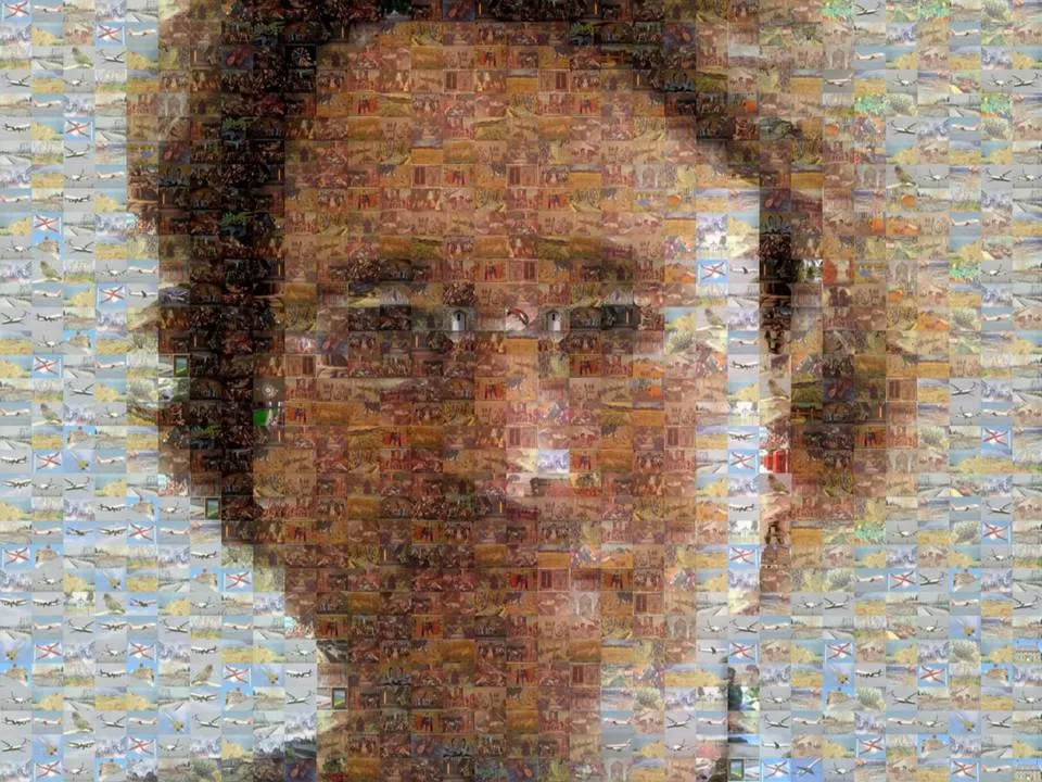
Many new technologies in enterpriseA software help you see the bigger picture that is hiding in various bits of information and data scattered across the organization. One option to visualize this in a presentation is through impressionism (painters such as Monet).

Another one is through a photo mosaic. This ancient post on Engadget still holds. You can download the software AndreaMosaic here. It’s freeware, as you as you give it credit when you use it. Hereby. Installation and use instructions can be found on the site.

·Concepts

Chart concept - the chain reaction

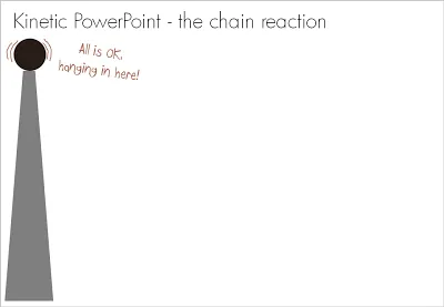
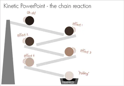
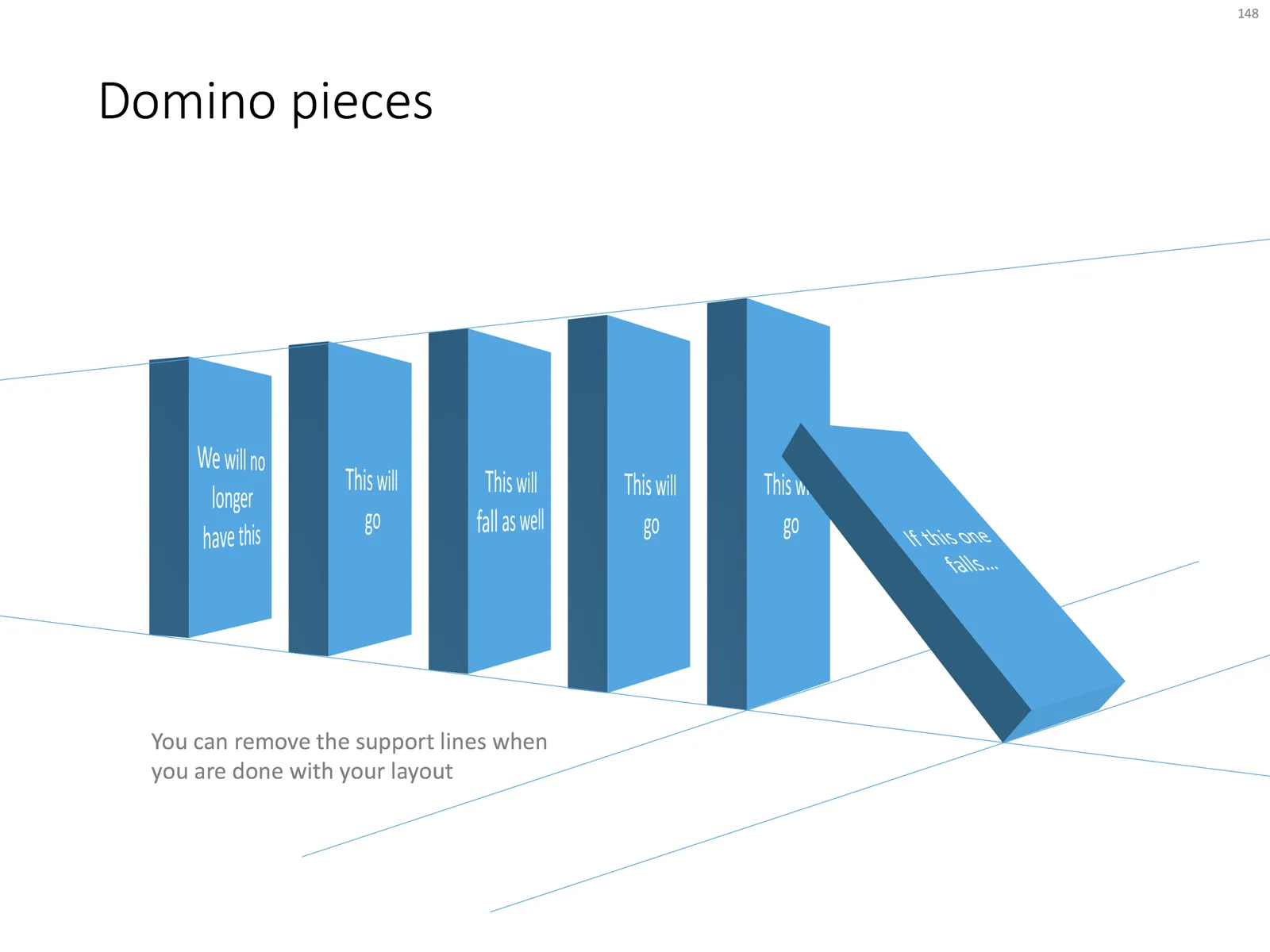
Sometimes a stable situation can easily be knocked out of balance, triggering an irreversible chain reaction of events. How to visualize this? A nuclear mushroom might be slightly too explosive. An image of a series of falling domino stones might be too cliche. Here is another idea based on a toy:

UPDATE: if you would like those domino stones, there is not a template with dominoes ready for download.

·Advertising

Experimenting with "real" textures

While I am getting a bit tired of stock images (first only the cliche ones, and now actually almost every image that is not real), I find new inspiration in textures of real-world materials (there are lots of these on stock image sites). See the ad below for the folding bike (via Ads of the World).

Do not forget to compress your images before saving. High-resolution textures can consume a lot of disk space on your computer and as an email attachment.

·Books

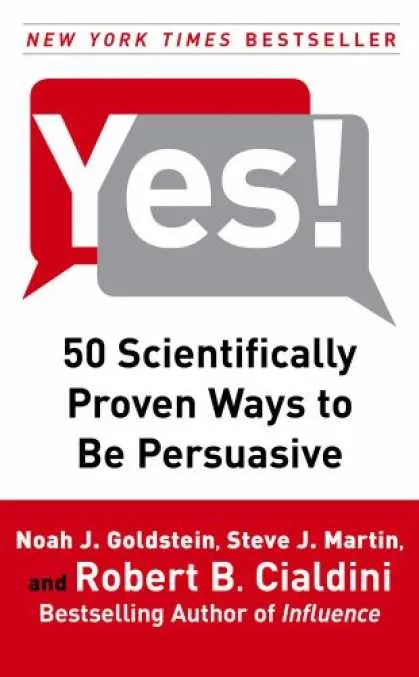
Book review - Yes! 50 scientifically proven ways to be persuasive

The book Yes!: 50 Scientifically Proven Ways to Be Persuasive is the “sequel” to Influence (earlier review here). Building on the approach of Influence, the book discusses 50 techniques to influence people’s behavior. A psychological science experiment is the basis for each technique: the results are discussed and general lessons are drawn out.

As both books are similar, so is my review. The research case examples are great, the generic lessons are sometimes a bit dry. It could have been left up to the reader how to use the findings. There is a lot of overlap with techniques presented in the first book, if you do not have tim to read both, I would recommend reading Influence, since it takes you through the process of thinking about psychology in a more fundamental way when trying to persuade others.
Reading this book once again confirms the potential for visual communication. A lot of these psychological experiments involve people allocated in groups (test group, control group) and various changes in the experiment. Putting the outcomes in simple tables or graphs would have made it much easier to understand the outcome. Now, the reader is left to plough through the text and construct the visual picture in his/her head. Some of the 50 techniques in the book are more powerful than others, some are more relevant to the field of presentations than others. A few here:

  • Create a bond with a group. “The majority of people who stay in this hotel room re-use their towels”
  • Create scarcity: “If operators are busy, try calling again”
  • Very relevant for presentations: watch out for data that can backfire. “22 million single women did not vote”. “Hmmm, that’s a lot, maybe I shouldn’t either?”
  • Create 2 extreme options around the desired outcome: people usually buy the middle-priced wine bottles in a restaurant. (Useful when presenting strategic options to your Board)
  • Big threats don’t work, people block them out. “Smoking kills”. You need to complement the threat and provide an easy, step-by-step action plan to solve the problem.
  • Hand-written post-it notes as a message really work. Thing about adding that personal touch to your presentation slides (by using selective hand-writing fonts for example)
  • Get people to write down a goal at the beginning or the end of the presentation, it dramatically increases the probability that they will act
  • Ask people whether they would be willing to do something later on. If they respond, they are actually more likely to do it themselves in the future.

Continue reading →
·Advertising

Filling charaters with an image (redux)

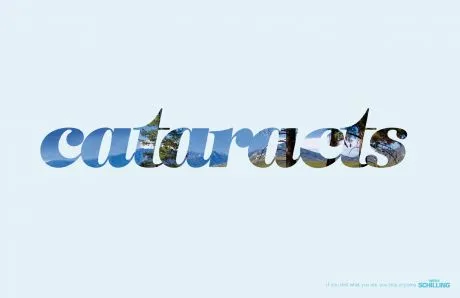
This ad (via Ads of the World) reminded me of an earlier post showing that you can also achieve this effect in PowerPoint (2007). It only works with huge, huge characters. The ones I used in my original post are actually not big enough.

·Data visualization

Visualizing 1 in 8,000

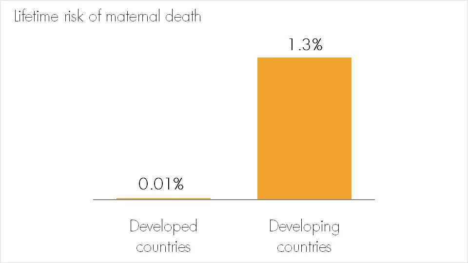
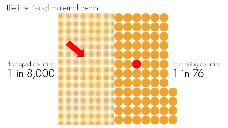
Bar and column charts are my favorite data visualization tools. I do not like pie charts, although they are in theory the best way to highlight relative proportions. Both of these graphs break down when you try to visualize very small proportions. In these cases I fall back on a technique that simply repeats the number of objects on a slide as done in the example below:

Note that especially for small proportions, it is very hard to internalize what things mean. “A 1.3% chance? That’s seems OK. What, 1 in 76? That’s a lot!.” Tap “1/x” on your calculator to translate a probability into a “1 in” number. For example: 2% translates into 1/0.02=50, 1 in 50.

More information on the issue of maternal death here.

·Design

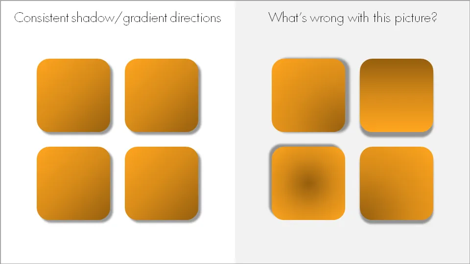
Consistent shadow and gradient directions

When using drop shadows and gradients, pick an imaginary source of light to guide in which direction you want to put your shadows and/or gradients. And then: use them consistently on the slide and possibly throughout your presentation.

Now that we are on the subject. I am not a big fan of these effects in general. In the example above, I emphasized them on purpose to illustrate the point of direction. Normally, I would use very subtle drop shadows only small chart elements that really need to stand out (example). Gradients, I use only to simulate a 3D effect.

·Concepts

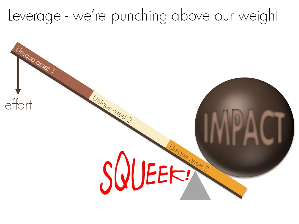
Chart concept - punching above our weight

OK, I admit, a previous chart concept on leverage might have been a bit hard to get for someone who forgot the physics of pulley systems that was discussed in highschool. This chart says the same thing, but simpler.

·Design

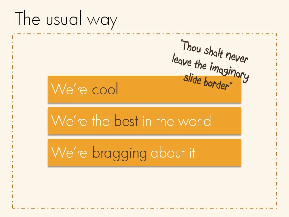
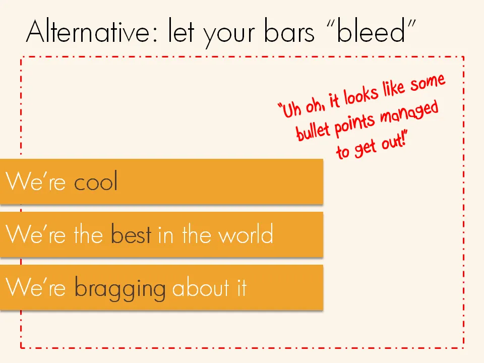
Breaking that imaginary slide border

Pictures are not the only objects that you can have “bleeding” off the slide. Regular text boxes work as well. Especially beautiful over an image.