SlideMagic Blog

Frequent updates about all things presentations since 2008. Subscribe to never miss a post.

RSS
all posts

Search results for “mckinsey”

·Keynote

Is this our strategy?

Young companies often have an ambiguous strategy. Nobody is really clear, and everybody has a different interpretation. The moment you need to write a press release or an external presentation it all has to be clear. That is why it can take a long time to agree on 1 single page of text.

·Keynote

Entire story on 1 page

Sometimes it is useful to frame your entire story in 1 table on 1 page. The other day, I had a client in the semiconductor industry. The story centred around 3 things that matter (the column headings). Then, the rows were: first: current product features, next row: why they cause problems, next row: what bottleneck you need to overcome to solve this, next row: how the bottleneck is overcome, next row: alternative product features. In a written management consulting report, you can stop here. A live presentation requires more work. The presentation design challenge is now to take this boring table and turn it into a compelling story, spreading it out over many pages and many minutes. The table is a little cheat sheet to make sure you have captured everything.

·Investor presentation

Consultants cannot pitch

The other day I was asked to provide input on a pitch deck prepared by a respected consulting firm. The idea was the result of a consulting project, the results of which for document in a hefty, detailed, and structured document that everyone agrees was great for reading background material, but not really right for presenting/pitching. The team took the first step by cutting down the number slides (not changing them) in an executive summary presentation.

My advice for consultants who want to pitch: start from scratch and design a completely new presentation specifically aimed at selling, pitching, fundraising and leave the big data Bible as back up.

What goes usually wrong in executive summary decks that are created by chopping slides out of a master pack? Some examples.

  • The team has probably been working for months on the project and as a result, they see the discussion of the problem as totally trivial and cut down a lot on the charts that adress the issue, most of them probably generated early on in the project, or even during the project definition phase. The consultants forget that to the outsider who hears about the issues for the first time, it is not that trivial. On the contrary, it is often easier to pitch the problem, than to pitch the solution.
  • The problem section usually involves data, and consulting data charts are loaded with facts and figures and tables. Most consultants actually violate one of the cardinal rules of one message per slide. Go back to your drawing board and pick one statistic/trend that is really crucial to sell your problem and make a super clean/clear data chart that just shows that, nothing else
  • As we get to the solution the consultant often forget to describe what it actually is. We show histories of how the initiative has been used in other parts of the world, who is involved, but hey: what is it that you actually want to do? To the consultant it is obvious, to the audience not.
  • Describing the initiative or its impact can be done in dry text bullets with low emotional appeal. But why not use pictures? Show the project in action. Profile the people that benefited from it in big page filling images. Create human stories. People relate to this much better than dry data. Yes, I want to help this girl in the picture!
  • Consultants are always shy, and hesitant to take a strong position. (Yes, you could take option B but it has these disadvantages and it depends on this scenario C panning out that way). As a result, it is actually unclear what is expected from the audience: contribute this amount of money to do X, Y, and Z. Get over your shyness, and spell it out the call of action bluntly.
Continue reading →
·Keynote

Skip the methodology

As a management consultant (or a scientist) you had to crack a very difficult issue: what approach to take to solve a particular problem or get to some insight. Once the approach was nailed, the rest of the work was relatively easy (sweat work rather than think work).

It is tempting to use this thought process as a structure of your presentation. Here is the problem, here is the theory behind it, here is our methodology, here is the data analysis, and finally, here is the conclusion. Most scientific papers are structured this way and kids get taught this approach in school/university.

This works if your audience also consists of management consultants and scientists. In most other cases, just talk about the problem you tried to solve (the actual one, not the approach issue) and then go straight to the conclusion and results.

·Keynote

The consulting presentation

As a former management consultant, I can say it: consultants make very poor presentations. But what about these fancy looking documents full of graphs (exhibits as they are called)? Well, they are decks meant for reading, not for presenting to a live audience.

And as documents intended for reading, they are pretty good. Consultants have replaced a word processor with a slide design program, which adds more writing freedom:

  • It is easier to add data charts and data tables
  • It is easier to add structure to a text (frameworks in consulting speak)
  • It is easier to group edit a document that consists of 1-page-1-topic that can be shuffled

Still, consulting reports meant for reading can be designed better: cutting jargon and using simpler language (synchronising key performance indicators across behaviour segments takes up a lot of space and does not mean much to the layman), and think better when to use data charts (often one single data point gets put down in one single column chart with one single column).

Now, this document is great for people who have been deeply involved in the project (consultants on the team, team members from the client). To win over the hearts of people who will see the recommendations for the first time, a whole new presentation needs to be designed from scratch. And unfortunately, most consulting firms do not make this final step.

·Keynote

The tiny legend

Many consulting charts feature a tiny legend in the top-right corner that explains what the shading in the bar chart means (for example “Have no access to clean drinking water”). Often that is the whole point of the chart and that legend deserve to be made a bit more visible.

·McKinsey

Strategy deck <> pitch deck

The other day a client showed me a pitch deck that a management consulting firm had prepared for them. Having been a consultant myself, I recognized it immediately: structured, organized, logical, dense. Great to solve a problem and/or convince an analytical audience with lots of facts.

Not good enough to make the sale: a good sales presentations needs to touch both the heart and the mind. Consulting presentations touch the latter, not the first.

Instead, put the consulting deck aside and start from scratch. What is the story you would like to tell? Sketch visuals without borrowing / Frankensteining / recycling charts from the consulting presentation.

·McKinsey

Rubber stamping a business plan?

I had a phone call with a potential client yesterday. He needed an investor presentation but also was interested in a full business plan.

There are different documents that both are called business plan. One is a stack of files (spreadsheets, gantt charts, PowerPoint slides) that contains the company financials/budget, competitive analysis, and development mile stones. In short: real content. It does not have to look pretty.

The second one is a long document created in Microsoft Word in which market research data is copy pasted (IDC says our market is $1bn), the company opportunity is described with lots of buzz words, and so forth.

You need the first one, you can forget about the second type of business plan. They take forever to write, they take forever to iterate, and as a result they are always out of date. No one reads long written text. Brad Feld and others have called them obsolete.

My client admitted that the business plan job was simply a matter of writing up material that was already there. He was willing to invest lots of money and 2.5 months of work with a consulting firm to have the document rubber stamped, paying for the logo on the front page.

I think it is a waste of money, time, and effort. If the only thing the consulting firm does is write down stuff that already exists, investors will look right though it and judge the investment opportunity based on your content, not the way in which it is written. If it is market data you are after, pay for the market data directly, rather than by hiring a consulting firm in the middle.


Continue reading →
·Software

Training AI on presentations?

ChatGPT is good at writing fluent text because there is lots of quality text around on the Internet to train it on. Most text online is at least grammatically correct, and a subset of online content is of some decent quality at a story level (books, reports, professional news websites, etc.) . Midjourney can make up great images because there are lots of images around to train it on, they do not even have to be that good in terms of composition, the pixels in an image add up to an accurate representation of something.

Now with presentations though…. There are fewer of them around online, and most of these are actually not that good. Even if you were to feed let’s say McKinsey’s entire archive of decks into an AI model, would it be able to produce a McKinsey-style deck based on a prompt? Maybe. But the result would be a consulting-style, dense document, not an engaging pitch deck.

·Data visualization

Combining column and line charts

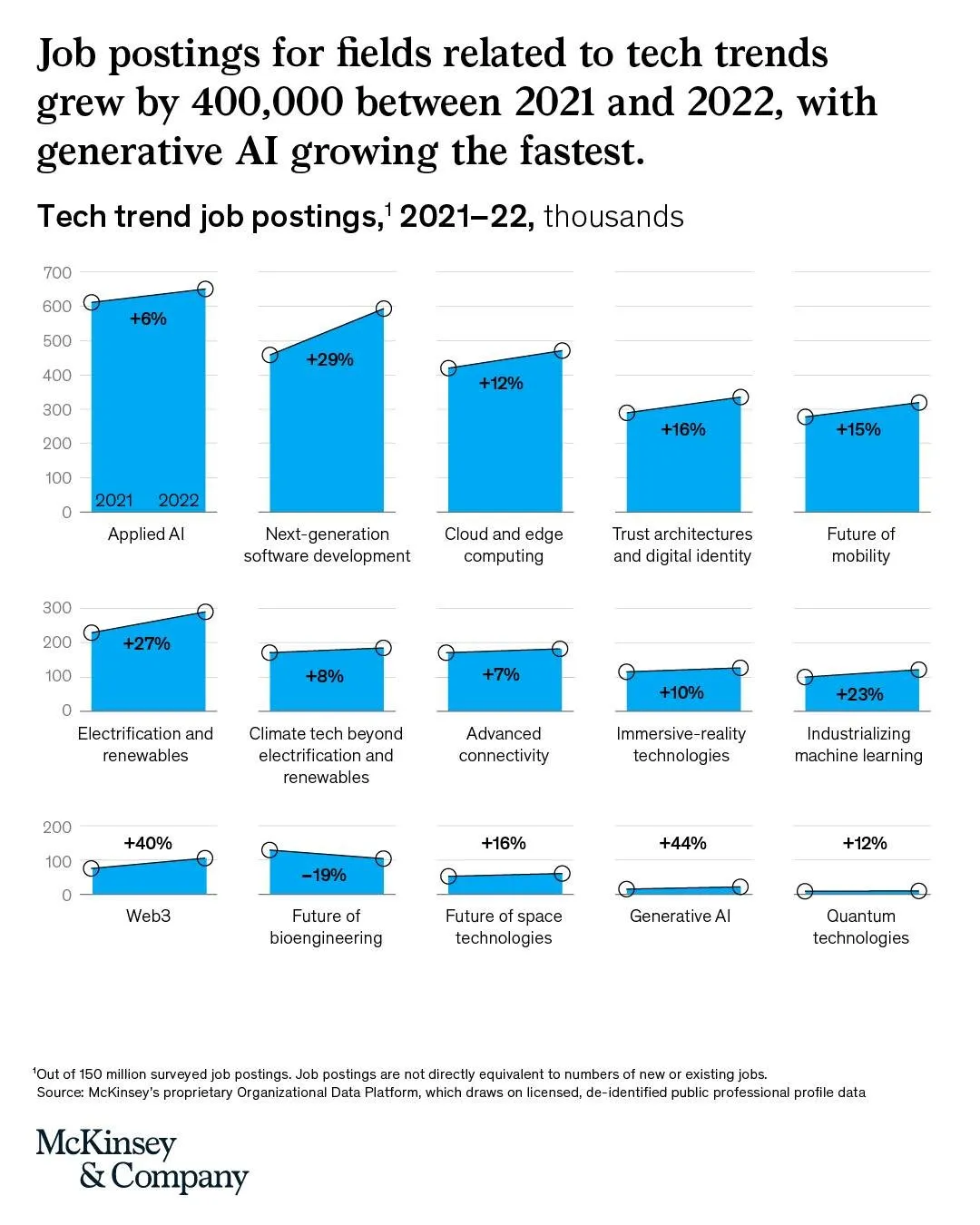
Below is an interesting chart from McKinsey. It combines a column chart with a line chart. The chart only works when a column has a reasonable size though.

I am not aware of any presentation software that can produce these (including SlideMagic), so this might have been bespoke illustration work.

Link of the original post.