SlideMagic Blog

Frequent updates about all things presentations since 2008. Subscribe to never miss a post.

RSS
all posts

Search results for “web design”

·Design

Review: Slideboxx, a PowerPoint search engine

I have been testing Slideboxx over the past day (Windows-only). Slideboxx is a tool that crawls all PowerPoint files on your computer (it counted more than 5,000 on mine…) and stores visual thumbnails and keywords of all the slides in a searchable database. You type in a keyword, you get instantly served icons of matching slides with options to refine your search, find similar slides, and even “frankenstein” (what?) a new presentation from old slides.

First of all, there is a real need for a tool like this. The legacy Windows filing system based on file names and application icons is useless for visual files such as PowerPoint slides. I am now using Gmail to track down presentations (“where is that file I sent to [x] a month ago?”) because a date, a keyword, and a person is a better clue to what I am looking for than a location on a hard disk.

There are more companies developing professional solutions to dig through data stored in enterprise networks, not just PowerPoint, but including spreadsheets, PDFs, databases, etc. BA Insight is one for example.

Back to Slideboxx. The software is easy to install, the interface is nice and clean, and the program is very powerful to dig up long-forgotten slides.

For someone with a lot of slides who makes presentations for one company, or related to one subject area, the tool makes a lot of sense, and could actually be a significant time saver.

For my 5,000+ files the search results are sometimes a bit too broad, I would love to have an option to narrow searches actually by a folder on a hard disk. Another approach would be to add generic presentation tags to all slides in a presentation. For example the company name on the front page of the deck, the name of the presenter, the subject of the presentation, the items of the agenda, each of these are relevant to all the slides in a presentation, while they might not be written down explicitly on each slide.


Continue reading →
·Design

Story in flat images

Some images contain an entire story. While it is hard to match the effect of this photo in an everyday presentation, you should at least try to use cinematic effects in composition: suggest movement, create tension of something that is about to happen, but has not yet. The man who is about to open the door creates a much stronger visual, than the image 5 seconds later of him escaping the women’s dressing room.

The original ad can be found here on Ads of the World. (By the way an example of an image that is grey, but not really grey)

·Concepts

So how many different types of slides are there?

I think there are 4 different type of visuals,  Have I forgotten any? (The images below are taken - out of their context - from previous posts on this blog)

  1. Big picture, big emotion slide. A huge image of a squeezed orange “the competition is killing us!”, a big picture of an audience asleep “presentations are boring!”, swimmer dives in the pool “let’s go for it!” (lot’s of cliches here, but I have seen many good ones as well). These slides are an emotional shortcut, they unlock an idea/feeling that is already present in everyone’s brain quickly.

  1. Location port, a big image of a place, a street, a country, a customer. Pretty much like a movie director opening a film to bring us to a different time, a different place. An image of the interior of a messy store is much more powerful than a list of bullets: isles are not straight, labeling is unclear, lighting is poor.

  1. Relationship slide. Shapes/boxes with text, arrows, to show how issues are related, impacting each other, are dependent on each other, sit in different places on the same map.

  1. Data chart showing us a trend, or comparing numbers.

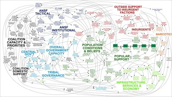
An incredibly dense relationship or data chart should actually be in the “location port” category, the U.S. army spaghetti chart is an example: it is not so much about understanding the chart in detail, rather the viewer understands immediately that “it’s complex” (earlier post).

Continue reading →
·Data visualization

Sync those charts

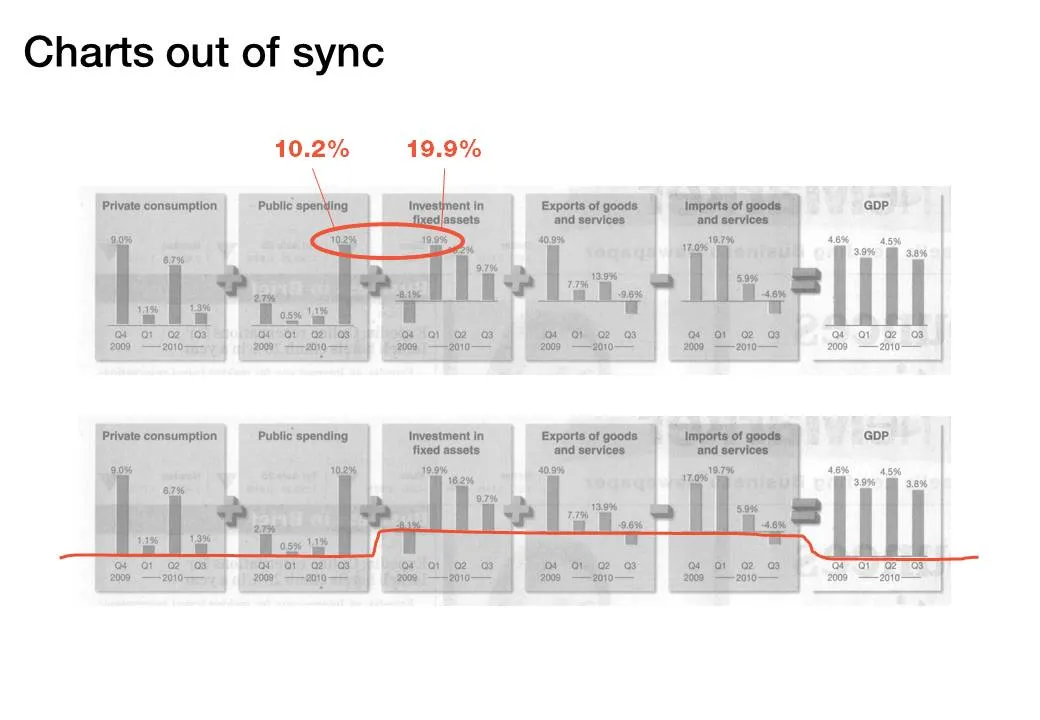
The idea behind the chart in the Haaretz newspaper is a good one: breaking the GDP growth up in its components (click the image for a bigger picture). The charts are not aligned very well:

  • The horizontal axis are not aligned
  • The scale of the vertical axis is different for each chart

·Data visualization

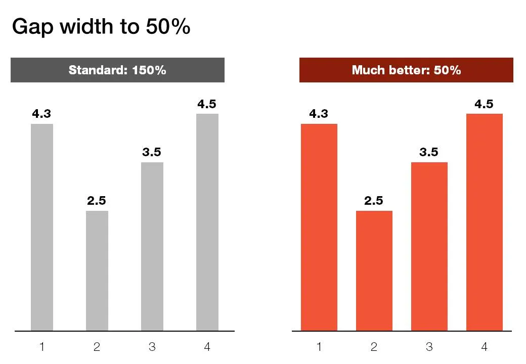
Gap width to 50%

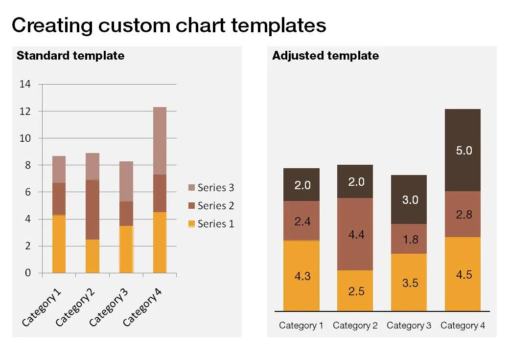
Microsoft PowerPoint sets the standard gap width between columns or bars to 150%. Graphs look much better if you set it to 50%. Right click the columns/bars in your chart, select format data series and lower the gap width value.

·Design

Showing versus describing

Describing is an indirect way to convey a message:

  • We have systems in 3 countries
  • They are maintained on different time schedules
  • Five different departments are interfering with maintenance

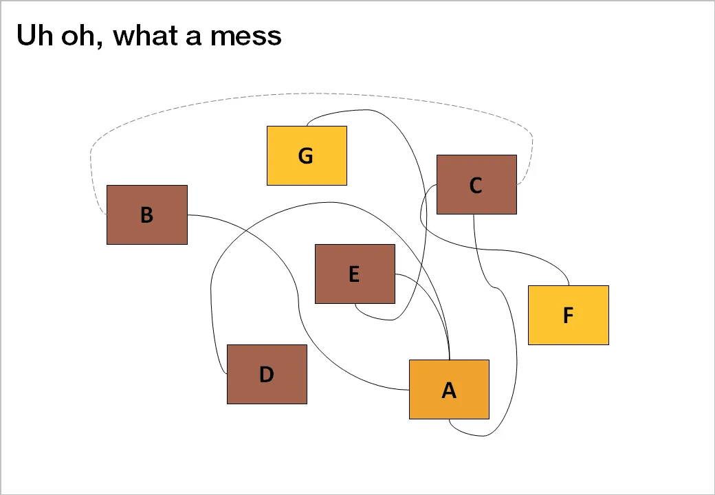
In short, it is a mess. The bullet point chart above does not convey the message very well. Why not show the mess and create a chart with boxes for each of the countries, the departments and connect them with arrows color-coded by time to show what’s going on.

The chart will be busy, the chart will be dense, the chart might even be incomprehensible, but hey, you wanted to convince your audience that it is time to do something about this? No better way to do it.

Image credit: Mr. P

·Concepts

Chart concept - negative lettering space

Here is a cute idea for a slide: negative lettering space. Computerarts.co.uk has a full tutorial how to create this effect here. It is easy to copy in PowerPoint: start with a word in a huge font on a page, set the font color light grey (or another color with a light contrast to your background), fill the page with the images you want, and as a final step delete the text or color it the same as your slide background.

Here is a search for earlier posts with a “can’t see the forest through the tress” type of concept.

·Design

Getting the best creative commons images via Flickr

Stock images are often staged, not natural, lacking spontaneity. Images with a creative commons license on Flickr are an excellent alternative, with one drawback: it is a bit harder to find the right image.

Here is what I do. Now and then I take a Flickr “deep dive” and just randomly browse/search images not using a functional key word such as “chair”, “pilot”, or “apple”. Rather use characteristics that a photographer would use to describe an image. As an example, see what a range of beautiful images comes up when searching for “focus”.

Browse through the images and bookmark them or save them to a tool such as Evernote for later use. An example, a very detailed image of the Manhattan Bridge by See-ming Lee.

·Design

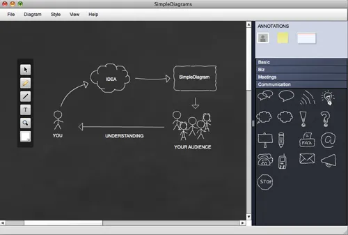
Simple diagrams creates well, simple diagrams

Simple diagrams (link) is a nice little tool to create simple sketches in the spirit of Dan Roam’s book “The back of the napkin” (review). You can either use it as a sketch tool to develop ideas, or as slides in your presentation. The extreme scenario would be to create an entire presentation out of these types of diagrams.

The program uses aggressive pop up messages to get you to use the full version. There are more subtle ways that will get to the same effect.

·Concepts

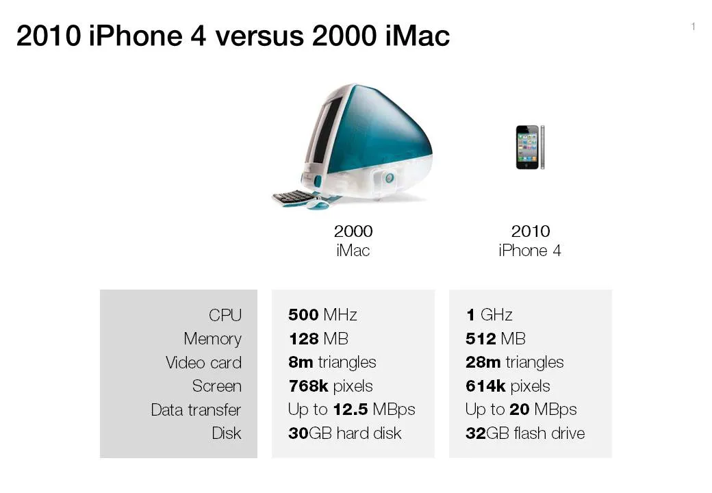
Chart concept - 2000 iMac versus 2010 iPhone 4

A chart concept I used yesterday in a client’s presentation to demonstrate the progress of personal computing technology over the past decade (technical details taken from this post by AdamH).

There is no point to construct complicated bar charts to compare the values of the technical specifications, they are similar (the point of the chart). Rather what is important, is to shrink the image of the iPhone so that it’s more or less to scale with the much bigger iMac.