SlideMagic Blog

Frequent updates about all things presentations since 2008. Subscribe to never miss a post.

RSS
all posts

Search results for “web design”

·Delivery

Timing your elevator pitch

Sometimes there is little time to do your pitch. You meet an investor in the corridor, you got a slot at a pitch competition. Seth Godin said the other day that no one has ever bought anything in an elevator: in other words a very short elevator pitch consisting of 2 sentences with hollow buzz words is not going to excite an investor.

Instead, you need to add more specifics to intrigue the investor to invite you to another occasion where there is more time to discuss your idea.
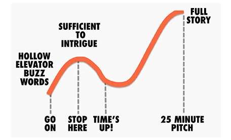
But sometimes, elevator pitches become less effective when you take too much time. You start adding details, provide facts, that take the energy out of your presentation, that require time to close all all the plot lines. There is a dip between the perfect short pitch, and the full-length 25 minute story. Do not get stopped in the middle, it is better to keep it short.


·Delivery

Tricky, those switch-overs

Switch-overs of technology during a presentations are always tricky. That is why I hardly ever recommend clients to use videos played in different software and live demos in short presentations. The worst case scenario happened last night at the school Hanuka event of my daughter.

After the performances of all the groups had been completed, this series of events unfolded:

  1. Mic: “After all the songs we already sang, we will just sing one more, really, only one”
  2. Full lights on in the room, everyone blinking
  3. Mic: “ There are huge amounts of donuts waiting for you outside the room!
  4. People struggling to put up the small PowerPoint projection screen again with lyrics (you can see it behind the band)
  5. People running around the stage looking confused at papers with lyrics, pianist and guitarist flicking through pages
  6. Kids are heading for the donuts…

Happy holidays to everyone!

·PowerPoint

Arial Black in caps

Arial is not as pretty as Helvetica. Arial Black in lower case looks really horrible. However, Arial Black in all-caps looks actually pretty good and is installed standard on most computers in the world. It only fits presentations with very few words on a slide.

·Images

Subtle reality distortion

Subtle reality distortion in Photoshop can give great results. One of my favorite uses is a black and white background with a small logo or item in color added into it. Here an image of another Idea Transplant truck on its way to a happy client with a little help of the Photoshop vanishing point filter.

·Investor presentation

One-line investor pitches

In the first second you meet an investor, you want her to stop guessing what you are doing. Describe in a short sentence what you are about, then move on with the more detailed pitch. An investor who is guessing what you are about is not listening to you.

I pulled up the trending startups of last month on AngelList.

  1. These slogans are targeted at investors, not (potential) customers
  2. They do not contain buzzwords or fluff (at least 99% of them) and describe what you are doing (not one of these is enhancing the social browsing experience with sticky semantic and relevant content dissemination)
  3. They can be very descriptive about what a company is about. Often direct comparisons to existing companies are used as a short cut.
  4. Startups are not afraid to put these type of descriptions in the public domain. The benefit of interesting a large potential investor base far outweighs the thread of someone copying the idea (based on the slogan) overnight

Here are the first ones that come up:

  • A high-quality, low-cost 3D printer that works out of the box
  • Safe driver score
  • Everyone’s second job
  • Spy on competitor’s display ads
  • Detailed social analytics for marketers, brands and agencies
  • Meetup for mealtimes
  • The Internet, peer-reviewed
  • Video advertising platform for mobile apps
  • Check in your daily accomplishments
  • Evolving the user experience for web interaction
  • An augmented reality gamification platform
  • Simple social business CRM
  • Mobile customer service ratings
  • Daily deals matched with industry leading publishers through editorials
  • Market place for artisan food
  • Flipboard for documents
  • Pinterest for places - spots you love from people you trust
  • Yelp for health
  • Beautifully simple dashboards
  • Building the neighbor graph
  • Cloud-based platform for visual and statistical text analysis
Continue reading →
·Images

A camera in the hand of a kid

Slightly off topic topday. Here is a holiday gift idea for small children: a very cheap, simple digital camera with a huge memory card. The key is that the buttons are easy to use. The camera app on a discarded iPhone or iPod is still to fiddly for a small child to use.

The result is an amazing stream of pictures of the life of a child through her own eyes. Camera positions are low and subjects are interesting. Art work that she created. A castel that was built. Daddy checking email on his phone again and not paying attention to you. A nanny preparing the bath water. Mammy fixing car seats.

If you upload the camera images together with the ones you are taking, you get an amazing recording of family life organized with time stamps. Lower the resolution and the file size on the camera so she does not fill 4GB in 2 days though.

It is interesting to see that preserving visual memories does not really require pin sharp images with millions of pixels, it just needs someone to be there at the right moment, snapping the right image. Adults usually lose the moment. Your kid photographer will not.

·PowerPoint

Over-used: the temple framework

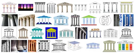
The pillar template goes back to the early days of PowerPoint. A building structure is a useful concept to show that things are dependent on each other, and will already collapse if only one pillar is removed. Still, using a Greek temple will give your PowerPoint presentation that instant 1990s feel. I am not sure that is what you want…

·Art

Learning from impressionists

Every presentation slide should have a clear organization, and direct the eye. Paintings are a good example. Have a look at this painting by Monet: The garden at Sainte Adresse. It is clearly divided in 3 horizontal bands, has a strong diagonal cutting across, and the flags and steam clouds from the boats  provide energy that leads the eye from left to right.

·Gadgets

First sketches with the Wacom Inkling

The Wacom Inkling Digital Sketch Pen (affiliate link) is a tool that lets you draw with a regular pen after which a sketch can be transferred to Photoshop or Illustrator for further editing. No, it does more than a regular scanner. First of all, it allows you to draw in layers and preserve them in the editing software. Secondly, the hardware is so small that you can take it any where you want.

My box arrived yesterday in the mail and the experience confirms what I have seen so far in the promotion video (my sketching skills have some way to go though). The product comes in a box the size of a regular pencil case. The pen and the receiver fit in nicely. Clip the receiver at the top of the page, and start sketching. It is as simple as that. One button opens a new file/page, another button adds another layer. The software is easy to install and works great.

The only drawback for me is that sketching has to happen with a ball point. I prefer a soft tip pen, or best of all a thick pencil to draw. There might be technical reasons why Wacom stuck to a ballpoint for sketching, but hopefully they will release a pencil-based scanner in the near future.

·PowerPoint

The first 4 bullets

I presented at an investor relations conference the other day and a buy-side analyst made some comments about what it was in a presentation or document that gets him to read further: the first four bullets need to catch his attention.

So, does this mean that your first slide should have 4 powerful bullet points on it?

Not necessarily. What the analyst said was that he wanted to get excited about an investment opportunity in about 1 minute. Given that most corporate presentations are a collection of bullet points, he translated that 1 minute into a number of bullets. However, that same minute can also contain a highly visual slide sequence that does a much better job pitching your idea.

Image by kcdsTM.