Extreme perspective
Images get more interesting with a dramatic perspective. How to find them? Look for unusual camera angles, and put an object on the foreground to amplify the effect of depth. As it is done in this ad found on Ads of the World.



Frequent updates about all things presentations since 2008. Subscribe to never miss a post.
Images get more interesting with a dramatic perspective. How to find them? Look for unusual camera angles, and put an object on the foreground to amplify the effect of depth. As it is done in this ad found on Ads of the World.
I said before that it is a shame that PowerPoint (or Keynote) do not have these powerful replicators that you can find in motion graphics software. Filter Forge is a nice piece of software that plugs into PhotoShop and extends the range of filters you have available for your images.
Here is an example image I created for a client that has software that works across all possible versions of the highly fragmented Android mobile operating system.

Filter Forge is a platform on which users can contribute their own filters, the result is an endless library of filters, including the perspective distortion above, instagram-style retro filters, and filters that turn your images into cartoons or impressionist paintings.
It is not cheap, I bought the professional edition which is priced at $399.
Things are never sure in business analysis. One option to deal with uncertainty is to use data ranges: $3-5m instead of ~$4m.
While it might be the correct approach to qualify your analysis, I do not find it visually pleasing. My approach would be to settle on a point estimate, and put a note on your slide that these numbers are estimates. It also easier to discuss with your audience, it is difficult to refer to ranges all the time: “Next year’s sales of $3-5m”.
One additional complication, ranges amplify when you add or subtract them. In the chart above, you see that 6.5 equals to a range of 4-9 instead of 6-7 for example. If this is the point you want to make, our sales forecast can fluctuate wildly because of things we do not know, then use the chart. If you just want to give a small range to show uncertainty about the exact value go for the point estimate.
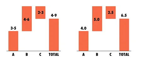
And one more issue, a range of $1m more or less can be a big difference if you apply it to a small number, or a big one: 1-2 versus 10-11 for example. The first is a 100% variation, the second 10%. So, to do it correctly you have to write down in your chart: 1.0-1.1 and 10.0-11.0. All this just makes it too complicated to have a meaningful strategy discussion.
And another one: ranges are a pain to use in calculations, as seen in the slightly counter-intuitive column chart above. (See an earlier post on how to make water fall charts here).
Embedding video in presentations has its drawbacks. It adds another technical risk factor when setting up the presentation outside your office environment. File sizes become so big that it is hard to email a document. And a PDF version of the presentation does not show the video.
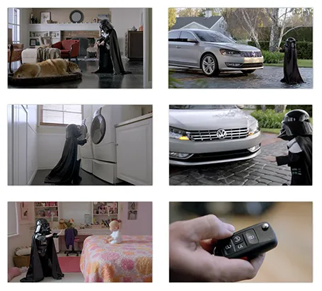
As a solution, you can put in a video summary in your presentation consisting of a few key still images taken from the video. Our brain is powerful enough to make up most of what happens in between, and might even imagine the Star Wars sound track in the background when looking at last year’s Volkswagen Super Bowl ad (which I think was better than the one shown this year).
Look how showing the video, or showing a consecutive series of page-filling images keeps up the suspense of the audience. Showing all images on one page gets the point across as fast as possible. The first approach might be the most fun, the second one is what works best when trying to communicate an idea to busy people.
In technical pitch presentations, you often have to show the application through screen shots. While a picture of the application inside a monitor frame might look nice, it is a poor way to get your audience to see the content of the screen.
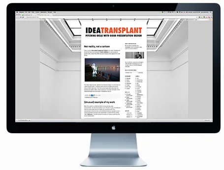
I would cut the monitor, cut the window bars above and below your application, and even zoom in to parts of the screen to highlight what is important. Cover everything that is not relevant (ads for example) with white boxes to keep things clean.
Having said that, there might be 2 uses for the monitor shot. One for a very quick 5-second slide that enables you to say “Let’s talk about the application” and move on. The second application is a slide that shows that your software is running on multiple platforms, but in that case you need a monitor image, a tablet screen shot, and a mobile phone application all on one page.
I am not a big fan of animation. It distracts the audience, can sometimes look funny instead of serious, and is not visible when you send people a PDF file, the new standard with the proliferation of platforms (PowerPoint, Keynote, mobile devices).
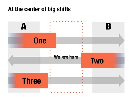
Here is an option to give a sense of movement in your slide without using animations. When filling a box, select the gradient option and let one side fade out to 100% transparent or 0% opaque. The chart below is a sanitized version for a client that is right in the center of some pretty major transformations that are going on now, so if you are an investor, that is where you want to be as well.
It has been a while since I blogged about chart concepts (here are some earlier ones), let me know if these ideas are useful for you.
Beebas Neue and League Gothic are my favorite narrow fonts that can fit a lot of text in a headline, and give that industrial modern look to a slide. And best of all, they are open source.

I am more and more fed up with stock images and turning to alternative sources of photographs for my presentations. Here is a great example of a real image with real people. If you want to make the point that the mobile era has arrived, you can do that with mobile penetration statistics (6b out of 7b people now have a cell phone), or you can just **this great image by Josh Liba**on Flickr, showing people consumed in their mobile world and not really interacting anymore among each other.

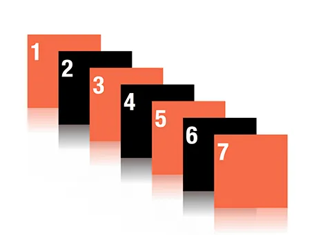
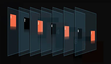
Despite my 10,000 hours of PowerPoint I never bothered to push the re-order objects button in the arrange menu (Mac). Hey, and out came a nice interface to make things to the front or to the back of the slide.
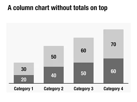
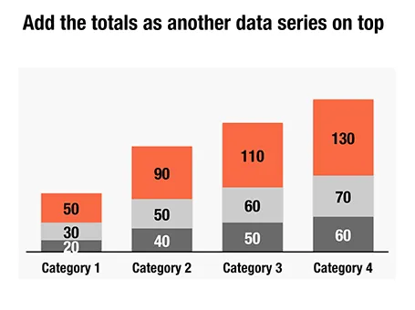
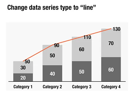
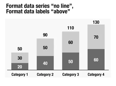
Here is a little trick to create automatic totals on top of column charts. This is an alternative to placing text labels manually, and especially useful when the data in the column charts is changing frequently.