SlideMagic Blog

Frequent updates about all things presentations since 2008. Subscribe to never miss a post.

RSS
all posts

Search results for “competition”

·Hardware

Designers are upset with Apple

Apple launched the new MacBooks a few days ago, and designers are not happy. Read all the comments here for example. The competition makes more powerful machines, Apple still does not make a 4K standalone display.

But there is also a psychological element to this. We designers used to use our Macs to show to everyone that we were different. We were free to buy cool equipment while most of the “other people” were stuck with crappy machines supplied by the corporate IT department.

Maybe reality has caught up with us designers. For most graphics design application, almost any computer will do. PowerPoint being at the bottom of performance-intensive applications, I have stopped looking at horse power as the main buying criterium for computers.

Still Apple is dropping the ball here and there. No innovation in productivity software (I am trying to add my bit of innovation with presentation app SlideMagic), and a proliferation of adaptors to connect devices, even those that are within the Apple ecosystem.

All of this leaves the door open to a new super premium computer brand. If I were Microsoft, I would create a “Lexus” in computing and court those style-conscious designer elitists again.
·Story

The tricky point

The bar is rising in presentation design. More and more people know how to design decent slide, more and more people know how to explain a business concept visually.

The challenge that remains is often a very specific point. In most cases, this is the answer to an “elephant in the room” question, a very specific answer to a question an ignorant but intelligent layman might have.

Most people burry these super important points inside a “standard” slide. “Oh, that is the point I make verbally when we present the competition slide.”

I tend to make these points more in your face. Dedicate a specific slide to it. Even sometimes putting things straight in the headline (“No, we are not another Google”).

These slides can be hard to design. The best approach is to listen really carefully when you explain it verbally to someone. “There are 3 groups of products, 1, 2, and 3, but none of them address y”. “Gasoline engines can do x, but with electrical power we can do this.”. “Up until now you could not see at nanometer level, but now it is possible”. Look at the sentences and see what they do. Divide things in groups (boxes), contrasts between two options, “From to”. Your language gives clues about what visual concepts to use. They don’t have to be sophisticated, they just should be clear.

Image via WikiPedia

·Layout

One visual concept

I like to use one single visual concept as much as I can in a presentation. Two by two matrices, graphs, frameworks, they all require time to absorb by an audience. If you have to through in a new one on every single page, things can get pretty tiring. Management consultants tend to do this, and forget that the audience did not spend 3 months on the project but is hearing the story for the first time.

Luckily common issues in a presentation are often related:

  • Why is something difficult to do  (problem)
  • What is your solution
  • Why is the competition different

If you can fit all of this in a variant of the same diagram, you will save the audience a lot of time.

Art: Robert Antoine Pichon, Le Pont Aux Anglais, 1905

·Investor presentation

Sales versus investor presentations

CEOs are used to doing the company’s product sales pitch. When they look for investors or acquirers for their company, it is temping to just press play and do that same sales pitch again. But they can be very different stories.

An investor needs to hear the sales pitch. It makes her believe that the company makes products that people want to buy. Also, it shows that the company CEO is actually good at selling (or not). But investors needs more: strategy, financials, margins, funding requirements, and a more explicit comparison versus the competition than you would put in the sales deck.

Potential acquirers might not be interested at all in the sales pitch. Maybe they are considering to buy the company for a very specific asset they need. (Technology, people, distribution). Acquirers need a very specific, tailored presentation. To make it, you need to put yourself in their shoes and resist the temptation to hit “play” and run the sales pitch.

Image from WikiPedia

You are not the only one

If you are pitching a healthcare IT business to a healthcare IT investor, she has probably seen hundreds of pitches of healthcare IT companies. If you are pitching a mobile content service to a mobile operator, she has probably seen hundreds of pitches by other mobile content providers. If your pitching an IT solution to a RFP evaluation team, they are likely to have invited more (similar) companies to pitch.

  • Check whether you need to invest time in presenting industry background. If you are number 50, others probably have covered that ground (no need to preach to the converted)
  • Don’t make up facts about the competition, the audience might have invited them before you and heard the actual information first hand
  • Use most of the time in the meeting to emphasise how you are different from all the other ones.

Art: Alfred Wierusz-Kowalski (1849–1915)  The lone Wolf

Cheaper stock images

A decade ago, the first stock photo web sites started at $1 per image. Over time prices have been creeping up to $15 or even more. I could buy 10 or more of these for a client presentation. Now I see the amount of money I spend on images going down again.

  • I use fewer images. Not every single point you want to make needs to be backed up by a photo.
  • Stock image databases have been diluted by millions of cliche photo compositions, wherever I can I look for alternative more genuine images that are free to use under a creative commons license
  • There is increasing competition from free stock image sites, and even competition among the big guys (if you are an Adobe Creative Cloud subscriber you can buy 10 images at $3 each each month from Adobe Stock).

What can stock image sites do?

  • Curate images better
  • Offer bundles of images that are compatible, uniform in style
  • Offer images with huge white spaces, i.e. extended canvases
  • Instead of ready-made compositions, offer layered Photoshop files so you can make your own

Let’s see if the stock sites are listening

Art: Gerard van Honthorst (1590–1656) , Allegory of Painting, 1648

Presentation or procrastrination?

A bit more elaboration on yesterday’s post.

A lot of time is spent on presentation design in corporations. There are many mid-level managers and analysts that have PowerPoint open on their screen all day. For the wrong reasons. Here is a strong statement: I think managers are using PowerPoint as a tool to keep subordinates busy. Boom, I said it.

Big corporates work in the leveraged hierarchy model. Commands trickle down the line. Every manager has a lot of issues to worry about and subordinates to manage. It is like a giant juggling exercise. The key idea is that a manager could do each individual task faster/better herself, but can’t complete all of them. It is more efficient to delegate work to others, check in now and then, spot mistakes or correct the direction. Although the total amount of time spent on a task is higher, and there is a lot of work wasted (someone going down the wrong track before being corrected), overall - at a company level - things get done faster.

A manager’s day gets divided up in meeting slots (see Paul Graham’ post). In every unit of time, the manager has an opportunity to provide input into one of her issues, talk with one of her subordinates. If there is not a lot of time, meetings get shorter, and input gets more cryptical. PowerPoint is the conduit. “Make it a bit more polished, add a section on the competition, combine these 2 slides into one, show the breakdown by month” All instructions that cost of a lot (PowerPoint time) but add very little to the story or the decision the company needs to take.

Continue reading →
·Keynote

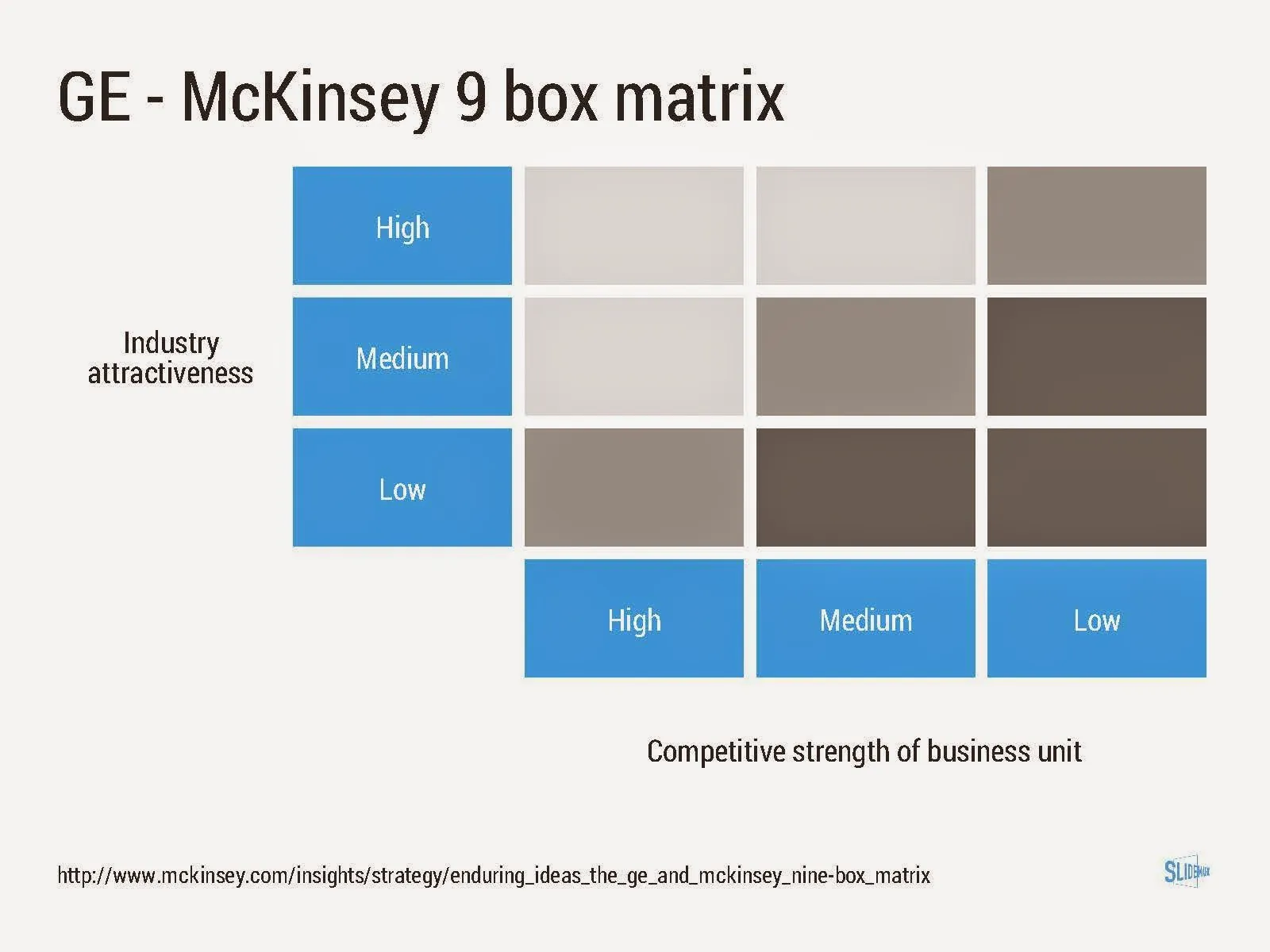
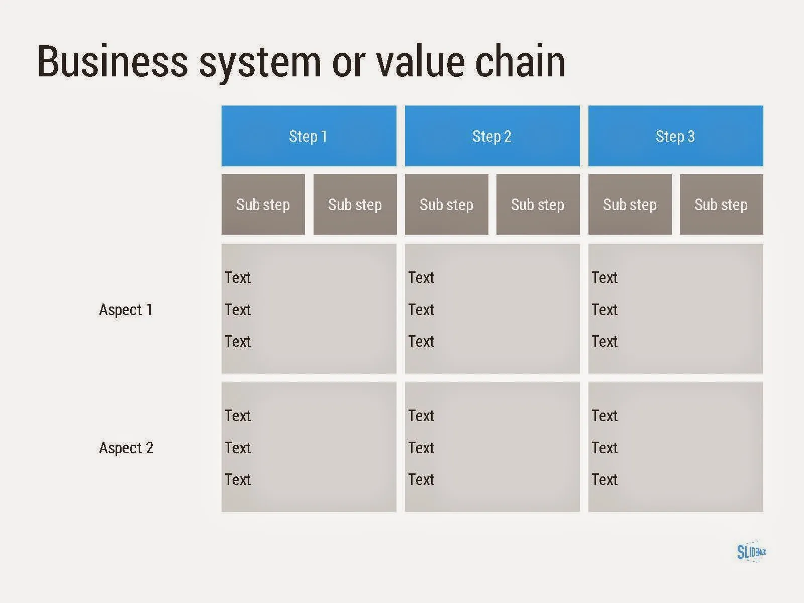
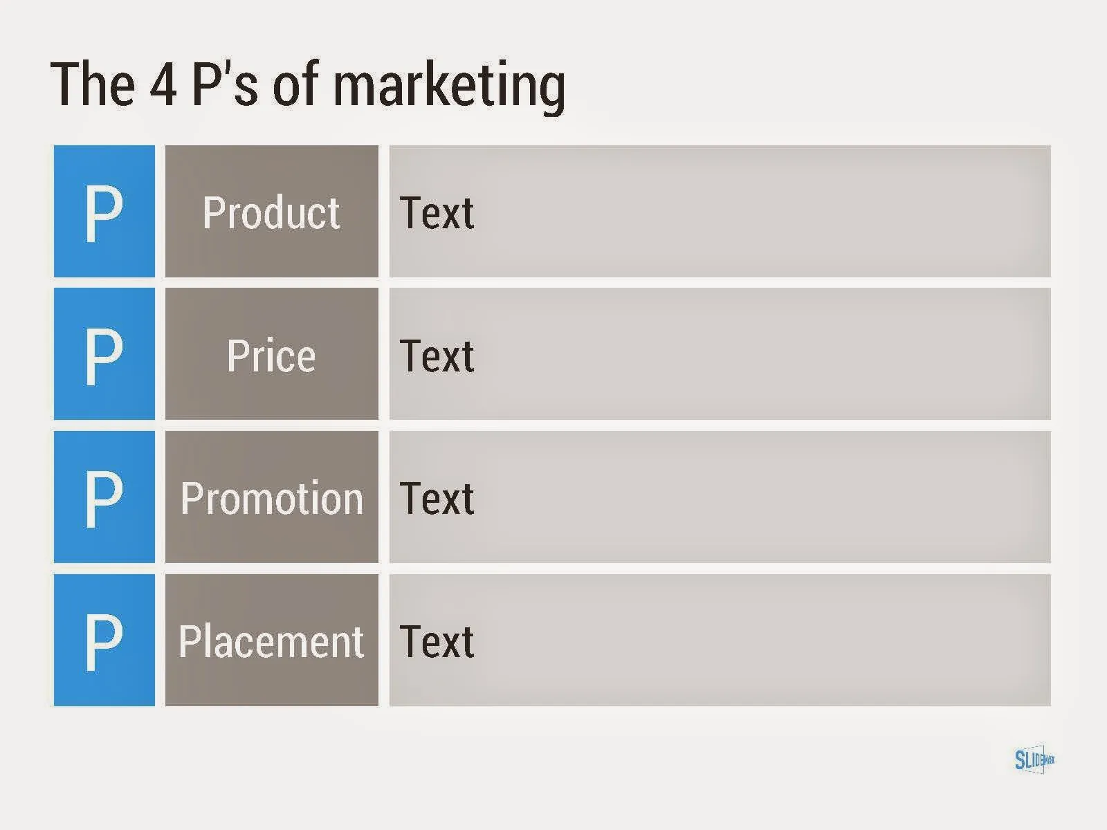
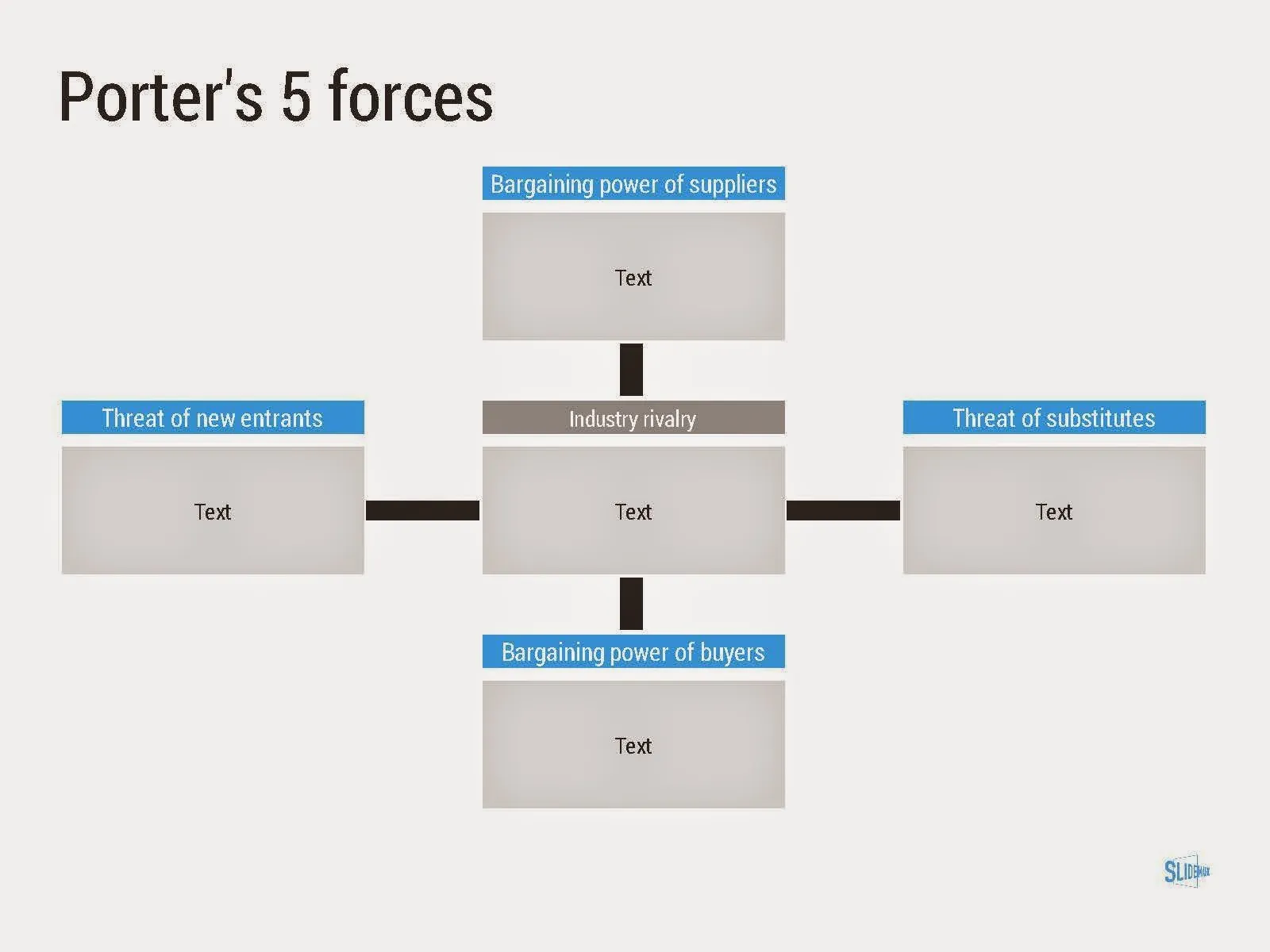
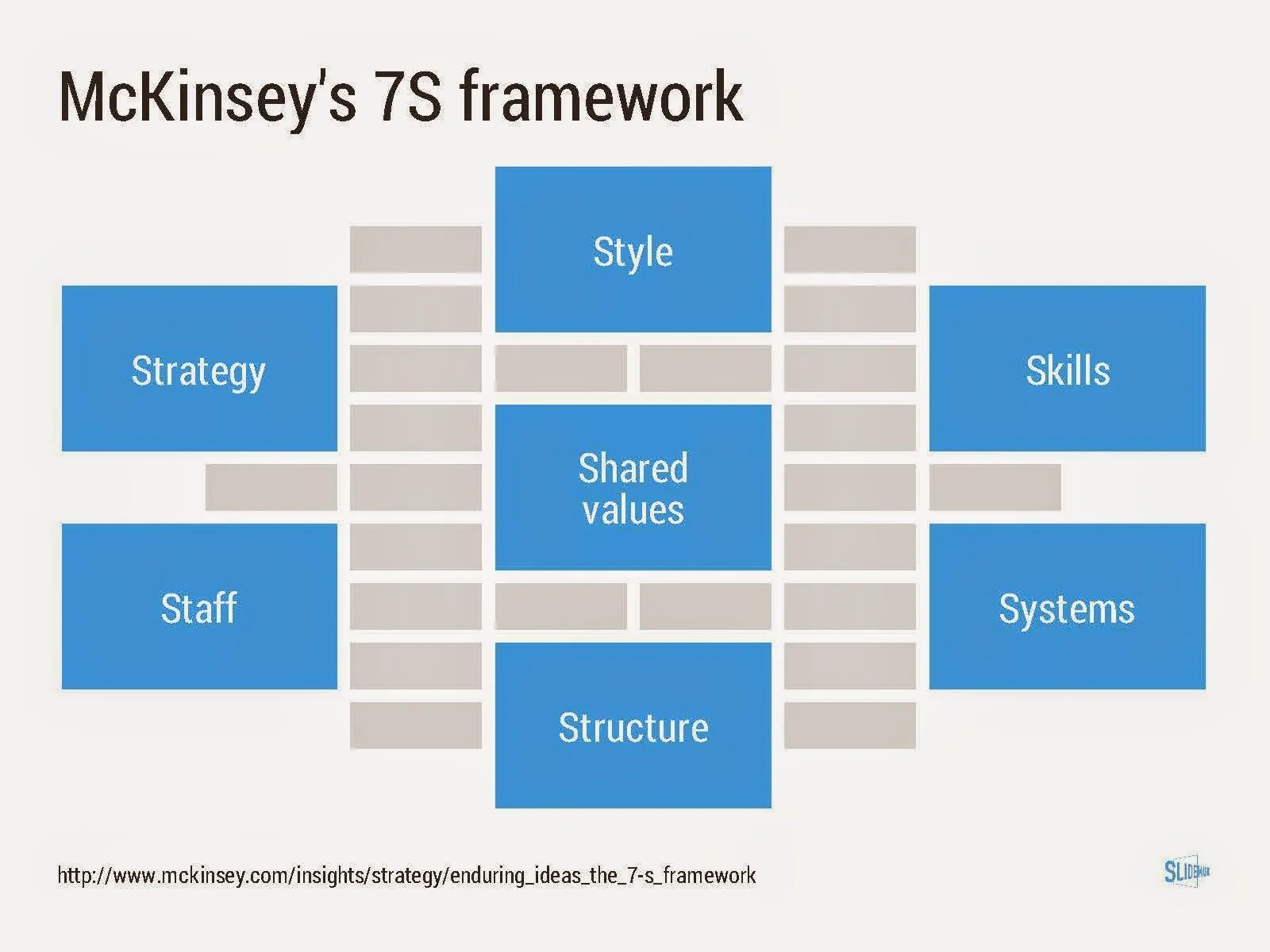
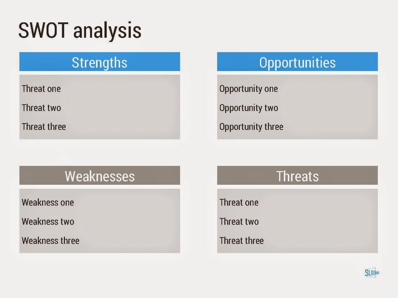
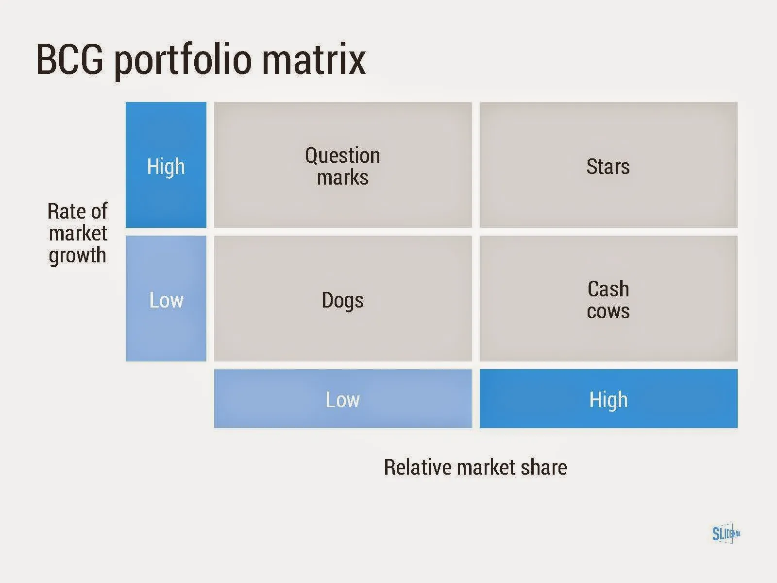
Consulting frameworks

I added a new set of templates to my presentation design app SlideMagic: consulting frameworks. It was an interesting journey back in time (I used to work for 10 years at McKinsey back in the 1990s).

Putting them in SlideMagic was interesting, it shows exactly what SlideMagic is supposed to do for business presentations. Take unnecessary complexity out of visual designs down to a level that the chart still says what it needs to say, but that you do not need to have a degree in graphics design to make them. I had to make slight deviations from the original here and there (Both SlideMagic and layman designers do not like curved shapes for example), but the end result is pretty good.

As to the content of these frameworks. They are more tools to help you think about a problem than slides that will get your audience jumping out of their chairs. Many of them are linked to classic micro-economics theory (demand/supply/competition). I think the strategic issues of many companies today have moved beyond these problems. Still some frameworks can work to kick start a discussion, they good old SWOT works great in group white board discussions.

·Investor presentation

The bar is rising

The average investor pitch deck gets better and better (bad news for presentation designers like me). SlideShare, video streams of startup competitions, TED videos, all create examples of good presentations that people can copy.

Five years ago, version 1 would be a horribly looking bullet point document with standard Microsoft Office fonts/colours, full of small low resolution images scraped from Google with their aspect ratios distorted, that is changing.

Many startups have some sort of designer involved, she gets pulled of the web site work to give the slide deck a much needed make over. The result: decent looking slides, decent colour scheme, decent story flow, still lots of bullet point slides, but at least they are written properly, newspaper heading style.

How to push it one more level up?

Focus on the content, not so much on the local and feel which is already pretty OK. Here is a check list of possible mistakes:

  • Think about where to focus your time/slides. Many of these decent presentations spend too much time stating the obvious. Instead go one level deeper: everyone seems to understand the problem, but why is it that in 2014 we sill have not found a solution for it?
  • Add more substance to your competitive differentiation. A simple 2x2 matrix with generic sounding axes is not always enough. Why are these other companies doing something different while it sounds like they do exactly the same thing you do? And why do they do it differently? Very rarely, this will because of stupidity, there is probably another reason these companies focus on a different solution for a different customer segment.
  • Even if your bullet points are short and well-written, remember that as soon as you start listing more than 3-5 benefits/differentiators, the audience will perceive this as no benefits/differentiators. Bla, bla, bla
Continue reading →
·Investor presentation

What not to put in a pitch deck

A post with 8 things you should not include in a pitch deck on TNW. My comments:

  1. No detail, 20-30 slides. It depends. If your slides are really light and visual, you can go through a lot of them in 20 minutes. maybe more than 30. Depending on your situation, (some) detail can be good. Really high level pitches lack meat.
  2. No contact information. No reason to overdo it, but an email or phone number on the last page does not harm I think. I do not like it when I cannot find a phone number at the bottom of an email.
  3. Remove a point they can object to. Maybe, but if it is a major point, it has to go in. You cannot change reality… If this is a deal breaker, then this investor is not the right one for you.
  4. Fund allocation. Yes, opening up criticism over your budget might not be smart. Still, an investor wants to know roughly what is going to happen with the funds, and why you need this money, now, and not in 6 months from now
  5. Guestimates. Agree. If you have to make guestimates, make intelligent ones, and make it transparent that it is a guestimate
  6. Unrealistic success prediction. Agree
  7. Saying there is no competition, absolutely agree. Even if there is no direct competitor, there are other solutions, categories, that people are using to solve a particular problem
  8. The “The End” slide, yes, you can take that one off, and replace it with a repeat of a strong visual earlier in the presentation. This is a nice backdrop against which to hold the Q&A discussion. The last slide is the slide that probably sits longest on the projector.