SlideMagic Blog

Frequent updates about all things presentations since 2008. Subscribe to never miss a post.

RSS
all posts

Search results for “web design”

·Investor presentation

From screenshots to use case

How do you showcase your application in a 20 minute pitch? Doing a full, live demo is hardly ever an option:

  • Murphy’s Law will strike, and your Internet connection will break down, and if not, another technical issue will hit you
  • Some aspects of your app are interesting to show, others are boring and time consuming (loggin in, entering some data, etc.)
  • It is hard to stay focussed and on script in a live application, before you know you have lost yourself in an interesting feature and spent far too much time on your demo.

In a short VC pitch, doing a live demo is likely to take the energy and momentum out of our talk. The other solution is showing a bunch of screen shots. But how can we transform a series of uninspiring screen shots into an exciting use case of your product? Some steps to consider:

  • Base the whole section on a story. The best stories are real: find an actual customer, disguise everything so it is impossible to expose private information and build the entire screen shot demo on her case.
  • Alternate between regular visuals and screen shots. Use a map to show locations, use images taken in the street to give things a sense of place.
  • When using screen shots, crop out all the clutter that is irrelevant: operating system window bars, icons, browser navigations and put huge arrows or circles to focus the viewer attention to what you want to see them. Use big text to emphasise what you are doing and why it is so great (“We open an account in just one click”).
  • Throughout your story, stay consistent: the same user, the same location, the same issue she is trying to solve.
Continue reading →
·Concepts

Bullet points can be OK

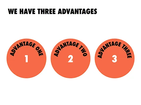
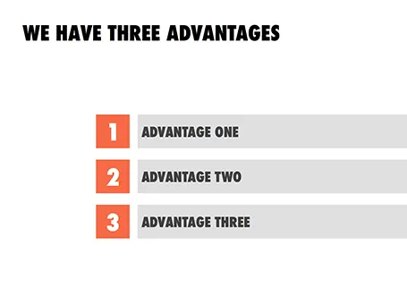
Some readers of my blog have become paranoid to use bullet points in a presentation (a good thing), but there are actually situations where putting 3 short sentences on a page is inevitable, or even a good solution for a slide.

These situations are when you want to express that something has a number of components. Breaking up those 3 advantages and give them one slide each enables you to explain them clearly individually, but the audience loses the overall perspective of how they are related.

In those cases - yes, it happens to the best - I revert to 3 short bullets.  But there are a few things you can do to keep things interesting:

  • A massive visual anchor (like a big 1, 2, and 3) to show that you are talking about an overview slide
  • Really, really short descriptions just to introduce the ideas. The full explanations come in subsequent charts
  • Also, you can deviate from the traditional list and come up with other geometrical shapes ore layouts to make your three (short) points.

·Concepts

Lots of layers

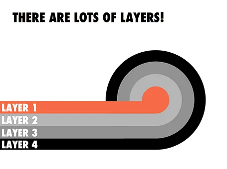
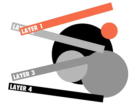
Here is a concept to label lots of layers in a circle without bending text, the second image shows with which components the first chart was created.

·Data visualization

Excel on the front page

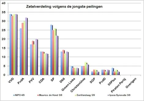
It is shocking to see that pre-election poll results on the cover of a large Dutch newspaper are presented in a plain standard Excel template and colours with one adjustment: add some 3D effects, which makes it even worse.

·Images

Pop out of the box

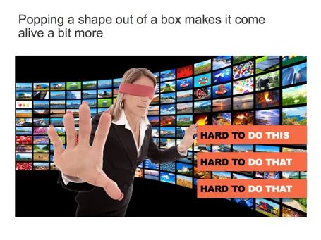
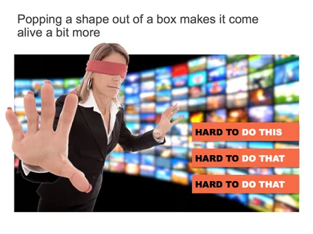
If you have a person or an object standing in front of a background, make it pop out a bit: increase the size, and fade the background.

·Keynote

Pink URLs

PowerPoint does weird things with URLs and email addresses. When you type in either, it turns them automatically into a hotlink (sometimes useful), but applies a highly ugly formatting (a bright color with underlined text). A slide is not a web page where links compete for your attention, make sure to tone down the formatting or remove the hyperlink all together.

·Data visualization

How to position a data chart

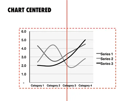
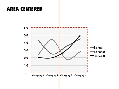
There are two ways to center a data chart on a slide: center the entire chart image including labels and legends, or center just the chart area, ignoring the labels. I prefer the latter.

·Images

Putting things in perspective

It has hard to grasp the magnitude of something with cold statistics. For example, this waterfall that I recently visited in Iceland drops 60m, but it is hard to imagine, unless you pay attention to the tiny people standing next to it.

Another example is this TED video by Ramesh Raskar, about photographing light traveling through an empty Coke bottle at a few trillion frames per second. At 3:50 the key statistic comes out: it would take a bullet fired from a gun 1 year to travel through the bottle if it was slowed down as the same rate as the light beam.

Do the same in your presentations. Tell stories with analogies to make it easier for people to understand big (or small) numbers.

Off topic: when photographing landscapes I usually resist the temptation of making that completely clean shot without any evidence of human presence in it. That small house, car, or person adds that critical sense of size to an object. When making a shot of a long-distance view, keep something close to the camera in the composition (a tree branch or something) to maintain the sense of distance.

·Concepts

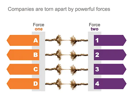
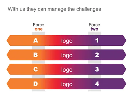
Torn

One of my clients is saving companies that are caught between two opposing forces. Here is the visual concept I used that explained the 4 contradictions.

·Keynote

Summer posting schedule

Over the next few weeks posting frequency will drop on the blog as I will be spending more time with my family and less time at the computer. I hope you all have a great summer as well.

Image credit: fridgeirsson