SlideMagic Blog

Frequent updates about all things presentations since 2008. Subscribe to never miss a post.

RSS
all posts

Search results for “web design”

·Data visualization

The Meeker deck 2012

Mary Meeker has updated her deck about the state of the Internet:

The slides inside are typical examples of investment banking/consulting visuals with lots of information, they are best read offline rather than presented in front of a live audience. Record the eye movements you have to make in order to absorb all the information on the slide below:

When presenting, you can simplify the chart, but shortening/cutting titles and subtitles, making sure that a few really stand out, and that the rest is put on the chart in small print visible to the reader, but not really to the live audience.

A more general point about this presentation though. I have followed many editions of it over the past few years (going back to the time when she was still an equity analyst), and actually find that the current one disappoints a bit in terms of content. But maybe that is the state of the Internet today, little surprises?

·Keynote

Pause slides

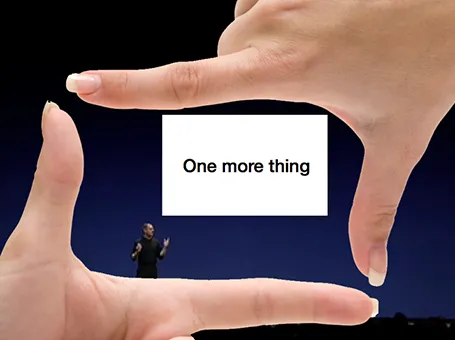
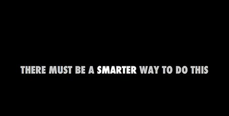
Some slides require a more dramatic introduction than just plopping it on the screen. I often use a blank slide wit a teaser sentence (not “the solution”) for this purpose. It breaks the flow and brings the audience attention back to the presenter.

·Images

Gestures

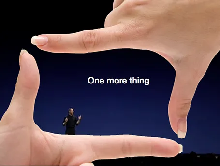
Sometimes simple human gestures make the most powerful background images. See the example below about people not being compliant with their medical prescription.

·Concepts

Zap!

In case you want to use laser beams in your presentation, they are easy to make: red lines, black background and a small dot with a huge red, semi-transparent glow.

·Keynote

The exact marketing messages

Marketing messages cannot be translated 1-on-1 into a presentation. Do not forget to make the translation. The language translation requirement is obvious (everyone can see that marketing jargon does not resonate with a consumer). Sometimes though, you have to further than that and cut messages out, or move them from the explicit text, to the implicit part of your presentation: in between the lines, or told in the verbal explanation of the slides.

Image found on Things real people do not say about advertising.

·Delivery

Light or dark background?

For big audiences, you need to get the entire look of the stage right, not just your slides. Below you see that a dark background works better. A light background on a huge screen overpowers the presenter. For small conference rooms, a light background will do fine, and for reading on screen, a light background is actually better.

·Data visualization

Infographic hieroglyphs

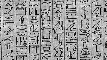
Sometimes I come across slides that simply try too hard. A stunning image with a hard to understand analogy, or an infographic-style rebus that looks like ancient Egyptian hieroglyphs. OK, it is a visualisation, but a puzzle does not make it easier for your audience to understand what you try to say. Even worse, an overly simplistic symbol might play down the seriousness of the business you are trying to pitch. Instead of creating a puzzle, why not simply write down what you want to say. Image via WikiPedia

·Data visualization

Data chart make over

Here is diagram published on TechCrunch about the financial returns of angel investors. There are 2 ways to improve the diagram:

  1. Make it a simple stacked column diagram that adds up to 100%, 1 column for the US, 1 column for the UK next to it.
  2. Use more contrasting colours than the dark blue and red

Then there are a few more things you can do to make it look less like Excel: tick marks out, big title at the top left, replace the Times Roman font from something sans serif, value axis title below the main title (i.e., no vertical text).

·Concepts

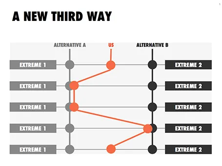
Concept: a third way

This slider chart is a great way to show a comparison between multiple concepts across multiple dimensions. I recently used it for a hedge fund with a new innovative investment process.

UPDATE: this slide concept can now be downloaded from the SlideMagic store

·Keynote

The screen shot workflow

On a Mac, you can create a screenshot of a specific part of your screen. Pressing CMD-SHIFT-4 brings up a cross hair and you can select the area you want to capture.

Screen shots have become an essential part of my workflow. Rather than worrying how import PDF files, web sites, video stills, or other images into my presentation I just snap a picture of them. The same for exporting PowerPoint slides, the images on my blog are usually screen shots.

No more looking for files, no more worrying about file formats. I heart screen shots.