SlideMagic Blog

Frequent updates about all things presentations since 2008. Subscribe to never miss a post.

RSS
all posts

Search results for “meeker”

·Data visualization

Mary Meeker slide makeover

Mary Meeker published her 2018 Internet Report: hundreds of PowerPoint slides filled with dense information. This is a presentation for pondering and study, rather than seeing it as a backdrop for an entertaining TED talk. For this purpose, the slides look pretty decent. I picked a random slide from the beginning of the deck and tried to improve things a bit in “SlideMagic-style”
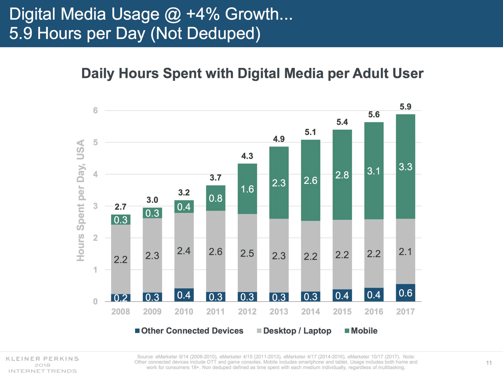
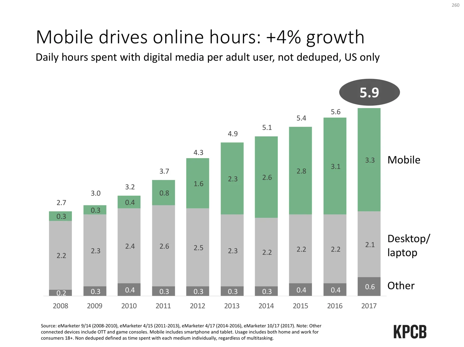
Here are some things I changed:

  • The KPCB template features the very heavy coloured bar at the top of the page, I took it out, and tried to apply the fresher green colour that was used for the branding of the web site of the document
  • The duplications of the titles were eliminated
  • The vertical chart axis and grid lines are not required, I took them out
  • I edited the title to make it shorter, put the growth point in the title, the absolute hour value as a bubble
  • The columns don’t add up because of rounding, I left it that way, but usually, I would change the value of the biggest column segment to make the numbers add up, it somehow looks sloppy when there are “calculation errors”
  • The legend was hard to read and difficult to link to the data series, I moved them to the right
  • I made the mobile data series pop more with stronger colouring
  • I stretched the data chart a bit horizontally to use the maximum possible space

A complete purist would argue that this chart is actually the wrong one to support the 4% growth point, there are no growth percentages anywhere on the chart.

Continue reading →
·Data visualization

Redesigning the Meeker deck

The Business Week magazine asked presentation designer Emiland de Cubber to redesign the information-loaded slides of Mary Meeker’s annual State of the Internet deck. Here is the original:

KPCB Internet Trends 2013 from Kleiner Perkins

You can see the result of the make-over here.

The Meeker presentation is a dense deck full of facts that can never be (and should never be) converted into a TED-style slide deck with a few words and some pretty pictures. And Emiland did a great job of making that information more visually powerful. Muted colours calm down the slides. The use of colours in the graphical language of KPCB eliminate the need to be reminded of KPCB by a huge logo on each page.

Here are some of my additional comments, the key point is that you can even be more radical in improving this presentation. These are all constructive ideas, Emiland did a great job!

I invite you to open the Business Week alongside this text, I am not sure whether I can copy all the slides into this post for copyright reasons.

The dark colour scheme does work better for large rooms and big projector screens. A huge wall of white light overpowers the stage presence of the presenter. However, I suspect the majority of the audience of this presentation will be sitting at a desk when watching the information, in that case sticking to the light background might keeps things more readable.

I disagree on the use of icons to simplify categories in slides. Icons simplify too much in these technical presentations. Instead, I would opt for dramatic text simplifications. Emiland did both, I would have taken the icons out, and put more emphasis on the shortened text. (The second make over example slide).

Continue reading →
·Data visualization

The Meeker deck 2012

Mary Meeker has updated her deck about the state of the Internet:

The slides inside are typical examples of investment banking/consulting visuals with lots of information, they are best read offline rather than presented in front of a live audience. Record the eye movements you have to make in order to absorb all the information on the slide below:

When presenting, you can simplify the chart, but shortening/cutting titles and subtitles, making sure that a few really stand out, and that the rest is put on the chart in small print visible to the reader, but not really to the live audience.

A more general point about this presentation though. I have followed many editions of it over the past few years (going back to the time when she was still an equity analyst), and actually find that the current one disappoints a bit in terms of content. But maybe that is the state of the Internet today, little surprises?

·Design

A dense presentation that's actually good

Mary Meeker is a well-known Internet analyst. Every few months she updates her presentation about the state of the online world. Usually, dense slides are boring and fail to communicate a message. Not when every slide is packed with interesting data like in Mary’s decks. This presentation will not fit a Steve-Jobs-style keynote address, but it contains a wealth of insights well worth digesting.

Internet Trends 2010 by Morgan Stanley Research

·Data visualization

Adoption curves - how long does it take?

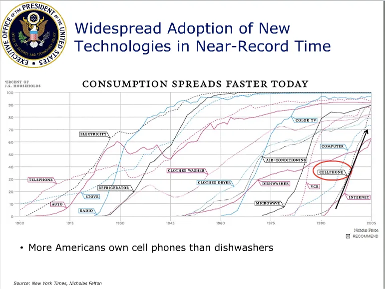
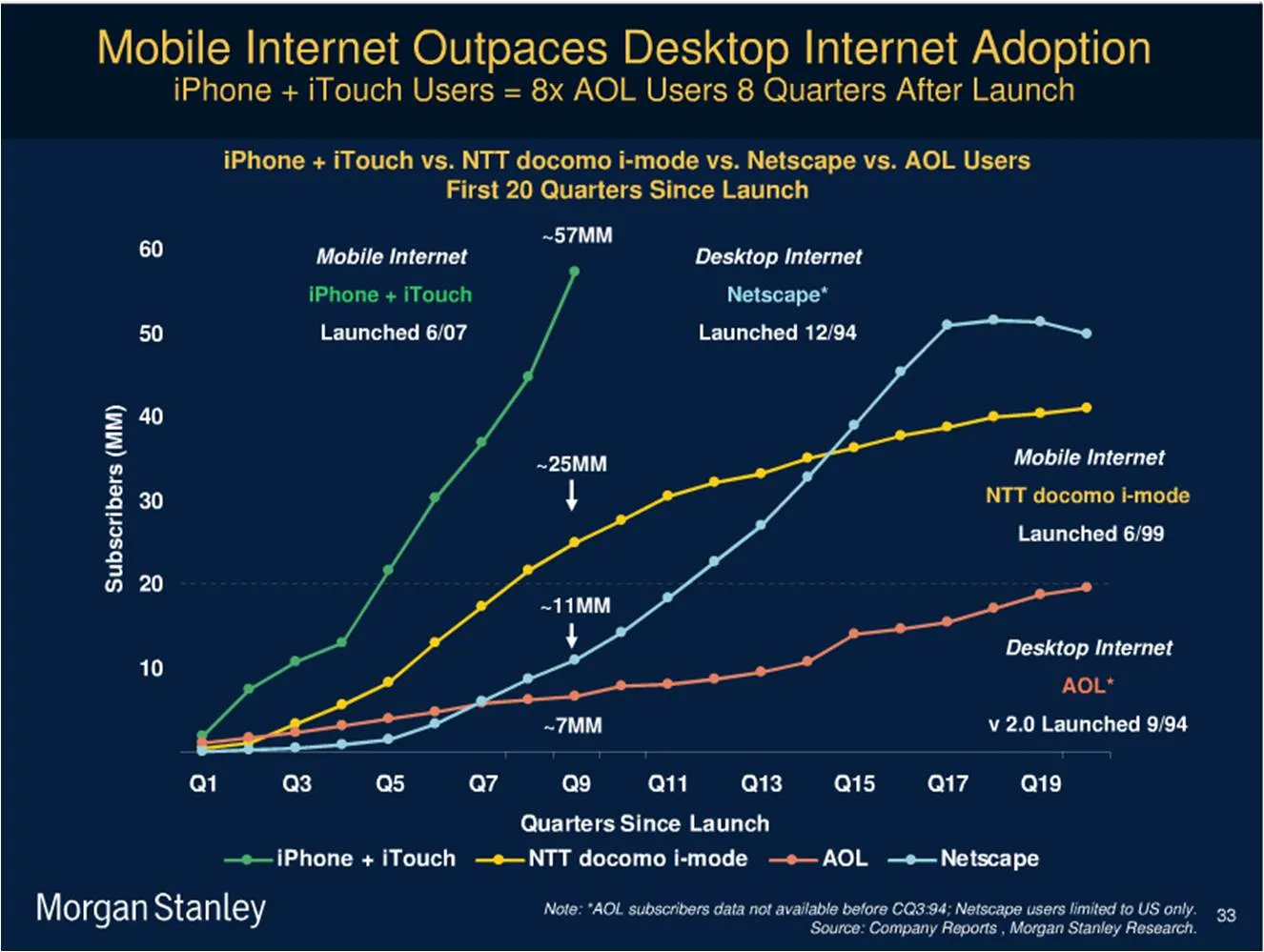
Adoption curves are a great way to compare the speed at which ideas spread, technologies were adopted or great companies were born. They are basic line graphs with the starting year set to zero. An alternative visualization would be a simple bar charts with “number of years before x reached y”. While simpler, this approach loses a lot of information: the absolute size, the rate of adoption, and changes in the rate of adoption over time. The classic use is to show that new technologies are getting adopted faster and faster. A good example can be found in Mary Meeker’s 2009 Internet presentation:

Mike Pulsifer found a chart that does not make all starting years zero, here is what happened:

Finally, interactive data visualization tools can add another dimension to adoption curves. See this example of a chart that shows how many years it takes to transform a startup into a large company (thank you Michael Eisenberg). The opening chart is far too busy to show in a PowerPoint presentation, but that’s not the objective here. These charts are designed for pondering over: select and de-select lines, mouse-over data, etc. If you had to translate this chart into PowerPoint, you would have to use a number of slides to highlight the messages you want to stand out.