SlideMagic Blog
Frequent updates about all things presentations since 2008. Subscribe to never miss a post.
Search results for “web design”
Sizing up the comet
A number out of contrast is hard to put in perspective. That is why our measurements originally were all somehow related to things we can compare to: feet, kilo (1 litre of water), inch (thumb). But when things get really big, or really small it is hard to absorb the scale of something.
In presentations, you would use bar or column charts to compare 2 numbers to each other. The best comparisons are those where the audience can relate to.
Many people tried to use images to put the size of Comet 67P in perspective (example, example). Below is my attempt, where I put the 4.1km height of the big blob in perspective to the 158m height of 26 Broadway in New York. I think the vertical compositions are much more dramatic than the juxtapositions on horizontal maps.

VC body language
Last week, I sat in the same seat many of my clients sit in: the one facing a VC. I had a couple of meetings in the valley to test initial appetite for my “PowerPoint killer” web app.
The body language in these meetings was very interesting. In all these meetings you could clearly see when people where excited, agree with you, do not agree with you, listen to you, are not listening to you because they are thinking about something else (probably the next question), already got what you want to say.
Read the signals and use them to steer the conversation in your meeting. But this might be hard to do in real time. The big use of this feedback will be your next VC meeting.
What not to put in a pitch deck
A post with 8 things you should not include in a pitch deck on TNW. My comments:
- No detail, 20-30 slides. It depends. If your slides are really light and visual, you can go through a lot of them in 20 minutes. maybe more than 30. Depending on your situation, (some) detail can be good. Really high level pitches lack meat.
- No contact information. No reason to overdo it, but an email or phone number on the last page does not harm I think. I do not like it when I cannot find a phone number at the bottom of an email.
- Remove a point they can object to. Maybe, but if it is a major point, it has to go in. You cannot change reality… If this is a deal breaker, then this investor is not the right one for you.
- Fund allocation. Yes, opening up criticism over your budget might not be smart. Still, an investor wants to know roughly what is going to happen with the funds, and why you need this money, now, and not in 6 months from now
- Guestimates. Agree. If you have to make guestimates, make intelligent ones, and make it transparent that it is a guestimate
- Unrealistic success prediction. Agree
- Saying there is no competition, absolutely agree. Even if there is no direct competitor, there are other solutions, categories, that people are using to solve a particular problem
- The “The End” slide, yes, you can take that one off, and replace it with a repeat of a strong visual earlier in the presentation. This is a nice backdrop against which to hold the Q&A discussion. The last slide is the slide that probably sits longest on the projector.
Focus on the differences
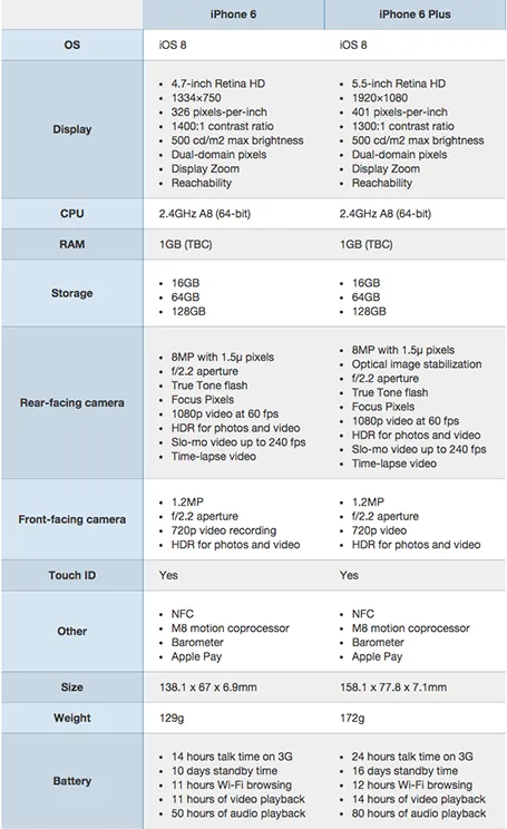
A nice side by side comparison of the new iPhone 6 and 6 Plus on the Cult of Mac. I see many of these tables in business presentations: columns with almost identical content. Why not focus on the differences instead and leave all the other clutter out?
Readability
Here is a data chart that was published in TechCrunch, it shows a breakdown of crowdfunding-sourced investments in hardware.
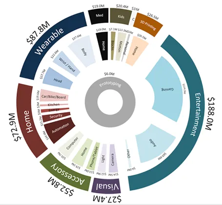
The scattered pie chart looks nice, but is not easy to read:
- A lot of data and many label are positioned upside down
- The $ and M signs clutter up space
- A lot of text is too small
Also, PowerPoint is not very well equipped to make charts like this. You see how the exploded pie points do not line up perfectly, and how the text is not curved right.
To make it readable, I would go for 2 stacked columns, one for the total categories, one for the sub categories. Put horizontal labels to the left of the totals, and to the right of the subcategory column. Use colours to link totals and subcategories together (like it is done in the above pie).
If you wanted to go fro an exploding pie as indicated above, do not explode the pieces in PowerPoint, but rather use extremely fat white lines around the elements of a regular pie to get a more organised diagram.
Non-stock stock photo sites
A friend of mine posted a question on her facebook timeline: where to get stock images that do not look like stock images. I am shamelessly copying the list of URLs that were posted in response:
http://unsplash.com/ http://thestocks.im/ http://www.stocksy.com/ http://thenextweb.com/dd/2014/05/15/53-free-high-quality-image-resources/ http://www.caddis.co/blog/free-quality-non-stock-photo-resources-for-blogging
Post by Shira Abel.
Upstream like a salmon
A few days ago I saw a National Park Ranger present in this setting below: 200+ getting and eating their lunch, continuing their conversation, while the ranger used a microphone to top the noise level of the crowd, reading from a piece of paper. A bit like Alaska salmon swimming up river, or the jazz band that is ignored in the background of a cocktail party.

A better approach: shorten the talk to focus it solely on the memorable facts: how big this National Park is, how powerful the 1964 earthquake/tsunami was and what permanent changes it made to the landscape. The philosophy behind the National Parks is less interesting for the hungry crowd.
Photo source: alaska.org
Meet me in Anchorage AK
I will be “presenting about presenting” in Anchorage, Alaska on August 14, at 17:30. The talk will be about how to pitch your ideas to investors. Details of the event can be found here on the page of AK Entrepreneurs Meetup community. Drop by if your are in the neighbourhood!

Human stories
I see that only a handful of my facebook friends follow Humans of New York: a photographer taking pictures of strangers in NYC, adding a little personal story. The way these stories are written is brilliant: an unexpected starter question, followed by a very short story, that usually ends in an unexpected twist or life lesson. Add them to your facebook feed if you have not already done so.