

Here is a data chart that was published in TechCrunch, it shows a breakdown of crowdfunding-sourced investments in hardware.
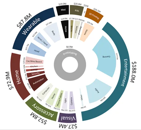
The scattered pie chart looks nice, but is not easy to read:
- A lot of data and many label are positioned upside down
- The $ and M signs clutter up space
- A lot of text is too small
Also, PowerPoint is not very well equipped to make charts like this. You see how the exploded pie points do not line up perfectly, and how the text is not curved right.
To make it readable, I would go for 2 stacked columns, one for the total categories, one for the sub categories. Put horizontal labels to the left of the totals, and to the right of the subcategory column. Use colours to link totals and subcategories together (like it is done in the above pie).
If you wanted to go fro an exploding pie as indicated above, do not explode the pieces in PowerPoint, but rather use extremely fat white lines around the elements of a regular pie to get a more organised diagram.