SlideMagic Blog

Frequent updates about all things presentations since 2008. Subscribe to never miss a post.

RSS
all posts

Search results for “web design”

·3D

How to position 3D objects in PowerPoint slides

I am not a big fan of heavy 3D graphics in PowerPoint. Similar to animations, or 3D bar/column charts: the fact that PowerPoint enables you to do it, does not mean you have to use it.

  • It is tricky to get things to look realistic: PowerPoint is not a 3D design tool. A failed 3D chart looks very amateurish
  • 3D charts make it almost impossible to work with images. If given a choice, I would use an image rather than 3D objects. You can’t have them both.
  • 3D is hardly ever required to make a point: less is more in good PowerPoint design. Exceptions to this rule could be things emerging at the horizon, long-term outlooks, etc.
  • Text becomes harder to read

If you do want to use a 3D composition, use guide lines and an imaginative vanishing point to make sure your objects are aligned properly.
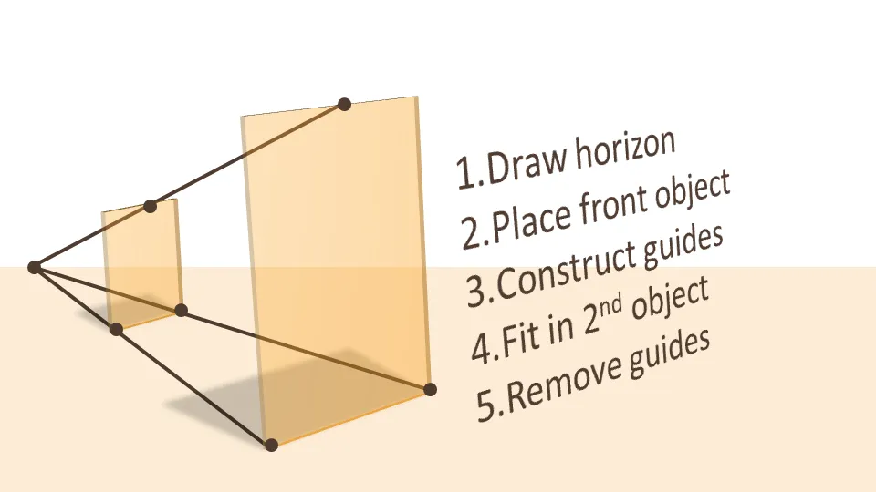
UPDATE: more on positioning text (with reflection) in 3D in PowerPoint in a folow up post to this one.
·Colors

How to set a non-standard color in PowerPoint - HSL codes

You can fill books about color theory, here I will take things one step at a time. How to set a non-standard color in PowerPoint?

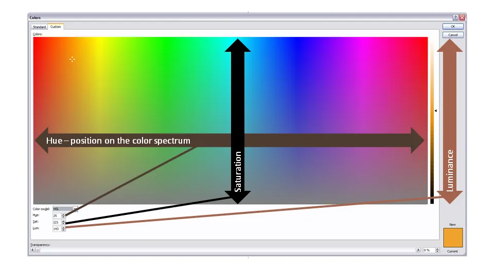
First of all to enter the right menu: hit any fill, outline or font color drop-down and select “more colors”. A big rainbow-like display will open. (Click the image above for a larger picture.) You have 3 options:

  1. Manually move the mouse in the color grid and click a color: this is never accurate enough. (Tip, you can actually stretch the window to make your selection more precise)
  2. Use RGB codes: a value of 0-255 for ®ed, (G)reen, and (B)lue: it is impossible to predict what the resulting color of an RGB-combination is
  3. Use HSL codes, my favorite. Let’s elaborate.

In the “color model” box at the bottom left of the matrix, change “RGB” to “HSL”.

You can define a color exactly by changing the 3 variables, each ranging from 0 to 255:

  • (H)ue is the position of the color on the spectrum, going from red all the way to purple
  • (S)aturation determines how bold are faded your color will be. Fluorescent colors go for the full 255, pastel colors for a low value, if you make the value really low, all colors turn more or less into grey
  • (L)umenance sets the shade of the color, from light to dark

In practice I hardly ever use this technique to set my PowerPoint presentation color scheme (see a previous post on how I do this). There are situations though you might have to use the HSL color model:

Continue reading →
·Advertising

"Burning" typography that almost hurts the eye

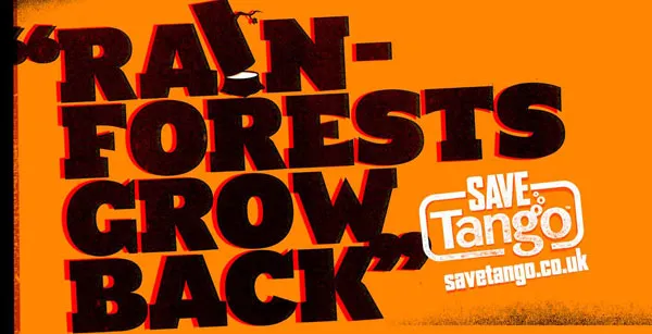
I am more and more fascinated by design lessons from consumer advertising billboards. Take this ad for Tango (a UK soft drink):

First of all the message. Confident, huge font, but the reader will discount the message completely “yeah right”. But it makes you think.

Then the typography. It almost hurts. Like watching a broken television screen. The onset of a migraine aura. Looking through the corner of your glasses and see how the lenses distort colors because of light refraction.

I argued before that slightly irritating the senses of your audience can help get your message across.

How did the typographer (Chris Chapman) do it? Clashing colors. Full orange background. Bright red shading. Colors that are very close on the color spectrum, but not similar. Like hitting 2 adjacent keys on a piano (harmonic dissonance). Grunch letter fill (hard to imitate in PowerPoint).

More on working with color wheels in a later post.

Via Ads of the world.

UPDATE after a comment. People should not misunderstand me. Any dissonance effect should serve a purpose. Simply screaming out a message does not make it stick. However, certain “painful” situations can be supported by a (one) “painful” chart.

·Design

How to align bullet points in PowerPoint

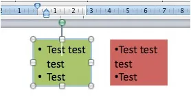
One of the PowerPoint annoyances is that bullet point paragraphs are not aligned properly when overflowing to the next line. It’s easy to fix.

Display the ruler (view menu), select the text, and move the little markers, leaving the top one to the left, and the bottom one at the desired indent. (See the image to the right).

That bullet points are NOT the main design concept to make PowerPoint presentations is clear, but a completely separate subject.

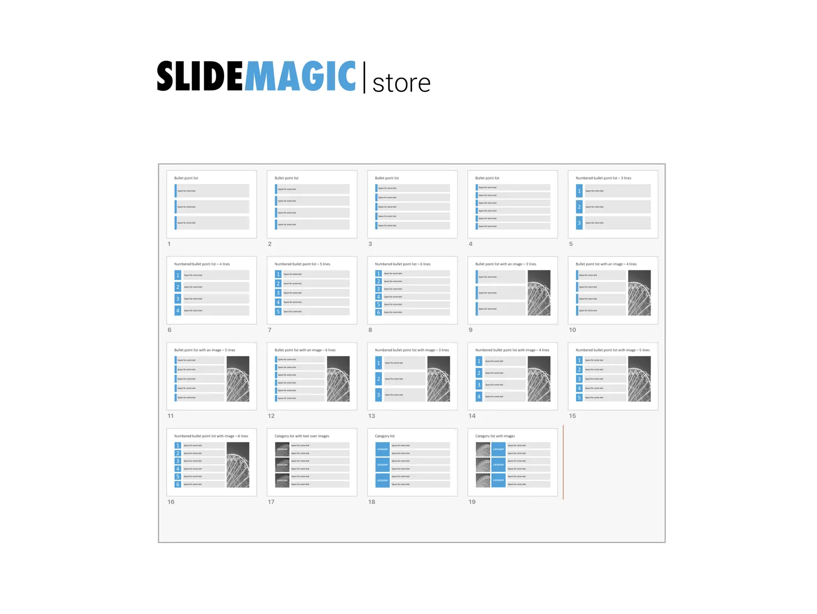
UPDATE February 2018. Another way to align bullet points in PowerPoint, is to use boxes with a very light background. This background shape gives the page a grid-like structure, compensating for differences in the length of text in a bullet point. Even if some bullet points stretch over 2 lines, and others consist of a few words, the page still looks evenly distributed.

I have added some examples of this layout style to the SlideMagic template store.

·Design

Black flags

Many visual identities use a dark or even black background. It looks great on web sites, or presentation slides, or print ads, even billboards. One place where it does not work: flags. Flags should be happy and/or vibrant. A row of black ones looks depressing and even scary.

If your identity does not have any happy colours: go for black on white which should work fine.

·Design

Organized randomness

This is a tricky thing to do: create a layout of seemingly random elements that look good together. I need to deal with this now for the new venture I am setting up

It is a process of constant iteration. Put one type of elements, put another. Add text and titles. They shift the weight of the page, so everything has to move around again, different screen aspect ratio, another shuffle. Repeat, repeat.

Subconsciously, your brain is scanning for anomalies in the unwritten rules of a layout. You don’t know what they are, but you see it when you break them. For example, including one angle in the path above that is “sharp” (i.e., smaller than 90 degrees, would stand out.

Architects have to deal with this a lot, or painters laying out the “random” elements of a still life painting.

In the end, we are all artists.

·Colors

Messaging group avatars

“Upload a profile picture” is the question you often face when creating a new messaging group for an upcoming event, a school parent group, etc. Most people go for a relevant picture, for example the class group photo of last year’s end of school year party.

But avatars are tiny and often have a circle shape. What jumps out most to the user is the dominant color of the image. So the best solution for avatars for these temporary messaging groups is a big bright colorful square (will be come a circle after uploading) with a big bold letter or number. “52” on green for the birthday party, 2 on purple for the 2nd grade parent group. Easy and effective.

(Pro-tip: use SlideMagic to create your avatar…)

·Concepts

Hexagons

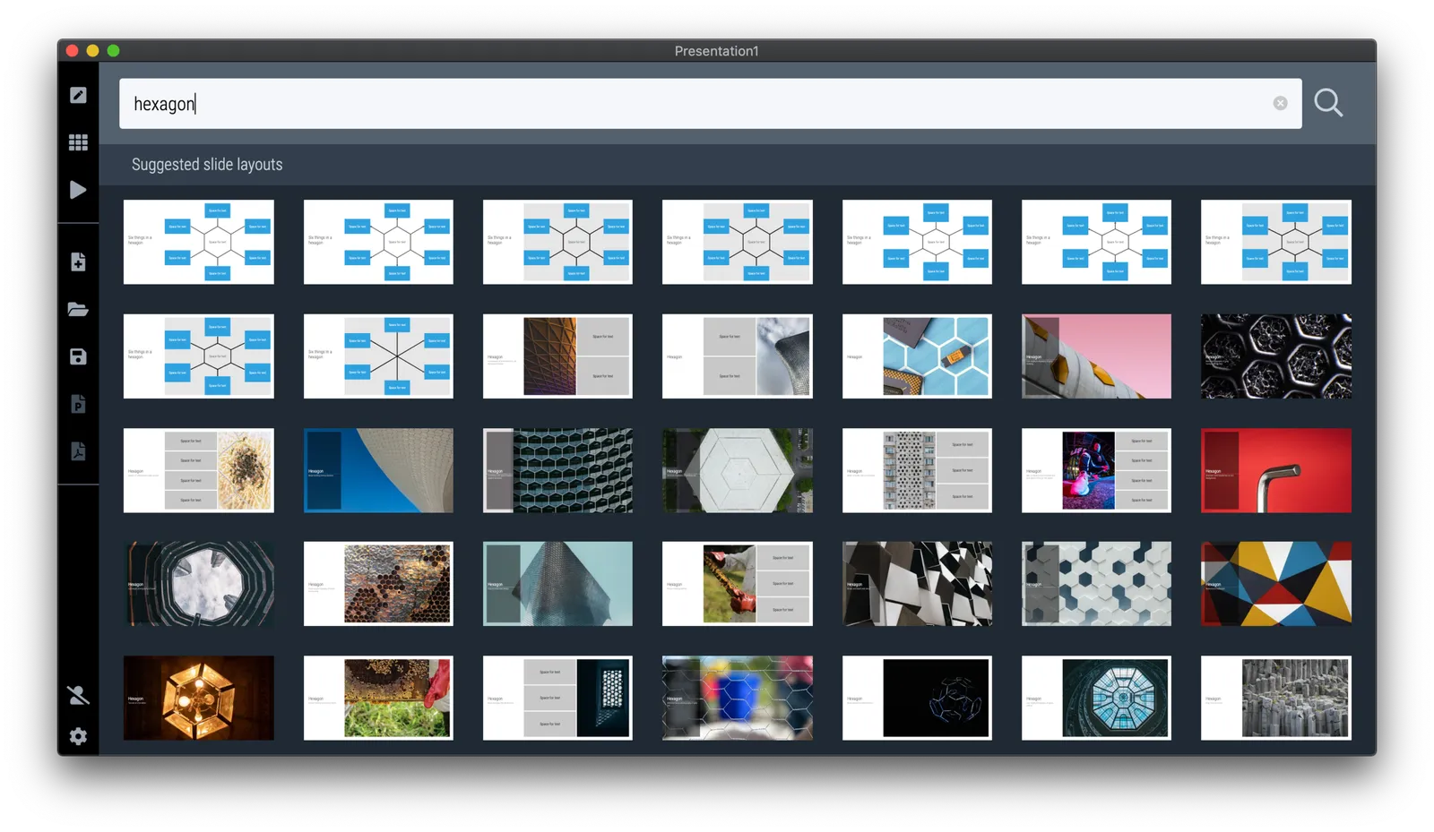
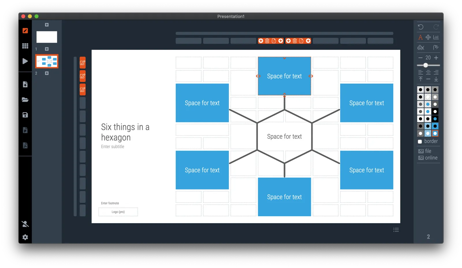
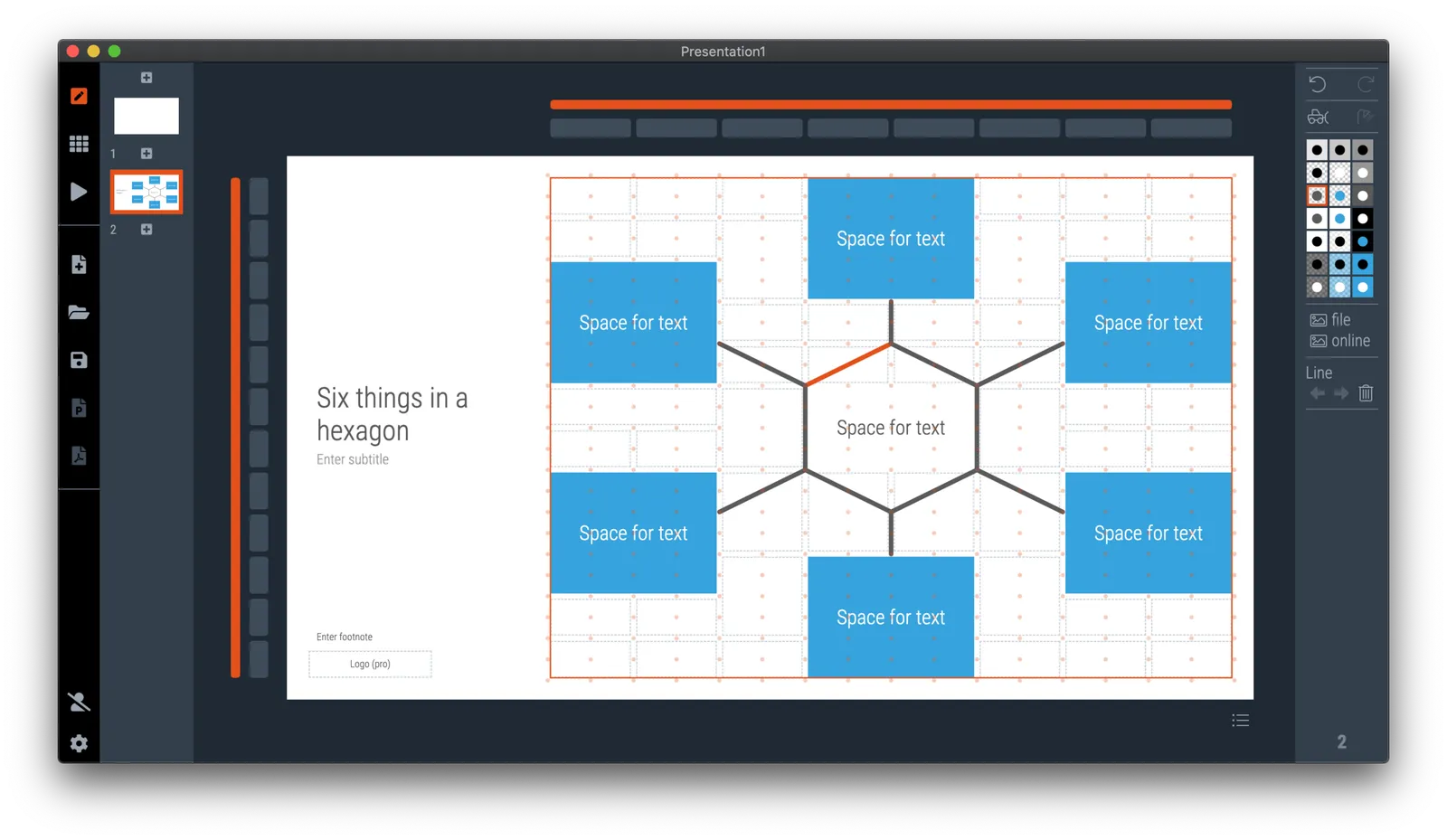
The new line drawing feature in SlideMagic was put in to support the connection of boxes in organisation charts and flow diagrams, but you can use it more creatively as well. The attached examples of the use of hexagon shapes shows how you can bypass SlideMagic’s strict limitations on shape types (basically boxes). But do you need to?

Photo by Jonas Svidras on Unsplash

·Images

Image cropping with a focal point

SlideMagic can switch back and forth between multiple layouts, and needs to handle rapid changes in the grid of a slide. As a result, aspect ratios of images get changed all the time, tripping up your carefully selected image composition. At the moment, the app is storing different crop and zoom levels for different aspect ratios, but that solution is not ideal. (You see how Squarespace gets it wrong with the banner image of this blog post).

I want to get to the point where a SlideMagic user can click a focal point of an image, after which the app will do the hard work of re-adjusting the crop automatically. Doing research, I see a lot of “AI” applications that can figure out what the focal point of an image should be, there seems to be nothing that deals with focal point-based cropping itself. The solutions I see, are ones where you can store multiple crops of the same image, after which the most appropriate one gets selected.

I started scribbling a manual algorithm to come up with reasonable compositions. Here are the first (manual but automateable) results applied to some cows on a beach in Africa, the first image is the original.

It works pretty well, on the the extremely horizontal one gets cropped too low, I would have shown a bit more sky on that one. Let’s see if we can get this to work, both in terms of the algorithm, and the user interface.

Continue reading →
·Design

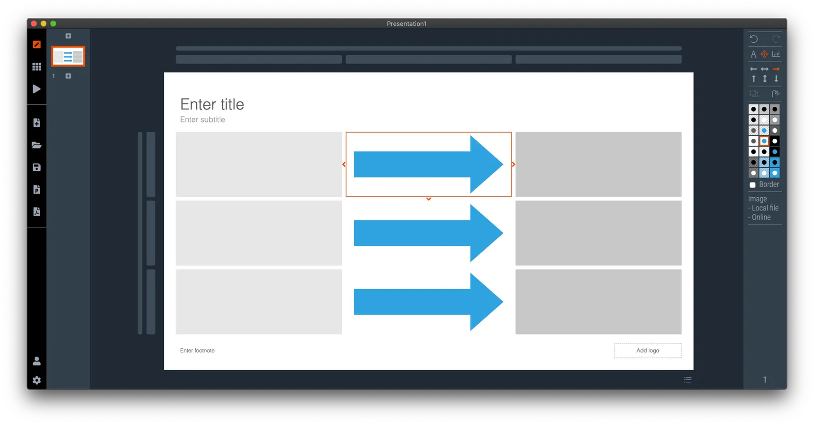
The perfect arrow...

I am replacing the connectors in SlideMagic with 2 features. The relatively thin lines that connect boxes in a diagram went live yesterday. Currently I am working on the 2nd feature: fat arrows to show cause-effect relationships or other forces.

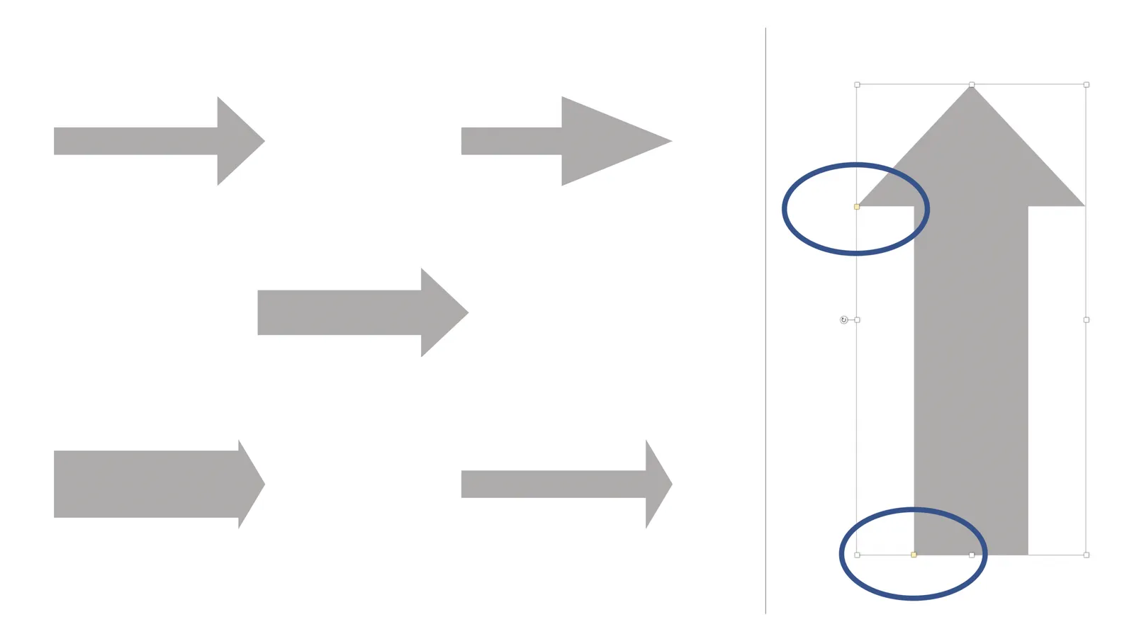
As I already discussed back in 2017, it is tricky to get arrows to look right in presentation software. The aspect ratio of the containing box, the angles of the arrow, some come out great, others won’t.

And even if you got one right on your slide by moving the various sliders in the shape, how do you make sure that the 3 below it look exactly the same? Oh, and then you need to insert a fifth one and squeeze everything a bit…

I think I am on to a possible solution. I scribbled an algorithm on a piece of paper, now let’s see how to bring it to life in SlideMagic, and then convert them to PowerPoint. The latter might have to be via an image rather than a dynamic shape. Below is a screenshot of my development machine. Work in progress.