SlideMagic Blog

Frequent updates about all things presentations since 2008. Subscribe to never miss a post.

RSS
all posts

Search results for “web design”

·Design

The Sword of Damocles - with a bit of shadow drama

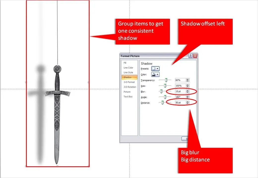
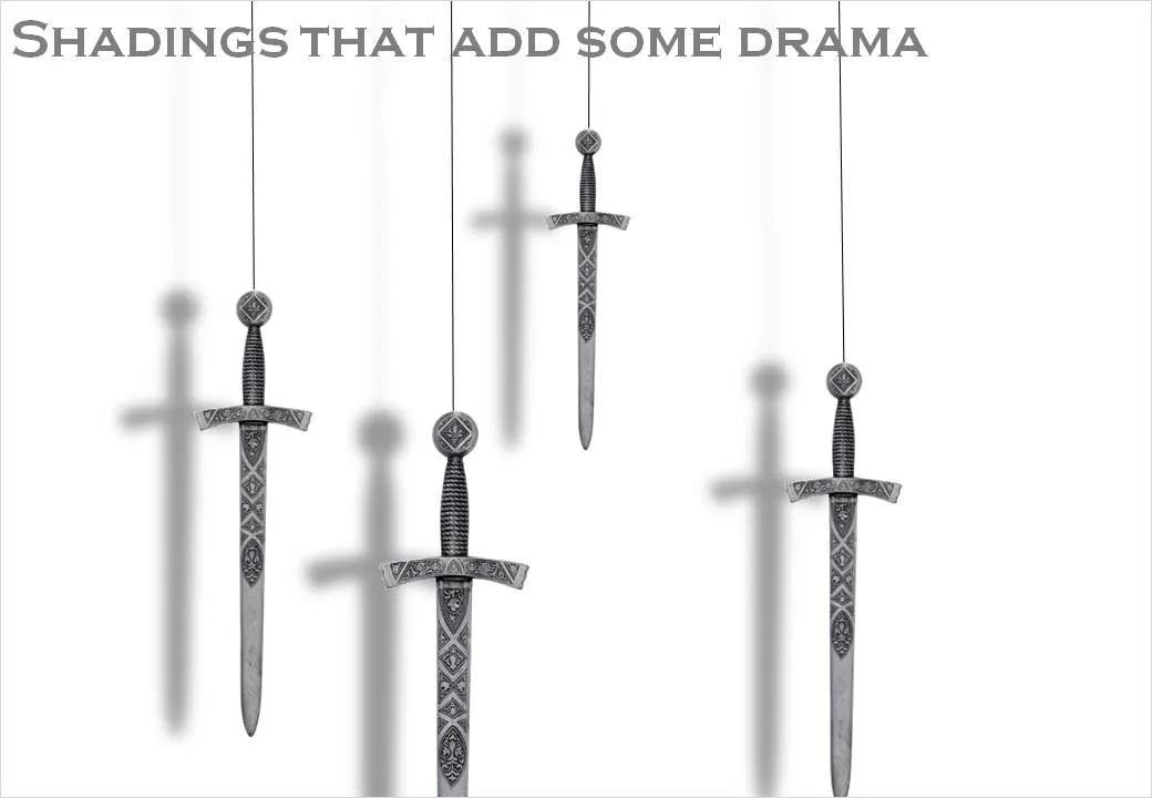
I had to design some apocalyptic presentations lately (sign of the times) and the Sword of Damocles composition below gave me the opportunity to play around with PowerPoint shadows.

The standard shadings in PowerPoint are a bit blunt and boring. Go into the “format shape menu” and click the “shadow” box. Experiment with the settings to get something more interesting. Increasing the blur, and increasing the distance creates the illusion of a wall right behind the subject. Just what I needed.

When you apply shadings to compositions make sure to group all items together first to get one smooth shading of the entire shape instead of individual shadings for the individual components.

·Advertising

The cobbler walks barefoot

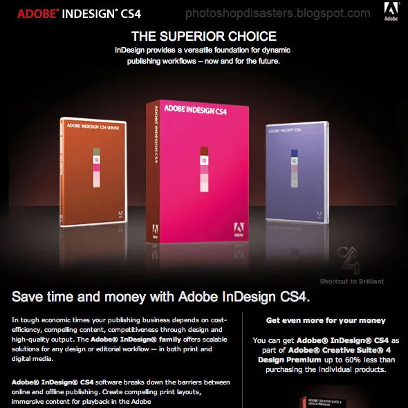
You would expect Adobe, the publisher of many design software packages, to be pretty good at designing print advertising. Not always. Have a look at this image that was featured on Photoshop Disasters.

Especially Adobe should have spent more effort to get the reflections right (see the right box), make the box shots look more realistic, and use better typography. This image looks like a poor “Photoshop”, not the best way to promote the Photoshop software.

Leaving the technicalities of the ad aside for the moment, there is a broader lesson here. This ad looks exactly like PowerPoint slides that many technology companies use to promote their product. They can do better.

  • A lot of headlines competing for attention
  • Box shots (software is not a breakfast cereal)
  • “White paper language”: spelling out the product benefits explicitly using very generic statements that do not get internalized by the audiece: “superior”, “dynamic”, “competitiveness”, “scalable”
·Concepts

Chart concept - bouncing ball

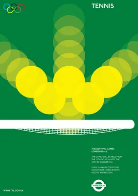
The best graphics design work is often the most simple one. Noisy Decent Graphics pointed to these beautiful Olympic posters designed by student Alan Clarke. (They were not adopted by the organizers of the Olympics though).

The bouncing ball in the tennis poster gave me inspiration for a concept that I can use in PowerPoint charts. Semi-transparent circles (with different levels of transparency) flying over the screen are great to show movement. Be sure to remember the law of reflection though,  :-).

·Design

Gadget review: Logitech Presenter remote control

A remote control is an essential tool for any presenter. You do not have to go back to your computer all the time to look for the arrow keys to change the slide. This is especially important if you adopt a “Zen”-style presentation: lots and lots of images that change at a very high pace. I finally got one.

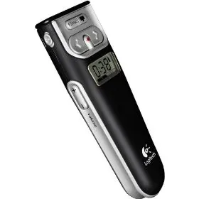
The Logitech 2.4 GHz Cordless Presenter does the job perfectly.

  1. Minimalist design, only the keys you really need: slide up/down, volume, screen “F5” and a button to black out the screen to talk to your audience without the distraction of slides.)
  2. The USB computer connection can be stored inside the device
  3. It has a stop watch to keep track of time
  4. It does (partly) work on the Mac (I run the latest Mac OS). Flipping through slides in both PowerPoint and Keynote, and changing volume is OK. The black screen and “F5” keys do not produce meaningful results (the opposite, they start inserting characters into your Keynote slides)

The device also has a built in laser pointer (although I am not a big fan of that nervously moving red dot on my slides).

·Design

The outrageous SlideShare title page

In a big conference hall your title page should contain some useful information for the audience that is walking in (“Is this the right session?”). When designing for online presentations platforms (such as SlideShare), they need to grab the attention of the site visitor without patience. Pretty much like the posters you used to put up for your events near the coffee machine in university.

Here is my coffee machine poster for a lecture I will be giving at the Technion in Haifa, Israel next week. In case you are in the neighbourhood…

·Design

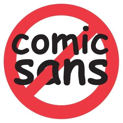
The global "ban comic sans" movement

Weekend reading. Comic sans is a font that resembles hand writing. Released by Microsoft in 1994, it was made popular through its standard inclusion in its Windows and Internet Explorer software. Graphics designers (with the sympathy of the Vincent Connare, creator of the font) started a movement “ban comic sans” as early as 1999 to stop the font from taking over more and more print and screen space around us. An entertaining summary of the history of the font and the efforts to put the genie back in the bottle can be found in this WSJ article.

What do I think? I agree that a comic-style font is not suitable for every occasion. When I have to use one, I prefer picking a more extreme comic font, like boopee. The problem with comic sans is that it is now so common that it has become boring. The same with Times New Roman…

Comic Sans from Sam and Anita on Vimeo.

·Design

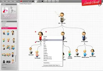
Lovely charts with Lovely Charts

Computer network diagrams are hard to make in PowerPoint. Finding the icons, positioning boxes, connecting them. The web application Lovely Charts might be a good solution. Also for flow diagrams, organization charts etc.

If you are in to designing network diagrams in PowerPoint, be sure to visit the Cisco icon library.

Via Armano

·Design

Meet Mr. Chicken and think about your PowerPoint template

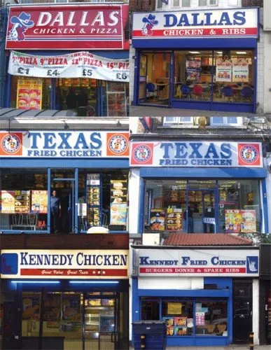
Amazing, there is one person who designed the “logos” and store fronts of almost 90% of all independent fried chicken outlets in the U.K. “Mr. Chicken” is interviewed here, there is even a book available on the phenomenon.

Amusing reading. However, it is not completely justified to pooh pooh these logo designs. Because they all look the same, they are actually pretty effective. If you find yourself in a U.K. high street looking for some fried chicken, you find one of these outlets in 2 seconds.

But, you do not want to be “Mr. Chicken” when it comes to your PowerPoint presentation. Get rid of the generic logo. Free up the screen real estate that is consumed by heavy banners with empty slogans. Instead, let people see the “what you have in store” with great content in your slides, all in a nice and consistent color scheme.

Via Noisy Decent Graphics.

·Books

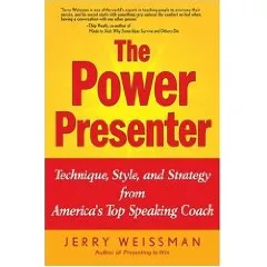
Book review - The Power Presenter

I just finished reading the book “The Power Presenter” by Jerry Weissman, a public speaking coach.

My main interest is in graphical slide design, so it is a bit unusual for me to be reviewing a book that is solely about delivery of speeches and presentations. Initially I found it a bit hard to get into the story of the book, but as I finished more and more chapters the entire plot of the book became clearer and by the time I read the last page I found that I learnt some real valuable lessons that will affect every presentation I will give in the future. The central objective of the book is to get rid of a presenter’s adrenaline rush when presenting: the instinctive debate of the body whether to fight or flight a stressful situation. Rather than prescribing a number of dogmatic “presentation rules”, Jerry suggests way to create a natural way to becoming a more confident speaker.

Central in his book is a concept called “ERA”:

  • Eye connect: “only speak to eyes”. Much more powerful than “don’t turn your back to the audience”, or “don’t muffle your voice”. It is a simple rule that everything you say, everything, should be said by looking a member of the audience straight in the eyes, waiting for eye contact, delivering the sentence, and then move on. No exception. Quite a challenge for a presenter, but it makes sense
  • Reach out with your hands and your body language to simulate the appearance of a hand shake
  • Animate, adding more drama and passion in the way you deliver your message
Continue reading →
·Concepts

Chart concept - signs with a little humor

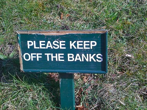
High-quality pictures of signs are great raw material for a presentation. They stand out by themselves, people are used to take a moment to read them and they could add some humor to your story:

  • Typos, or unusual text as an ice breaker for your audience
  • A correct message that is put out of context in a funny way in your presentation

The downside, they are very hard to find, but with a bit of creativity you can re-create them either by using a blank sign from a stock photography site, use a generator like AddLetters, or - even better - creating one of your own using PowerPoint shapes.

Here is a diffrent take on the credit crunch found on Noisy Decent Graphics: