OK, OK, I get the point, thank you
Repetition helps the brain to remember things. But when looking at a slide, it is just fine to say things once. OK, OK, I get the point (for now).


Frequent updates about all things presentations since 2008. Subscribe to never miss a post.
Repetition helps the brain to remember things. But when looking at a slide, it is just fine to say things once. OK, OK, I get the point (for now).
I wrote about pptPlex and Prezi before, but for the first time I actually spend some real time to get into the details with 2 tools to let you design presentations on a big canvas, which you can mover around during a presentation, and you can zoom in and out of.
An introduction video about pptPlex:
An introduction video about Prezi:
Both of these tools have a learning curve, and I would be curious to see whether any of you have tried them out as well. Some of my observations below could simply be because I am ignorant of some of the features of the software.
My overall comment is that I really like the ability to freely move around, zoom in and out in presentation content. For example in fund raising presentations (small smart audience with little time), questions from the audience might take over the pre-set order in which slides are presented. But this also brings me to the main “negative” feedback of these tools: both are basically “frameworks” that link a series of slides or objects. I am missing the ability to design a presentation really as just one infinite canvas. The effect you get in Google Earth: zooming into ever more detail.
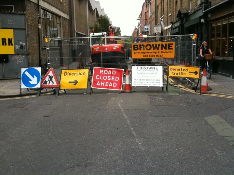
When you use very little words on a slide, the position of the them becomes crucial. I always correct the automatic line wrapping manually.
Either the designers of this ad wanted to make something that is hard to read on purpose, or this is a mistake.

Via Ads of the World.
It is hard to find that one image that tells your entire story, especially when writing fund raising presentations for technology startups. This one comes pretty close: “Dont’ lose your contacts when you drop your phone”, and ad by Indian mobile phone operator Airtel for a phone address book backup service.
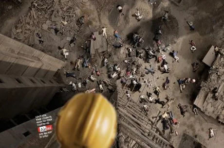
See how the composition of the image creates an enormous depth of field. Although it might clash with a minimalist approach to design, I would put the message in a big bold title on top of the image if I were to apply something like this in PowerPoint. Over-communicating is better just to make sure that everyone gets the point.
A larger image can be seen here on Ads of the World.
The text balloon is commonly used in cartoons. It is now making its way in PowerPoint presentations as well. There are 2 fundamental ways in which you can use them.
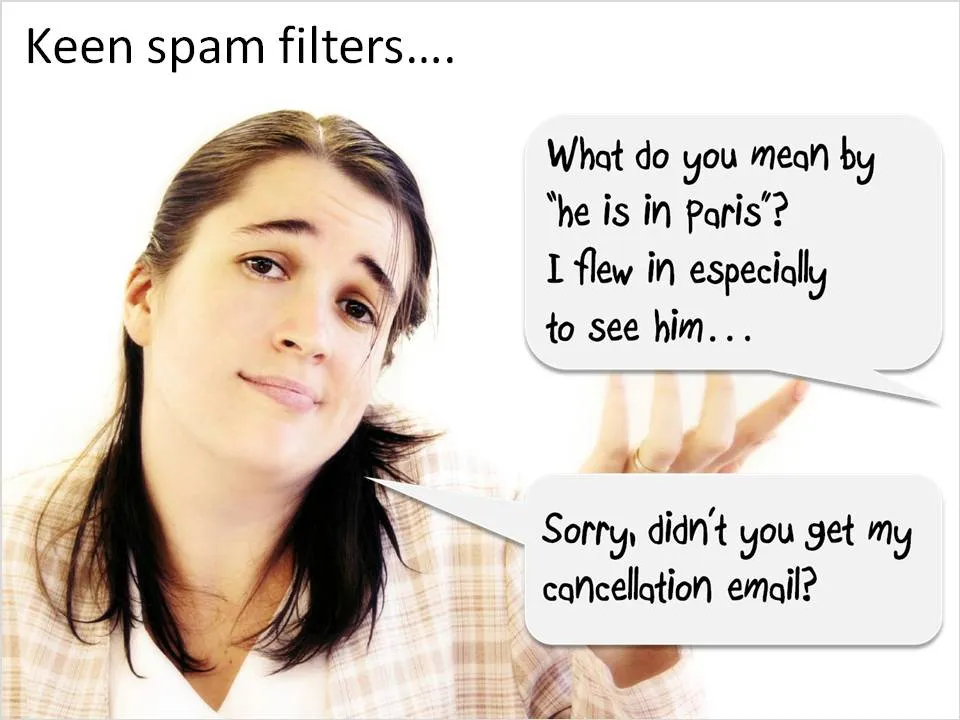
If you use mini-dialogues:
While browsing Hugh MacLeod’s “gapingvoid” blog (wonderful cartoons) I stumbled across this online investment pitch for an enterprise software startup that calls itself thingamy.
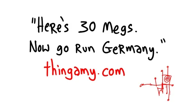
There are different phases in VC due dilligence. The 60 second look, the first 15 minute meeting, the first hour spend, sitting through a pitch and finally the complete “turn everything upside down” check on the company.
You should read the blog post by VC-ist Brad Feld about “Saying no in 60 seconds”: investors are ploughing through huge deal flows and need to make up their mind quickly to avoid wasting a startup’s time, and wasting their own time that they could have spent on deals they want to do, or working with their portfolio companies. It sounds harsh, but a polite “thank you” after a 60 second analysis is still better than no answer at all.
So I took the 60 second stage of due dilligence (as a VC amateur, but a professional presentation ptich designer). My feedback.
Things I really liked:
It’s public. The fact that you are looking ofr money, the story behind your company, all available to see for everyone on the Internet. More startups should have the confidence to do this. Spread your story within the boundaries of proprietary IP.
The headlines and the supporting cartoons on the 30megs site.
The completely different approach to fund raising gets you a plus as an entrepreneur/team.
Things that can be improved:
Presentation design needs time. Squeezing out the last slides the night before the deadline will make your presentation look like, well, a document that was squeezed out the night before the deadline (most management consulting presentations). Give yourself lapse time to complete your presentation. A day of work spread out over a week gives much better results than sprinting from 18:00 to 02:00.

Most ideas come at times and places when you least expect it, and when you don’t always have a note book around. Evernote seems like a useful tool. Capture things on whatever device is convenient, but most importantly, archive it and make it searchable. This archiving is the most important feature I think. Finding notes, mobile phone images, yellow stickies, I lose most of them.
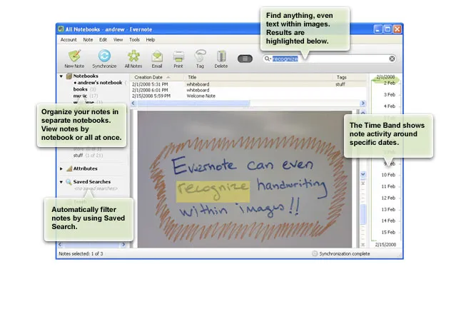
Maybe a special case of Fred Wilson’s “watch later” concept: stumbling on things when you do not have time to deal with it, putting it away somewhere for later access.
Via Lifehacker
Seth Godin picked a T-shirt print provider based on a clean and professional looking web site and a straightforward pricing policy because it conveyed a sense of trust. There are lessons for presentation designers here.
It is good to invest in your presentation design. Over-doing the graphics though might give a negative return on investment:
We can all imagine a slick sales person (cars, kitchens, insurance). Do we trust them?
Handouts or regular hardcopies (“napkins”) of a PowerPoint presentation come out OK on a laser printer, the device will shrink the slides to leave a white band around them.
Although less common now, sometimes a napkin-style hard copy is not enough. Especially investment bankers like to hand out high-quality prints of a presentation. If you haven’t set up your presentation for this properly, you wil be faced with a lot of re-design work hours before your presentation. The image below (click for a larger picture) contains the essentials that can save time and stress.
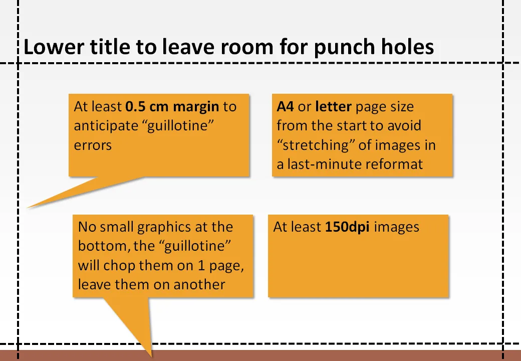
Some more advice. All of this probably makes perfect sense to the graphics design professional working in Adobe InDesign, but PowerPoint “amateurs” (including me) have figured this out by experience (unfortunately).
There are many great creative web sites that you can add to your feed reader for a daily dose of graphical design inspiration, far away from the PowerPoint slide editing screen. One example is Behance showing projects in typography, graphics design, illustration, photography, and other design disciplines.

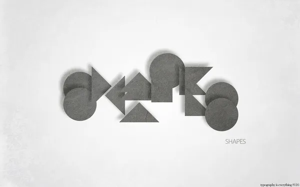
Today, “hard to read typography” by Simon Page is one of the items featured on the front page. Here is one example from the collection that is actually relatively readable.
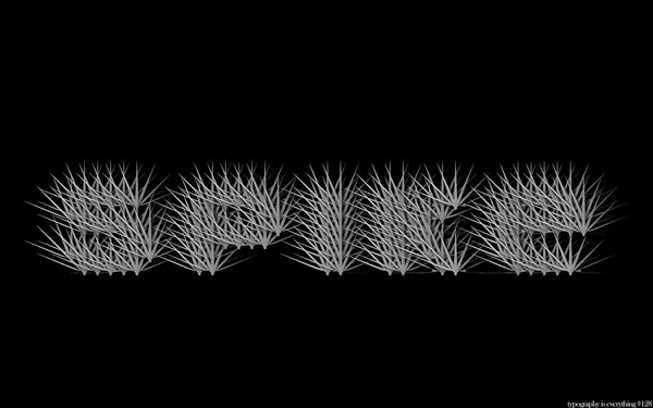
A bit harder to read:
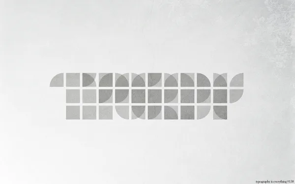
What’s written here? Is “shapes” a helpful hint?