SlideMagic Blog

Frequent updates about all things presentations since 2008. Subscribe to never miss a post.

RSS
all posts

Search results for “web design”

·Design

Help, not enough white space in my image!

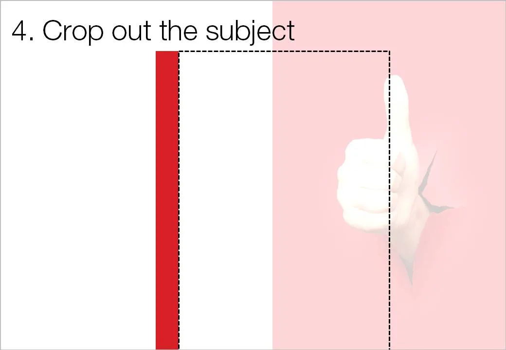
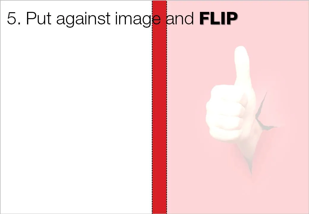
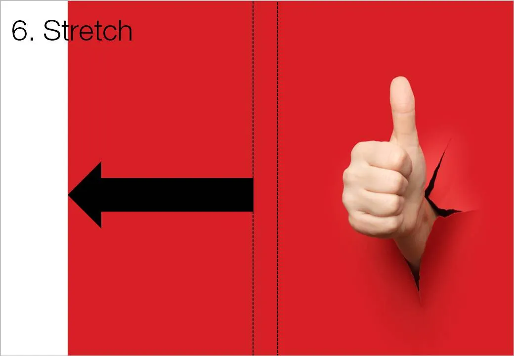
White space is a powerful element in slide design. An image with the subject in the center often does not leave enough space to let the slide breathe a bit. The following image sequence explain a work around. Basically, you stretch the background of the image without stretching and distorting the image subject itself. Flipping the cropped background makes sure that there is a smooth transition between original and stretched background.


Image via iStockPhoto.

·Design

The trouble with 99% perfect photo compositions

See the ad below. Something is not right. It is hard to see what it exactly is, but the image is not natural. The light? The shadows? The 3D proportions?

Photo manipulations are increasingly easy to make, but the technology of image editing is not the problem. We already learn as a child that getting 3D to look right on a 2D canvas is hard. Architects and designers use a full 3D design environment to create realistic-looking simulations.

But, a 3D composition can look great even if the designer does not even bother to get the proportions right. Art would be have been incredibly boring if painters had stuck to the conventions all the time. Luckily they did not.

The problem are those compositions that are almost right, but not 100%. Look at the ad: very good technical execution, no ruffled borders around the sheep, drop shadows re-created, letters embedded in the fur: far better than most PowerPoint designers (including me) could do. Still the viewer is distracted: what is going on here? A distracted audience does not absorb messages.

In short: distort reality completely or forget about photo compositions all together.

Related, one of my earlier posts contains some useful links about photo manipulations.

Ad via Ads of the World.

·Art

Develping confident PowerPoint "brush strokes"

OK, this concept is somewhat hard to explain. I will give it a try, but I am not sure I can get it across in a blog post. Here we go:

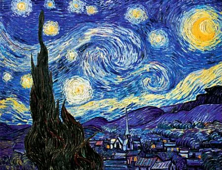
Paint is irreversible: therefore a painter must get it right a first time, or otherwise face extensive fix up work. The more experience the painter gets, the more confident a painter becomes. It is better to make a (small) mistake than restrict yourself to making timid and boring paintings.

The starry night, Vincent van Gogh, 1889, oil on canvas, 74x92cm, MoMa, New York

I notice something similar in presentation design. Be confident as your design your slide in “analogue mode”, scribbling on a piece of paper. Be confident to open the PowerPoint screen, delete all Microsoft bullets and start adding elements from your design: box, box box, align, arrow, etc. Make them big, bold, confident, but minimalist.

In this way you work faster, and slides come out more natural. It is all about confidence.

Maybe this post does a better job in explaining.

·Data visualization

Formating an Excel table in PowerPoint (under time pressure)

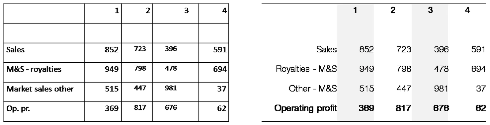
At 11PM on the evening before the Board meeting, the finance department emails you a horribly looking PowerPoint deck full of copied tables from Excel with the latest quarterly results. There is no time to start designing beautiful data charts. What emergency fixes can you do?

Here are a few suggestions:

  • Select the the table and set the fonts and font sizes to the ones you are using throughout the presentation. (Get rid of that Excel Arial)
  • Remove as many abbreviations as you can
  • Right-align the row labels
  • Right-align the numbers
  • Take out decimal points, or add decimal points so that the numbers align
  • Round up to whole millions, billions if you can
  • Select the columns with data and distribute them, set them to be exactly the same width
  • Put repeated words (“M&S” in my example) to the right
  • Center the column headings
  • Bold up the totals
  • Get rid of as many borders as you can
  • Add some subtle grey tones to differentiate columns

Click on the image for a bigger picture.

·Design

Five presentation images your audience will not understand

It is important that your audience “gets” the image on a slide immediately, otherwise they will be staring at it, thinking about it, trying to solve the puzzle, in short everything but return their attention to you as the speaker.

Some reasons why an image that makes perfect sense to you in your office might not work for a big audience:

  1. The clue is in the small print (as in the image used in this post). Put a big marker to draw the attention to the sentence that matters
  2. Incredibly busy compositions, Times Square in New York, a screen shot of a video game
  3. Cartoons with a lot of text. Things get worse when a small cartoon image is scaled up, leaving a poor picture quality. Give your audience time to read it, and may black out the screen to focus attention back on you
  4. (Too) interesting people: an image of the red carpet during Oscar night might make people wander off and examine those beautiful dresses rather than listen to your story about Business Process Redesign
  5. Clever graphics such as an Escher drawing. “Hey, how did he do that?”
·Design

Avoid slide elements with negative connotations

I really like red as a bright contrasting color to put comments or circles on busy slides. Until a meeting with people in the Finance Department of one of my big corporate clients. “Can you please take the red off, in our (financial) language red equals bad news”.

Three things to avoid in slide design:

  1. Bright red highlights in fonts, especially when talking about numbers
  2. Arrows pointing down (if you want to visualize something positive), why not redesign the slide and have them point up?
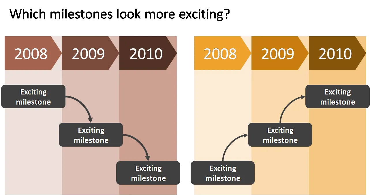
  3. Lines, sequences, or page elements that force the eye to go from top left to bottom right. The milestone graphic in this earlier post is a good example.

As always, these are not rules to be set in stone, it is just another piece of slide design context that you should be aware of.

·Design

The best wishes for 2010

I would like to wish all readers happy holidays and a healthy and prosperous 2010. From a presentation perspective, try to make a difference in 2010, for example:

  • If you are working in an organization with a conservative approach to presentations, try to find an opportunity to demonstrate a different way to get your message across, spreading the ideas we talk about here to more people.
  • If you are a professional presentation designer consider donating some of your time to a really important cause and design the best possible presentation for it.

Since Tel Aviv is bright, warm, and sunny today, and probably the only Xmas tree in the city is put up in my apartment, I actually enjoy watching some of these old masters that have been put too many times on post cards:

Pieter Breugel the Elder, 1565, Hunters in the snow**, Oil on wood, 117x162cm, Kunsthistorisches Museum, Vienna

·Data visualization

PPT hack - custom chart templates

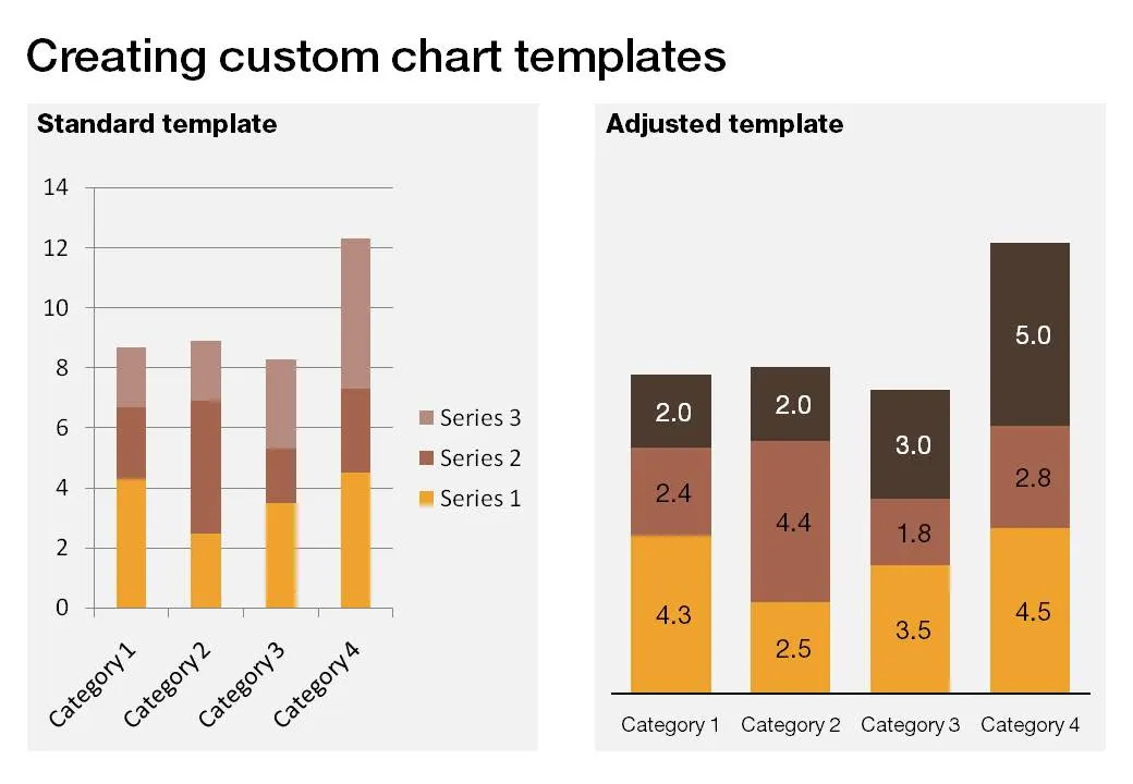
The standard PowerPoint templates do not look very good. The standard slide layout invites people to write presentations through endless lists of bullet points. But even more time-consuming to change are the standard templates for data charts.

This earlier post with a make-over of a column chart in a presentation by Skype shows some of the pain a presentation designer has to go through over and over again to create decent data charts. It took me around 17 years to discover the option to create your own templates. Let’s save you this time, right now.

If you click a chart in PowerPoint 2007, you can find the “save as template” button in the “design” ribbon of the chart. (Confusingly, two “design” ribbons pop up when you have a chart open, one for the chart, one for the slide). Give your template a name and PowerPoint 2007 will save it in the appropriate directory (with a “.CRTX” extension, but you do not need to worry about that).

The next time you select “insert chart”, a folder appears at the top of the standard PowerPoint options, open it to create a data chart using your own customer templates.

·Art

Finding font inspiration in Bauhaus architecture

More presentation design and art today. I had a very clear policy on the use of fonts and typography:

Until now. I just finished a presentation:

  • Set in ALLCAPS
  • Using the Futura Bk font
  • 90% of the slides are set in bold (yes, ALLCAPS bold)

The Futura font family is to blame. The history of the font go back to the 1930s and its design is heavily influenced by the Bauhaus movement. Clean geometrical shapes, look at these o’s, almost perfectly round.

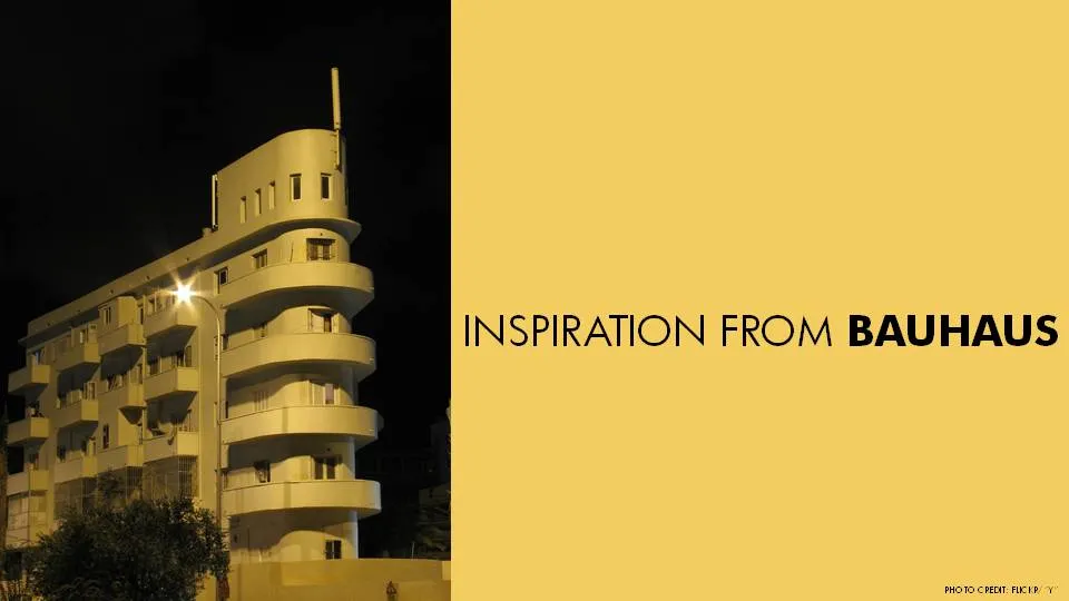
Maybe being located in Tel Aviv, a city that has one of the world’s most extensive collection of Bauhaus architecture, had something to do with it. The picture below is an example of a Bauhaus-style building in Tel Aviv, the “Bait ha’Onia” or “Ship house” on 56 Levandah Street, designed by architect Arieh Cohen and built in 1934-1935. To make the side track complete, if you are interested in Tel Aviv Bauhaus architecture, make sure to get your hands on this book (text both in French and in English).

Back to presentation design. In particular I like two font variations of Futura. The Light version (Futura Lt) for thin, elegant, sentences in sentence case, and the Book version (Futura Bk) for all caps. The allcaps look especially impressive in fat bold (look at the font in the image). Obviously, some of my old font design principles still hold. Allcaps bold fonts should only be used in presentation that contain a few words per slide.

Continue reading →
·Design

Harmonizing images using Photoshop filters

A presentation should have a consistent look and feel on each slide. When you are using just text and PowerPoint shapes, this is no problem: just use consistent fonts and colors. Images complicate things because they usually come from different sources and - as a result - have different styles:

  • Colors
  • Real” images versus studio shots
  • “Real” images versus computer-generated renderings
  • “Real” images versus “real” art versus stock image art
  • Vintage versus modern images
  • Portraits, landscapes, objects

Have a look at well-designed books with many images: the images are different but somehow fit together. You as a presentation designer can do a number of obvious things to harmonize image styles:

  • Actively pick an image style when you start out designing a presentation (or - like me - adjust the image style as you go through the design process, replacing images as you go)
  • Minimize the number of image sources
  • Use less images
  • Take out the color of all images, and just use black & white, or apply a color overlay

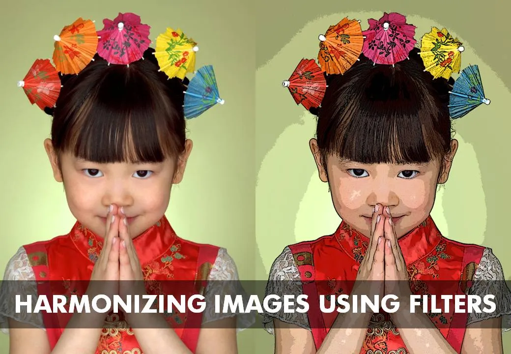
Recently I discovered another solution: applying consistent PhotoShop filters throughout your presentation. A slightly brutal way to harmonize images, but the result can be a presentation with a unique look and feel. The image below has been subjected to a “poster edge” filter, creating a pop-art style of presentation if you apply it consistently to every image in your presentation.

Image via iStockPhoto