SlideMagic Blog

Frequent updates about all things presentations since 2008. Subscribe to never miss a post.

RSS
all posts

Search results for “web design”

·Keynote

1st impression web page

For most companies, a web page is a store front, a shop window. It should look professional, give a basic sense of what you are about, and provide instructions how to get there/contact you. Sophisticated visual effects, carefully crafted strategy paragraphs, mission/vision statements, marketing buzzwords might be important to you, but not to the reader of your home page.

  • Cut back the amount of content
  • Ditch the sophisticated custom design for a good looking template (such as squarespace.com)
  • Make sure the basics are up to date (address information, management bios, the “news” section)

It is that simple.

·Design

License plate design

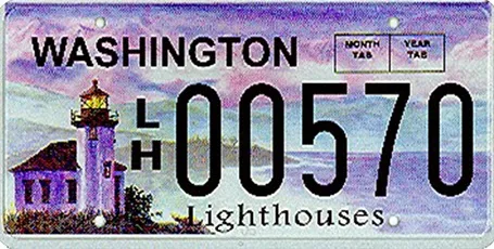
There is a parallel between the decline in license plate design as discussed in this article by William Morgan on Slate, and presentation slide design. Digital printing technology allows the addition of (background) graphics and unlimited use of colour. The result is a license plate that is unreadable and an ugly blob of graphical clutter on your car.

·Keynote

Free quick logo design tool

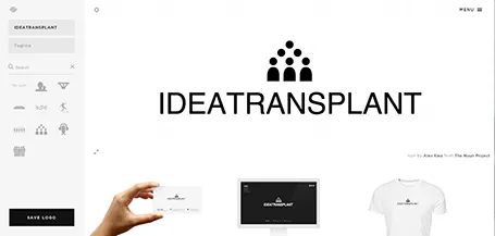
I am a big fan of the web design tool Squarespace and am currently turning a restaurant web site template into the marketing site for my presentation app. Hidden inside Squarespace is a cute free quick logo design tool that uses icons from the noun project. If you are a startup on a tight budget, it could be a good source for your first graphical identity before you are ready to pay serious designers.

·Keynote

Web site = company presentation

Now and then I get stuck on the border of web site design and presentation design. And increasingly, the border is blurring. I am not talking about big eCommerce sites or sophisticated web applications here, I deal with a straightforward web presence for a high tech startup.

How can a presentation designer be helpful here?

  1. There is hardly any need for extensive technical content. Viewers are looking for a simple and professional looking page that quickly answers a few basic questions: what do you do and who are the people behind the company. If your page looks like a 800-pixel wide website from 2002, your company is probably from that time as well. If I cannot find details and names of the management team, nor a postal address then the company might actually not be real.
  2. Web-based presentations and web sites have the same audience: click, click, click-ing to find out what you were looking for. Elaborate text, buzzwords, spectacular videos, auto-play music all distract and delay in exactly the same way as animation and bullet points do in a PowerPoint deck.
  3. There are great what-you-see-is-what-you get tools out there for novices to build web sites. Wix has a very consumer non-professional feel, Webydo is like Adobe InDesign put online, and my favourite is Square Space. My own web site is still based on Wordpress, which missed a great opportunity I think to become a simple web site creation platform.

Basic web presence design will become increasingly standardised, but I still encounter many web designers who continue the bespoke route of the past decade. Prediction: something similar will happen to presentation design and enterprise communication: you can instantly recognise two types of presentations: 1) the bullet list by the non-designer, 2) the presentation that is prettied up by a professional graphics designer (icons, banners, logos, effects). I am working hard to eradicate both.

·Keynote

PowerPoint web app

After my quick review of Keynote and its new web app version, I went back to check out the Microsoft PowerPoint web app, which is free to use for anyone with a Microsoft Sky Drive account.

Overall the look and feel of the app is similar to the desktop version, interactions are reasonably snappy, but there are a few very simple roadblocks towards making this a credible alternative to the desktop version. I did not bother to go into a more detailed review at this stage:

  1. Fonts. If you used custom fonts in a presentation designed on your desktop, they will not show up in the web app (I use a Mac so I cannot embed fonts inside a PowerPoint file). This is a showstopper: it is very difficult to edit a presentation when you cannot see what you are doing, and completely kills the option of using the browser to present your slides.
  2. Data chart. You cannot edit or create them. No use for a business presentation.

 We are heading in the right direction, but are not there yet.

·Keynote

Design inspiration

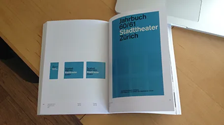
See how easy it is to use a classic design into a beautiful presentation template. A 1962 brochure designed by Josef Mueller-Brockmann (read more about him in this book), image of the girls by H-Huynh.

·Advertising

Everyone can design

Advertising agency RPA made a bunch of Apple-style ads for common products, probably intending to show that the world would be boring of all ads looked like this. I actually disagree, and would welcome to see the clutter in advertising go.

You see how easy it is to create professional looking slides by just applying a bit of white space and picking the right crop for your images. You do not need to be an advertising professional to do this, you do not need sophisticated software to do this.

Via AdFreak.

·Investor presentation

What is a good fund raising web site?

I see many startups pitching for VC or angel money early in their life. The investor presentation is often first piece of collateral that the company produces. The second one is a web presence and people ask me how it should look like.

A fund raising web site of a company that is not operating yet is completely different from one that provides a service and/or processes live transactions: it is a relatively static piece of fund raising content. The only visitors it is likely to get are investors you have met or heard about you checking out the company, or maybe potential users that have found out about you in the rumor mill. The web site should be designed with that audience in mind.

The content of an investor web site can be very minimal, look and feel should be highly professional. Let’s start with the look and feel.

  • URL. Make sure that you have the URL to your company name and that your sites uses it (and that you use it for your emails). This is check 0 of an investor to see whether you are actually real or not. Gmail addresses and Google sites do not score you any points here.

  • Template. The site needs to look like that of a serious company, not a MySpace social media profile. Just setting up a Wordpress blog in disguise (i.e., a blog template that is used as a static site) with a nice minimalist template should do (go to sites like Theme Forest to find one).

Continue reading →
·Layout

Presentation = web site

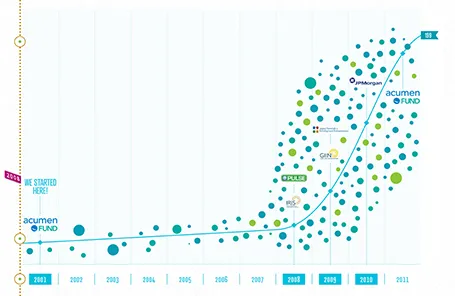
The new web site of the Acumen Fund is a great example of how presentation and web design is blending. Gone are the navigation menus, environmental statements, and other wasted screen real estate. Instead, the site is a vertical series of visuals that equally could have gone into a presentation.

I often recommend this web site design approach to early-stage start ups. Once you have designed your investor presentation deck, you can simplify slides, take out the confidential ones (financials, pipeline, IP) and you have the ingredients for a great, simple web site, that shows potential investors clicking through to your URL a message that is consistent with your pitch.

By the way, Acumen is doing some great work to tackle poverty. If you are interested, join the community here to find out more.

·PowerPoint

Presentation design eBook can be downloaded

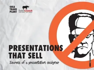
With the help of SalesCrunch, I have compiled an eBook of the 2 NYU presentations and the SalesCrunch webinar. Go here to download the eBook about presentation design. Some readers pointed out a few glitches to me, keep the feedback coming so I can improve it.