SlideMagic Blog

Frequent updates about all things presentations since 2008. Subscribe to never miss a post.

RSS
all posts

Search results for “powerpoint mac windows”

·Keynote

New PPT for Mac now 1 year later

In a recent blog post, Microsoft announced a new version of Outlook (the email client for Mac), but at the same time pushes back the launch of a new Mac version of its Office suite (Excel, Word, and of course PowerPoint) by a year to the second half of 2015:

Historically we have released a new version of Office for Mac approximately six to eight months after Office for Windows. However, following the release of Office 365 we made the conscious decision to prioritize mobile first and cloud first scenarios for an increasing number of people who are getting things done on-the-go more frequently. This meant delivering and continuing to improve Office on a variety phones (iPhone, Windows Phone, and Android) and tablets (iPad and Windows)—brought together by the cloud (OneDrive) to help people stay better organized and get things done with greater efficiency at work, school, home and everywhere between. Continuing our commitment to our valued Mac customers, we are pleased to disclose the roadmap for the next version of Office for Mac—including Word for Mac, Excel for Mac, PowerPoint for Mac and OneNote for Mac.

In the first half of 2015 we will release a public beta for the next version of Office for Mac, and in the second half of 2015 we will make the final release available. Office 365 commercial and consumer subscribers will get the next version at no additional cost, and we will release a perpetual license of Office for Mac in the same timeframe.

Continue reading →
·Colors

Fix the PPT for Mac colour bug

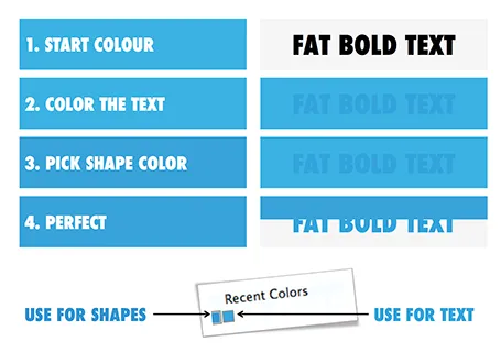
The colour rendering bug in Microsoft PowerPoint 2011 for Mac is highly annoying. Here is fiddly a trick to get around it. You basically need to goal-seek the text colour into something you like.

  1. Pick a colour you like, draw a shape and fill it with the colour
  2. Write some text in a big bold font and set it to the same colour: PowerPoint will render it incorrectly
  3. Here is the fiddly part: repeat steps 1-3 until you are happy with the TEXT COLOUR.
  4. Now, use the Apple colour picker to strip the colour of the text

Save your colour template with 1 accent colour for text, and one accent colour for shapes. In your drop down menu they will look different, on screen they will look the same.

Note 1: I tested the PowerPoint RGB colours as well in Photoshop and Illustrator, and it turns out that PowerPoint renders the shape colours incorrectly, the text is correct.

Note 2: There is a more analytical way to get your desired colour than simply trial and error. You can analyse the RGB codes of the background colour and the text colour. So, set the shape colour to something that you would like. Write down the RGB codes. Colour the text with that colour, and pick its colour with the colour picker. Write down the text RGB codes. Analyse the difference between the two colours and create a third colour by adding/subtracting the R, G, and B differences between the colours. This will be your text colour that renders the same as the desired shape colour. It all sounds more complicated than it is.

Continue reading →
·Colors

PPT 2011 for Mac color bug

Microsoft PowerPoint 2011 for Mac has an annoying bug: when you apply a colour to a font, it comes out slightly differently than when you apply the exact same colour to a shape. One: it looks bad on slides, two: it gives surprises when you open a PowerPoint file created on a Mac on a Windows machine (which does not have the same issue).

When I posted about this somewhere on a Microsoft forum I got the response that this was done on purpose; to make text readable against a coloured background. This does not make sense, if I want to make the text readable, I will put in a different colour myself, and definitely not the one that Microsoft is using. See below, the letter colour is a completely different type of blue than the background.

(Geek alert). There is a complicated way to get around it. Type some text, change it to the desired colour. Now select the desired text (not the entire sentence) and bold it: the right colour appears… But, as soon as you do anything else to your text box, the wrong colour gets put in. Annoying…

·Keynote

OS X - Windows compatibility

Now that the installed base of Macs is growing, especially outside the large enterprises, you need to take into account that your PowerPoint presentation is likely to be opened on both machines.

There are obvious differences to be aware of. The key one is fonts: there is a large set of fonts that are available on both operating systems, but very obvious ones are not always part of the overlap (Helvetica for example is not available on a standard Windwos machine, and Calibri gets only installed on a Mac once the user buys Microsoft Office).

But here are the less obvious ones. Even if you stick to standard fonts, there are still tiny differences in how both operating systems insert line breaks. Watch out especially for tight text in boxes.

Also, there is an annoying difference in the way PowerPoint for Mac colors text and shapes. You pick the same colour for both, but they look different. A design can look perfect on a Windows machine, but off on a Mac.

There is no quick solution to all of this. Installing a second virtual machine on your computer might be a bit overkill. I guess there is no alternative but to ask a friend or the recipient of the presentation to send back a quick PDF file to double check, especially for important presentations that will be presented on screen (as opposed to a document meant for reading).

·PowerPoint

First impressions of Windows 8

Although I have switched to a Mac, I dip into the world of Windows now and then on a virtual machine, for such things as running .EXE CD ROMs with medical images on them, or editing a chart for a client still on PowerPoint 2003. The latter is no longer necessary, and that is a good thing, since Windows 8 is no longer supporting PowerPoint 2003.

So, I took the plunge and installed Windows 8 on my Parallels 8 virtual machine. I ignored all the scary warnings on the Parallels web site and managed to get a perfect install.

As a non-Hebrew speaker in Israel I always have an additional issue when installing new software. Trying to change the system language on a computer without being able to read most of the text on the screen. Gambling, plus comparing English and Hebrew screen shots finally did the job, but my computer science undergraduate degree came in handy. Not something for novice computer users as languages for application screens, keyboards, user accounts and welcome screens all seemed to be controlled in a slightly different way.

OK, back to the software. I will not describe the ins and outs of the new operating system here, but stick to my personal impressions. Detailed descriptions can be found in other reviews.

I really like the new Microsoft graphical look and feel of the new Metro interface. It is calm and clean, with simple clean graphics without shadings, gradients, drop shadows and near-realistic leather or paper effects. Some of the tiles on your home screen update in real time with weather, stock market information and a flow of pictures of your facebook and Twitter friends. I switched these live updates off, too distracting.

Continue reading →
·PowerPoint

PowerPoint feature wish list for Microsoft

My wish list of features to be included in PowerPoint. Feel free to add your own in the comments.

PowerPoint 2011 for Mac

  • Custom font embed (available in PPT 2010)
  • Ability to set custom theme fonts (available in PPT 2010)
  • Selection pane (available in PPT 2010)
  • Define custom grid spacing (available in PPT 2010)
  • Ability to lock the static grid

PowerPoint 2010 for Windows

  • Better integration with photo browsers (available in PPT 2011)
  • Included weights in font selection menu (available in PPT 2011)
·PowerPoint

My new Macbook Pro setup

So I replaced my computing infrastructure over the past week. Things are moving fast in the world of IT.

  • Laptop. A few years ago having decent graphical power still restricted you to using desktops. No longer. I have gone mobile. (Maybe motion graphics will make me regret it later). No I can use those little downtimes in between meetings to do actual useful work, rather than catching up on email or Twitter.
  • 17", I compared screen sizes and concluded that as a visual designer there is no avoiding the extra weight and size to get a decent size screen
  • Apple. Strangely enough it is actually the physical interfaces that convinced me. A nice machine to touch, nice keyboard, nice track pad. Something you spend the majority of your day on. Interestingly, a hardware decision, not a software one.
  • Cloud. It was surprisingly simple to move to a new environment when all your critical data resides in the cloud: email on gmail, files in dropbox (affiliate link), clients and invoices in Freshbooks (affiliate link), contacts in Batchbook. Everything is in sync on my new machine, and the legacy infrastructure that I continue to use as backup. 1Password synced via Dropbox to keep track of all the accounts
  • Virtual Windows/OSX blur. None of my clients use Keynote, and PowerPoint on Mac is simply not good enough (see a comparison between PowerPoint 2010 for Windows and PowerPoint 2011 for Mac). So in comes Windows, but I totally do not notice it. I use Parallels to create a virtual machine, and my Windows applications run in a Window as if I am working on a Mac. All data is shared and file management happens via OSX. It requires beefing up the hardware though. I put in 8GB of memory, of which I allocate 5GB to the Windows machine. The big customer segment for Parallels is actually hardcore gamers who want to port their favorite graphics-intensive games to the Mac. As a result, performance of a Windows virtual machine is actually very good. There is only a slight delay when you switch over.
  • Adobe alternatives. Adobe software is incredibly complicated and bloated. I need basic photo editing capabilities to resize images for the web and take out backgrounds out of images. Pixelmator is a beautiful Mac app that can do all these things (and much more) in a beautiful user interface. The same with Illustrator, I need it to edit stock vector diagrams nothing more. I could not find an alternative for Mac yet and as a result kept my old Windows CS3 installed (I see no need to upgrade). It is interesting to see that I started to look at user interfaces to decide my software, not so much the features anymore (same story as in hardware).
  • Legacy software. Some of my clients (mostly the large ones) are still running PowerPoint 2003. Hence I actually installed it in parallel to my production software PowerPoint 2010. (It took some time to dig up those old CDs).
·Design

How to transfer fonts from a PC to a Mac

Fonts, PowerPoint and multiple computers do not mix. I have begun to go down the font slide: beautiful results but increasing complexity. Once you’re on it, there is no way back:

  1. First level, just use one popular font, let’s say Verdana (but it gets boring)
  2. Second level, group items together and “paste as PNG” back (but it is so hard to edit)
  3. Thid level, embed fonts with your PPT file

All was fine with level 3 untill I tried to use the PPT file on a Mac: disaster again. The “hardcore” solution:

For some reason, my Windows PC has far more fonts installed than my Mac. Font files are portable, they work on a PC and on a Mac. I simply copied all my PC font files and put them in a folder on my Mac desktop. If I need a font, I double click the relevant file, start PowerPoint over again and things are fixed.

Now where are these PC font files? Click “start”, “run”, type “%windir%\fonts” and they all show up. Select all, copy and paste them in a folder to be copied to the Mac. Done.

·Gadgets

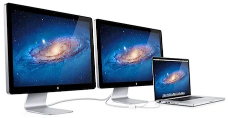
MacBook with 2 external screens

The new Apple 27" Thunderbolt display enables you to connect 2 giant external displays to a laptop, something that has not been possible until now without additional hardware.

Large screen real estate has its advantages. It is easier to design presentation slides when you have a large workspace in front of you. Extra space also enables you to open multiple windows, for example a PDF file with comments on the previous version of your presentation, or an Excel file with the data that need to go into your pie chart.

Now, 27" is a lot of space (2550x1440 pixels) and for most ordinary people, one screen will do. A presentation designer might actually need two (putting her in the same category as financial traders, air traffic controllers and social media addicts). I like to design on a clean and calm canvas. All the small windows with bits of information distract me. So I use that second screen as my messy desktop, literally pushing bits, pieces, and windows aside when I do not need them, preserving my pristine and uncluttered design environment in front of me.

Now some technical details. An Apple Thunderbolt screen can only be connected to a recent MacBook laptop that actually has a Thunderbolt port. But more importantly, the dual screen configuration only works on the most recent 15" and 17" MacBook pros, not on the 13" MacBook Pro, and not on the MacBook Air. (This might actually be an argument for getting a MacBook Pro over a MacBook Air) at the time of writing, October 2011).

Continue reading →
·Art

Art Authority for Mac

I reviewed Art Authority, this great art catalogue for iPad earlier, and I just bought the same application for the Mac.

The bad news, the user interface is a lot worse than the iPad. You browse art in finder windows, sometimes via HTML pages.

The good news, working with the images is a lot easier. Since a good keyword search mechanism is still missing, a very large monitor makes it easier to browse icons of paintings. You can have multiple thumbnail windows open, and leave them open for a long time.

Ten dollars well spent. Twenty dollars well spent if you buy the iPad app as well.