SlideMagic Blog

Frequent updates about all things presentations since 2008. Subscribe to never miss a post.

RSS
all posts

Search results for “curse of knowledge”

·Delivery

Common pitfalls in IPO presentations

I was asked to mention common pitfalls in IPO presentations the other day. Here are some of my thoughts in random order

  • Using an internal strategy deck as the basis for your presentation, rather than starting from scratch. Internal presentations are targeted at insiders, IPO presentations are meant for people who do not suffer from the Curse of Knowledge.
  • Talking management speak, full of buzzwords. Institutional investors are sifting through investor pitches and data all day long, they are trained to cut out the noise. If you provide a lot of noise and padding, they automatically think there is no real substance to talk about.
  • Over-structuring, repeating, repeating again. In a short investor pitch tell a story, do not try to get investors to remember key facts by drilling it in their heads.
  • A generic investment thesis. Very high-level bullet points that could apply to just about any company: growth, profitability, etc. Diluting the core of what is special about your company with many, many other positives that are valid, but not that important. Like in marketing: too many benefits, no benefits.
  • Avoiding the elephant in the room. institutional investors probably are pretty well informed about your company, and the key questions they have (often shared with journalists and bloggers) are pretty clear. Your presentation should address those, maybe not explicitly (here are our weaknesses), but implicitly. These questions are the only thing that people are worried about.
  • Avoid the long-term growth options. There are legal restrictions to what extent management can provide business forecasts in an IPO filing, but that does not mean that you cannot educate investors on how you can think about valuing your business. Give a framework on what value components could be there for the long-term.
  • Focus only on the company, not on trends in broader society. Sometimes the key driver behind the success of a company is a fundamental shift on how people are operating, how things are changing in the world. Your IPO is an opportunity for an investor to invest in that trend. If that is the main driver, discuss it.
  • Confusing financial data. A 30 minute pitch is not enough time to go over the financial data in full detail. Still, there is no reason why you should confuse things instead. Give a good overall picture of the components of your company. Show how the revenue model is working. Show how the cost structure works.
  • Forget the front line. Management talks about a company in terms of top line revenue, overall market share, but the real action is in the front lines. Give customer case examples, they are often a much more powerful illustration of the attractiveness of a business than top line figures.
  • Recording your presentation in front of a camera, without an audience. Unless you are a professional TV host, people find it difficult to look natural in front of a camera. Invite a small audience when you are video-ing your tape. If that is not possible, maybe tape some images of people on some chairs in the studio/conference room so you can imagine talking to the people who are listening/watching you later.

·Investor presentation

So what do you do?

This tweet by Michael Arrington says it all: investors are human, take it slowly and answer the very first thing what is on their mind: what is it that you are actually doing. You might have been working on this startup for months now, an investor hears about it for the very first time. You suffer from the Curse of Knowledge, and remember, an audience who is guessing what you do in the back of the mind is not paying attention to all the other things you want to say.

Just read an entire investor presentation, twice, carefully. No idea what this company wants to build or sell.Maybe sensors. We’ll see. — Michael Arrington (@arrington) March 21, 2012

Michael tried reading the deck twice, most investors will not do that.

·PowerPoint

Mission statement on slide 2?

Mission statements are supposed to be the ultimate piece of prose: in one sentence you have the entire essence of a company: what you stand for, what your values are, how you treat customers, everything. This is serious stuff. Making jokes about the mission statement is often considered committing sacrilege.

Mission statements often feature on page 2 of a corporate presentation, right after the title slide. Here you are: our company in one sentence.

It takes time to develop a good mission statement. Projects to craft one can take weeks. The entire organization needs to be involved. Words need to be adjusted. Values need to be discussed.

And that is exactly the problem for an external audience. They miss the context of the 3-week project. They miss the background of the debate. They have no idea about that offsite where you discussed your company’s values. For someone who reads the mission statement for the first time, it is well, just another sentence with familiar sounding words.

The ultimate example of the Curse of Knowledge.

When I pooh pooh mission statements in presentations I did not mean to make fun about the values of your company. I think mission statements are valuable. Slide 2 of your presentation is just not the right place for them.

·Data visualization

Data without context is meaningless (and boring)

The quarter is done, and here comes the day-long sales results presentation. Excel is pasted into PowerPoint, creating huge decks through which senior management has to sit through. Sales organizes by channel: small restaurants sales, growth; large restaurants sales, growth, supermarkets sales, growth. Marketing presents by brands: brand 1 sales, growth, brand 2 sales, growth.

If you are a marketing manager, looking at the Q3 sales and growth figures of a particular brand is really interesting. All the numbers of the previous quarters are more or less in your head. For the production manager though, going through these pages is mental torture, as she does not have the historical context readily available. (Read more about the Curse of Knowledge here)

The solution is the opposite of what I preach for bullet point charts: instead of breaking up slides into multiple pages, condense lots of data in 1 chart, but make it comparable. Put the quarter growth rates of all brands on a page and compare them. List the historical brand growth rates of the past 8 quarters on one page and see what is going on. There is no problem showing a massive amount of data on 1 slide, as long as it is about the same variable that is compared across different dimensions.

·Books

Recommended presentation design books

What are the best books about presentation design and public speaking

Some good books about presentation design, public speaking, graphics design, and art. If you click on an image, you will be linked through to Amazon where you can buy the book. We use affiliate links and receive a small commission when you purchase a book through this site.

You can find reviews of presentation design books that I posted on the blog here.

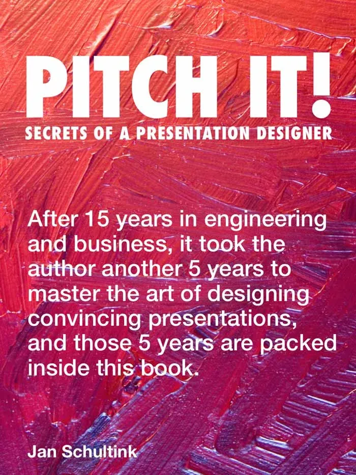
Pitch It! by Jan Schultink, my own book about all things presentation design. The book can be accessed free online here.

Presentation Zen by Garr Reynolds started the revolution in presentation design, transforming bullet point slides into visuals with images. Read my review here (2008).

Design Elements by Timothy Samara takes you through the basics of layout and typography. Read my review here (2010).

Resonate by Nancy Duarte has good instructions on how to design a captivating story that gets your audience to do something, take action after they walk out of the auditorium. The iPad version is free. Read my review here (2010).

Slide:ology by Nancy Duarte is a good general introduction to presentation design and delivery. Read my review here (2008).

Continue reading →
·PowerPoint

Designing analyst presentations

Some random thoughts about designing good investor presentations. Investor presentation in this context is a presentation by a larger publicly traded company to equity analysts and institutional investors, for example a quarterly results announcement or an investor conference.

My blog contains a lot of ideas that visible for only one day, I plan to start writing some longer articles about certain topics that deserve a more permanent presence, and update them with new ideas or input from my readers.

Begin working on the presentation early The worst presentations are finished at 3AM the night before the investor call. It is possible to create 75% of the content of the investor presentation with preliminary data, or even the data from last quarter. Usually changes in data are not that dramatic that completely new visualization approaches are needed. Use existing data to decide on what type of graphs you need and replace the dummy data with the real thing as the information comes in. And: not all sections in an investor presentation are about data. The section with the update on the company strategy can be completed independently of the availability of the latest financial results.

Get the basic formating right Use the correct corporate template, set the colors and the fonts to the correct values. Avoid clip art. Use professional, high resolution images. Use one template throughout all the presentations at the event. Pay special attention to the way data charts are formated. There is nothing worse than a straight copy-paste from Excel. Look the way newspaper or magazines such as The Economist pay attention to the layout of graphs: clean and focussed on one message. A PowerPoint presentation to investors differs from an annual report: it is OK to round up numbers to make the chart more readable. People who want the full detail can always refer back to the accounts. In a 20 minute call those last 3 digits behind the dot do not matter.

Continue reading →
·PowerPoint

Poster design: "If you have to explain it, it ain't workin' "

Currently I am in the process of reading book after book about graphics design and typography and it interesting to see see the similarities and differences between presentation slide design and poster design.

  • Similarity: both are meant to communicate a message instantly
  • Difference: designers think days/weeks about a single poster, slides are usually slapped together in 15 minutes.

This TED video of famous graphics designer Milton Glaser (you know the I heart NY campaign) popped up in my Twitter stream this week (Tweeted in 2011, recorded in 1998).

It sparks a few thoughts:

  • It always interesting to hear these very senior, experienced people speak in very abstract language: they can make a short point and their eyes show that they just shared an incredible insight with you.  The ultimate curse of knowledge: I need a few decades more of life experience to grasp it. A bit similar to me saying to my children: “really it does not matter how many toys you have, believe me”. Response: blank stare.
  • Milton summarizes the essence of designing a poster: “If you have to explain it, it ain’t working”. I guess here is where the distinction between art and design comes in, an artist might be happy with an ambiguous interpretation of her work, the poster (and presentation) designer’s job is it to get a specific message across.
  • It was very interesting for me to see/hear Milton describe the creative process he goes through when designing a poster. Maybe we should invest a similar amount of time into designing a slide for a presentation?
Continue reading →
·Design

But what is it?

Here is a big sentence on the front page of a new web site targeted at iPhone users:

[Company] develops real-time personal discovery and contextualization technologies that leverage semantics and social attention to make social streams more relevant.

Industry insiders might understand what it means, but most people will not. I am not a big believer in mission statements. Often, the big wordy sentence that covers all will be the most compact way you can describe your business to yourself, but as you suffer from the curse of knowledge, other people will not get it.

·Advertising

One Lego visual - 2 insights about leveraging imagination

I found this great Lego ad yesterday on SlipperyBrick:

Sometimes relying on audience imagination can work, sometimes it does not.

  1. Sometimes it can work. Although adults might lose some of their imagination capabilities over time, it is still possible to get across visual messages with very simple graphics. Simple shapes, simple cartoons, even just creative typography. The mind will fill in the missing pieces
  2. Sometimes it does not work. The book Made to Stick introduces the concept of Curse of Knowledge. The presenter “hears”/imagines a tune in his head and taps it with his fingers on the table. All is perfectly clear to the presenter. All the audience can hear is… someone tapping.
·Books

Book review - Made to Stick by Dan/Chip Heath

Made to stick by Chip Heath and Dan Heath (find it here, affiliate link) is recommended reading for everyone who delivers presentations: it analyzes why certain stories “stick” in people’s mind, and why others disappear, almost independent of the content: it’s they way that they are told that matters.

  • Keep them simple without creating silly sound bites
  • Add unexpected twists to keep people interested
  • Be specific and avoid fluffy hollow statements (Dilbert mission generator style)
  • Be credible to get people to believe your idea
  • Add emotion to make people care
  • Tell stories

The book is written as a set of stories that are analyzed following the above framework. Sometimes this categorization can feel a bit forced (since most stories combine multiple elements), but generally it works well. Framework or not, the stories inside the book are the real treasure. They are interesting and fun to read (many of them still stick in my head). Besides the big idea of the book there are countless interesting bits of knowledge hidden in the stories. Some examples:

  • The brain stores stories in a “virtual 3D” space. Slightly absurd experiment: people read a sentence about a guy and a shirt slower when the shirt has just been taken off a few seconds ago. Your presentation structure and the structure used to absorb information is not the same
  • Being analytical, logical, thinking of numbers switches off your emotional mood: the mood in which you are most receptive to store information. Think about that when ordering slides
  • The curse of knowledge (actually this is a big idea in the book) prevents people from putting themselves in the shoes of an audience for which a concept that took you 3 years to understand might not sound as obvious as it seems to you
  • Another example of the curse of knowledge: when someone taps a song with his fingers on a table, he/she hears the entire performance including vocals, instruments, etc. A bystander just hears an irregular beat of taps…
  • 70% of learning can happen by just imagining, anticipating, thinking about the task ahead of you (scientifically proven): rehearse, rehearse, rehearse your presentation.
  • Negative “don’t”, “avoid this”, “don’t fall in this trap”-type recommendations stick better than positive ones: people learn from mistakes. This goes a bit against my marketing theory in business school though.
Continue reading →