SlideMagic Blog

Frequent updates about all things presentations since 2008. Subscribe to never miss a post.

RSS
all posts

Search results for “windows”

·Design

Making the audience feel small

You probably have noticed as well that it is impossible to capture a wide panorama with a camera. “Look at this sunset over the sea! Where is my camera?!”. The resulting image is often boring and lacks depth, the exact reason why so many stock images of panoramas fail to excite.

The human brain is not restricted by a small 2D screen. It senses distance/3D by blending the slightly different images from both eyes in to one. Eyes never sit still, they constantly move. We are standing at the inside of a gigantic sphere. Eyes compare the size of objects, to assess dimensions.

Handing out 3D goggles to your audience is not an option (at least not today), so the presentation designer has to resort to tricks to create 3D effects.

  • Pay attention to camera position (earlier post)
  • Put a known object in the image so people can relate the size of the whole to the familiar dimensions of the object (earlier post).
  • Or use effects like the one used in the image below. Stitching together multiple photographs to create on large, distorted image that gives the illusion of standing inside a sphere. Your eyes are really running up and down the image, just as you would do when you would stand inside the cathedral for yourself. Huge image by balondrotor here. (Earlier post on a similar but less spectacular version taken in the Notre Dame)
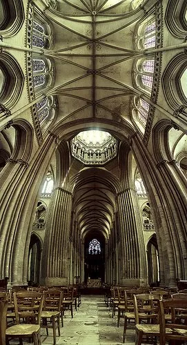
For those interested, the cathedral in question is the one in Coutances, Normandy, 20 km from this year’s holiday home. This majestic old building stands in the middle of the city center that was largely rebuild after the July 1944 battles. It was almost unscathed.

Continue reading →
·Gadgets

1st experiment with the iPad as a 1-on-1 presentation tool

OK, I did my first presentation in a 1-on-1 meeting using an iPad. It was a bit improvised, as I made a last minute decision to drop a paper copy for the new gadget. My experiences.

  • It still is a bit of a hassle to get your file presentable on an iPad. I installed the Keynote app, but this is an iPad-specific piece of software that does not import regular Keynote files and I have not (yet) designed presentations specifically for the iPad. So I went for PDF.

  • In order to get the file on the iPad I had to upload it to Google docs, and then I used the GoodReader app to get it down on the device.

  • PDF was a bit tricky too. The PDF I created on my Windows PC did not render well on the iPad (custom fonts were invisible). It turned out, that it did not show well on a Mac either. So: import the Windows PowerPoint file into PowerPoint 2008 on the Mac, have the Mac convert it to PDF.

  • The PDF conversion was not ideal. The Mac decided to give my slides a white frame, and keep the parts of the pictures that were outside the slide borders in the page render. So I went back into PowerPoint to delete these (compress pictures) and start the process again.

  • I presented outside and the bright Tel Aviv sun light was too strong for the display of the iPad, so it was a bit hard to see. I already use big fonts om my slides, but my advice when designing for an iPad: go even bigger. The presentation view you have at a coffee table is one of an audience member in the back of the presentation venue.

Continue reading →
·Design

Microsoft Office web apps are going live

Microsoft is quietly rolling out its office applications in the cloud. They announced that the web-version of major Office applications are live, at least in a number of countries/languages. In Israel I could get it to work. Try for yourself here.

I have been following these in-the-cloud initiatives closely, and must conclude that Microsoft stands a good chance to be the winner. I chose Microsoft over Google docs for a recent project that involved collaboration in multiple countries.

It looks like the world is dividing into 2:

  1. Consumers and freelancers using Google Docs, iPhones, prezi, SlideShare, Windows 7 or Apple OS, gmail, freely sharing stuff over social networks and insecure internet connections
  2. Corporate workers using Blackberry, Microsoft Office 2003, Windows XP as a result of strict security guidelines and cost cutting in IT budgets (i.e., delaying upgrades of software). These people are struggling to find stuff in their bulging Outlook 2003 inbox.

The learning curve of switching user interfaces of Office applications is huge (read: costing a lot of money in downtime and helpdesk support), and for a big corporate to switch means that everyone is required to change habits: the 25-year old tech savvy analyst, the 60 year old secretary of the CEO, the CEO herself, to name a few. It’s just hard to move them out of the Microsoft world.

Ultimately, the big corporates will move Office applications/data into the cloud, there are significant benefits to collaboration and simply finding stuff. They will go with Office Live though, and not with Google Docs…

Continue reading →
·Art

Finding font inspiration in Bauhaus architecture

More presentation design and art today. I had a very clear policy on the use of fonts and typography:

Until now. I just finished a presentation:

  • Set in ALLCAPS
  • Using the Futura Bk font
  • 90% of the slides are set in bold (yes, ALLCAPS bold)

The Futura font family is to blame. The history of the font go back to the 1930s and its design is heavily influenced by the Bauhaus movement. Clean geometrical shapes, look at these o’s, almost perfectly round.

Maybe being located in Tel Aviv, a city that has one of the world’s most extensive collection of Bauhaus architecture, had something to do with it. The picture below is an example of a Bauhaus-style building in Tel Aviv, the “Bait ha’Onia” or “Ship house” on 56 Levandah Street, designed by architect Arieh Cohen and built in 1934-1935. To make the side track complete, if you are interested in Tel Aviv Bauhaus architecture, make sure to get your hands on this book (text both in French and in English).

Back to presentation design. In particular I like two font variations of Futura. The Light version (Futura Lt) for thin, elegant, sentences in sentence case, and the Book version (Futura Bk) for all caps. The allcaps look especially impressive in fat bold (look at the font in the image). Obviously, some of my old font design principles still hold. Allcaps bold fonts should only be used in presentation that contain a few words per slide.

Continue reading →
·Design

Maximizing screen real estate in PowerPoint

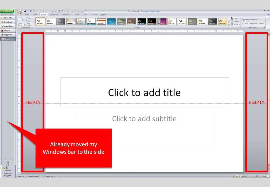
Many people have 16:9 computer monitors by now. Most of the time, we still design slides in 4:3 or A4/letter mode. As a result, a lot of space is available on the left and right of the PowerPoint slide in editing mode.

PowerPoint, like most software, is designed for the 4:3 screen by adding the ribbon and status bars at the top and the bottom of the screen. A lot of screen real estate is wasted. Adobe does a better job, tool bars are positioned to the left and to the right of the work area.

I already moved my Windows bar to the side. Is there a way to do the same thing with the PowerPoint ribbon? I don’t think so. A feature request for PowerPoint 2010.

·Design

How to transfer fonts from a PC to a Mac

Fonts, PowerPoint and multiple computers do not mix. I have begun to go down the font slide: beautiful results but increasing complexity. Once you’re on it, there is no way back:

  1. First level, just use one popular font, let’s say Verdana (but it gets boring)
  2. Second level, group items together and “paste as PNG” back (but it is so hard to edit)
  3. Thid level, embed fonts with your PPT file

All was fine with level 3 untill I tried to use the PPT file on a Mac: disaster again. The “hardcore” solution:

For some reason, my Windows PC has far more fonts installed than my Mac. Font files are portable, they work on a PC and on a Mac. I simply copied all my PC font files and put them in a folder on my Mac desktop. If I need a font, I double click the relevant file, start PowerPoint over again and things are fixed.

Now where are these PC font files? Click “start”, “run”, type “%windir%\fonts” and they all show up. Select all, copy and paste them in a folder to be copied to the Mac. Done.

·Design

The global "ban comic sans" movement

Weekend reading. Comic sans is a font that resembles hand writing. Released by Microsoft in 1994, it was made popular through its standard inclusion in its Windows and Internet Explorer software. Graphics designers (with the sympathy of the Vincent Connare, creator of the font) started a movement “ban comic sans” as early as 1999 to stop the font from taking over more and more print and screen space around us. An entertaining summary of the history of the font and the efforts to put the genie back in the bottle can be found in this WSJ article.

What do I think? I agree that a comic-style font is not suitable for every occasion. When I have to use one, I prefer picking a more extreme comic font, like boopee. The problem with comic sans is that it is now so common that it has become boring. The same with Times New Roman…

Comic Sans from Sam and Anita on Vimeo.

·Design

How to strip web text of its formating

Especially for sources in footers I often want to avoid re-typing a complicated title of a document that I found on the web. Copy-paste of the text also copies some of the text formating. Solution: copy the text, paste it into “Note pad” (the standard text editing utility that comes with Windows), select the text again and paste it into a PPT text box. I would be interested if other people have faster solutions for this.

UPDATE: Remy got the solution in the comments: copy any text, then select Edit and “Paste Special” and select unformatted text. Thank you!

UPDATE 2: Glen Turpin recommends PureText (see the comments).Thank you!

·Design

Not all presentations are "Zen" - different formats for different settings

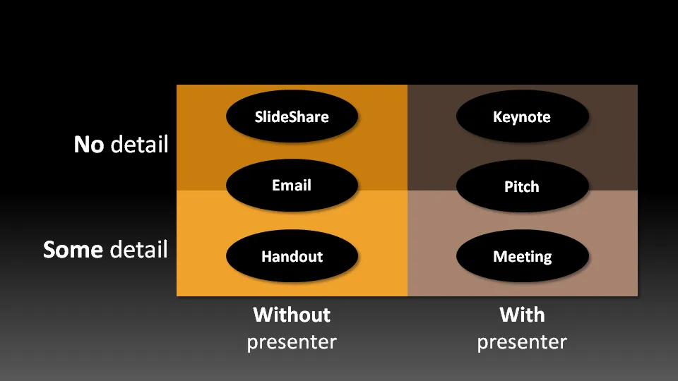
Not all presentation settings are the same. A “Presentation Zen” slide show with stunning images and the incidental word on a slide is great for a keynote, but might be a bit too much to discuss last quarter’s financial results. The 50 page deck with bullet point slides might be serve better as a printed business plan than the key communication tool for a 20 minute VC funding pitch. I have tried to describe 6 presentation scenarios and categorized them according to:

  • Whether the  presenter is present or not
  • The amount of detail/data inside the document

Here we go (click image for bigger picture):

  1. The key note is the classical “Zen” presentation. Huge fonts, dark background, few words, large images.
  2. The pitch is similar to the key note, with the difference that it might be shorter, and does contain some more data to answer questions from the much smaller audience.
  3. The meeting presentation is probably done on a light background, and contains much more facts and details. Over-simplified slides with beautiful pictures do not work in the small conference room with people ready to go through raw material. McKinsey and other consulting firm’s presentation often fit in this box.
  4. The slideshare (or online) presentation is something relatively new. People see it typically in small windows, i.e., fonts should be big, pictures should be nice. The audience of this presentation is highly impatient, clicking rapidly to reach the end, and aboning your presentation if it is not interesting enough. No animations here.
  5. The email attachment is similar to the key note presentatation with an important difference that it needs to stand on its own, titles need to explain the messages in the charts. Some animation could be used here (sparingly though). Detail is less than the handout.
  6. The handout contains the full detail, the full text. It should be prepared on a white background (people will often print it) and use no animation (again, does not come out in print). For VC pitch situations, the good handout makes the business plan “brick” obsolete (hardly anyone reads these anyway).
Continue reading →
·Typography

Correct use of apostrophes and quotation marks

Inspired by a Tweet by Garr Reynolds, I dug up the typography rules for apostrophes and quotation marks. The ’ and " that everybody is using because they are conveniently located on a computer keyboard are in fact the characters for feet and inches.

  • ‘ and ’ - the single quotation marks (the right one is the apostrophe), ASCII codes 145 and 146

  • “ and ” - the double quoation marks, ASCII codes 147 and 148

Their use is different in some countries. In the UK, people use single quotation marks, in The Netherlands for example, people use low opening quotation marks. How do you enter them? There are a number of options:

  • ALT+code (Windows only). Swith on your numeric keypad with NUMLOCK (laptop owners read your manual). Hold down the ALT key, now press “0” plus the ASCII code you need on the numeric keypad, the number keys on top of the regular keyboard will not work. For example, an apostrophe would be [ALT] [0146] [release ALT]

  • HTML option 1, for example to display the apostrophe enter ’ (for more ASCII codes see above)

  • HTML option 2, enter & followed by a specific character code, a full list can be found here. Single open: ‘ Single close: ’ (apostrophe) Double open: “ Double close: ”

  • Microsoft Office (including PowerPoint), I use the insert symbol menu option, switch to ASCII decimal code and find the right symbols at position 145-148

Because of the complicated entry, I double check use of quotation marks only in final versions of presentation documents. In email, Twitter, (and even in this blog…),  I will continue to violate the rules and use my feet and inches characters… Sorry.

Continue reading →