SlideMagic Blog

Frequent updates about all things presentations since 2008. Subscribe to never miss a post.

RSS
all posts

Search results for “web design”

·Books

Apple iBooks and presentations

Two main take-aways from the announcement by Apple yesterday about the new platform to design and publish interactive books for the iPad:

  1. It removes the excuse that the lizard brain inside me used so far to stop me from writing a book: the thousands of dollars and months in training I would have to invest to port an InDesign document to a working iPad app. Here you go, I committed publicly.
  2. This platform can be fantastic to write investor and sales pitch documents for one-on-one meetings or sending to a prospect before you meet face-to-face. The standard for the boring text “Executive Summary” just got raised in such a way that people might actually start to read them.

·Investor presentation

Investor presentation in HTML

Have a look at the DressRush investor presentation, an entire pitch deck written as a web site, in the public domain. Some of my observations.

I like publicly available investor pitches. It fits in the wave of increasing transparency in the startup funding market. (Check out Angel List). Startups can dramatically increase their access to potential investors by making part of their content public. The first stage of a fund raising round does not have to be the closed meeting room of the VCs that happen to be located in the same city as you are. Obviously you would not put your core IP, financials, or other sensitive strategic content in a public presentation. Another option would be to make the sensitive part of your investor pitch on your web site pass word protected.

I like these airy web sites. Lots of white space and information that you can scroll through freely, up and down. I actually first skim the whole site in a few seconds, then go back up to start reading in more detail. This is so much better than the nervous clicking on a small button in a SlideShare window (especially when people design slides that -click- break up -click- a sentence -click- in 5 -click- slides.

It is still tricky to design from this new medium though. The DressRush example uses beautiful muted colors (interrupted here and there by images and facebook logos) and takes an infographic approach to investor pitches. On certain pages it works, on others it does not. In whatever direction the technology develops, you still will need to eye of a good designer to get your investor pitch right, also in HTML.

Continue reading →

A better slide 1 of your presentation

The cover page of your presentation is important: it will be sitting on the projector for a long time as the audience comes into the room, and even more important: it determines how many people will open your deck on online presentation sharing platforms such as SlideShare.

Presentation designers (including me) still have lots to learn from book cover designers. I enjoyed browsing through this book: The Best of Cover Design: Books, Magazines, Catalogs, and More (affiliate link). It reminded me of all this design options I have in PowerPoint that I actually do not use at all for cover slide design.

There is some irony though. The introduction of the book states that the cover designs presented in the book are proof that print media is here to stay forever. I disagree, we digital designers are learning to bring the quality of digital design up to the same standard as print.

Cliché stock compositions

On stock photo sites, many photographers and illustrators try to do the slide design work for you and create ready-made compositions. Often, they are not very good.

The one below for example. It requires a lot of technical skill to make it, but somehow the colors and the look and feel do not seem right. Also, the concept is a bit forced. You could equally show the 2 logos of the joint venture partners on the last slide and you convey the same message.

And worst of all: because these type of images have been over-used so much in bad presentations, putting one up will immediately make your audience assume that this presentation will fit into that category.

(Soft) launching Idea Transplant

I am in the process of re-branding my presentation and pitch business into idea transplant. I felt that this name reflects what I do, taking your idea, and making sure other people get it. “Getting it” is more than a simple registration in your audience’s brain, a presentation’s success equals people living and breathing your idea in their heart. Hence the slight medical twist of the brand. You can see the first version of the redesigned web site here, but I am still not done with finalizing logos and colors (suggestions are welcome).

Do not worry, I will keep the name Sticky Slides for this blog.

An emotion is worth a thousand pictures

“A picture is worth a thousand words” is a famous cliche, highlighting how inefficient reading text is as a means to transfer information.

  1. Read/recognize words
  2. Construct sentences
  3. Extract meaning
  4. Visualize image

Just looking at a picture directly would have saved a lot of time/brain power.

But this is just one level of efficiency/shortcut. Let me explain.

Locked up in your brain are millions of experiences and emotions that you have accumulated over the years. These stored experiences are of a totally different order of magnitude than a simple image. A good presentation slide manages to unlock these hidden experiences in a microsecond: a super brain short cut.

A crude comparison is to look at the basics of the transistor, an electronic component that was the basis of the rise of the portable radio and modern consumer electronics. A small current to the Basis terminal, unlocks a much larger current between the other 2 terminals (image via Wikipedia).

In his book Brain Rules, John Medina explains how smell is actually an even more powerful trigger of releasing experiences than visual stimulation. Besides the technical challenge of using smells in a presentation, it would also be impossible to use them: the smell that counts is the one you personally experienced when “recording” the emotion. They are different for every member in the audience.

I always like to contradict myself, so here we go. Hemingways’ famous 6-word story:

For sale: baby shoes, never used.

is actually an example of how a few words can actually trigger a complex chain of emotions in our brain. More 6-word stories here. But I think it is the exception to the rule.


Continue reading →

Try to resist the tempation to over-do PowerPoint effects

I see them more and more. A bullet point presentation with now and then a spectacularly formated PowerPoint object inserted. Bevels, textures, drop shadows, 3D rotations, lighting angles, they have it all.

Try to resist it. Like with data charts, the fact that you have the ability to use sophisticated effects does not mean that you have to use them.

Oh, one more thing. If you hired a professional presentation designer, and the only thing she does is apply 3D and lighting effects to your diagrams, it is time to find another one.

·Images

Rant: iStockPhoto stealth price increases

The site iStockPhoto is a great source for stock photography (got the image below there). They have increased prices significantly. I remember being able to buy images at $1. Then 1 credit did not equal to $1 anymore. Then, higher DPI images cost a bit more. Since a few days ago, a regular “medium” image cost 6 credits (a lot more than $6).

  • I don’t like the “stealth” price increases, every few months, a bit up. Why not set your prices, and stick to it? Pretty much what Apple did when it set up the iTunes store.
  • At these prices, I am stopping to use a creative process of buying lots and lots of images, and in the end picking the best possible slide. It has to be rigth the first time. I would be willing to pay a lot for a crucial image for a huge advertising billboard, the day-to-day PowerPoint is a different story
  • Small isolated objects I buy in lower resolutions
  • I increasingly look for other “real” image sources (such as Flickr), there are more and more cliche images and illustrations available on iStockPhoto
  • There is a sense that people are getting a bit tired of the “stunning image with 1 word” anywway in slide compositions
  • More and more I am discovering other ways to make interesting slides: typography for example
  • There used to be a sense that iStockPhoto was the answer to expensive stock image sites such as Getty Images. Getty bought iStockPhoto, and with stealth price increases is it still “cool”?
  • iStockPhoto migh be missing a lot of people on the verge of signing up. Professional presentation designers know about iStockPhoto, and have the budget for it. But as the “Presentation Zen” approach spreads among “amateur” designers, there could be a great opportunity for iStockPhoto to increase its customer base beyond these professionals.
Continue reading →

How to create heat maps in PowerPoint

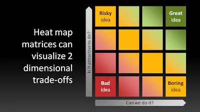
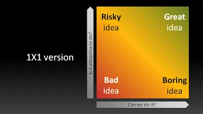
Not a grand presentation design insight today, but a quick sketch.Matrices such as 2x2s are often over-used. When you combine them with a heatmap, some colors and some gradients, you get a nice visualization of a trade-off:

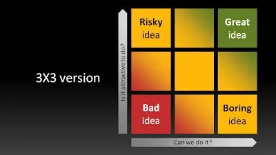
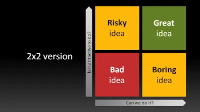
UPDATE: to show that the big lines are not grid lines, here are the 3x3, 2x2 and 1x1 versions of the same chart:

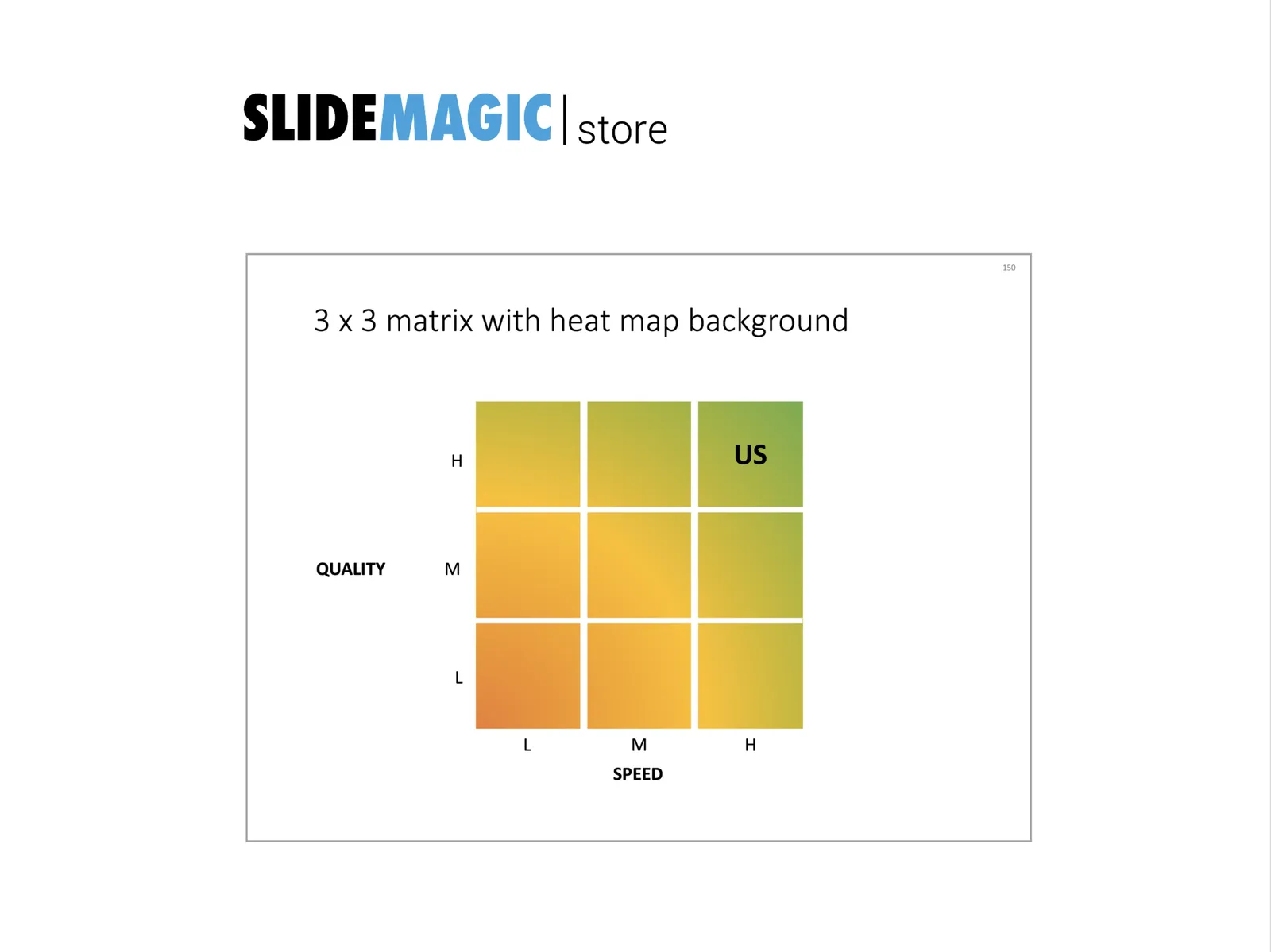
UPDATE 2: I have added a heat map chart to the template store

·Humor

Rediscovering PowerPoint classics: the Gettysburg presentation

More weekend reading.

Peter Norvig is Director of Research at Google. Back in 2000, being fed up with boring PowerPoint, he decided to use a famous speech by President Lincoln to demonstrate how a poorly designed PowerPoint translation could destroy its communication power completely. He put the creative “master piece” on his web site and more or less forgot about it.

Gettysburg address