

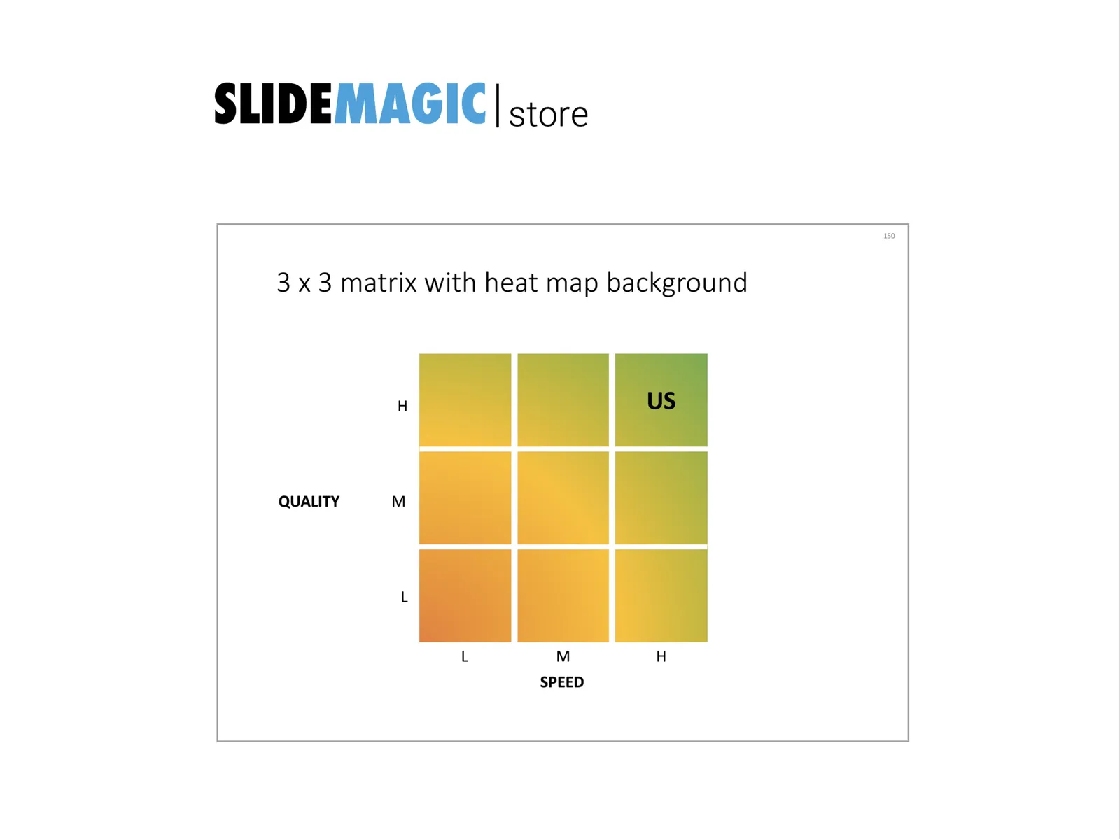
Not a grand presentation design insight today, but a quick sketch.Matrices such as 2x2s are often over-used. When you combine them with a heatmap, some colors and some gradients, you get a nice visualization of a trade-off:
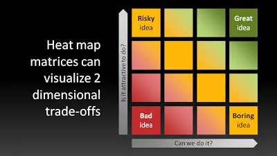
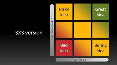
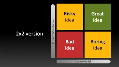
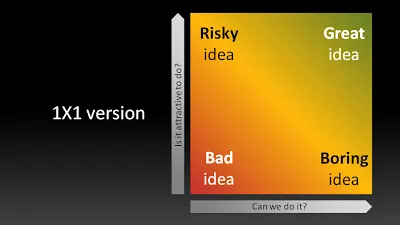
UPDATE: to show that the big lines are not grid lines, here are the 3x3, 2x2 and 1x1 versions of the same chart:
UPDATE 2: I have added a heat map chart to the template store
3 comments
A heat map as generally acknowledged shows the distribution of a parameter's values across 2D space. It may look like a contour plot, as in ClickHeat | Clicks heatmap, showing the concentration of a user's attention on a web page. It may look like a data table, with each cell colored according to some value, as in TFS Performance & Excel 2007 Heat Map. The popular red state-blue state displays of election results are heat maps as well.
Thank you for all the links. Yes, I agree the absence of data. I was more playing around with boxes and shadings (interesting feedback that you see the space in between as grid lines).
Often, I use the technique of coloring cells according to quantitative data with qualitative values. In the above sample the axis labels could be: "totally not", "maybe", "probably yes", "absolutely". When you use these type of labels you end up with a smooth color transition.
Titus Tielens