SlideMagic Blog

Frequent updates about all things presentations since 2008. Subscribe to never miss a post.

RSS
all posts

Category Typography

·Design

Experiment with typography - slice up those paragraphs

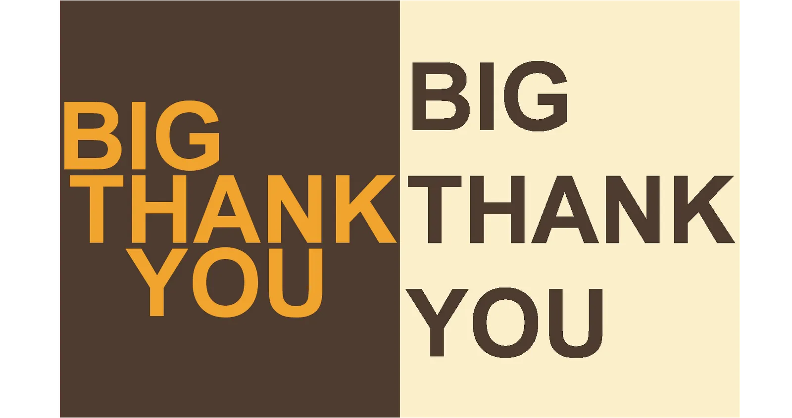
Typography is a major under-utilized tool in PowerPoint. On the right a standard PowerPoint display of a large 100pt text. Wide distances between lines, not very interesting. On the left, I cut it up in 3 pieces and started to re-align characters vertically. I am only starting to learn.

·Design

Squeezing more text inside a PowerPoint shape

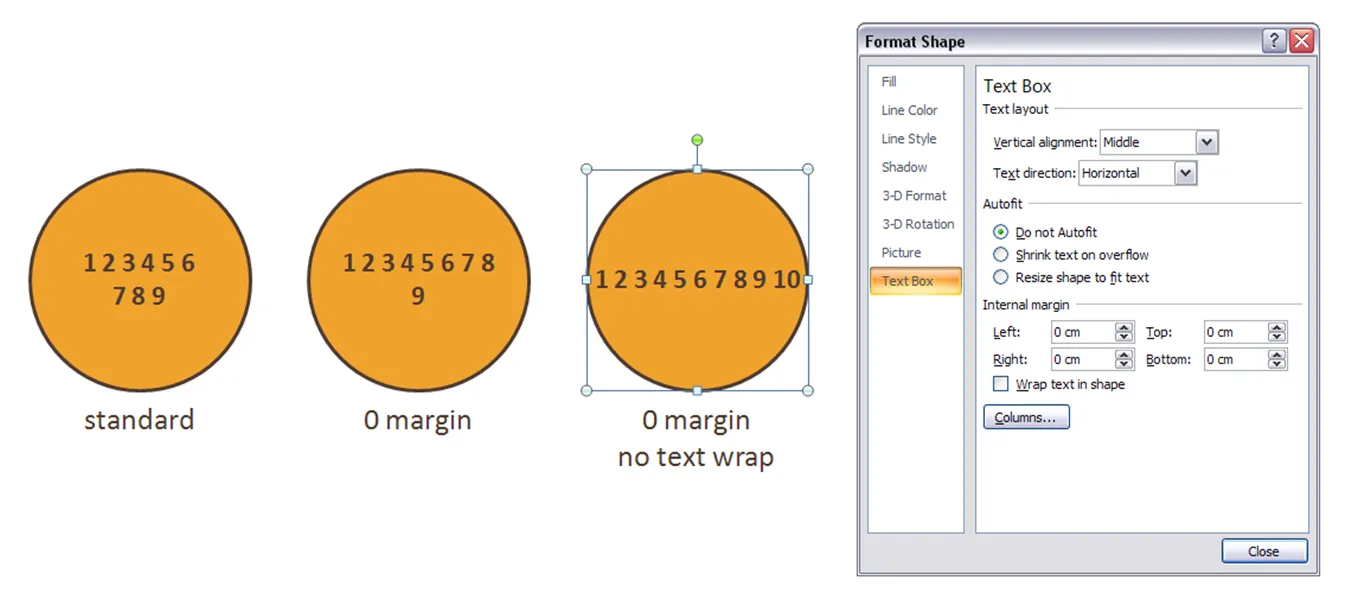
Circles are beautiful shapes to work with. Unfortunately, PowerPoint’s standard settings make it hard to fit in text. To get a bit more space, got to “format shape”->“text box”:

  • Set the internal margin to zero
  • Switch off automatic word wrap

·Design

A better solution for using custom fonts in PowerPoint

PowerPoint Ninja is essential reading for improving your technical PowerPoint skills.

The most recent post is about embedding non-standard or custom fonts inside a PowerPoint presentation so that you can be 100% sure your presentation will come out as you intended it when using on another computer. Custom fonts are a major untapped designer resource for PowerPoint presentations. Over the past years people started using a number of graphical tools in PowerPoint. First enabled by technology, then “abused”, after which a “Zen-oriented” tribe of people developed the common wisdom about how to use each of them correctly, elegantly, and most importantly in such a way that it helped the purpose of the presentation

  • Bullet points
  • Colors (my pre-2002 presentations were almost all B&W)
  • Clip art
  • Boxes and diagrams
  • Animations
  • Images: Google image search, stock images

I think fonts and typography are next.

·Design

Street art - "the secret of happiness is..."

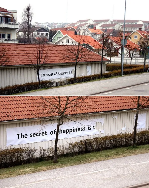
I stumbled on an interesting street art project (more about creator "Elay"and more images here).

  • In the spirit of the season: happy holidays to everyone, and hopefully you have found the secret already or will find the secret soon.
  • The image is an example of how leaving stuff out (of a PowerPoint presentation) can stimulate your audience to fill in the details themselves. Like (good) authors of novels, film directors, etc. try to do.
·Design

Graffiti and crossing things out with a red paint brush in PowerPoint

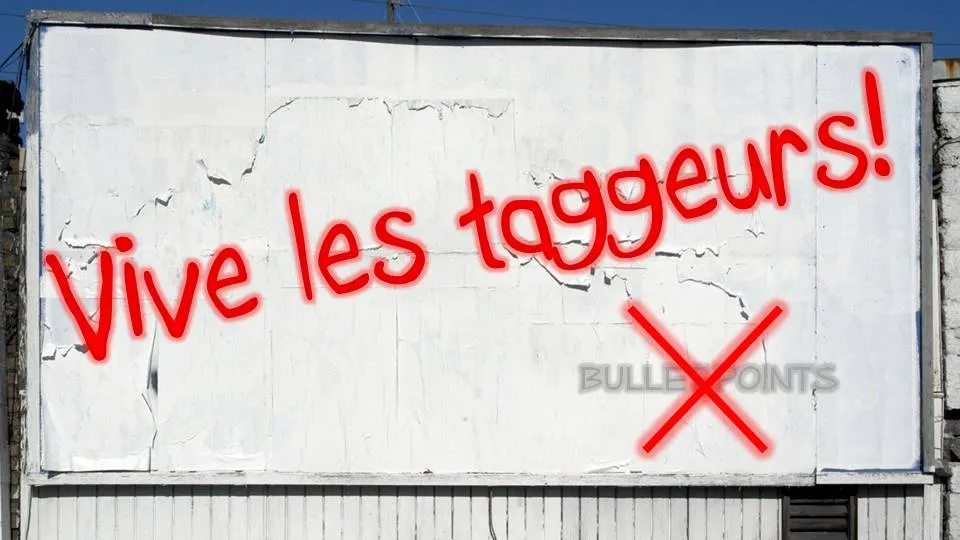
Crossing things out in an immaculate PowerPoint slide with a rough, red paint brush can make a point strongly: “with our technology you can skip buying that new server”

I use a simple PowerPoint 2007 “glow” to get a graffiti-style effect. In the image below, I selected the “Boopee” font (standard in PowerPoint 2007) to which I applied a red glow and a gradient text fill (bright red, with a darker red). The background image was purchased on iStockPhoto. Let me know in the comments if you need more detailed instructions.

The French are just so good in inventing words: “taggeur” for graffiti artist (or vandal). Brilliant.

Be sure to avoid setting yourself up for disaster when using non-standard fonts in a PowerPoint presentation.

·Design

Bleeding edges - you can use them both for images and text

A “bleed”, or “bleeding edge” is a page with a graphic extending over the edge of the page. I like to use them a lot in PowerPoint presentations.

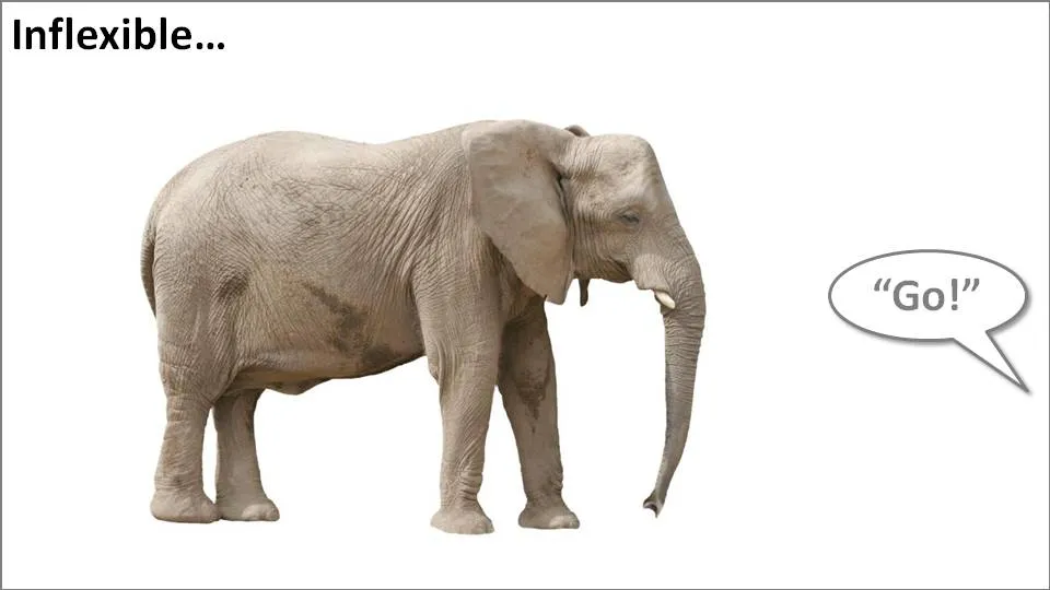
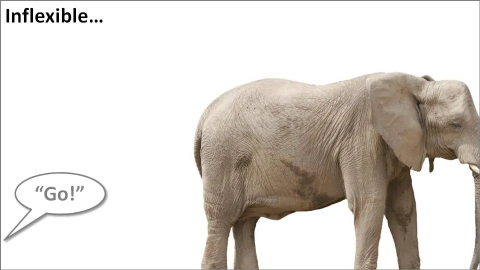
Take the following example. When the elephant is positioned in the middle of the slide, the composition is not really interesting. Have him walk off the page and insert a bit more white space makes it a lot more interesting (our friend just stands there, ignoring all things around him).

Pushing things a bit further, you can use the same technique for words/typography as well. The brain does not always need clean typography to be able to read. You probably remember this text (I do not know who wrote it, or whether the research actually happened):

i cdnuolt blveiee taht I cluod aulaclty uesdnatnrd waht I was rdanieg. The phaonmneal pweor of the hmuan mnid, aoccdrnig to a rscheearch at Cmabrigde Uinervtisy, it dseno’t mtaetr in waht oerdr the ltteres in a wrod are, the olny iproamtnt tihng is taht the frsit and lsat ltteer be in the rghit pclae. The rset can be a taotl mses and you can sitll raed it whotuit a pboerlm. Tihs is bcuseae the huamn mnid deos not raed ervey lteter by istlef, but the wrod as a wlohe. Azanmig huh? yaeh and I awlyas tghuhot slpeling was ipmorantt!

An example of letting words “bleed” off the page (I used to highlight problems with current solutions in the market for a client in the technology sector):

Continue reading →
·3D

More 3D: positioning text with a reflection in PowerPoint

On today’s SlideShare front page is a nice presentation by Martin Pure:

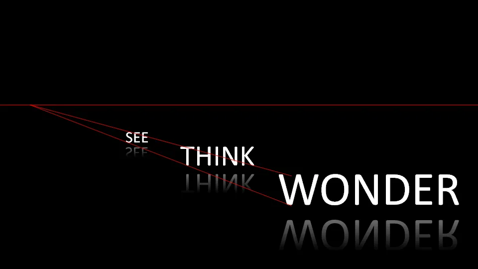
Marketers See Think Wonder

Following on yesterday’s post on 3D objects, you can see that “something is wrong” with the alignment of the objects. The use of a reflection (a “Web 2.0” effect that I only use very rarely) implies a 3D setting.

You can apply the same guide lines thought to correct things. In addition, you can change the size of the font to emphasize the feel of a 3D environment.

My comments were all about positioning of text. Do not misunderstand me, I like this presentation.

·Design

Preserving custom fonts when presenting away from your own computer

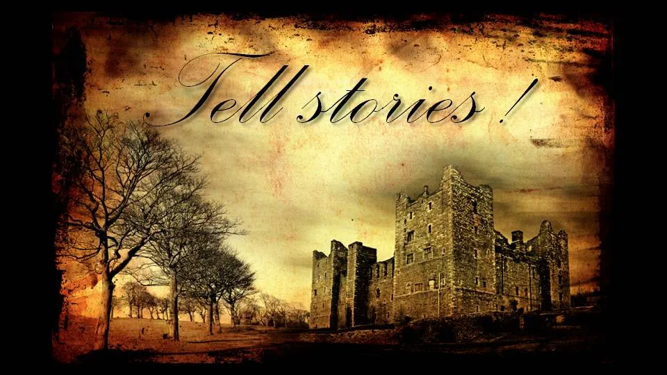
Complex, custom fonts can be beautiful. Seth Godin even recommends everyone to buy their own as one of his 9 steps to PowerPoint magic.

One problem, custom fonts are a disaster when used on a machine that is not yours. And you discover it when you click through slide 2 of your presentation in front of  a live audience…

Therefore, I won’t use them as my default font in a presentation, but only in specific pages. Here is the trick:

  • Make a copy of the original (editable) slide and put it in the back of the deck, you don’t wont to lose the original
  • Group all elements of the original slide into one object
  • Cut it (CTRL-X)
  • Paste special as “PNG”

The whole slide has been transformed into an image which for sure will show up correctly on whatever computer you are using.

UPDATE: POWERPOINT NINJA SHOWS A MUCH BETTER SOLUTION. HOW TO EMBED CUSTOM FONTS IN POWERPOINT: LINK

Background image purchased on iStockPhoto. Font used is Palace Script MT, built into PowerPoint 2007.

·Advertising

"Burning" typography that almost hurts the eye

I am more and more fascinated by design lessons from consumer advertising billboards. Take this ad for Tango (a UK soft drink):
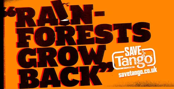
First of all the message. Confident, huge font, but the reader will discount the message completely “yeah right”. But it makes you think.

Then the typography. It almost hurts. Like watching a broken television screen. The onset of a migraine aura. Looking through the corner of your glasses and see how the lenses distort colors because of light refraction.

I argued before that slightly irritating the senses of your audience can help get your message across.

How did the typographer (Chris Chapman) do it? Clashing colors. Full orange background. Bright red shading. Colors that are very close on the color spectrum, but not similar. Like hitting 2 adjacent keys on a piano (harmonic dissonance). Grunch letter fill (hard to imitate in PowerPoint).

More on working with color wheels in a later post.

Via Ads of the world.

UPDATE after a comment. People should not misunderstand me. Any dissonance effect should serve a purpose. Simply screaming out a message does not make it stick. However, certain “painful” situations can be supported by a (one) “painful” chart.


·Typography

I don't understand the U.S.-English habit of title case...

It is common in English-language publications to capitalize words in the title (the full detail on rules behind “title case” in this Wikipedia entry). Once (in the early days of printing), it might have been a good way to emphasize words. In today’s PowerPoint presentations I find that title case actually makes it harder to read the title of a slide.

I do not use it.