Make-over artist tip: don't underline words
Underlining words just doesn’t look good. Especially not in headlines. Use a bold font instead, or italics inside body text to emphasize.


Frequent updates about all things presentations since 2008. Subscribe to never miss a post.
Underlining words just doesn’t look good. Especially not in headlines. Use a bold font instead, or italics inside body text to emphasize.
Fonts, PowerPoint and multiple computers do not mix. I have begun to go down the font slide: beautiful results but increasing complexity. Once you’re on it, there is no way back:
All was fine with level 3 untill I tried to use the PPT file on a Mac: disaster again. The “hardcore” solution:
For some reason, my Windows PC has far more fonts installed than my Mac. Font files are portable, they work on a PC and on a Mac. I simply copied all my PC font files and put them in a folder on my Mac desktop. If I need a font, I double click the relevant file, start PowerPoint over again and things are fixed.
Now where are these PC font files? Click “start”, “run”, type “%windir%\fonts” and they all show up. Select all, copy and paste them in a folder to be copied to the Mac. Done.
Weekend reading. Comic sans is a font that resembles hand writing. Released by Microsoft in 1994, it was made popular through its standard inclusion in its Windows and Internet Explorer software. Graphics designers (with the sympathy of the Vincent Connare, creator of the font) started a movement “ban comic sans” as early as 1999 to stop the font from taking over more and more print and screen space around us. An entertaining summary of the history of the font and the efforts to put the genie back in the bottle can be found in this WSJ article.
What do I think? I agree that a comic-style font is not suitable for every occasion. When I have to use one, I prefer picking a more extreme comic font, like boopee. The problem with comic sans is that it is now so common that it has become boring. The same with Times New Roman…
Comic Sans from Sam and Anita on Vimeo.
Sometimes you need to emphasize a very IMPORTANT !!! word in your slide (how to do underline in Blogger?).
Don’t use all the tools you can use. In dense text, use italic, in PowerPoint slides make it bold, or change the color of the word. People will get it.
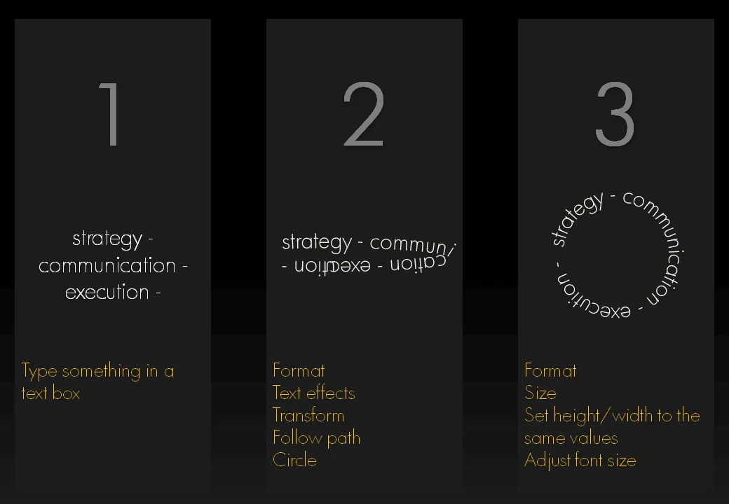
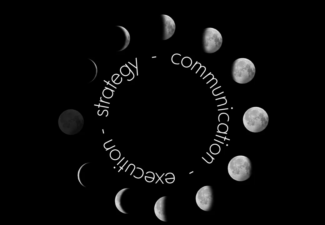
I am revamping my own introduction presentation and needed to align text according to a circle. Untill now, I used to improvise to fit text in a circle. There is a clean and simple way to do this. Click on the image for a bigger picture.
Graphics design has always been ahead of mainstream PowerPoint in terms of graphical abilities (colors, images, drop shadows, etc.). On the front page of Digg Design today an interesting collection of 3D typography put in one place by Naldz Graphics .
A taste of things to come! Wouldn’t it be interesting to navigate around in a 3D city of buildings made of words to support your presentation?
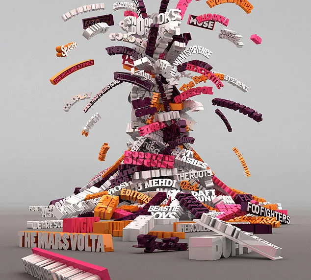
(Image by Serial Cut, advertising for the Zune marketplace)
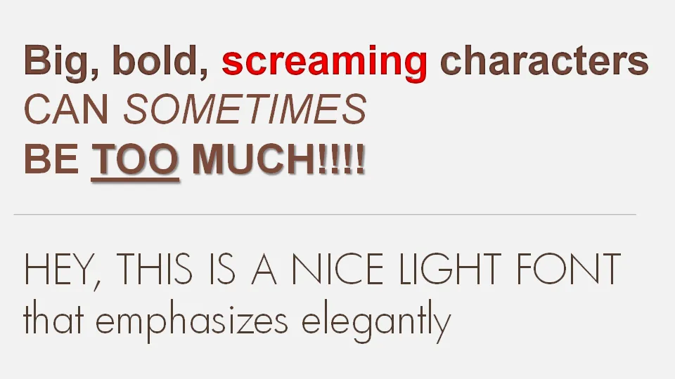
If a message is important there is a temptation to use a “screaming” typography: bold, italic, underline, big fonts in bright red. Resist it. Underlining should always be avoided. Italics almost always. And I am not a big fan of heavy bold characters either. Experiment with a lighter font, such as this Futura Light font that comes with PowerPoint 2007. (Don’t forget to save it with your presentation to prevent catastrophes when presenting on another computer).
Especially for sources in footers I often want to avoid re-typing a complicated title of a document that I found on the web. Copy-paste of the text also copies some of the text formating. Solution: copy the text, paste it into “Note pad” (the standard text editing utility that comes with Windows), select the text again and paste it into a PPT text box. I would be interested if other people have faster solutions for this.
UPDATE: Remy got the solution in the comments: copy any text, then select Edit and “Paste Special” and select unformatted text. Thank you!
UPDATE 2: Glen Turpin recommends PureText (see the comments).Thank you!
I am creating a presentation for a client today that provides a very simple solution for a very complex problem. While moving around the letters in the words I saw an usual pattern:

I need to find more of these.
Fewer words is more. The Word Wise blog posted a number of phrases that can be reduced to one word without losing meaning. (Copied in full here, but please do visit this interesing blog).
There is a bigger trend here: