

I am not a big fan of heavy 3D graphics in PowerPoint. Similar to animations, or 3D bar/column charts: the fact that PowerPoint enables you to do it, does not mean you have to use it.
- It is tricky to get things to look realistic: PowerPoint is not a 3D design tool. A failed 3D chart looks very amateurish
- 3D charts make it almost impossible to work with images. If given a choice, I would use an image rather than 3D objects. You can’t have them both.
- 3D is hardly ever required to make a point: less is more in good PowerPoint design. Exceptions to this rule could be things emerging at the horizon, long-term outlooks, etc.
- Text becomes harder to read
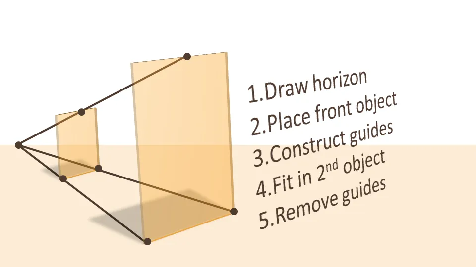
If you do want to use a 3D composition, use guide lines and an imaginative vanishing point to make sure your objects are aligned properly.
UPDATE: more on positioning text (with reflection) in 3D in PowerPoint in a folow up post to this one.
2 comments
In the world of clip art (and I mean the good one as opposed to the poor Microsoft standard library) with graphics that are simplified on purpose I agree that a 3D shadow can add something.
That being said, I am pretty much fed up with 3D stacked bar charts!.
- Dr. Jim Anderson
The Accidental Communicator Blog
"Learn How To Calm Your Fears, Wow Your Audience, And Get Your Point Across"