SlideMagic Blog

Frequent updates about all things presentations since 2008. Subscribe to never miss a post.

RSS
all posts

Category Story

·Story

"Ooff, but we answered you already"

Often, when I start a presentation design project, I find that the real message of a pitch is buried.

  1. Buried under buzzwords and jargon that make the pitch sound the same as any other presentation out there
  2. Buried under “short cuts”: this is a bigger problem. Over time, the company has developed an internal proprietary language where certain key terms summarise the entire concept behind the company. The insiders understand it perfectly, to an outsider it sounds meaningless.

As a result, I tend to get back to the same questions in a briefing meeting. “Why are you different again? What is the difference between your product and the one that company is offering?” My first version of a slide deck often contains deliberately blunt charts that force the client to react and correct a positioning that I think I understood (sort of).

Some people in the room fear that they hired the wrong presentation designer, who keeps on asking the same ignorant questions. Most of the time, I manage to convince them by the time my final product is delivered.

Image on Flickr by Nic McPhee

·Layout

Presentation design without the design

Most business presentations can be done perfectly without sophisticated and complex visual concepts. That image of an elephant balancing on a ball, or a 3 dimensional constellation of rotating database cylinders might not be necessary to get your point across.

Instead focus on the non-design challenges:

  • Finding nice full page images that can introduce the problem you are trying to solve
  • Recutting, regrouping, re-wording the key problems and your solution in a very clear and crisp table
  • Deciding what are the key statistics and data you want to use to show that your solution works and that the company is having momentum
  • Organising the more “boring” facts about your product/company in some decent looking tables in the back of the deck (team, product offering, pipeline, terms, etc.)

Full page images, tables, and simple graphs, that’s all  you need (and all you will find in my presentation app SlideMagic). Doing more complicated things is more risky:

  • A perfectly executed simple slide looks a lot better than an amateurish looking effort at something that is more than you can pull of.
  • You can hire an expensive graphics designer to do the concept for your, but her style will be dramatically different from the slides you want to add yourself to the deck last minute

Keep it simple, and do that really well.

·Story

Presentations are short cuts

Many of a company’s operational processes have become a lot more efficient over the past decades, partly with the help of automation and computers.

Above the factory floor, middle management of corporations gets more efficient as well. Computers take over routine tasks, and slide/dice data so it becomes easier to make decisions.

Human communication among decision makers is pretty inefficient. People are bad at formulating and selling their ideas. Presentations have helped though: they have replaced long-winded memos and forced people to get to the point faster. Visuals are easier to digest, and more importantly, it is faster to skip through useless pages of a presentation (PGDN, PGDN) than looking for “the meat” in a text document.

This realisation might help you with the design of your everyday presentations. It should look decent. It should get to the point. It should show interesting, unusual, unexpected facts and insights. You want to get to a decision, you are not aiming to publish a complete, scientific document.

Here is where my presentation app SlideMagic comes in, adding even more shortcuts to make corporate decision making more efficient, and less cumbersome, boring and time consuming.

Image from WikiPedia

·Story

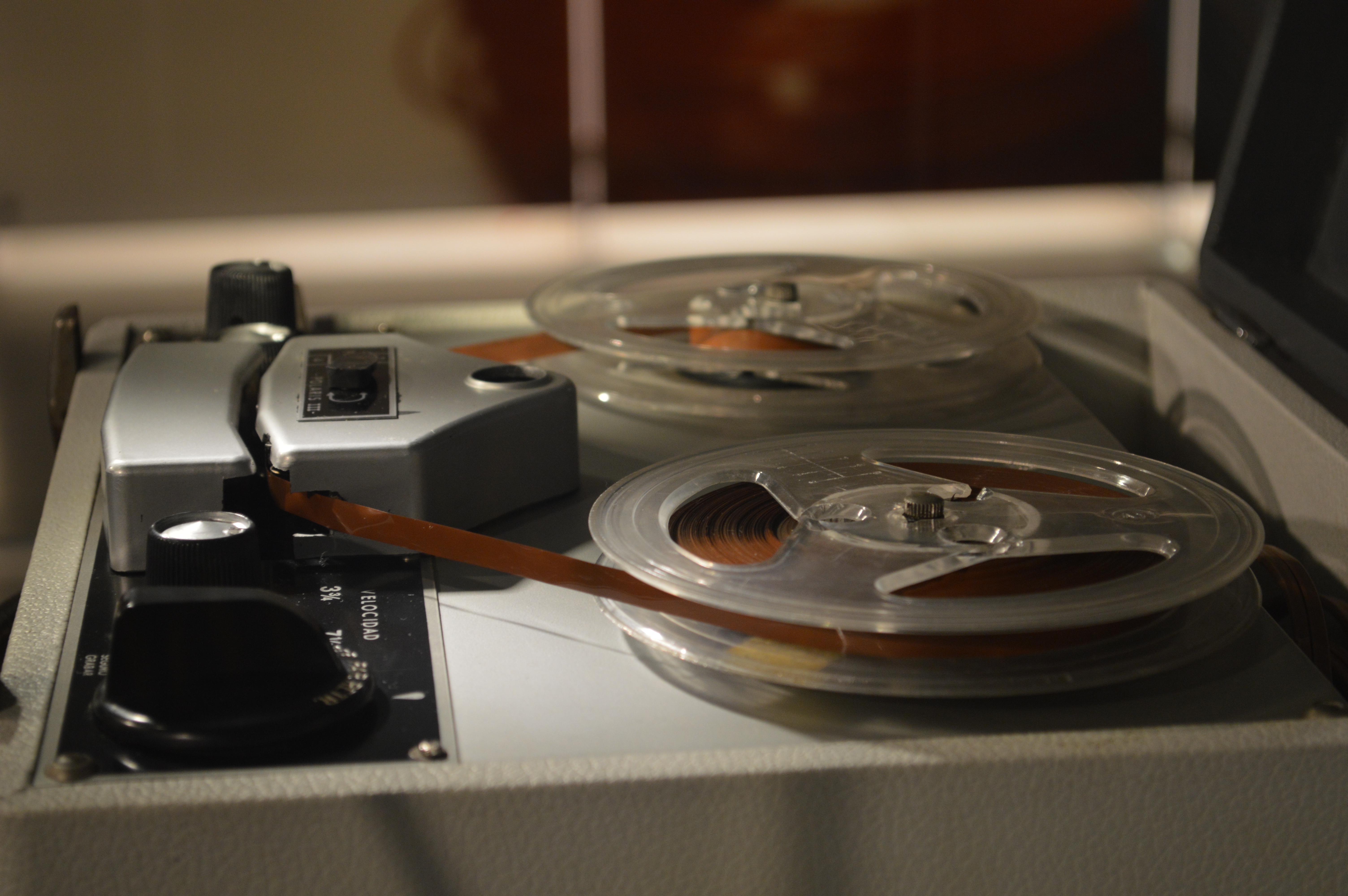
The audio recording test

Next time when you do a pitch in a 1-on-1 meeting record the audio (obviously ask your meeting guest). Back in the office, play it back with the slide presentation closed. Hit pause after every major point and scribble/sketch a quick chart you would use to make that point. When finished, compare your scribble with your slide deck and make the required changes.

Image on WikiPedia

·Investor presentation

"It takes too much time to get to the solution"

Clients say they get this feedback after giving a pitch. The initial reaction to this would be:

  • Cut slides from the deck
  • Take the specifics out of your text, make it shorter and more high level
  • Combine multiple slides into one

The danger of this is that you end up with a few slides of highly generic and dense bullet points.  Remember:

  • Slide count does not equal time spent presenting them
  • Smacking someone with the solution in their face instantly takes away the opportunity to lead them by the hand in an interesting story that covers the problem you are trying to solve.
  • The best way to sell the solution is to sell the problem

Here is what I do:

  • Create a super short intro slide that explains the audience what you solve and what you do. So they can stop guessing about the point you are trying to get to.
  • Now, lead people through a sequence of visual slides that highlight the problem, slowing down sufficiently to make sure that the audience “feels” the issue. “Production cost is too high” is too generic. Why is it so expensive, and why could no one do it cheaper until today?
  • Then, present your solution and use the framework of the problem you set up in the previous section to mirror your product against markets that are out there in the market today

Image by David Felstead on Flickr

·Investor presentation

Teach them how to think about you

This debate on the Fred Wilson blog whether you should look at Twitter in terms of monthly active users who log in, or (the much larger number of) people who view/get exposed to tweets is an important lesson in investor presentation design: sometimes you need to educate your audience how to think about you.

Investors like benchmarks that they can compare quickly across stocks, like features of car: EPS, CAC, churn, MAU, eye balls, beta, EV/EBITDA. If your company does not fit the traditional pattern you need to make sure your audience understands it.

Image from WikiPedia

·Story

Clever categorisation

Categorisation is a key skill for presentation designers. Raw material usually consists of lists of bullet points: some are detailed, some are generic, some are important, others not, some overlap, sometimes lists are not complete.

Moving around these points, grouping, categorising them is an important part in the design process. Next is the decision what issues to tackle on what slides. Where can you condense, where do you need to break things up over multiple visuals.

Image from WikiPedia

·Concepts

Too good to be true

If this is the main message of your presentation, very few will believe you, unless you have a very credible explanation why you can offer a free lunch where others can’t. “It is like magic” will not cut it.

Image by Eva Peris

·Story

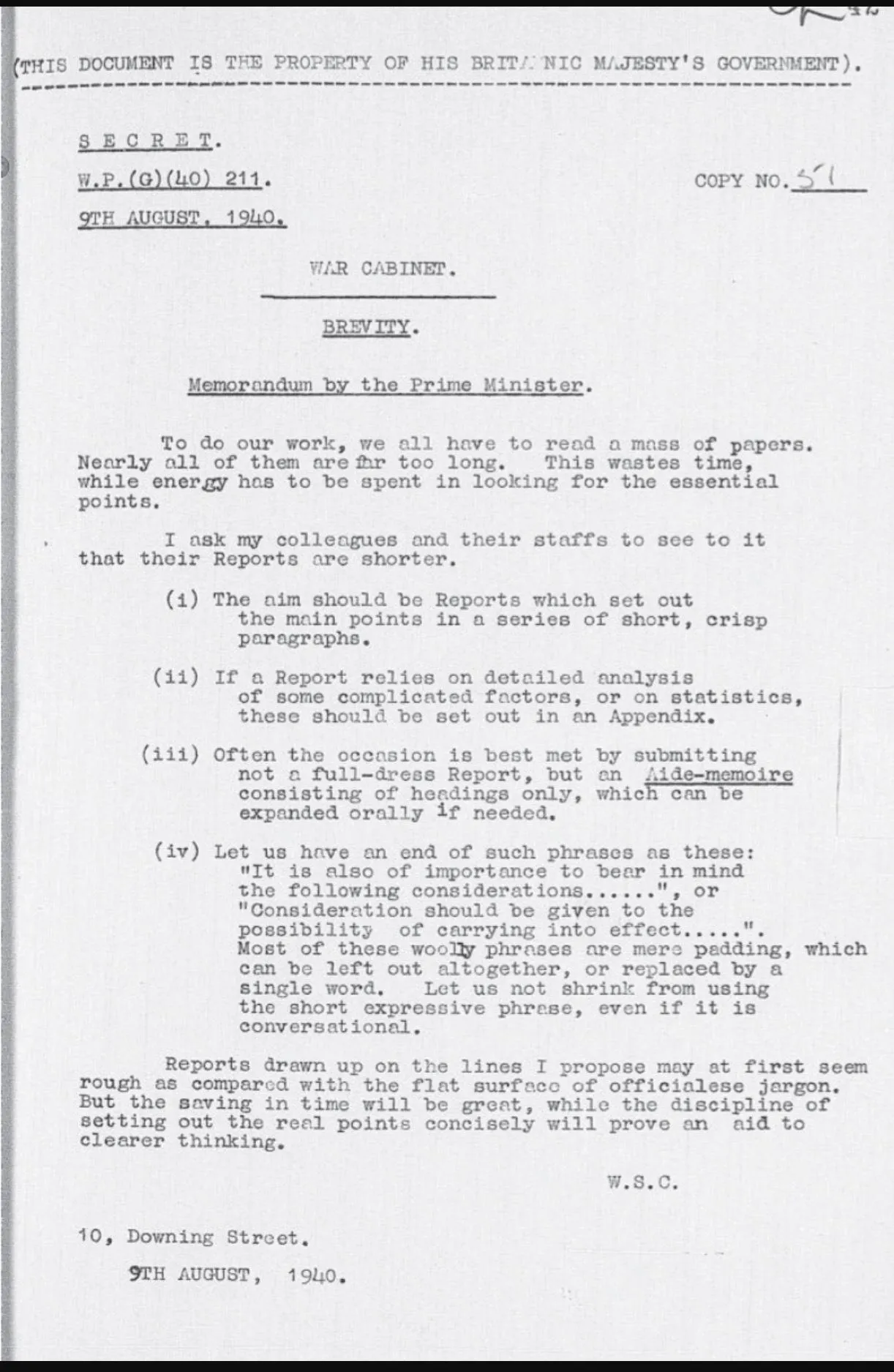
Brief memo by Churchill on brevity

Still relevant today:

·Story

Quotes in presentations

Most quotes in presentations do not add to the story:

  • Too long to read
  • Too many buzzwords and generic language
  • Given by a person nobody has ever heard of
  • Given by a person with a position that is not very impressive (junior analyst at unknown consulting company)
  • Give by a person who is very famous but has nothing to do with the subject (Ghandi)
  • Used too many times

What can you do better? Find the right person, and get them to say something specific, clear, and simple: “This solution saved the launch of product [x]!”

UPDATE February 2018: I have added a new post about using quotes in PowerPoint to the blog