SlideMagic Blog

Frequent updates about all things presentations since 2008. Subscribe to never miss a post.

RSS
all posts

Category Software

·SlideMagic

SlideMagic and generative AI update

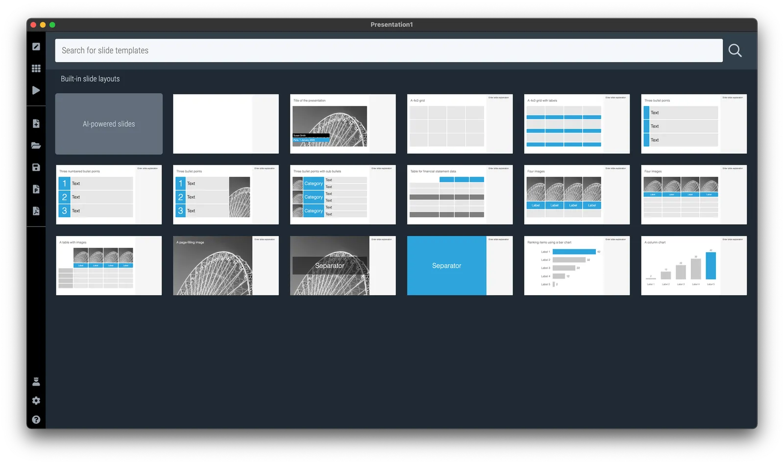
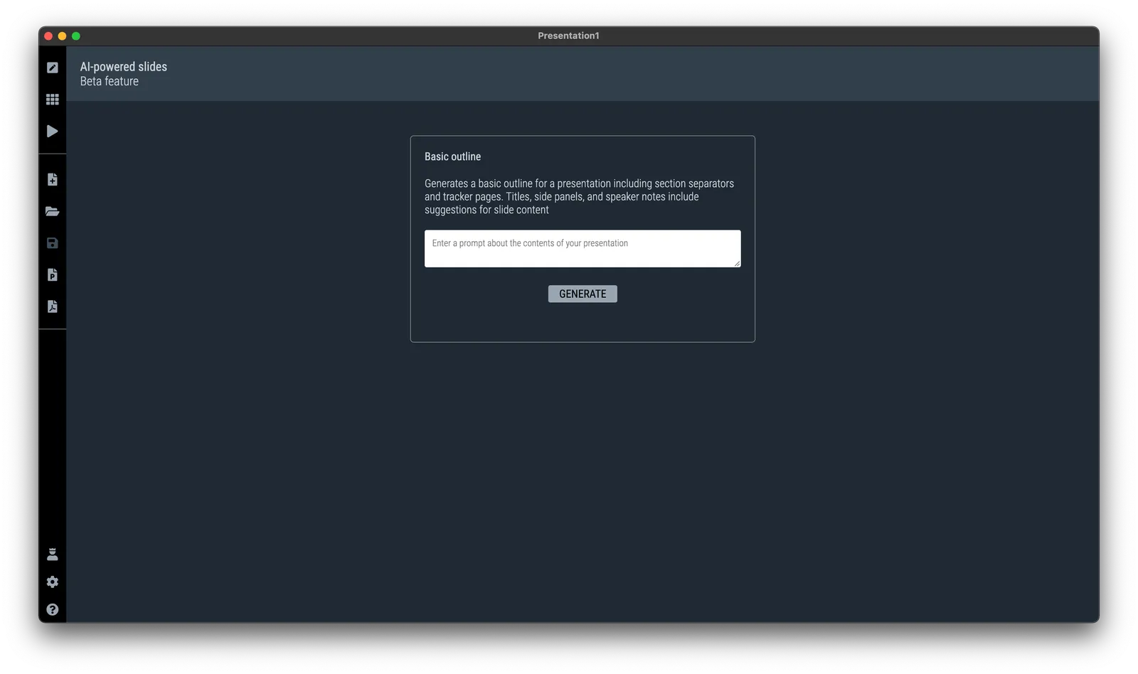
I am continuing to experiment with OpenAI to see how it can help us make presentation design easier. Generative AI feels a lot like the early days of the Internet in the end of the 1990s. People did not really see that “Internet” was not really a unified tool that could do wonders for business, but rather a description for hundreds of different applications and use cases that happen to rely on a web browser.

The same is true for generative AI now. I don’t think that I will come up with the ultimate AI-based presentation tool overnight that can read your thoughts and deliver the slides at the press of a button. Instead, I will try to release bite-size features that can make the life of a presentation designer easier.

And some of these might not even be very clever. Anyone can go to ChatGPT and get it to produce some presentation skeletons or summaries of text. But there are ways to make prompting of the engine better for presentations. You can save a lot of time by having a user interface straight into SlideMagic, and most importantly, it saves a lot of time when SlideMagic creates the slides for you (in .magic and/or .pptx). The latter has nothing to do with AI, but rather improving the slide generation engine that I already built.

Watch this space.

·Software

Why does it look like PowerPoint?

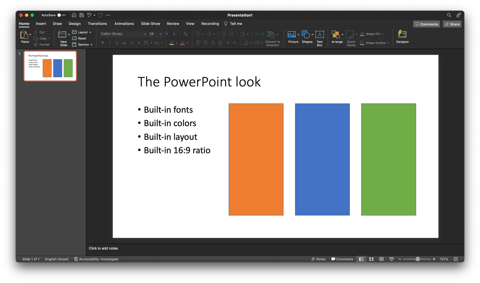
It is often quick and easy to use PowerPoint to draw a diagram. No need to install and learn new specialized software. A few boxes, lines, a screenshot, and you are done. But why the result totally obvious a PowerPoint slide, even if you are not using the program to present your visual?

Over the past years (decades for some) we have become so used to seeing PowerPoint slides with the built-in fonts, standard color palettes, that most people will recognize it instantly. But when your end product is a screenshot, you don’t have to worry about things like font compatibility and presentation templates.

  • Change colors and fonts to match the document you are working in
  • Let go of the restrictions of the aspect ratios for a slide (4:3, 16:9) and pick something that is appropriate for your diagram.
·Software

Prompting...

I have been experimenting extensively with prompting ChatGPT for the use in presentations. In a sense, I am glad that I did not raise huge amounts of money a few years ago in order to build features that now more or less come out in a few minutes.

Still there is a difference in “hacking” some quick results in a demo and having a stable product that can be used in the front line of presentation design.

These features have all to do with the automatic generation of layouts and story lines. Further out in the future though, there might be other applications that can replace the slide deck as the central tool to pitch ideas.

·PowerPoint

This presentation tool is not a presentation tool

PowerPoint, Google Slides are presentation tools that most of the time are actually not used as presentation tools. Rather people use them as a visual collaboration tool. The organization chart that needs to go into the deck forces the issue: it is time to agree on where the boxes sit and which lines (dotted or straight) go between them. The tiny footnote is essential to agree the strategy for the North America entry strategy etc.

The visual character of these programs makes them more useful to do this than word processors. Online collaboration adds another option to manage multiple pens in one document. Comments give a system to manage todo lists.

SlideMagic on the other hand is a presentation tool.

Image credit: Jay Cross on Flickr

·Software

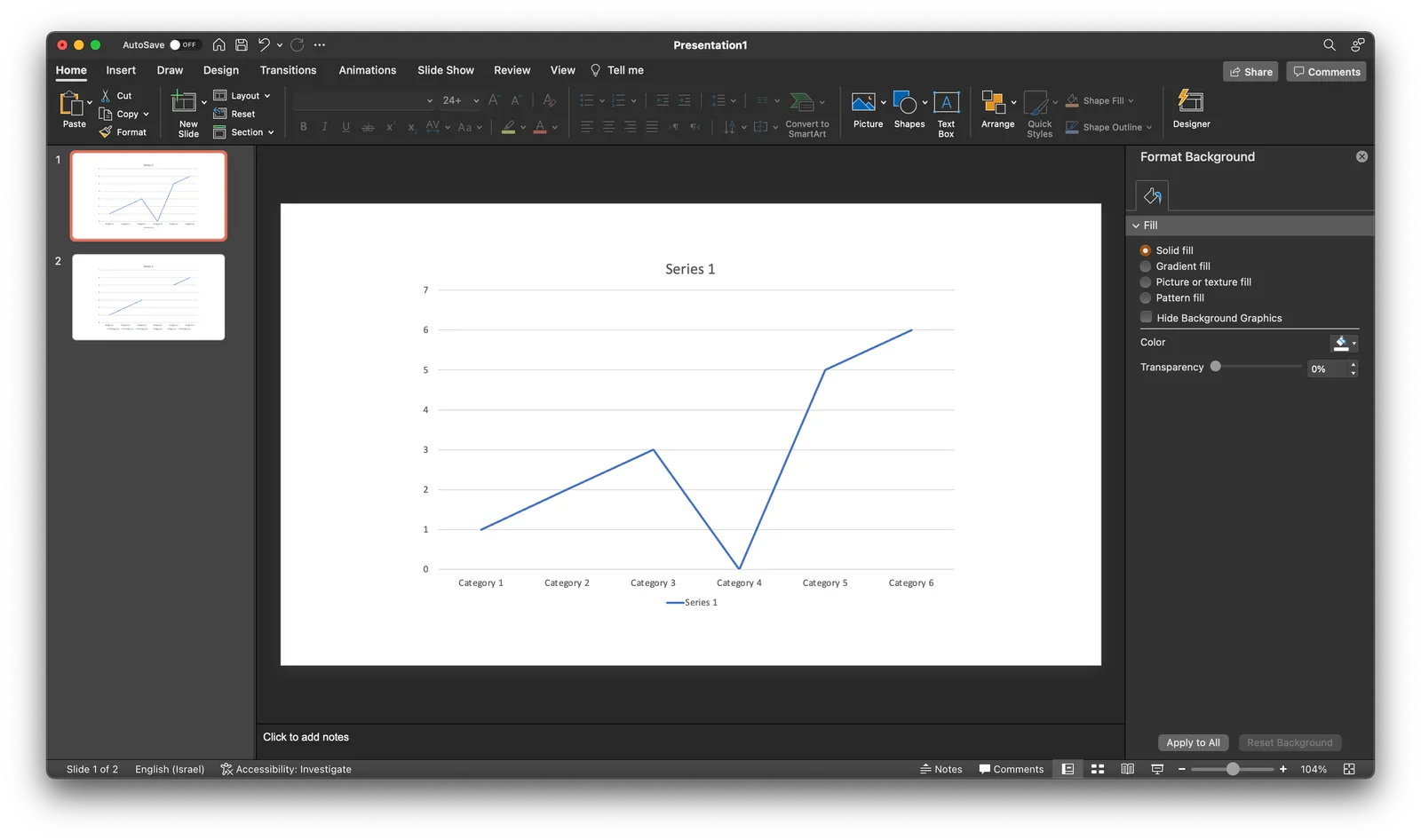
Taking out a point in a line graph in PowerPoint

A PowerPoint post today, why not… Someone showed me a little trick to remove a point in a line graph. Useful when you have one year with missing data, and simply interpolating the value between the 2 neighbors would be bending the truth. Putting a zero leaves an odd line (see below).

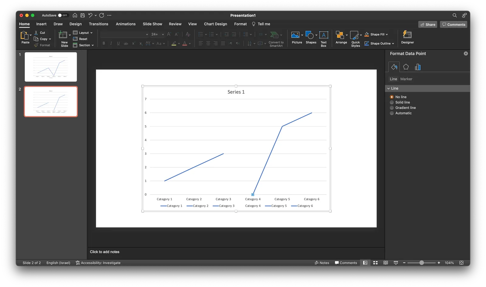
If you select the data point, (not the data series), and go into format data point and the paint bucket, you can set the line to “no line” (see below).

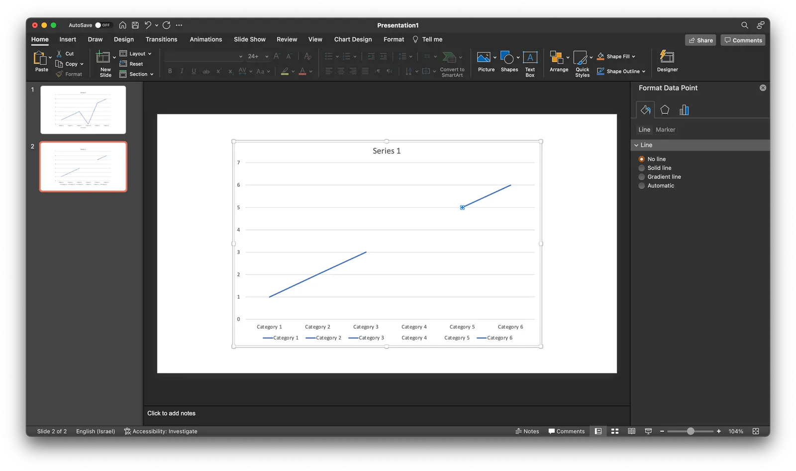
Repeat the process for the neighbor to the right (see below).

As a result, some weird things are happening to the data series labels though. Also, this standard PowerPont/Excel chart is far from presentable in your slide deck. An alternative approach in SlideMagic? Put in a column chart with a zero column value.

·Layout

Football charts in SlideMagic

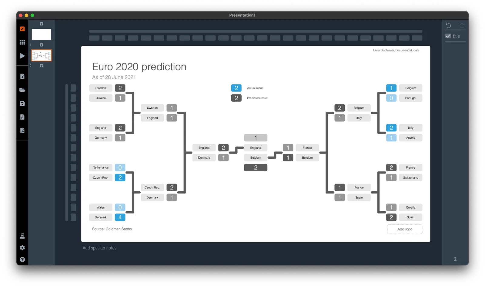
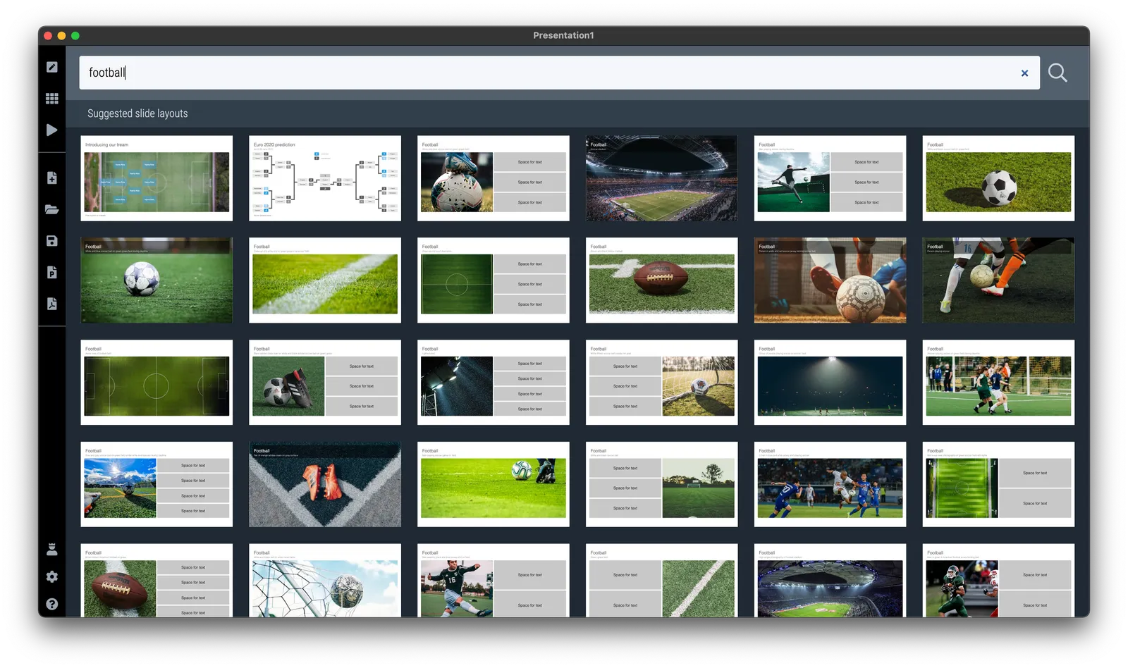
If you need to plot the progress of your team in the FIFA World Cup, SlideMagic is there to help you. There are a number of football charts in the library, including a tree where you can add teams in the knock out race to the final (see below).

Simply search for football in the SlideMagic app and the charts will show up (see below).

SlideMagic Pro users can convert these slides to PowerPoint or PDF. Free student plan available

·Layout

Fixed slide titles

PowerPoint slide templates originate from the 1980s. “Slides” would mainly be data charts: graphs and tables to show information. At the top of these pages would be a descriptive title (Economic output in the EU), and the subtitle would give the unit of measurement ($ billion).

Slide templates evolved. Business school professors and management consultants invented frameworks, more conceptual slide layouts, and people started using presentation software to layout their entire story on the big screen, often in bullet points. Descriptive titles became messages.

In most cases the title stayed. Every slide always has a title at the top. But this layout does not always work. People started adding a big arrow, with another big message next to it to make sure that the audience gets the point (it is spelled out 2x on the slide).

Titles take up valuable screen real estate, especially on widescreen 16x9 layouts. They make the chart body space even longer, more stretched. A loooong sentence in small font across a 16x9 slide can be hard to read.

I have become more flexible when it comes to titles. Data charts still have them. But other slide layouts might have none, instead, just an image, or a big text box somewhere else on the page. Or a message that is actually a few paragraphs long, on the side of the slide.

In SlideMagic, you can instantly change the layout of slides, and switch the fixed title on or off. It is time to let go of the obligatory title. See the the examples below. (If you are reading this as an email blog update, you might have to click through to the original post to see).

Continue reading →
·Software

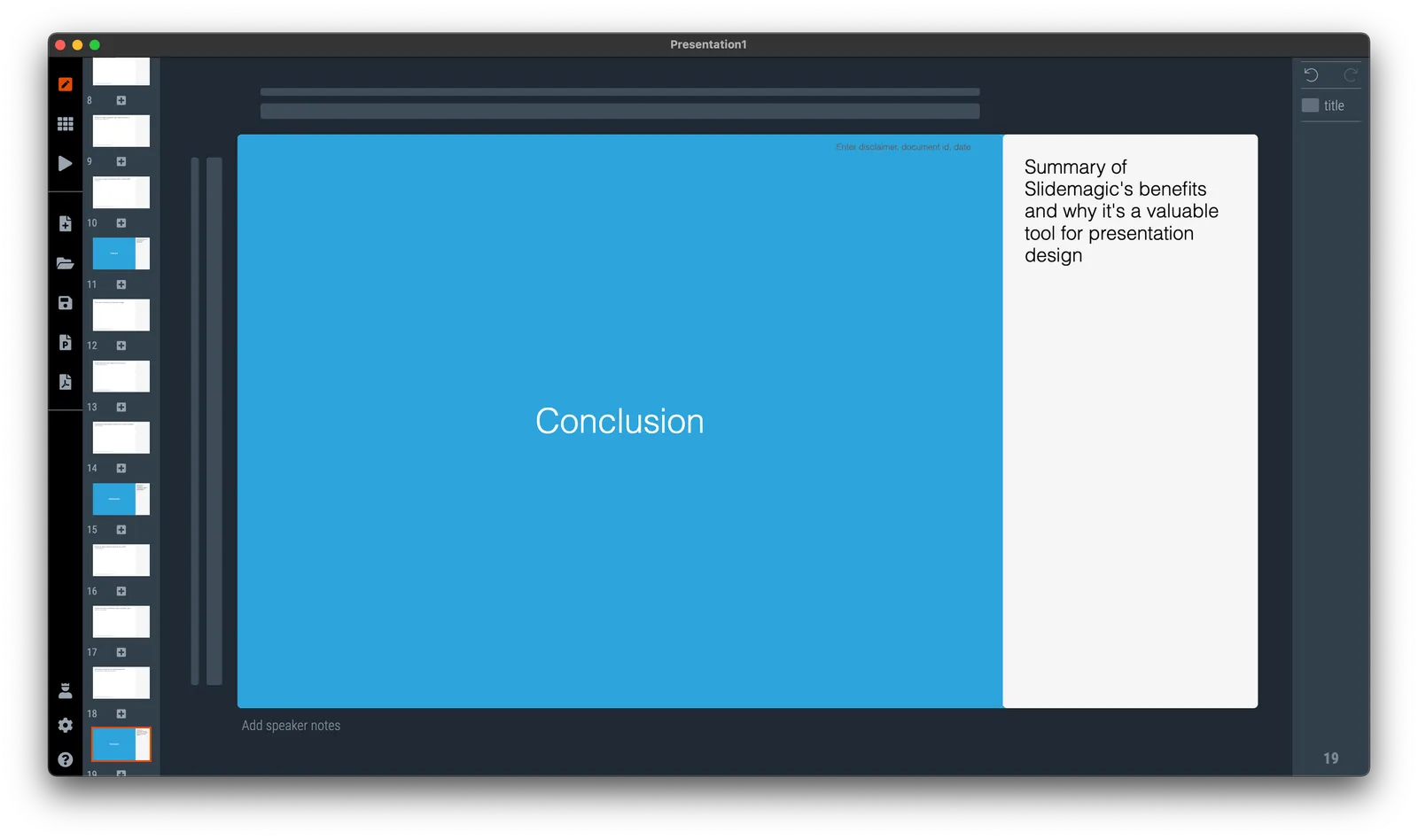
Side panels in separator slides

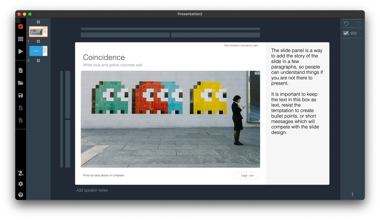
The slide panel is a way to add the story of the slide in a few paragraphs, so people can understand things if you are not there to present. It is important to keep the text in this box as text, resist the temptation to create bullet points, or short messages which will compete with the slide design.

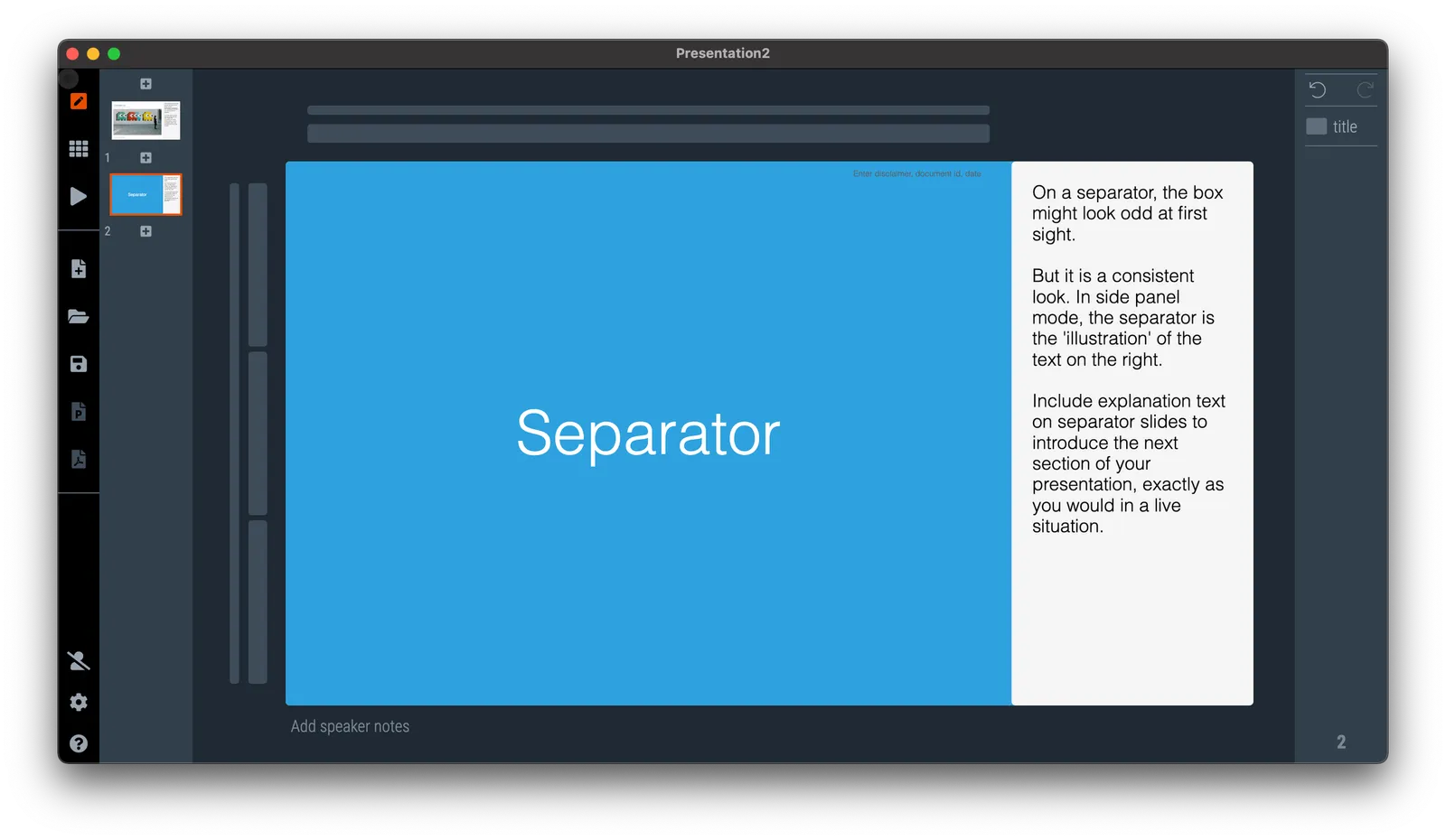
On a separator, the box might look odd at first sight. But it is a consistent look. In side panel mode, the separator is the ‘illustration’ of the text on the right. Include explanation text on separator slides to introduce the next section of your presentation, exactly as you would in a live situation.

See the example below:

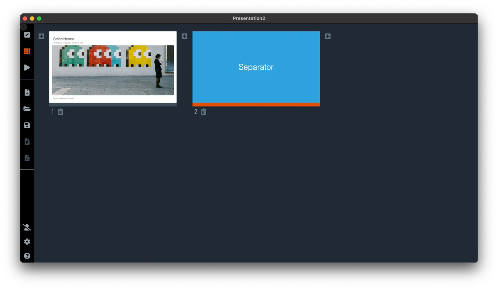
If you switch to another view mode, the side panel will disappear, but the app keeps the text, so you can switch them back on at a later stage.

·Software

Agario-style

This amazing visualization shows the history of Europe and the coming and going of various empires in the style of the Agario video game, where bubbles collide and merge.

This video was made using Adobe After Effects. In theory you could do something like this in PowerPoint: a slide for every year with animations and then loop the whole thing. It is a lot of work though.

·Software

SlideMagic 2.6.41

A new version of SlideMagic is deployed, and should automatically install. This version includes security patches, and a slightly less strong background color difference between the main slide and the explanation box view.

The explanation box is one of 4 views of SlideMagic:

  1. Narrow 4 x 3 aspect ratio
  2. Wide 16 x9 aspect ratio
  3. Title on the side
  4. Explanation box view, which creates space for an extra text box where you can enter a few paragraphs to explain a slide in case you send the deck without being present yourself.

The text in the side panel stays saved in the file even if you go to another view, so you can decide when you want to show it, and when to hide (for example in a live presentation).