More plumbing...
An update.
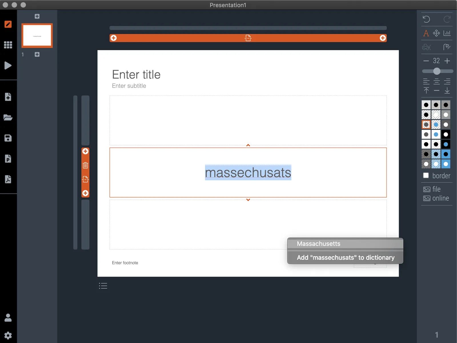
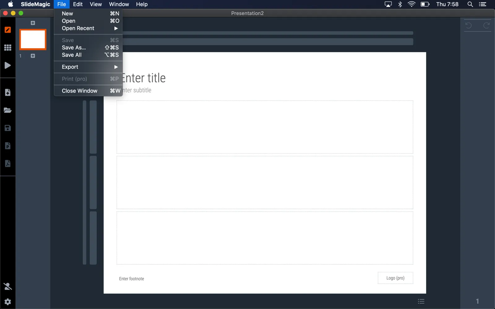
A couple of days ago I released version 2.5 of SlideMagic with lots and lots of small updates that were sitting on the todo list. When designing, I cannot stand it when a small detail is off, and the same applies to software development. And like in design, most users/viewers won’t notice these individual details, but when taken together they add up to something. This slide does looks right for some reason, this app just works for some reason. Opening up SlideMagic should trigger an update to version 2.5.3 (writing this on November 11) after a few minutes, if not, you can visit the SlideMagic download site to install the latest version.
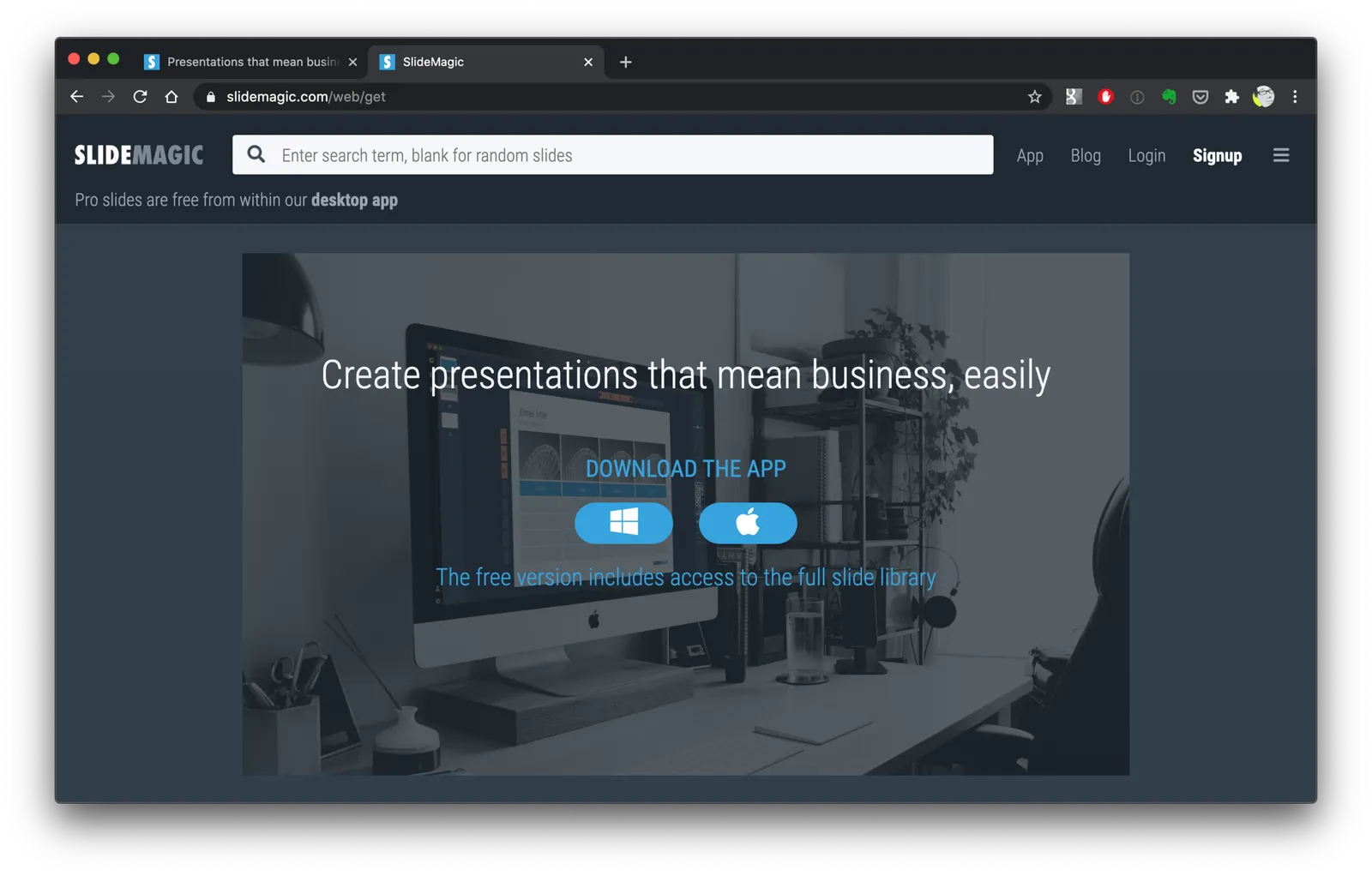
I am making changes to the positioning as well. That download or app landing page is now the home page of SlideMagic and no longer the web site that says that SlideMagic is a template bank, but also an app, and also a place where you can download entire presentations. All confusing, and still a left over of the SlideMagic template store on Shopify. The Shopify store is closed, and (that was quite a moment), the entire V1 version of the SlideMagic web app has been wiped from the server.
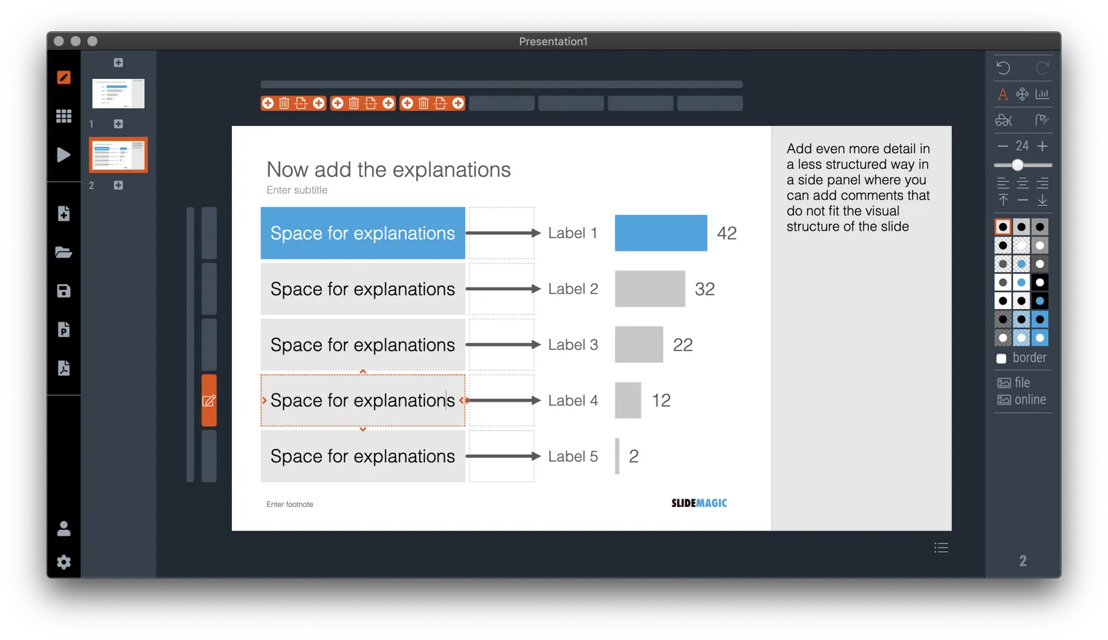
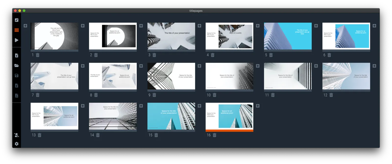
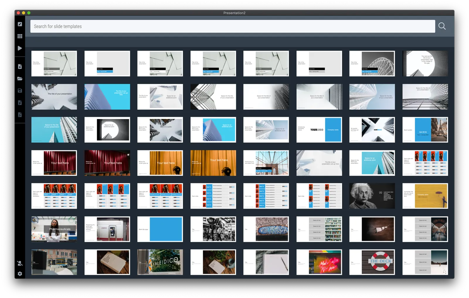
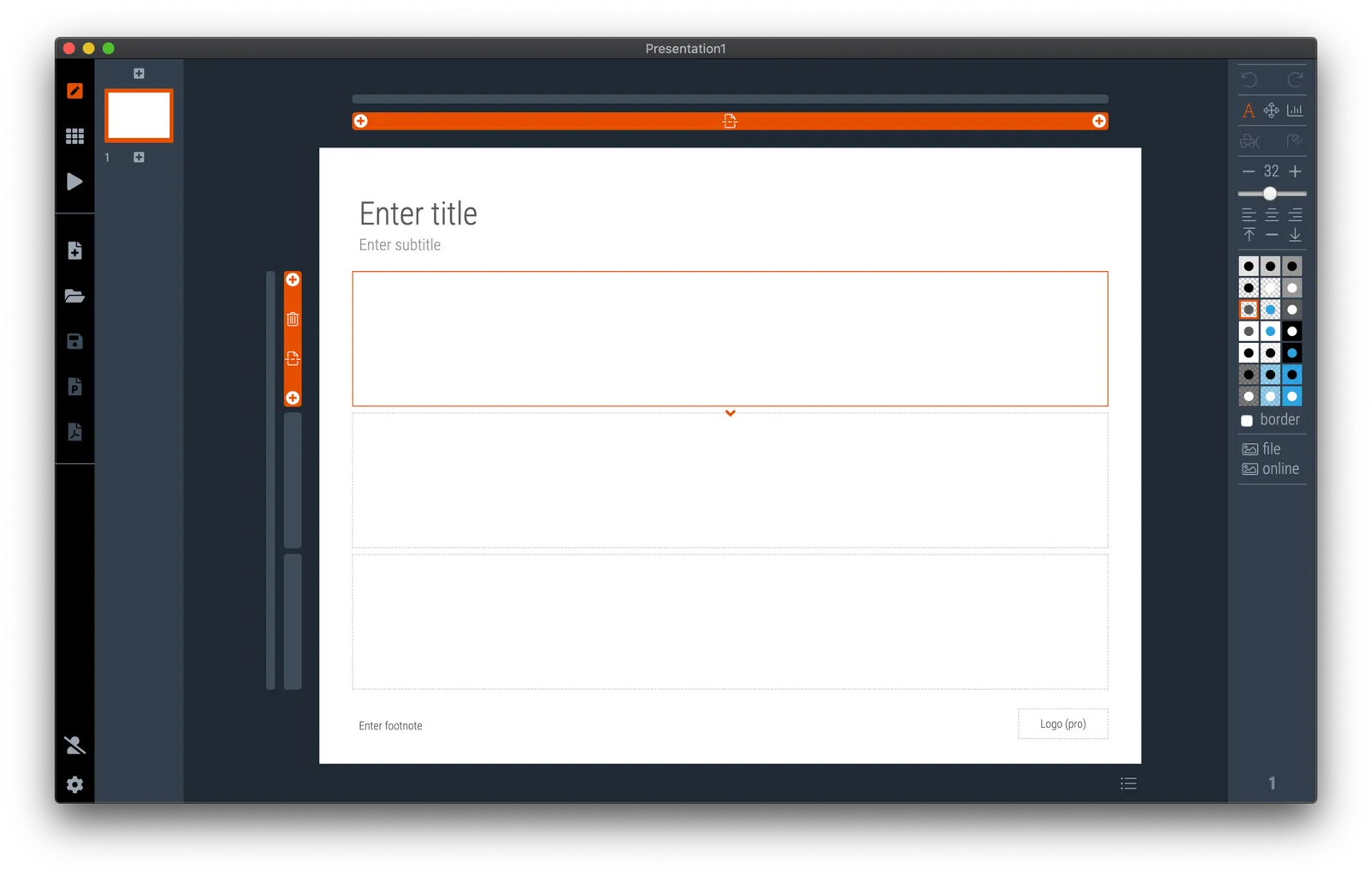
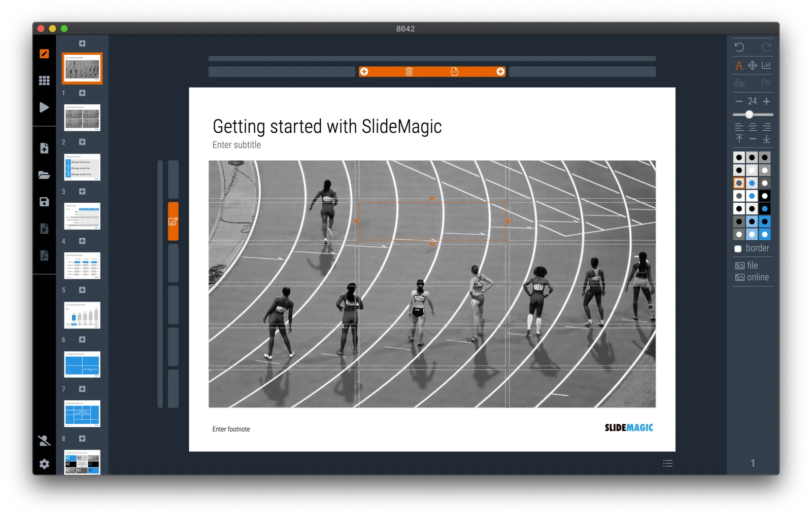
So the web site (still WIP) now reflects what SlideMagic is: presentation software with a uniquely clever user interface and a huge built-in template data base.
Photo by Bruce Warrington on Unsplash