SlideMagic Blog

Frequent updates about all things presentations since 2008. Subscribe to never miss a post.

RSS
all posts

Category Presentation

·Data visualization

Bit by bit

Listing pages and pages of market size numbers that are related to your industry are hard to digest for the novice (for example, a potential investor in your company). This number includes devices, that number is 2011 only, this number excludes Eastern Europe, that one is number of users, that one is in Euro, and this is the percentage growth, but the growth of the average basket size.

An investor who is seriously considering putting money in your company will try to piece this data together to come to some consistent picture. You might as well do the work for her with reasonable assumptions. Size up the 2011 market to 2013, add your estimate for Eastern Europe, convert everything to dollars, etc. etc.

Start with some sort of overall market estimate, compare it to something the investor can relate to, then start adding complexity, break things into pieces.

Obviously your estimate will biased and very optimistic, but your analysis has at least provided the investor with a framework of how to think about your market. Put all the raw data that you used in the appendix so that the investor can do her own homework when she returns back to her office.
·Images

Getty Images - free embed

Getty Images (a huge database of both stock and news photos) is open sourcing non-commercial use of its collection if you publish an image via their embed widget. Web sites only for the moment, presentation design software will have to wait…

·Images

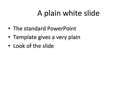
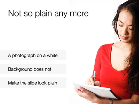
White <> plain

No one likes the plain, white, standard PowerPoint slide. And sometimes when I design a slide with an image on a white background and a lot of white space I get the comment that it looks very similar to a boring, plain PowerPoint slide. I beg to differ.

·Delivery

"I need a conference presentation"

You have a sales presentation that - despite the fact that it is loaded with bullet points - has been very successful in 1-on-1 meetings with customers. Now you have an invitation to speak at a conference for an audience of more than 100 people for a maximum of 20 minutes. What next? Here is a recipe.

  1. Trim down the content. In the conference audience are competitors, analysts, journalists, all kind of people that might not be suitable to receive the ins and outs you would discuss with a prospective customer. Remember, the object of a conference presentation is not to close a deal, it is to tease people into calling/emailing you to set up a first meeting.
  2. Flatten the story. Take out overview/summary slides, and spread them out: one slide covers one bullet. We want a story, not a structured table of contents of a business school text book.
  3. Beef up the “problem” section of your presentation to let the audience connect with the issue you are trying to solve. The problem might be totally obvious to you, and 60% of the audience, the other 39% is not there yet.
  4. Avoid repetition. If you talk early on in the presentation how highly accurate your product is, group that together with the a slide in the back that shows test data confirming accuracy.
  5. Find big bold visuals that support your points (one point per slide). Stretch images to a full page size, and cut text.
  6. Take out any live demos or demonstrations
  7. Use your videos (if you have them), BUT only if you can integrate them seamlessly in your presentation flow. Embed it and test it 300 times to make sure there are no technical glitches. Think where you want to insert the videos. Videos are excellent wake up calls, anticipate where in your story the audience runs the risk of getting bored.
  8. Practice, practice, practice, until you can deliver the whole talk in 15-17 out of the allocated 20 minutes.
Continue reading →
·Images

Historical images - CC

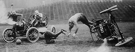
Another source of images that are in the public domain: the publicdomainreview.org You could pick one set of images and use them throughout a presentation to get a consistent look and feel of all your slides. Below a preview of a car polo game in the early 1900s.

Thank you Joann Sondy

·Images

Unsplash: CC image library

Unsplash is a frequently updated blog of creative commons images. Mostly background and nature shots. Via Orli. Image by Dyaa Eldin Moustafa.

·Books

Slidedocs by Duarte

Nancy Duarte published her fourth book: Slidedocs, about how to design visual documents in PowerPoint (or Keynote) that are meant for reading rather than presenting.

She is on to something. Business communication is getting shorter and shorter, and the role of word processors that used to write long boring memos is taken over by presentation design software that is used to create more visual documents.

Slidedocs is a free download (it is actually a PowerPoint file) that talks you through an approach to make these documents better. Most useful might actually be the file itself, that can serve as a template for your next Slidedoc!

·3D

The wow intro

Bombastic animated introductions are often used to promote movies, and some people might think they make spectacular product presentations. However, I think that a 3D animated product name with loud music does not make a good connection with the audience.

·Creativity

Always beautiful

I try to keep ugliness completely out of my design work. Ugliness tends to spread like a virus that wants to take over your work.

Even if you make a quick mockup or even a paper sketch of a slide, it should look orderly, balanced, clean. This is what I learned on my first day at McKinsey, when a client walks in you should be able to talk her through the hand-written deck.

·PowerPoint

PPT for Mac colour bug workaround

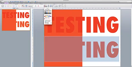
Microsoft PowerPoint 2011 for Mac renders colours of shapes and text differently, it has given me many headaches and inspired many blog posts over the years. So - finally - here is the simplest fix: create a thin outline in the same colour as the text around your characters, done!

The screen shot below shows how normally text get rendered differently even if you apply the same colour code to it (#!@$#@). Below that, the same text, with the same colour, but now with a tiny outline (same colour) around it. In the small preview window at the right you can see that the text and the shape have the same colour.You can see how I selected the text, and picked the line option from the format ribbon to do it.

Microsoft, please acknowledge this as a bug and not a feature (which you suggested in the past) and fix it in the next Office 2011 patch.