

SlideMagic Blog

Frequent updates about all things presentations since 2008. Subscribe to never miss a post.

RSS
all posts

Category Presentation design

·Investor presentation

"Cute" investor pitches, watch out

The other day I could a project inquiry. The current deck looked like an infographic, it was very nicely done: soft pastel colors, retro fonts, nice icons. Still, the company had difficulty finding traction with investors: where is the meat, where are the numbers, this looks like an ad.

Many VCs come out of the world of engineering or banking which has a certain quantitative, macho communication style to it. Even if your product positioning is “cute”, your investor presentation should probably a bit more testosteron-loaded.

In my previous life as a management consultant, I have spent many years inside consumer goods companies. Believe me, their management presentations do not look like the ads they put on TV for their products.

I am not saying that you should kill the cute slide deck (the world would be a lot more boring if that happened on a large scale), I just wanted to emphasize that if you decide to go with this style to be aware of your audience and compensate in some other way.

·Delivery

Even CEOs cannot wing it

Everyone would agree that Steve Jobs was a pretty good presenter. But he is said to have practiced two to three full time days before a major product launch speech. Two to three full time days! I bet if you put in that effort before your next presentation, you would be pretty close.

Practice means real practice: standing up, going through the slides first to last without interruption or a quick skip back when you make a mistake, you cannot do this on stage either. Make a video of yourself if you can. Put your screen where your monitor laptop will be (so you do not have to look back at your screen to see what slide is on).

It may sound counter–intuitive, but you actually need to know your story inside out to be really spontaneous. There is no such thing as “winging it”. Your audience will notice, you will use “uh” and “oh” all the time, the key lines will not come out the way they should, you will repeat yourself all the time.

And memorizing the talk line by line is not enough. If an actor has to go back to her memory for every line in the play, she will not have the mental energy to focus on the mood of her character. You need live and breathe your story. Then it will come out naturally, and you can improvise around your story line depending on the reaction of your audience.

The exception here might be webinars. Here, the audience cannot see you and you can probably get away with reading through a presentation line by line.

Continue reading →
·PowerPoint

PowerPoint guides using xScope

One of the most annoying shortcomings of PowerPoint 2011 for Mac is the inability to lock drawing guides. An external app can solve the issue.

A guide is a thin blue line on your design canvas along which you can align slide objects. If you drag an object close to the line, the object snaps into place. In this way objects on multiple pages are positioned in exactly the right place. I use them to mark slide borders, and more importantly the vertical center of my drawing canvas when it does not coincide with the center of the screen.

It is very important that these drawing guides stay exactly in the right location, and this is the issue. As soon as your cursor comes anywhere near a drawing guide, PowerPoint will make moving the actual drawing the priority. So if you try to straighten out an object that is a little bit off and want to fixate it against the guide, PowerPoint moves the guide rather than moving or resizing the object.

xScope (affiliate link) is an app for Mac that allows you to draw screen guides independent of the underlying application. The good news: PowerPoint does not move your guides anymore. The bad news, objects do not snap, you have to make sure manually that they are perfectly aligned. One other comment, the app lets you decide where to draw lines and where not when you use 2 screens. xScope does not allow you to manage this on 3 screens.

Continue reading →
·Keynote

The table as a grid

It can be a real pain to space out logos in a logo page nicely. My trick is to use a table with a really fine grey line between cells. It is easy to adjust the grid when you need to insert and/or delete columns and/or rows.

See here an earlier post on how to make great looking logo pages.

·Data visualization

Tables can look good

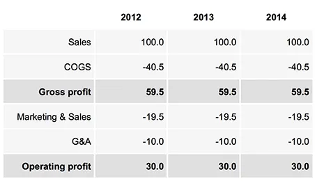
Sometimes, you do not need a data chart at all, and nicely formatted table with rounded numbers might just be the best option to visualize your data. This is especially true for financial statements with lots of information, or in situations where one chart contains a lot of numbers with completely different orders of magnitude. Some quick improvements you can make to make a table look good:

  • Space out rows and columns, the more of them are the same size, the calmer the table will look
  • Round up numbers to a reasonably precision, use a “,” to separate thousands Right-align numbers, make sure the decimal dot lines up
  • Right-align the first column with descriptive text, so it is as close as possible to the first column with numbers.
  • Use highly muted background colors, I usually pick the lightest grey that I can get, and draw the cell borders with a white line
  • If necessary reduce the font size, very big fonts with unnatural line breaks do not look very good in a table.
  • Enter data manually: yes typing in every single number by hand is often the only way to get the table to look exactly the way you want it to. Fifteen minutes that are well-spent

UPDATE: on request an example of a table layout I often use.

·Investor presentation

The real case study

Case studies in investor and sales presentations are most of the time hollow and fluffy quotes that were clearly the result of an email saying “Do you mind if I quote you saying that our solution is highly flexible and scalable?”.

Here are a few ways to make a case example real:

  • Focus on one specific benefit, if you try to put your entire story in the mouth of your customer, you need 30 slides, not one
  • Cut the fluff
  • Be very specific, and very detailed, quantify if you can.
  • Add an image of your client to make things more authentic.

Case studies can be more than a simple quote of text. If you want to show that your system can be installed within 6 weeks, why not show a bar chart of your last 10 customer installations, with the exact time it took to install the system?

Tell a real customer story.

·Gadgets

Content creation on iPad

I have been experimenting a lot with using my iPad as a laptop replacement. It boils down to getting used to a new user interface: designing slides in Keynote works fine, and even building a spreadsheet in Numbers might be more intuitive on a touch interface, it is easier to navigate around cells. Strangely enough picking up a regular pen and paper feels a bit weird the first second after all that digital handwriting.

There is a very big issue though, an issue that was solved on the PC in the mid 1990s: multiple application windows. Quickly getting the data out of a PDF, running a side calculation in a spreadsheet, browsing through your images before putting them in a deck is simply not possible yet.

Here are some features that should be baked into a future tablet operating system:

  • Touch-friendly application switching that does not create the cluttered window mess of regular computers
  • A universal file format so you do not have to worry about in which application to open what
  • A new clever archiving system that is not (only) dependent on file names and directories, maybe find files based on the time you were working on them, based on the people you cooperated with.

Maybe the successor to Microsoft Office is not a new series of software, but a standard file format that covers text, graphics, and calculations on top of which everyone can build applications.

·Investor presentation

Ooh, that's complicated!

Sometimes it can be useful to create a slide that is hard to understand. If your technology is really complicated and impossible to replicate, why not show it?

They easy way to show a complicated chart is to take a few pages of code, and shrink them down to font size 7. While this gives you a complicated chart, it does not convince your audience how clever your technology is.

The best way to show complexity is take a micro case example, show that it is complex, but explain it very clearly. A recent client had a very powerful real-time customer screening algorithm. To show the power of the technology, I visualized all the checks that are conducted within 0.1 s. The chart was highly readable and very clear. Still it was complex. And that was exactly the message we wanted to convey to potential investors.

·Investor presentation

Lying to potential investors?

It can be tempting to omit some details about your company in an investor presentation. Especially in the healthcare industry with its complicated data from clinical trials it is definitely possible to hide something from a potential investor until very far into the due diligence process.

A due diligence process that can takes weeks, sometimes months. You enter an exclusivity period, stop talking to other investors, continue to burn money until… the investor finds out. You lose the investment, probably not because the company all of a sudden looks completely bad, but because of you burned your integrity, your trust with a potential new Board member. And by that time your company could have run out of finances and have no other investors to talk to anymore.

Do not make an investor presentation that emphasizes your weaknesses with all the visual power in the world, on the other hand, be honest.

·PowerPoint

Custom font U-turn

After a year of experimenting with custom fonts, I noticed that I am going back to Arial more and more in my presentation design, so my decks can be read on Windows, Mac, iPad, PDF, Dropbox, SlideShark, Keynote, PowerPoint on any device in any place. Well at least it forces me to make more effort to let my slides look good if I cannot rely on a pretty font…