"My story is more complicated"
A client told me the other day that she had seen many of my presentations, and thought they were really good, but all very simple. Her story would for sure be more complicated… It made me smile.


Frequent updates about all things presentations since 2008. Subscribe to never miss a post.
A client told me the other day that she had seen many of my presentations, and thought they were really good, but all very simple. Her story would for sure be more complicated… It made me smile.
Tables in PowerPoint are a great basis to set up a slide in PowerPoint. Everything is instantly lined up in a grid, it is easy to add and remove boxes (lines). I often use tables with a very light grey fill and fat white lines.
Now that the installed base of Macs is growing, especially outside the large enterprises, you need to take into account that your PowerPoint presentation is likely to be opened on both machines.
There are obvious differences to be aware of. The key one is fonts: there is a large set of fonts that are available on both operating systems, but very obvious ones are not always part of the overlap (Helvetica for example is not available on a standard Windwos machine, and Calibri gets only installed on a Mac once the user buys Microsoft Office).
But here are the less obvious ones. Even if you stick to standard fonts, there are still tiny differences in how both operating systems insert line breaks. Watch out especially for tight text in boxes.
Also, there is an annoying difference in the way PowerPoint for Mac colors text and shapes. You pick the same colour for both, but they look different. A design can look perfect on a Windows machine, but off on a Mac.
There is no quick solution to all of this. Installing a second virtual machine on your computer might be a bit overkill. I guess there is no alternative but to ask a friend or the recipient of the presentation to send back a quick PDF file to double check, especially for important presentations that will be presented on screen (as opposed to a document meant for reading).
I realised that I hardly look back at my notes from a briefing meeting when designing a presentation. The big story is designed from memory, only for facts I need to revert to my scribbles.
I guess that your brain gets used to recording stories when you design presentations for a living. When I listen to someone (more important than seeing an existing presentation) I record the information by creating a story flow in my head that is more memorable than scribbles on paper.
Sometimes I get this question when using the same image multiple times in a presentation. I re-use it on purpose (not to save stock image costs, or for lack of inspiration). Throughout the presentation, an image can become a brand, or a logo, for a complex idea. Putting up the image again (either in full size, or a smaller icon) communicates that complex idea in a nano second.
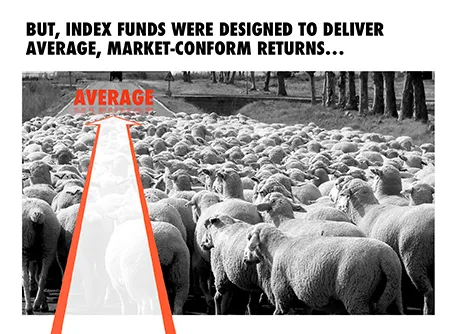
I designed the chart below for a sales presentation for an asset manager who is about to go on a roadshow to pitch a new investment fund to potential distribution partners. Yes, you saw that right, I did use a reflection effect.
A 20 minute presentation is usually to short to carry a live product demo. You might run into technical difficulties, and you are losing time/attention with banal product features such as logging in, etc.
In those cases it is better to use application screen shots, rather than the real thing. You can still point at your computer and say that there is a working prototype, and that you are more than willing to take people through in a separate, longer meeting.
The next level up is to crop/magnify the screen shots and focus only on those aspects you want the audience to see. Your Skype window, menu bars, and all other unnecessary screen real estate can be cut out.
Next level up: put big, bold, explanation arrows explaining what the user should see. Say that it is a really minimal UI, if it is minimal.
Now here is the big difference. Do not just structure your product demo alongside the feature list of your app. Instead, create a user story and let the app screens flow with the story. You can also include visual images that are not screen shots into this story board. Even better, link back to story elements you have used elsewhere in the presentation.
A product demo is a user story, not a list of features.
Every presentation design effort goes through a similar process flow:
You need to think about these phases when designing a presentation for a big deadline. Often, critical data for slides only becomes available at the very last minute. And most of the time, stakeholders only start to focus on the presentation in the last minute, and only when they see slides that are ready. The result: a lot of stress and sleepless nights. So what to do?
Early in the process, move from phase 1 to phase 2 and start crafting the critical slides that convey the most important ideas of your presentation, with imperfect data, maybe even without data at all. It forces senior management to get out of the blah blah blah zone, and gives specific input on the story line. When phase 2 is completed, nobody will be nervous anymore that the project might not come up with a good end result. Everyone is calm.
I find that a long-hand story board written in a word processor is equal to phase 1.5: people will react to it and give input, but when you turn that into slides, the whole thing can go upside down again. Push for phase 2 early, and do not get stuck in 2 pages of bullet points.
Now the bulk of the sweat work is phase 3. There is no reason to postpone that to the last night, you can prepare 98% of most business presentations with incomplete data.
In many draft/briefing presentations I see, there is a page 1 that was inserted after the full presentation was finished. It contains the things the presenter really wants to say.
Do not feel guilty to discard almost the entire presentation (slides 2-50), take page 1 as a story board to build up the entire presentation from scratch, focussing just on the things you really want to say.
The three weeks of work you invested in page 2-50 where necessary to get you to write page 1, which you can now turn into a full presentation in less than a day, because the full picture is crystal clear, very different from where you were 3 weeks ago.
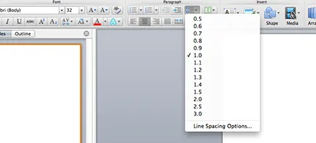
One of the typography elements I play with all the time is leading, the space between 2 lines of text. PowerPoint sets the leading standard to 1.0, or 100% of the typeface size. What leading looks good depends on:
There is no general rule here, you need to fiddle and see what looks best. On a Mac, there is a button that controls the leading of your paragraph, see the screenshot below. It is one of the buttons I use most.